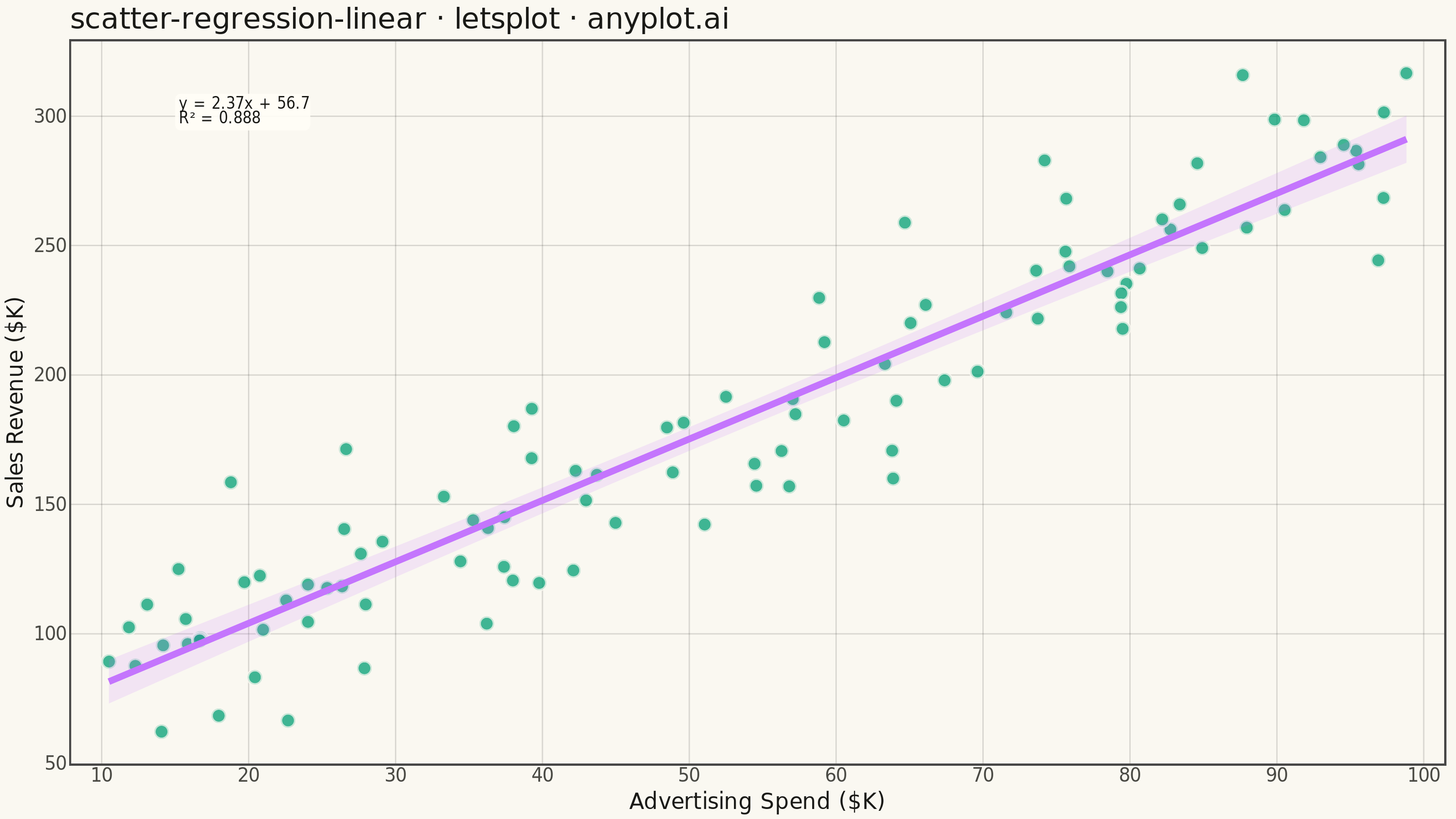
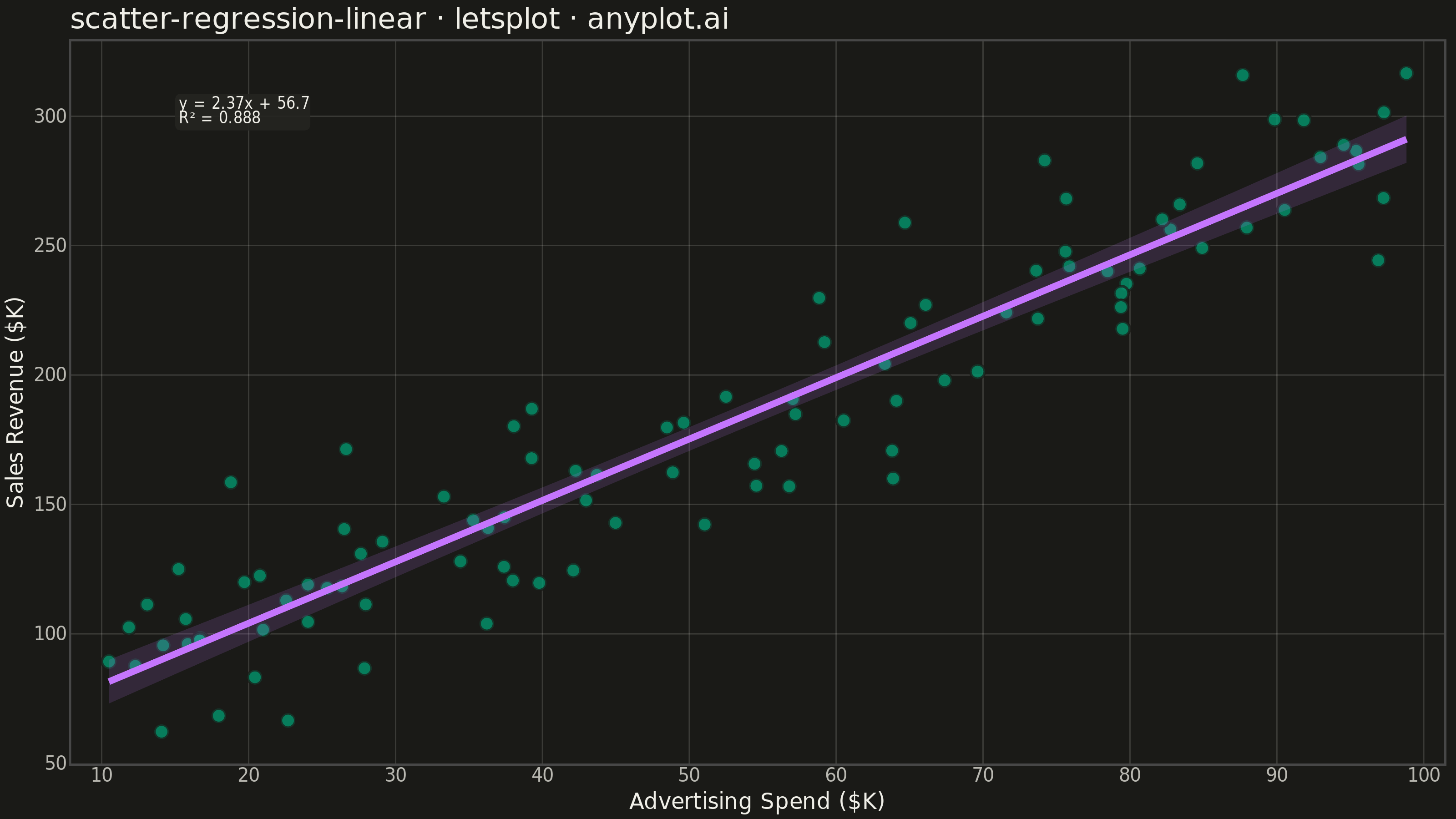
A scatter plot that displays the relationship between two numeric variables with a fitted linear regression line and confidence interval band. This visualization extends the basic scatter plot by adding statistical modeling elements, making it ideal for understanding linear relationships, assessing model fit, and communicating the strength of correlations with visual uncertainty quantification.
""" anyplot.ai
scatter-regression-linear: Scatter Plot with Linear Regression
Library: letsplot 4.11.0 | Python 3.13.14
Quality: 85/100 | Updated: 2026-08-05
"""

import os

import numpy as np
import pandas as pd
from lets_plot import *
from lets_plot.export import ggsave as export_ggsave


LetsPlot.setup_html()

# Theme tokens (Imprint)
THEME = os.getenv("ANYPLOT_THEME", "light")
PAGE_BG = "#FAF8F1" if THEME == "light" else "#1A1A17"
ELEVATED_BG = "#FFFDF6" if THEME == "light" else "#242420"
INK = "#1A1A17" if THEME == "light" else "#F0EFE8"
INK_SOFT = "#4A4A44" if THEME == "light" else "#B8B7B0"
GRID_COLOR = "rgba(26,26,23,0.15)" if THEME == "light" else "rgba(240,239,232,0.15)"
BRAND = "#009E73"  # Imprint palette position 1
SECONDARY = "#C475FD"  # Imprint palette position 2 — regression line + CI band

# Data - Advertising spend vs sales revenue relationship
np.random.seed(42)
n = 100
advertising_spend = np.random.uniform(10, 100, n)
sales_revenue = 2.5 * advertising_spend + 50 + np.random.randn(n) * 25

df = pd.DataFrame({"advertising_spend": advertising_spend, "sales_revenue": sales_revenue})

# Regression statistics (closed-form OLS, so the annotation matches geom_smooth exactly)
x_mean = np.mean(advertising_spend)
y_mean = np.mean(sales_revenue)
slope = np.sum((advertising_spend - x_mean) * (sales_revenue - y_mean)) / np.sum((advertising_spend - x_mean) ** 2)
intercept = y_mean - slope * x_mean

y_pred = slope * advertising_spend + intercept
ss_res = np.sum((sales_revenue - y_pred) ** 2)
ss_tot = np.sum((sales_revenue - y_mean) ** 2)
r_squared = 1 - (ss_res / ss_tot)

equation_text = f"y = {slope:.2f}x + {intercept:.1f}"
r2_text = f"R² = {r_squared:.3f}"
annotation_text = f"{equation_text}\n{r2_text}"

annotation_x = 15
annotation_y = sales_revenue.max() - 8

# Plot
plot = (
    ggplot(df, aes(x="advertising_spend", y="sales_revenue"))
    + geom_point(
        shape=21,
        fill=BRAND,
        color=PAGE_BG,
        stroke=0.6,
        size=3,
        alpha=0.65,
        tooltips=layer_tooltips()
        .line("Ad Spend|$@advertising_spend{.1f}K")
        .line("Sales|$@sales_revenue{.1f}K"),
    )
    + geom_smooth(
        method="lm",
        color=SECONDARY,
        size=1.6,
        se=True,
        level=0.95,
        fill=SECONDARY,
        fill_alpha=0.15,
        tooltips=layer_tooltips()
        .line("Fitted|@..y..")
        .line("95% CI|[@..ymin.., @..ymax..]"),
    )
    + geom_label(
        x=annotation_x,
        y=annotation_y,
        label=annotation_text,
        size=4.5,
        color=INK,
        fill=ELEVATED_BG,
        label_size=0,
        family="sans-serif",
        hjust=0,
        vjust=1,
        alpha=0.92,
    )
    + labs(
        x="Advertising Spend ($K)", y="Sales Revenue ($K)", title="scatter-regression-linear · letsplot · anyplot.ai"
    )
    + scale_x_continuous(expand=(0.03, 0))
    + scale_y_continuous(expand=(0.05, 0))
    + ggmarginal(
        "tr",
        size=0.09,
        layer=geom_density(color=BRAND, fill=BRAND, alpha=0.25, size=0.8),
    )
    + ggsize(800, 450)
    + theme_minimal()
    + theme(
        plot_background=element_rect(fill=PAGE_BG, color=PAGE_BG),
        panel_background=element_rect(fill=PAGE_BG),
        panel_border=element_blank(),
        panel_grid_major=element_line(color=GRID_COLOR, size=0.6),
        panel_grid_minor=element_blank(),
        axis_text=element_text(size=10, color=INK_SOFT),
        axis_title=element_text(size=12, color=INK),
        plot_title=element_text(size=16, color=INK),
        axis_line_x=element_line(color=INK_SOFT, size=0.6),
        axis_line_y=element_line(color=INK_SOFT, size=0.6),
        axis_ticks=element_blank(),
    )
)

# Save outputs
export_ggsave(plot, filename=f"plot-{THEME}.png", path=".", scale=4)
export_ggsave(plot, filename=f"plot-{THEME}.html", path=".")
Runnable source as JSON, for any HTTP client: https://api.anyplot.ai/specs/scatter-regression-linear/letsplot/code. Any spec id and library id listed in llms-full.txt fit the same URL shape; every URL below is complete and callable.
{
  "spec_id": "scatter-regression-linear",
  "language": "python",
  "library": "letsplot",
  "page": "https://anyplot.ai/scatter-regression-linear/python/letsplot",
  "hub": "https://anyplot.ai/scatter-regression-linear",
  "code_json": "https://api.anyplot.ai/specs/scatter-regression-linear/letsplot/code",
  "spec_json": "https://api.anyplot.ai/specs/scatter-regression-linear",
  "render_light_png": "https://storage.googleapis.com/anyplot-images/plots/scatter-regression-linear/python/letsplot/plot-light.png",
  "render_dark_png": "https://storage.googleapis.com/anyplot-images/plots/scatter-regression-linear/python/letsplot/plot-dark.png",
  "interactive_light_html": "https://storage.googleapis.com/anyplot-images/plots/scatter-regression-linear/python/letsplot/plot-light.html",
  "interactive_dark_html": "https://storage.googleapis.com/anyplot-images/plots/scatter-regression-linear/python/letsplot/plot-dark.html",
  "quality_score": 85.0,
  "license": "MIT",
  "guide": "https://anyplot.ai/llms.txt"
}
Part of Scatter Plot with Linear Regression on anyplot.ai.