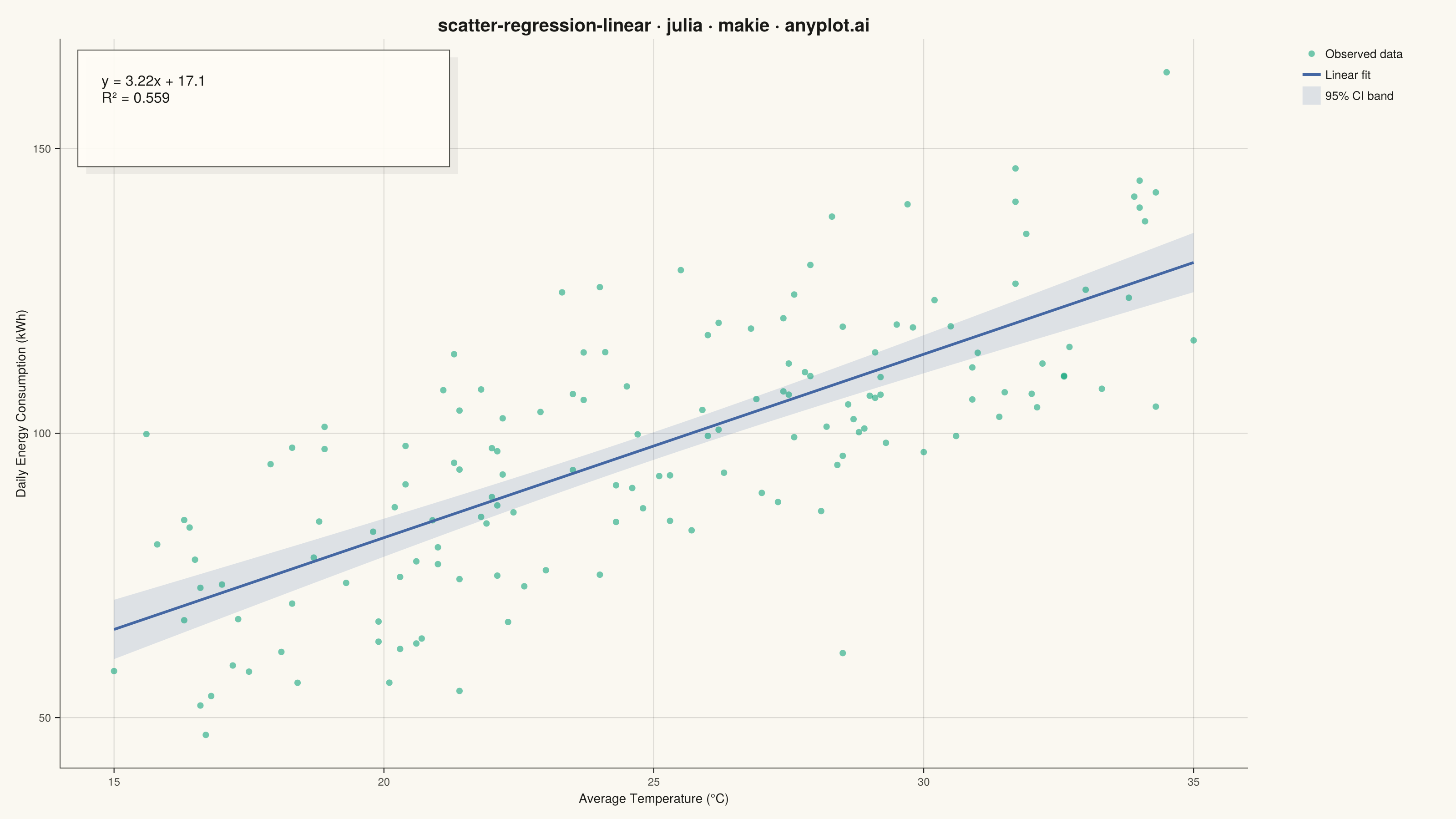
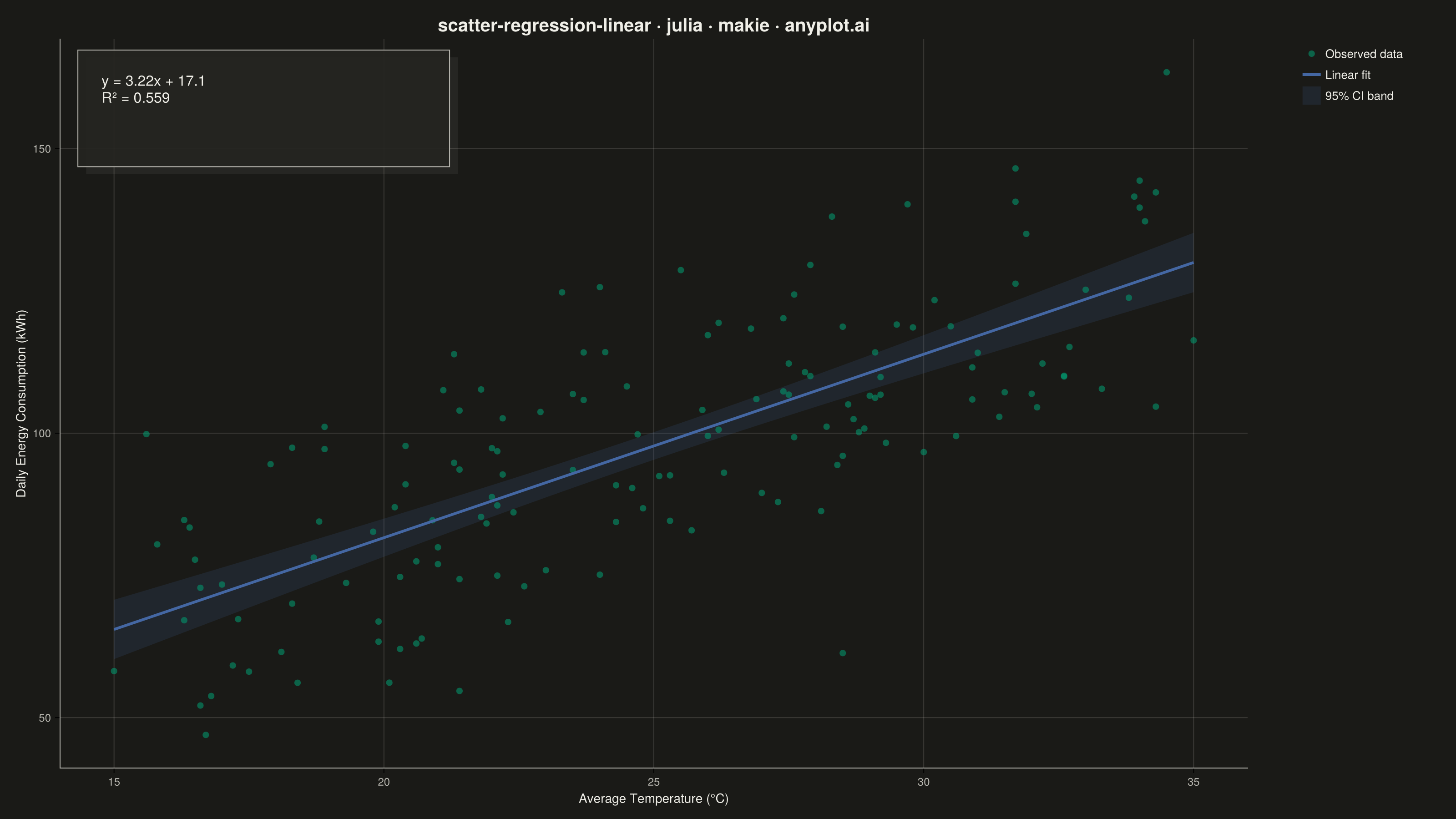
The same plot in 14 other libraries — Python: Altair, Bokeh, lets-plot, Matplotlib, Plotly, plotnine, Pygal, Seaborn; R: ggplot2; JavaScript: Chart.js, D3.js, Apache ECharts, Highcharts, MUI X Charts. Compare all 15 side by side: Scatter Plot with Linear Regression in Python, R, Julia and JavaScript.
A scatter plot that displays the relationship between two numeric variables with a fitted linear regression line and confidence interval band. This visualization extends the basic scatter plot by adding statistical modeling elements, making it ideal for understanding linear relationships, assessing model fit, and communicating the strength of correlations with visual uncertainty quantification.
# anyplot.ai
# scatter-regression-linear: Scatter Plot with Linear Regression
# Library: makie 0.21.9 | Julia 1.11.9
# Quality: 88/100 | Created: 2026-08-05

using CairoMakie
using Colors
using Random
using Statistics

Random.seed!(42)

# --- Theme tokens ------------------------------------------------------------
const THEME    = get(ENV, "ANYPLOT_THEME", "light")
const PAGE_BG  = THEME == "light" ? colorant"#FAF8F1" : colorant"#1A1A17"
const INK      = THEME == "light" ? colorant"#1A1A17" : colorant"#F0EFE8"
const INK_SOFT = THEME == "light" ? colorant"#4A4A44" : colorant"#B8B7B0"
const IMPRINT_PALETTE = [
    colorant"#009E73", colorant"#C475FD", colorant"#4467A3", colorant"#BD8233",
    colorant"#AE3030", colorant"#2ABCCD", colorant"#954477", colorant"#99B314",
]

# --- Data ---------------------------------------------------------------------
n = 150
temperature = rand(15.0:0.1:35.0, n)
energy_consumption = 12.0 .+ 3.4 .* temperature .+ randn(n) .* 15.0

# --- Regression -----------------------------------------------------------
x_mean = mean(temperature)
y_mean = mean(energy_consumption)
sum_xx = sum((temperature .- x_mean) .^ 2)
sum_xy = sum((temperature .- x_mean) .* (energy_consumption .- y_mean))
slope = sum_xy / sum_xx
intercept = y_mean - slope * x_mean

fitted = intercept .+ slope .* temperature
residuals = energy_consumption .- fitted
ss_res = sum(residuals .^ 2)
ss_tot = sum((energy_consumption .- y_mean) .^ 2)
r_squared = 1 - ss_res / ss_tot

dof = n - 2
residual_se = sqrt(ss_res / dof)
t_critical = 1.96  # normal approximation for 95% CI, valid at dof=148

x_line = range(minimum(temperature), maximum(temperature), length = 200)
y_line = intercept .+ slope .* x_line
se_fit = residual_se .* sqrt.(1 / n .+ (x_line .- x_mean) .^ 2 ./ sum_xx)
y_lower = y_line .- t_critical .* se_fit
y_upper = y_line .+ t_critical .* se_fit

# --- Plot -----------------------------------------------------------------
fig = Figure(
    resolution      = (1600, 900),
    fontsize        = 14,
    backgroundcolor = PAGE_BG,
)

ax = Axis(
    fig[1, 1];
    title              = "scatter-regression-linear · julia · makie · anyplot.ai",
    titlesize          = 20,
    titlecolor         = INK,
    xlabel             = "Average Temperature (°C)",
    ylabel             = "Daily Energy Consumption (kWh)",
    xlabelsize         = 14,
    ylabelsize         = 14,
    xlabelcolor        = INK,
    ylabelcolor        = INK,
    xticklabelsize     = 12,
    yticklabelsize     = 12,
    xticklabelcolor    = INK_SOFT,
    yticklabelcolor    = INK_SOFT,
    backgroundcolor    = PAGE_BG,
    topspinevisible    = false,
    rightspinevisible  = false,
    leftspinecolor     = INK_SOFT,
    bottomspinecolor   = INK_SOFT,
    xgridcolor         = RGBAf(INK.r, INK.g, INK.b, 0.15),
    ygridcolor         = RGBAf(INK.r, INK.g, INK.b, 0.15),
)

band_plot = band!(ax, x_line, y_lower, y_upper; color = (IMPRINT_PALETTE[3], 0.16))
scatter_plot = scatter!(ax, temperature, energy_consumption;
    color = (IMPRINT_PALETTE[1], 0.55), markersize = 10, strokewidth = 0)
line_plot = lines!(ax, x_line, y_line; color = IMPRINT_PALETTE[3], linewidth = 3)

# --- Equation callout card ---------------------------------------------------
# A layered card (drop-shadow rect + bordered panel) instead of bare text-on-plot,
# giving the annotation a distinct focal point rather than a floating label.
card_bg = THEME == "light" ? colorant"#FFFDF6" : colorant"#242420"
poly!(ax, Point2f[(0.022, 0.975), (0.335, 0.975), (0.335, 0.815), (0.022, 0.815)];
    space = :relative, color = (INK, 0.06), strokewidth = 0)
poly!(ax, Point2f[(0.015, 0.985), (0.328, 0.985), (0.328, 0.825), (0.015, 0.825)];
    space = :relative, color = (card_bg, 0.92), strokecolor = INK_SOFT, strokewidth = 1)

equation_sign = intercept >= 0 ? "+" : "-"
equation = "y = $(round(slope, digits = 2))x $equation_sign $(round(abs(intercept), digits = 1))"
stats_label = "$equation\nR² = $(round(r_squared, digits = 3))"

text!(ax, 0.035, 0.955; text = stats_label, space = :relative,
    align = (:left, :top), fontsize = 16, color = INK)

# --- Legend (Makie layout composition, identifies the 95% CI band) ----------
legend_elements = [
    MarkerElement(color = (IMPRINT_PALETTE[1], 0.55), marker = :circle, markersize = 10),
    LineElement(color = IMPRINT_PALETTE[3], linewidth = 3),
    PolyElement(color = (IMPRINT_PALETTE[3], 0.16)),
]
Legend(fig[1, 2], legend_elements, ["Observed data", "Linear fit", "95% CI band"];
    framevisible   = false,
    labelcolor     = INK,
    labelsize      = 13,
    backgroundcolor = PAGE_BG,
    tellheight     = false,
    valign         = :top,
)
colsize!(fig.layout, 2, Relative(0.13))
colgap!(fig.layout, 1, 18)

# --- Save -------------------------------------------------------------------
save("plot-$(THEME).png", fig; px_per_unit = 2)
Runnable source as JSON, for any HTTP client: https://api.anyplot.ai/specs/scatter-regression-linear/makie/code. Any spec id and library id listed in llms-full.txt fit the same URL shape; every URL below is complete and callable.
{
  "spec_id": "scatter-regression-linear",
  "language": "julia",
  "library": "makie",
  "page": "https://anyplot.ai/scatter-regression-linear/julia/makie",
  "hub": "https://anyplot.ai/scatter-regression-linear",
  "code_json": "https://api.anyplot.ai/specs/scatter-regression-linear/makie/code",
  "spec_json": "https://api.anyplot.ai/specs/scatter-regression-linear",
  "render_light_png": "https://storage.googleapis.com/anyplot-images/plots/scatter-regression-linear/julia/makie/plot-light.png",
  "render_dark_png": "https://storage.googleapis.com/anyplot-images/plots/scatter-regression-linear/julia/makie/plot-dark.png",
  "quality_score": 88.0,
  "license": "MIT",
  "guide": "https://anyplot.ai/llms.txt"
}
Part of Scatter Plot with Linear Regression on anyplot.ai.