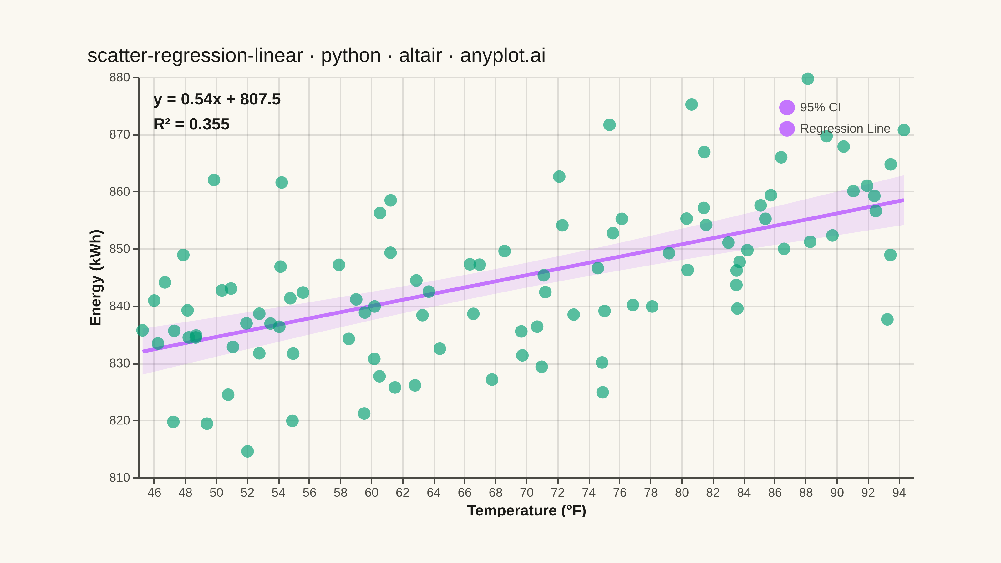
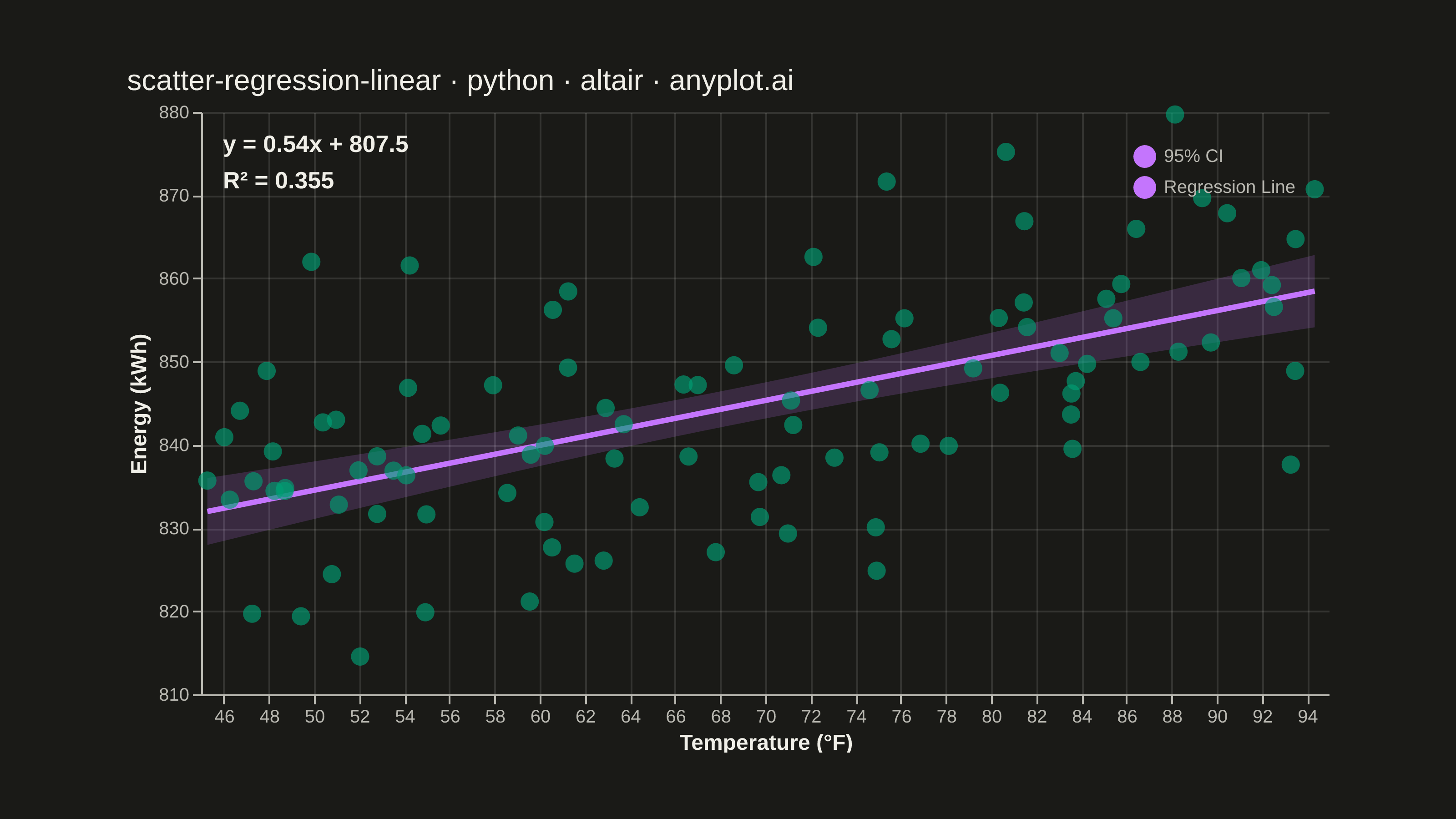
A scatter plot that displays the relationship between two numeric variables with a fitted linear regression line and confidence interval band. This visualization extends the basic scatter plot by adding statistical modeling elements, making it ideal for understanding linear relationships, assessing model fit, and communicating the strength of correlations with visual uncertainty quantification.
""" anyplot.ai
scatter-regression-linear: Scatter Plot with Linear Regression
Library: altair 6.2.2 | Python 3.13.14
Quality: 92/100 | Updated: 2026-08-05
"""

import os

import altair as alt
import numpy as np
import pandas as pd
from PIL import Image


# Theme tokens (Imprint palette, see prompts/default-style-guide.md)
THEME = os.getenv("ANYPLOT_THEME", "light")
PAGE_BG = "#FAF8F1" if THEME == "light" else "#1A1A17"
INK = "#1A1A17" if THEME == "light" else "#F0EFE8"
INK_SOFT = "#4A4A44" if THEME == "light" else "#B8B7B0"
BRAND = "#009E73"  # Imprint palette position 1 — always first series
ACCENT = "#C475FD"  # Imprint palette position 2 — regression line + CI band

# Data - Temperature vs Energy Consumption
np.random.seed(42)
n = 100
temperature = np.random.uniform(45, 95, n)  # Fahrenheit
noise = np.random.normal(0, 12, n)
energy_consumption = 0.65 * temperature + 800 + noise  # kWh

# Closed-form OLS — drives the 95% CI band and the equation/R² annotation
x_mean = np.mean(temperature)
y_mean = np.mean(energy_consumption)
ss_xx = np.sum((temperature - x_mean) ** 2)
ss_xy = np.sum((temperature - x_mean) * (energy_consumption - y_mean))
slope = ss_xy / ss_xx
intercept = y_mean - slope * x_mean

y_pred = slope * temperature + intercept
ss_res = np.sum((energy_consumption - y_pred) ** 2)
ss_tot = np.sum((energy_consumption - y_mean) ** 2)
r_squared = 1 - (ss_res / ss_tot)

x_line = np.linspace(temperature.min(), temperature.max(), 150)
y_line = slope * x_line + intercept
mse = ss_res / (n - 2)
se_line = np.sqrt(mse * (1 / n + (x_line - x_mean) ** 2 / ss_xx))
t_val = 1.984  # t-critical for 95% CI, df=98
y_upper = y_line + t_val * se_line
y_lower = y_line - t_val * se_line

df_scatter = pd.DataFrame({"Temperature (°F)": temperature, "Energy (kWh)": energy_consumption})
df_band = pd.DataFrame({"Temperature (°F)": x_line, "y_lower": y_lower, "y_upper": y_upper, "series": "95% CI"})

equation_text = f"y = {slope:.2f}x + {intercept:.1f}"
r2_text = f"R² = {r_squared:.3f}"
annotation_df = pd.DataFrame({"equation": [equation_text], "r2": [r2_text]})

# Shared color scale so the CI band and regression line report into one merged legend
overlay_scale = alt.Scale(domain=["95% CI", "Regression Line"], range=[ACCENT, ACCENT])
overlay_legend = alt.Legend(title=None, labelFontSize=10, orient="top-right")

# Layers
scatter = (
    alt.Chart(df_scatter)
    .mark_point(size=100, opacity=0.65, filled=True)
    .encode(
        x=alt.X("Temperature (°F):Q", scale=alt.Scale(zero=False)),
        y=alt.Y("Energy (kWh):Q", scale=alt.Scale(zero=False)),
        color=alt.value(BRAND),
        tooltip=[alt.Tooltip("Temperature (°F):Q", format=".1f"), alt.Tooltip("Energy (kWh):Q", format=".1f")],
    )
)

band = (
    alt.Chart(df_band)
    .mark_area(opacity=0.18)
    .encode(
        x="Temperature (°F):Q",
        y=alt.Y("y_lower:Q", title="Energy (kWh)"),
        y2="y_upper:Q",
        color=alt.Color("series:N", scale=overlay_scale, legend=overlay_legend),
    )
)

# Regression line fit natively via Altair's declarative regression transform
regression_line = (
    alt.Chart(df_scatter)
    .transform_regression("Temperature (°F)", "Energy (kWh)", method="linear")
    .transform_calculate(series="'Regression Line'")
    .mark_line(strokeWidth=3)
    .encode(
        x="Temperature (°F):Q",
        y="Energy (kWh):Q",
        color=alt.Color("series:N", scale=overlay_scale, legend=overlay_legend),
    )
)

annotation_eq = (
    alt.Chart(annotation_df)
    .mark_text(align="left", baseline="top", fontSize=13, fontWeight="bold", dx=12, dy=12)
    .encode(x=alt.value(0), y=alt.value(0), text="equation:N", color=alt.value(INK))
)

annotation_r2 = (
    alt.Chart(annotation_df)
    .mark_text(align="left", baseline="top", fontSize=13, fontWeight="bold", dx=12, dy=32)
    .encode(x=alt.value(0), y=alt.value(0), text="r2:N", color=alt.value(INK))
)

# Title — mandated format, length-scaled fontsize (see prompts/plot-generator.md)
title_str = "scatter-regression-linear · python · altair · anyplot.ai"
title_fontsize = round(16 * (67 / len(title_str) if len(title_str) > 67 else 1.0))

chart = (
    alt.layer(band, regression_line, scatter, annotation_eq, annotation_r2)
    .properties(
        width=620,
        height=320,
        padding={"left": 0, "right": 0, "top": 0, "bottom": 0},
        title=alt.Title(title_str, fontSize=title_fontsize, anchor="start"),
        background=PAGE_BG,
    )
    .configure_view(fill=PAGE_BG, stroke=None, continuousWidth=620, continuousHeight=320)
    .configure_axis(
        labelFontSize=10,
        titleFontSize=12,
        labelColor=INK_SOFT,
        titleColor=INK,
        domainColor=INK_SOFT,
        tickColor=INK_SOFT,
        gridOpacity=0.12,
        gridColor=INK,
    )
    .configure_title(color=INK, fontSize=title_fontsize, anchor="start", fontWeight="normal")
    .configure_legend(labelColor=INK_SOFT, symbolStrokeWidth=2.5, symbolOpacity=1)
)

# Save
chart.save(f"plot-{THEME}.png", scale_factor=4.0)

TW, TH = 3200, 1800
_img = Image.open(f"plot-{THEME}.png").convert("RGB")
_w, _h = _img.size
if _w > TW or _h > TH:
    raise SystemExit(
        f"altair vl-convert produced {_w}x{_h}, exceeds target {TW}x{TH}. "
        f"Shrink chart .properties(width=, height=) values and re-render."
    )
if _w < TW or _h < TH:
    _canvas = Image.new("RGB", (TW, TH), PAGE_BG)
    _canvas.paste(_img, ((TW - _w) // 2, (TH - _h) // 2))
    _canvas.save(f"plot-{THEME}.png")

chart.save(f"plot-{THEME}.html")
Runnable source as JSON, for any HTTP client: https://api.anyplot.ai/specs/scatter-regression-linear/altair/code. Any spec id and library id listed in llms-full.txt fit the same URL shape; every URL below is complete and callable.
{
  "spec_id": "scatter-regression-linear",
  "language": "python",
  "library": "altair",
  "page": "https://anyplot.ai/scatter-regression-linear/python/altair",
  "hub": "https://anyplot.ai/scatter-regression-linear",
  "code_json": "https://api.anyplot.ai/specs/scatter-regression-linear/altair/code",
  "spec_json": "https://api.anyplot.ai/specs/scatter-regression-linear",
  "render_light_png": "https://storage.googleapis.com/anyplot-images/plots/scatter-regression-linear/python/altair/plot-light.png",
  "render_dark_png": "https://storage.googleapis.com/anyplot-images/plots/scatter-regression-linear/python/altair/plot-dark.png",
  "interactive_light_html": "https://storage.googleapis.com/anyplot-images/plots/scatter-regression-linear/python/altair/plot-light.html",
  "interactive_dark_html": "https://storage.googleapis.com/anyplot-images/plots/scatter-regression-linear/python/altair/plot-dark.html",
  "quality_score": 92.0,
  "license": "MIT",
  "guide": "https://anyplot.ai/llms.txt"
}
Part of Scatter Plot with Linear Regression on anyplot.ai.