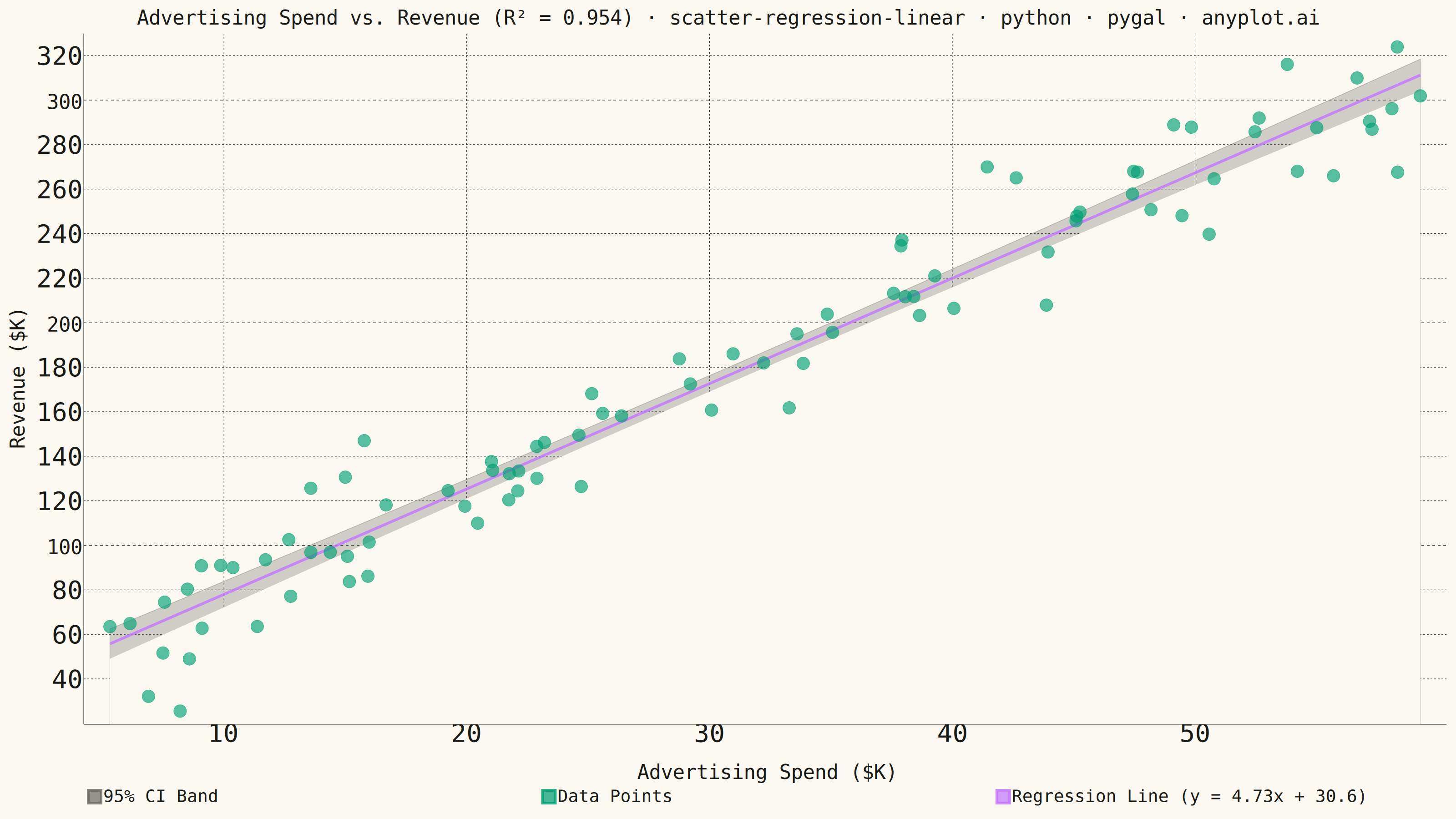
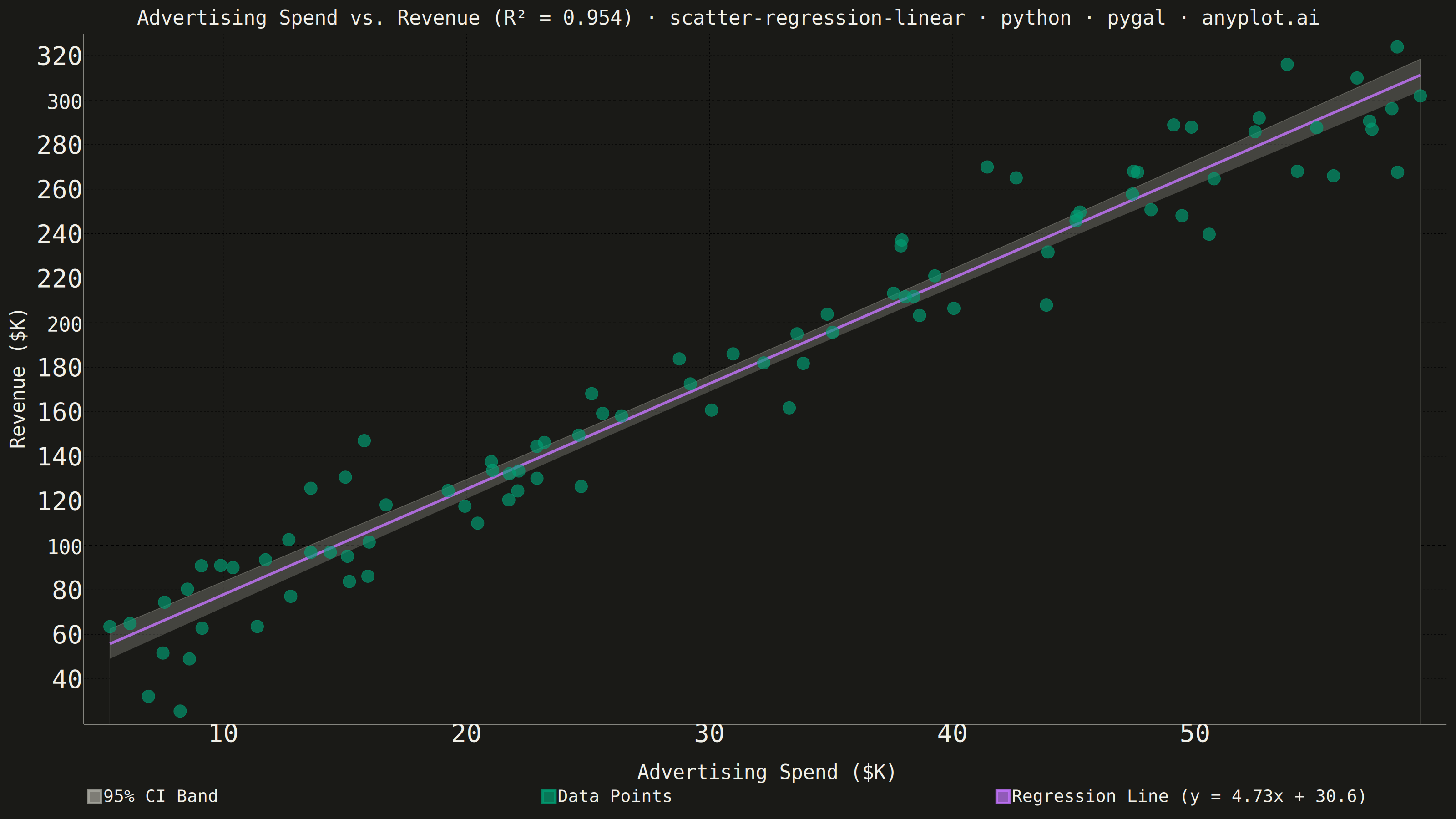
A scatter plot that displays the relationship between two numeric variables with a fitted linear regression line and confidence interval band. This visualization extends the basic scatter plot by adding statistical modeling elements, making it ideal for understanding linear relationships, assessing model fit, and communicating the strength of correlations with visual uncertainty quantification.
""" anyplot.ai
scatter-regression-linear: Scatter Plot with Linear Regression
Library: pygal 3.1.3 | Python 3.13.14
Quality: 88/100 | Updated: 2026-08-05
"""

import os

import numpy as np
import pygal
from pygal.style import Style
from scipy import stats


# Theme tokens
THEME = os.getenv("ANYPLOT_THEME", "light")
PAGE_BG = "#FAF8F1" if THEME == "light" else "#1A1A17"
INK = "#1A1A17" if THEME == "light" else "#F0EFE8"
INK_MUTED = "#6B6A63" if THEME == "light" else "#A8A79F"  # Imprint 'muted' anchor: confidence-band fill

IMPRINT = ("#009E73", "#C475FD", "#4467A3", "#BD8233", "#AE3030", "#2ABCCD", "#954477", "#99B314")

# Data - advertising spend vs revenue
np.random.seed(42)
n_points = 90
x = np.random.uniform(5, 60, n_points)  # ad spend, $K
y = 35 + 4.6 * x + np.random.normal(0, 18, n_points)  # revenue, $K

# Linear regression + 95% confidence band
slope, intercept, r_value, p_value, std_err = stats.linregress(x, y)
r_squared = r_value**2

x_line = np.linspace(x.min(), x.max(), 100)
y_line = slope * x_line + intercept

n = len(x)
x_mean = x.mean()
residual_std = np.sqrt(np.sum((y - (slope * x + intercept)) ** 2) / (n - 2))
t_val = stats.t.ppf(0.975, n - 2)
se_line = residual_std * np.sqrt(1 / n + (x_line - x_mean) ** 2 / np.sum((x - x_mean) ** 2))
ci_upper = y_line + t_val * se_line
ci_lower = y_line - t_val * se_line

equation = f"y = {slope:.2f}x + {intercept:.1f}"

# pygal has no free-text annotation API, so the R² the spec asks to display
# "prominently" is surfaced in the title itself - the most prominent element
# pygal offers - and the fit equation is folded into the regression line's
# legend label.
title = (
    f"Advertising Spend vs. Revenue (R² = {r_squared:.3f}) · scatter-regression-linear · python · pygal · anyplot.ai"
)
# Scale the title font linearly off the 67-char mandated-title baseline so the
# longer descriptive prefix never overflows the canvas (see plot-generator.md).
title_font_size = round(66 * min(1.0, 67 / len(title)))

custom_style = Style(
    background=PAGE_BG,
    plot_background=PAGE_BG,
    foreground=INK,
    foreground_strong=INK,
    foreground_subtle=INK_MUTED,
    # Series order below is [CI band, CI erase layer, Data Points, Regression
    # Line] - see the two chart.add() calls that build the band for why the
    # erase layer must sit between the band and the data points.
    colors=(INK_MUTED, PAGE_BG, IMPRINT[0], IMPRINT[1]),
    title_font_size=title_font_size,
    label_font_size=56,
    major_label_font_size=44,
    legend_font_size=38,
    dot_opacity=0.65,  # spec: scatter points at moderate transparency (~0.6-0.7)
    # pygal derives every line's rendered stroke-width from this single style
    # token (per-series `stroke_style={"width": ...}` only styles the series'
    # <g> wrapper, which the line path's own class overrides) - set it bold
    # enough that the regression line reads as clearly thicker than the dots.
    stroke_width=6,
)

chart = pygal.XY(
    width=3200,
    height=1800,
    style=custom_style,
    title=title,
    x_title="Advertising Spend ($K)",
    y_title="Revenue ($K)",
    show_legend=True,
    legend_at_bottom=True,  # top-left legend reserved a tall dead-space column; a bottom row lets the plot use the full canvas width
    legend_at_bottom_columns=3,
    legend_box_size=28,
    dots_size=14,
    stroke=False,
    show_x_guides=True,
    show_y_guides=True,
    truncate_legend=-1,
    margin_bottom=40,
    # pygal's own `.reactive{fill-opacity/stroke-width}` rule is emitted
    # scoped to the chart's `#chart-<uuid>` id, which outweighs a plain
    # `.serie-N .reactive` selector on specificity - `!important` (the same
    # escape hatch pygal's own stylesheets use, e.g. `.always_show .guide.line`)
    # is required for a per-series override to actually win. Soften the CI
    # band (index 0) into translucent shading with a thin edge, and make the
    # erase layer (index 1, see chart.add() calls) fully opaque so it cleanly
    # carves the band's lower bound out with no visible seam of its own.
    css=(
        "file://style.css",
        "file://graph.css",
        "inline:.serie-0 .reactive { fill-opacity: 0.3 !important; stroke-width: 1.5 !important; stroke-opacity: 0.4 !important; }"
        " .serie-1 .reactive { fill-opacity: 1 !important; stroke-width: 0 !important; }",
    ),
)

# 95% CI band, built from two ordinary single-curve fills instead of one
# hand-closed upper+lower polygon: pygal's fill always splices its own
# baseline-connector segment onto the *first and last vertex* of whatever
# path it's given, so a closed polygon whose start/end vertex sits at the
# plot's leftmost x (as the manual-loop version did) gets that connector
# added twice at the same x - the stray vertical bar from attempt 2. A plain
# open curve doesn't have this problem, since its first/last vertices are at
# different x values, which is exactly pygal's supported fill shape.
#
# So: fill under the upper bound (translucent - the visible "95% CI Band"),
# then fill under the lower bound in the page-background color (title=None -
# a helper layer, not its own legend entry) to erase everything below it.
# What's left visible is exactly the band between the two curves.
chart.add(
    "95% CI Band",
    [(float(xi), float(yi)) for xi, yi in zip(x_line, ci_upper, strict=True)],
    stroke=True,
    fill=True,
    show_dots=False,
)
chart.add(
    None,
    [(float(xi), float(yi)) for xi, yi in zip(x_line, ci_lower, strict=True)],
    stroke=True,
    fill=True,
    show_dots=False,
)

# Scatter points - added after the CI band layers so dots stay visible even
# where the opaque erase layer covers the plot area below the band's lower bound.
chart.add("Data Points", [{"value": (float(xi), float(yi))} for xi, yi in zip(x, y, strict=True)])

# Regression line - solid stroke in a contrasting color, equation in the label
chart.add(
    f"Regression Line ({equation})",
    [(float(xi), float(yi)) for xi, yi in zip(x_line, y_line, strict=True)],
    stroke=True,
    show_dots=False,
)

chart.render_to_png(f"plot-{THEME}.png")
with open(f"plot-{THEME}.html", "wb") as f:
    f.write(chart.render())
Runnable source as JSON, for any HTTP client: https://api.anyplot.ai/specs/scatter-regression-linear/pygal/code. Any spec id and library id listed in llms-full.txt fit the same URL shape; every URL below is complete and callable.
{
  "spec_id": "scatter-regression-linear",
  "language": "python",
  "library": "pygal",
  "page": "https://anyplot.ai/scatter-regression-linear/python/pygal",
  "hub": "https://anyplot.ai/scatter-regression-linear",
  "code_json": "https://api.anyplot.ai/specs/scatter-regression-linear/pygal/code",
  "spec_json": "https://api.anyplot.ai/specs/scatter-regression-linear",
  "render_light_png": "https://storage.googleapis.com/anyplot-images/plots/scatter-regression-linear/python/pygal/plot-light.png",
  "render_dark_png": "https://storage.googleapis.com/anyplot-images/plots/scatter-regression-linear/python/pygal/plot-dark.png",
  "interactive_light_html": "https://storage.googleapis.com/anyplot-images/plots/scatter-regression-linear/python/pygal/plot-light.html",
  "interactive_dark_html": "https://storage.googleapis.com/anyplot-images/plots/scatter-regression-linear/python/pygal/plot-dark.html",
  "quality_score": 88.0,
  "license": "MIT",
  "guide": "https://anyplot.ai/llms.txt"
}
Part of Scatter Plot with Linear Regression on anyplot.ai.