The same plot in 14 other libraries — JavaScript: Chart.js, D3.js, Apache ECharts, MUI X Charts; Python: Altair, Bokeh, lets-plot, Matplotlib, Plotly, plotnine, Pygal, Seaborn; R: ggplot2; Julia: Makie.jl. Compare all 15 side by side: Scatter Plot with Linear Regression in Python, R, Julia and JavaScript.
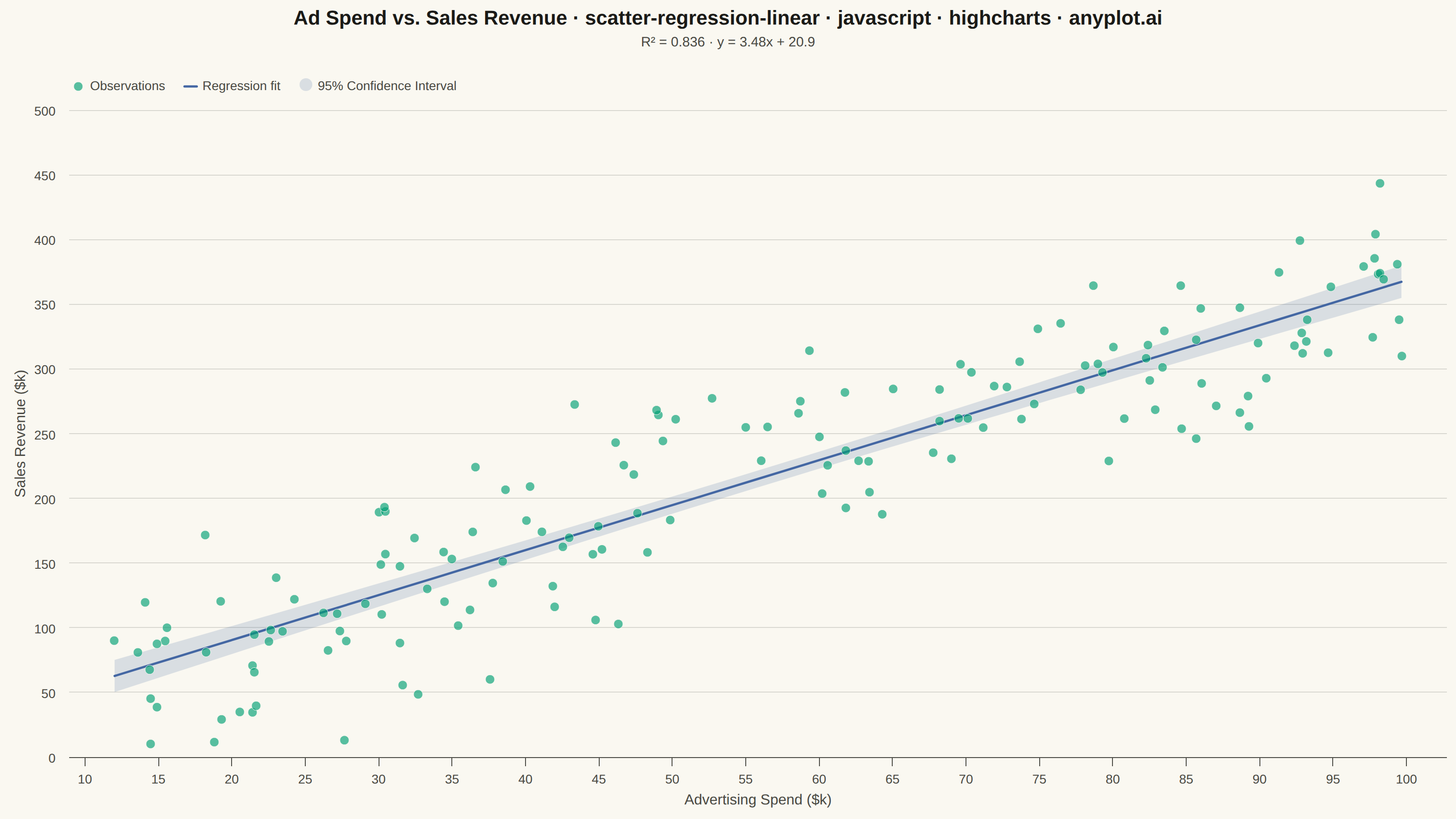
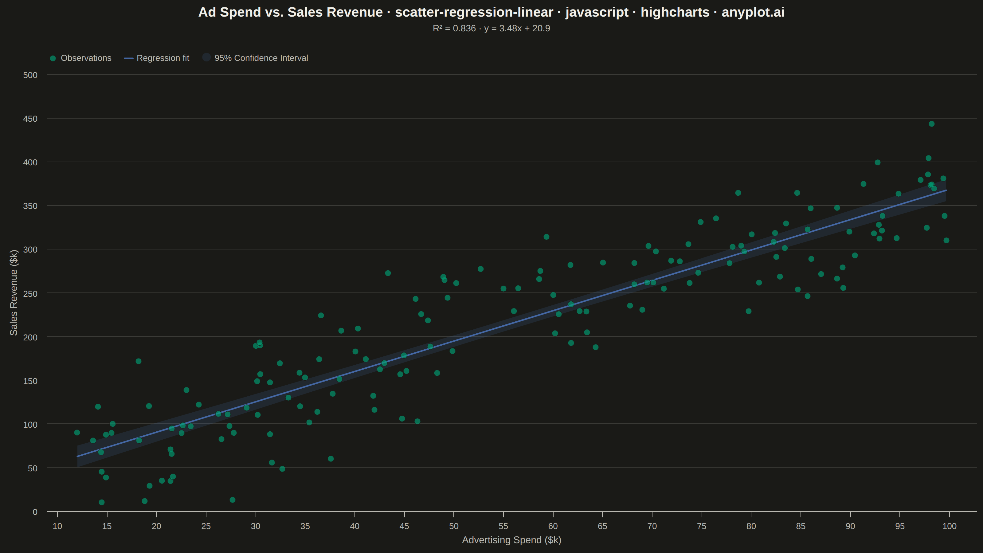
A scatter plot that displays the relationship between two numeric variables with a fitted linear regression line and confidence interval band. This visualization extends the basic scatter plot by adding statistical modeling elements, making it ideal for understanding linear relationships, assessing model fit, and communicating the strength of correlations with visual uncertainty quantification.
// anyplot.ai
// scatter-regression-linear: Scatter Plot with Linear Regression
// Library: highcharts 12.6.0 | JavaScript 22.23.1
// Quality: 89/100 | Created: 2026-08-05

const t = window.ANYPLOT_TOKENS;

// --- Data: advertising spend vs. sales revenue, fixed-seed LCG -------------
function lcg(seed) {
  let state = seed >>> 0;
  return function () {
    state = (Math.imul(state, 1664525) + 1013904223) >>> 0;
    return state / 4294967296;
  };
}
const rand = lcg(42);
function randNormal() {
  const u1 = Math.max(rand(), 1e-9);
  const u2 = rand();
  return Math.sqrt(-2 * Math.log(u1)) * Math.cos(2 * Math.PI * u2);
}

const n = 160;
const points = [];
for (let i = 0; i < n; i++) {
  const spend = 10 + rand() * 90; // advertising spend, $k
  const revenue = 25 + 3.4 * spend + randNormal() * 45; // sales revenue, $k
  points.push([spend, revenue]);
}

// --- Ordinary least-squares fit ---------------------------------------------
const xs = points.map((p) => p[0]);
const ys = points.map((p) => p[1]);
const xBar = xs.reduce((a, b) => a + b, 0) / n;
const yBar = ys.reduce((a, b) => a + b, 0) / n;
let sxx = 0;
let sxy = 0;
let syy = 0;
for (let i = 0; i < n; i++) {
  const dx = xs[i] - xBar;
  const dy = ys[i] - yBar;
  sxx += dx * dx;
  sxy += dx * dy;
  syy += dy * dy;
}
const slope = sxy / sxx;
const intercept = yBar - slope * xBar;
const r2 = (sxy * sxy) / (sxx * syy);
const sse = ys.reduce((acc, y, i) => acc + (y - (slope * xs[i] + intercept)) ** 2, 0);
const residualStdErr = Math.sqrt(sse / (n - 2));
const tCrit = 1.975; // ~95% two-tail critical value at df=158

// Regression line + 95% CI band, sampled across the observed x-range.
const xMin = Math.min(...xs);
const xMax = Math.max(...xs);
const steps = 40;
const lineData = [];
const ciUpper = [];
const ciLower = [];
for (let i = 0; i <= steps; i++) {
  const x0 = xMin + ((xMax - xMin) * i) / steps;
  const yHat = slope * x0 + intercept;
  const se = residualStdErr * Math.sqrt(1 / n + (x0 - xBar) ** 2 / sxx);
  lineData.push([x0, yHat]);
  ciUpper.push([x0, yHat + tCrit * se]);
  ciLower.push([x0, yHat - tCrit * se]);
}

// --- Chart -------------------------------------------------------------------
// arearange lives in highcharts-more (not vendored), so the CI band is drawn
// as a plain SVG path in the core renderer, redrawn on every chart render.
let bandPath;
Highcharts.chart("container", {
  chart: {
    type: "scatter",
    backgroundColor: "transparent",
    animation: false,
    style: { fontFamily: "inherit" },
    events: {
      render: function () {
        const xAxis = this.xAxis[0];
        const yAxis = this.yAxis[0];
        const upper = ciUpper.map(
          (p, i) => `${i === 0 ? "M" : "L"} ${xAxis.toPixels(p[0], false)} ${yAxis.toPixels(p[1], false)}`,
        );
        const lower = ciLower
          .slice()
          .reverse()
          .map((p) => `L ${xAxis.toPixels(p[0], false)} ${yAxis.toPixels(p[1], false)}`);
        const d = `${upper.join(" ")} ${lower.join(" ")} Z`;
        if (bandPath) {
          bandPath.attr({ d });
        } else {
          bandPath = this.renderer
            .path()
            .attr({ d, fill: Highcharts.color(t.palette[2]).setOpacity(0.18).get(), zIndex: 2 })
            .add();
        }
      },
    },
  },
  credits: { enabled: false },
  colors: t.palette,
  title: {
    text: "Ad Spend vs. Sales Revenue · scatter-regression-linear · javascript · highcharts · anyplot.ai",
    style: { color: t.ink, fontSize: "22px", fontWeight: "600" },
  },
  subtitle: {
    text: `R² = ${r2.toFixed(3)}  ·  y = ${slope.toFixed(2)}x + ${intercept.toFixed(1)}`,
    style: { color: t.inkSoft, fontSize: "15px" },
  },
  xAxis: {
    title: { text: "Advertising Spend ($k)", style: { color: t.inkSoft, fontSize: "16px" } },
    lineColor: t.inkSoft,
    tickColor: t.inkSoft,
    gridLineColor: t.grid,
    labels: { style: { color: t.inkSoft, fontSize: "14px" } },
    min: xMin - 2,
    max: xMax + 2,
  },
  yAxis: {
    title: { text: "Sales Revenue ($k)", style: { color: t.inkSoft, fontSize: "16px" } },
    lineColor: t.inkSoft,
    tickColor: t.inkSoft,
    gridLineColor: t.grid,
    labels: { style: { color: t.inkSoft, fontSize: "14px" } },
  },
  legend: {
    align: "left",
    verticalAlign: "top",
    x: 60,
    y: 10,
    itemStyle: { color: t.inkSoft, fontSize: "14px" },
    itemHoverStyle: { color: t.ink },
  },
  tooltip: {
    pointFormat: "Spend: {point.x:.1f}k<br/>Revenue: {point.y:.1f}k",
  },
  plotOptions: {
    series: { animation: false },
  },
  series: [
    {
      type: "scatter",
      name: "Observations",
      data: points,
      zIndex: 5,
      marker: {
        radius: 5,
        fillColor: Highcharts.color(t.palette[0]).setOpacity(0.65).get(),
        lineColor: t.pageBg,
        lineWidth: 0.5,
      },
    },
    {
      type: "line",
      name: "Regression fit",
      data: lineData,
      color: t.palette[2],
      lineWidth: 2.5,
      zIndex: 4,
      marker: { enabled: false },
      enableMouseTracking: false,
    },
    {
      type: "column",
      name: "95% Confidence Interval",
      data: [],
      color: Highcharts.color(t.palette[2]).setOpacity(0.18).get(),
      legendSymbol: "rectangle",
      showInLegend: true,
      enableMouseTracking: false,
    },
  ],
});
Runnable source as JSON, for any HTTP client: https://api.anyplot.ai/specs/scatter-regression-linear/highcharts/code. Any spec id and library id listed in llms-full.txt fit the same URL shape; every URL below is complete and callable.
{
  "spec_id": "scatter-regression-linear",
  "language": "javascript",
  "library": "highcharts",
  "page": "https://anyplot.ai/scatter-regression-linear/javascript/highcharts",
  "hub": "https://anyplot.ai/scatter-regression-linear",
  "code_json": "https://api.anyplot.ai/specs/scatter-regression-linear/highcharts/code",
  "spec_json": "https://api.anyplot.ai/specs/scatter-regression-linear",
  "render_light_png": "https://storage.googleapis.com/anyplot-images/plots/scatter-regression-linear/javascript/highcharts/plot-light.png",
  "render_dark_png": "https://storage.googleapis.com/anyplot-images/plots/scatter-regression-linear/javascript/highcharts/plot-dark.png",
  "interactive_light_html": "https://storage.googleapis.com/anyplot-images/plots/scatter-regression-linear/javascript/highcharts/plot-light.html",
  "interactive_dark_html": "https://storage.googleapis.com/anyplot-images/plots/scatter-regression-linear/javascript/highcharts/plot-dark.html",
  "quality_score": 89.0,
  "license": "MIT",
  "guide": "https://anyplot.ai/llms.txt"
}
Part of Scatter Plot with Linear Regression on anyplot.ai.