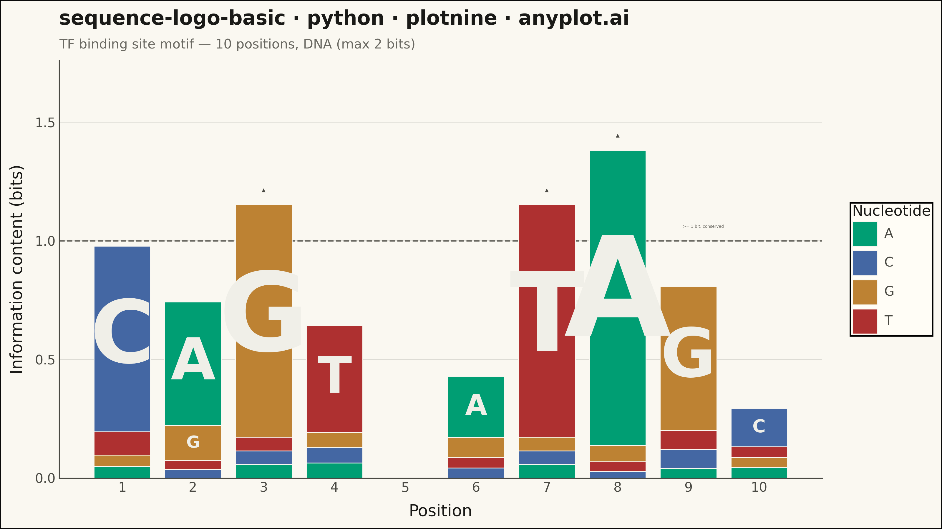
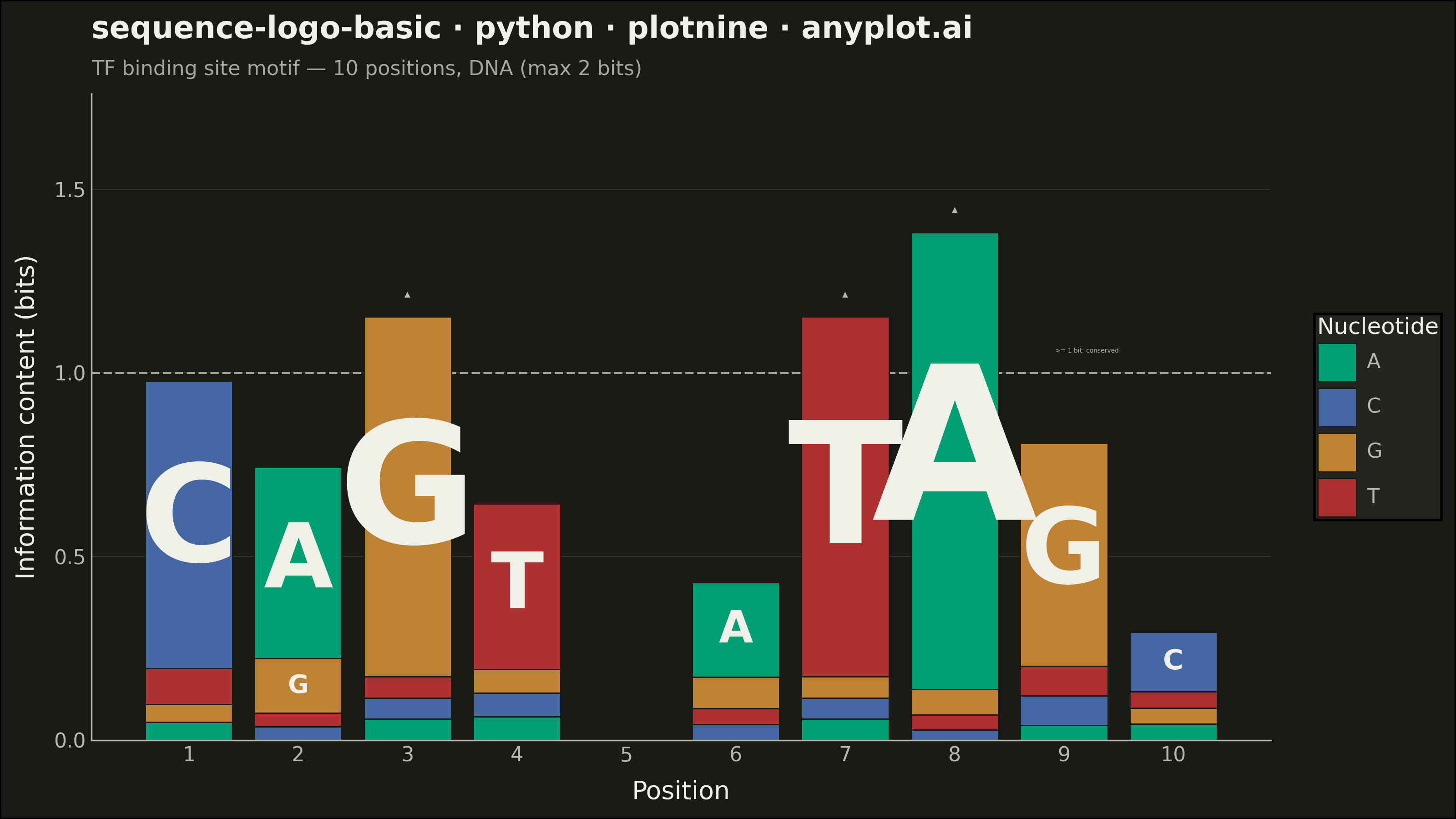
A sequence logo visualizes the consensus of multiple aligned DNA, RNA, or protein sequences. At each position, letters are stacked vertically with height proportional to information content (measured in bits), and individual letter heights within the stack reflect their relative frequency. This is the standard visualization for identifying conserved positions in transcription factor binding sites, splice sites, and protein domains.
""" anyplot.ai
sequence-logo-basic: Sequence Logo for Motif Visualization
Library: plotnine 0.15.4 | Python 3.13.13
Quality: 87/100 | Updated: 2026-06-02
"""

import os

import numpy as np
import pandas as pd
from plotnine import (
    aes,
    annotate,
    coord_cartesian,
    element_blank,
    element_line,
    element_rect,
    element_text,
    geom_hline,
    geom_rect,
    geom_text,
    ggplot,
    labs,
    scale_fill_manual,
    scale_size_identity,
    scale_x_continuous,
    scale_y_continuous,
    theme,
    theme_minimal,
)


# Theme tokens
THEME = os.getenv("ANYPLOT_THEME", "light")
PAGE_BG = "#FAF8F1" if THEME == "light" else "#1A1A17"
ELEVATED_BG = "#FFFDF6" if THEME == "light" else "#242420"
INK = "#1A1A17" if THEME == "light" else "#F0EFE8"
INK_SOFT = "#4A4A44" if THEME == "light" else "#B8B7B0"
INK_MUTED = "#6B6A63" if THEME == "light" else "#A8A79F"

# Imprint palette — semantic mapping for standard DNA color convention
# A=green, C=blue, G=orange/ochre, T=red (domain standard, semantic exception applies)
dna_colors = {
    "A": "#009E73",  # Imprint position 1 — green
    "C": "#4467A3",  # Imprint position 3 — blue
    "G": "#BD8233",  # Imprint position 4 — ochre
    "T": "#AE3030",  # Imprint position 5 — matte red
}

# Data — 10-position DNA transcription factor binding site motif
position_freqs = {
    1: {"A": 0.05, "C": 0.80, "G": 0.05, "T": 0.10},
    2: {"A": 0.70, "C": 0.05, "G": 0.20, "T": 0.05},
    3: {"A": 0.05, "C": 0.05, "G": 0.85, "T": 0.05},
    4: {"A": 0.10, "C": 0.10, "G": 0.10, "T": 0.70},
    5: {"A": 0.25, "C": 0.25, "G": 0.25, "T": 0.25},
    6: {"A": 0.60, "C": 0.10, "G": 0.20, "T": 0.10},
    7: {"A": 0.05, "C": 0.05, "G": 0.05, "T": 0.85},
    8: {"A": 0.90, "C": 0.02, "G": 0.05, "T": 0.03},
    9: {"A": 0.05, "C": 0.10, "G": 0.75, "T": 0.10},
    10: {"A": 0.15, "C": 0.55, "G": 0.15, "T": 0.15},
}

# Compute information content and build stacked letter segments
records = []
ic_values = {}
for pos, freqs in position_freqs.items():
    ic = 2.0 + sum(f * np.log2(f) for f in freqs.values() if f > 0)
    ic_values[pos] = max(ic, 0.0)
    sorted_letters = sorted(freqs.items(), key=lambda x: x[1])  # most frequent on top
    y_bottom = 0.0
    for letter, freq in sorted_letters:
        height = freq * ic_values[pos]
        if height > 0:
            records.append(
                {
                    "position": pos,
                    "letter": letter,
                    "ymin": y_bottom,
                    "ymax": y_bottom + height,
                    "y_mid": y_bottom + height / 2,
                    "height": height,
                }
            )
            y_bottom += height

df = pd.DataFrame(records)
bar_half_width = 0.40  # Reduced from 0.44 to add breathing room between adjacent glyph columns
df["xmin"] = df["position"] - bar_half_width
df["xmax"] = df["position"] + bar_half_width

# Significantly conserved positions (IC >= 1 bit) — highlighted for data storytelling
conserved_threshold = 1.0
conserved_positions = sorted([pos for pos, ic in ic_values.items() if ic >= conserved_threshold])

# Scale font size to approximate stretched-glyph fill for each segment.
# Calibrated for (8, 4.5) canvas: 80% fill target with 0.7 cap-height factor.
max_ic = max(ic_values.values())
y_range_bits = max_ic * 1.08
plot_area_mm = 4.5 * 25.4 * 0.78  # ~89 mm usable plot height
font_scale_mm = plot_area_mm * 0.8 / (y_range_bits * 0.7)
df["fontsize"] = df["height"] * font_scale_mm

# Only label segments tall enough to avoid crowding at bottom of stack
df_labels = df[df["height"] > 0.12].copy()

title = "sequence-logo-basic · python · plotnine · anyplot.ai"
subtitle = "TF binding site motif — 10 positions, DNA (max 2 bits)"

# Build plot — uses plotnine's annotate() and geom_hline() for conservation storytelling
plot = (
    ggplot(df)
    # Dashed threshold line marks the 1-bit conservation boundary
    + geom_hline(yintercept=conserved_threshold, color=INK_MUTED, size=0.5, linetype="dashed")
    + annotate(
        "text", x=9.5, y=conserved_threshold + 0.06, label=">= 1 bit: conserved", color=INK_MUTED, size=2.5, ha="right"
    )
    + geom_rect(aes(xmin="xmin", xmax="xmax", ymin="ymin", ymax="ymax", fill="letter"), color=PAGE_BG, size=0.3)
    + geom_text(
        aes(x="position", y="y_mid", label="letter", size="fontsize"),
        data=df_labels,
        color="#F0EFE8",  # near-white for contrast on colored rectangles
        fontweight="bold",
        show_legend=False,
    )
    + scale_fill_manual(values=dna_colors, name="Nucleotide")
    + scale_size_identity()
    + scale_x_continuous(breaks=list(range(1, 11)), minor_breaks=[])
    + scale_y_continuous(expand=(0, 0, 0.22, 0), breaks=[0, 0.5, 1.0, 1.5])
    + coord_cartesian(ylim=(0, None))
    + labs(x="Position", y="Information content (bits)", title=title, subtitle=subtitle)
    + theme_minimal()
    + theme(
        figure_size=(8, 4.5),
        plot_title=element_text(size=12, color=INK, fontweight="bold"),
        plot_subtitle=element_text(size=8, color=INK_MUTED),
        axis_title=element_text(size=10, color=INK),
        axis_text=element_text(size=8, color=INK_SOFT),
        legend_title=element_text(size=9, color=INK),
        legend_text=element_text(size=8, color=INK_SOFT),
        panel_grid_major_x=element_blank(),
        panel_grid_minor=element_blank(),
        panel_grid_major_y=element_line(color=INK, size=0.3, alpha=0.15),
        panel_border=element_blank(),
        axis_line_x=element_line(color=INK_SOFT, size=0.6),
        axis_line_y=element_line(color=INK_SOFT, size=0.6),
        plot_background=element_rect(fill=PAGE_BG, color=None),
        panel_background=element_rect(fill=PAGE_BG, color=None),
        legend_background=element_rect(fill=ELEVATED_BG, color=None),
    )
)

# Add triangle markers above each significantly conserved position using plotnine's annotate()
for pos in conserved_positions:
    plot = plot + annotate("text", x=pos, y=ic_values[pos] + 0.06, label="▲", color=INK_SOFT, size=3)

# Save
plot.save(f"plot-{THEME}.png", dpi=400, width=8, height=4.5, units="in", verbose=False)
Runnable source as JSON, for any HTTP client: https://api.anyplot.ai/specs/sequence-logo-basic/plotnine/code. Any spec id and library id listed in llms-full.txt fit the same URL shape; every URL below is complete and callable.
{
  "spec_id": "sequence-logo-basic",
  "language": "python",
  "library": "plotnine",
  "page": "https://anyplot.ai/sequence-logo-basic/python/plotnine",
  "hub": "https://anyplot.ai/sequence-logo-basic",
  "code_json": "https://api.anyplot.ai/specs/sequence-logo-basic/plotnine/code",
  "spec_json": "https://api.anyplot.ai/specs/sequence-logo-basic",
  "render_light_png": "https://storage.googleapis.com/anyplot-images/plots/sequence-logo-basic/python/plotnine/plot-light.png",
  "render_dark_png": "https://storage.googleapis.com/anyplot-images/plots/sequence-logo-basic/python/plotnine/plot-dark.png",
  "quality_score": 87.0,
  "license": "MIT",
  "guide": "https://anyplot.ai/llms.txt"
}
Part of Sequence Logo for Motif Visualization on anyplot.ai.