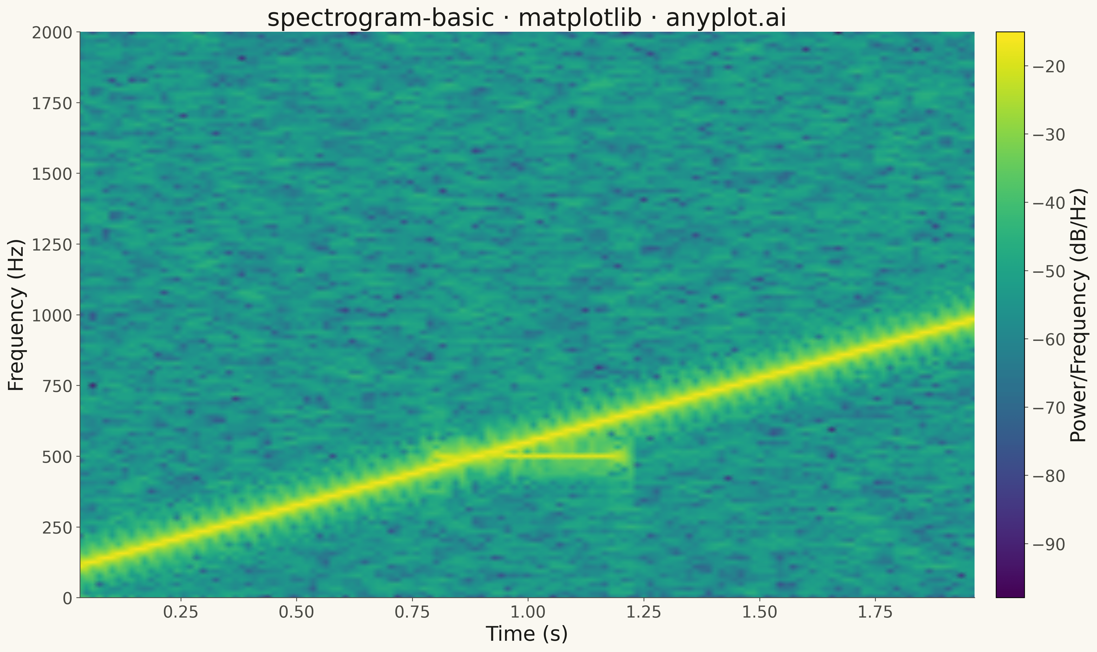
A spectrogram displaying time-frequency representation of a signal as a heatmap. It shows how the frequency content of a signal changes over time, with color intensity representing the amplitude or power at each time-frequency point. Essential for analyzing non-stationary signals where frequency characteristics vary, revealing patterns invisible in time-domain or frequency-domain views alone.
""" anyplot.ai
spectrogram-basic: Spectrogram Time-Frequency Heatmap
Library: matplotlib 3.10.9 | Python 3.13.13
Quality: 84/100 | Updated: 2026-05-15
"""

import os

import matplotlib.pyplot as plt
import numpy as np
from scipy import signal


# Theme tokens
THEME = os.getenv("ANYPLOT_THEME", "light")
PAGE_BG = "#FAF8F1" if THEME == "light" else "#1A1A17"
INK = "#1A1A17" if THEME == "light" else "#F0EFE8"
INK_SOFT = "#4A4A44" if THEME == "light" else "#B8B7B0"

# Generate a chirp signal (frequency increases over time)
np.random.seed(42)
sample_rate = 4000  # Hz
duration = 2.0  # seconds
t = np.linspace(0, duration, int(sample_rate * duration))

# Create chirp signal: frequency sweeps from 100 Hz to 1000 Hz
f0 = 100  # Start frequency
f1 = 1000  # End frequency
signal_data = np.sin(2 * np.pi * (f0 * t + (f1 - f0) * t**2 / (2 * duration)))

# Add a second component: a tone burst in the middle
burst_start = int(0.8 * sample_rate)
burst_end = int(1.2 * sample_rate)
burst_freq = 500  # Hz
signal_data[burst_start:burst_end] += 0.7 * np.sin(2 * np.pi * burst_freq * t[burst_start:burst_end])

# Add some noise
signal_data += 0.1 * np.random.randn(len(signal_data))

# Create figure
fig, ax = plt.subplots(figsize=(16, 9), facecolor=PAGE_BG)
ax.set_facecolor(PAGE_BG)

# Compute and plot spectrogram using scipy
freqs, times, Sxx = signal.spectrogram(signal_data, fs=sample_rate, nperseg=256, noverlap=200, scaling="density")

# Convert to dB scale
Sxx_db = 10 * np.log10(Sxx + 1e-10)

# Plot spectrogram
im = ax.pcolormesh(times, freqs, Sxx_db, shading="gouraud", cmap="viridis")

# Add colorbar
cbar = fig.colorbar(im, ax=ax, pad=0.02)
cbar.set_label("Power/Frequency (dB/Hz)", fontsize=20, color=INK)
cbar.ax.tick_params(labelsize=16, colors=INK_SOFT)
plt.setp(cbar.ax.get_yticklabels(), color=INK_SOFT)

# Labels and styling
ax.set_xlabel("Time (s)", fontsize=20, color=INK)
ax.set_ylabel("Frequency (Hz)", fontsize=20, color=INK)
ax.set_title("spectrogram-basic · matplotlib · anyplot.ai", fontsize=24, color=INK)
ax.tick_params(axis="both", labelsize=16, colors=INK_SOFT, labelcolor=INK_SOFT)

# Style spines
for spine in ("top", "right"):
    ax.spines[spine].set_visible(False)
for spine in ("left", "bottom"):
    ax.spines[spine].set_color(INK_SOFT)

plt.tight_layout()
plt.savefig(f"plot-{THEME}.png", dpi=300, bbox_inches="tight", facecolor=PAGE_BG)
Runnable source as JSON, for any HTTP client: https://api.anyplot.ai/specs/spectrogram-basic/matplotlib/code. Any spec id and library id listed in llms-full.txt fit the same URL shape; every URL below is complete and callable.
{
  "spec_id": "spectrogram-basic",
  "language": "python",
  "library": "matplotlib",
  "page": "https://anyplot.ai/spectrogram-basic/python/matplotlib",
  "hub": "https://anyplot.ai/spectrogram-basic",
  "code_json": "https://api.anyplot.ai/specs/spectrogram-basic/matplotlib/code",
  "spec_json": "https://api.anyplot.ai/specs/spectrogram-basic",
  "render_light_png": "https://storage.googleapis.com/anyplot-images/plots/spectrogram-basic/python/matplotlib/plot-light.png",
  "render_dark_png": "https://storage.googleapis.com/anyplot-images/plots/spectrogram-basic/python/matplotlib/plot-dark.png",
  "quality_score": 84.0,
  "license": "MIT",
  "guide": "https://anyplot.ai/llms.txt"
}
Part of Spectrogram Time-Frequency Heatmap on anyplot.ai.