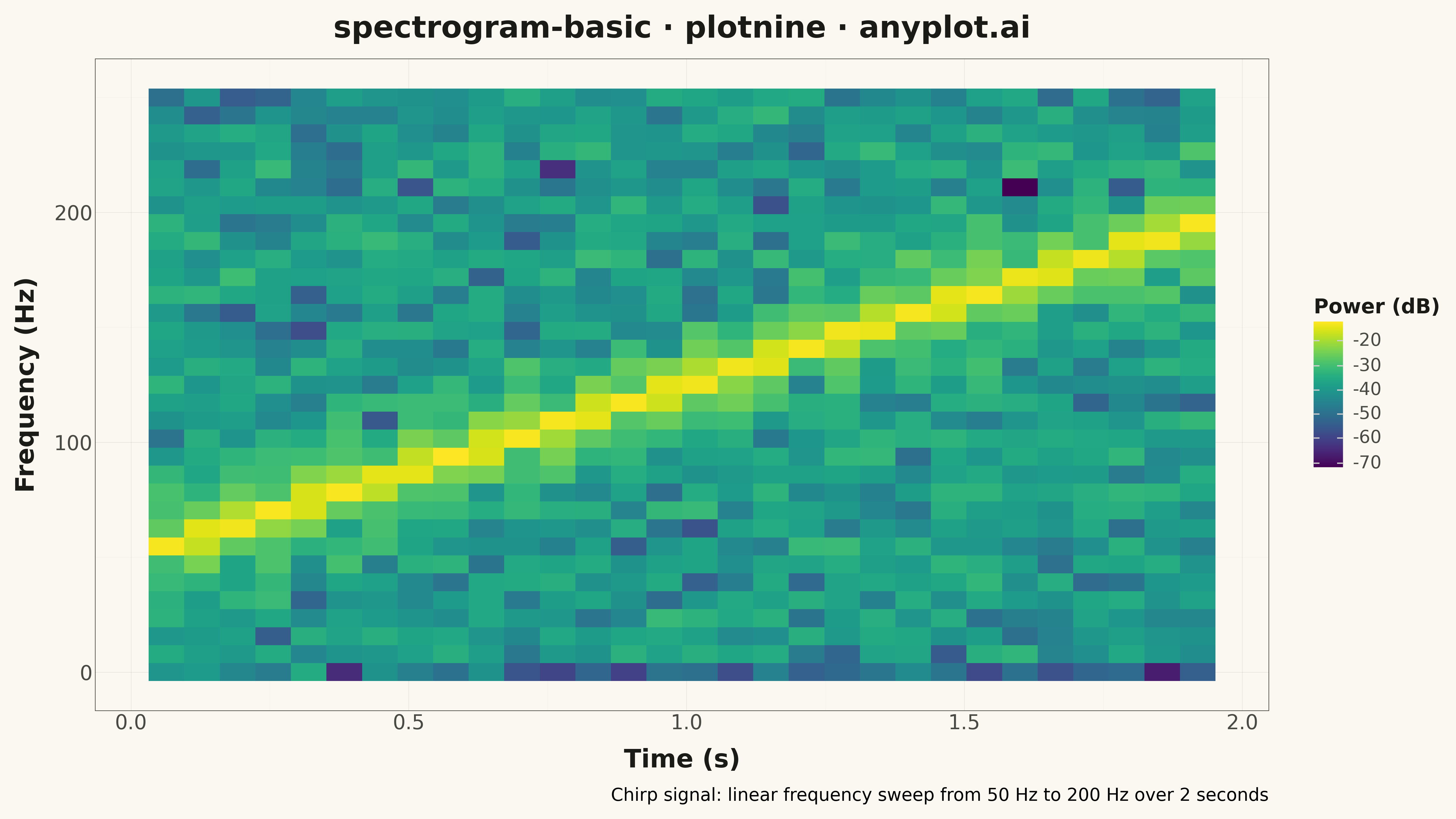
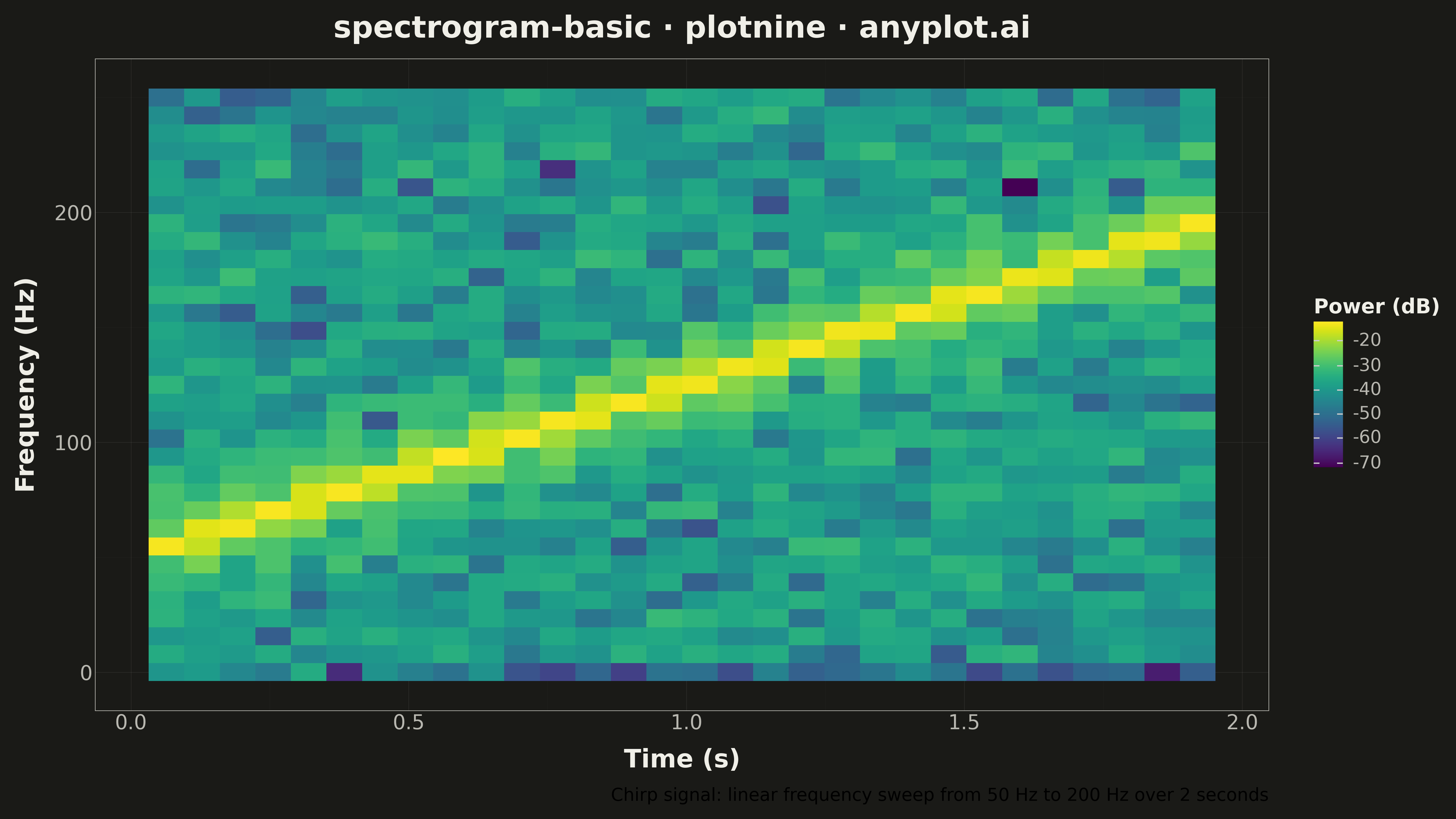
A spectrogram displaying time-frequency representation of a signal as a heatmap. It shows how the frequency content of a signal changes over time, with color intensity representing the amplitude or power at each time-frequency point. Essential for analyzing non-stationary signals where frequency characteristics vary, revealing patterns invisible in time-domain or frequency-domain views alone.
""" anyplot.ai
spectrogram-basic: Spectrogram Time-Frequency Heatmap
Library: plotnine 0.15.4 | Python 3.13.13
Quality: 90/100 | Updated: 2026-05-15
"""

import os
import sys


# Prevent current directory from shadowing the plotnine package
sys.path = [p for p in sys.path if not p.endswith("implementations") and not p.endswith("python")]

import numpy as np
import pandas as pd
from plotnine import (
    aes,
    element_line,
    element_rect,
    element_text,
    geom_tile,
    ggplot,
    labs,
    scale_fill_cmap,
    theme,
    theme_minimal,
)
from scipy import signal


# Theme tokens
THEME = os.getenv("ANYPLOT_THEME", "light")
PAGE_BG = "#FAF8F1" if THEME == "light" else "#1A1A17"
INK = "#1A1A17" if THEME == "light" else "#F0EFE8"
INK_SOFT = "#4A4A44" if THEME == "light" else "#B8B7B0"

# Data - Generate a chirp signal with increasing frequency
np.random.seed(42)
sample_rate = 1000  # Hz
duration = 2.0  # seconds
t = np.linspace(0, duration, int(sample_rate * duration))

# Create chirp signal: frequency increases from 50 Hz to 200 Hz
f0, f1 = 50, 200
chirp_signal = signal.chirp(t, f0=f0, f1=f1, t1=duration, method="linear")
chirp_signal += 0.3 * np.random.randn(len(chirp_signal))  # Add noise

# Compute spectrogram using Short-Time Fourier Transform
nperseg = 128
noverlap = nperseg // 2
frequencies, times, Sxx = signal.spectrogram(chirp_signal, fs=sample_rate, nperseg=nperseg, noverlap=noverlap)

# Convert power to dB scale
Sxx_db = 10 * np.log10(Sxx + 1e-10)

# Create DataFrame for plotnine (convert 2D grid to long format)
time_grid, freq_grid = np.meshgrid(times, frequencies)
df = pd.DataFrame({"Time": time_grid.ravel(), "Frequency": freq_grid.ravel(), "Power": Sxx_db.ravel()})

# Filter to relevant frequency range (tighter bound for better visualization)
df = df[df["Frequency"] <= 250]

# Create spectrogram plot using geom_tile (heatmap) with viridis colormap
anyplot_theme = theme(
    plot_background=element_rect(fill=PAGE_BG, color=PAGE_BG),
    panel_background=element_rect(fill=PAGE_BG),
    panel_grid_major=element_line(color=INK, size=0.3, alpha=0.12),
    panel_grid_minor=element_line(color=INK, size=0.15, alpha=0.06),
    panel_border=element_rect(color=INK_SOFT, fill=None, size=0.5),
    axis_title=element_text(color=INK, size=20, weight="bold"),
    axis_text=element_text(color=INK_SOFT, size=16),
    axis_line=element_line(color=INK_SOFT, size=0.4),
    plot_title=element_text(color=INK, size=24, weight="bold"),
    legend_text=element_text(color=INK_SOFT, size=14),
    legend_title=element_text(color=INK, size=16, weight="bold"),
    figure_size=(16, 9),
    text=element_text(size=14),
)

plot = (
    ggplot(df, aes(x="Time", y="Frequency", fill="Power"))
    + geom_tile()
    + scale_fill_cmap(cmap_name="viridis", name="Power (dB)")
    + labs(
        x="Time (s)",
        y="Frequency (Hz)",
        title="spectrogram-basic · plotnine · anyplot.ai",
        caption="Chirp signal: linear frequency sweep from 50 Hz to 200 Hz over 2 seconds",
    )
    + theme_minimal()
    + anyplot_theme
)

# Save
plot.save(f"plot-{THEME}.png", dpi=300, verbose=False)
Runnable source as JSON, for any HTTP client: https://api.anyplot.ai/specs/spectrogram-basic/plotnine/code. Any spec id and library id listed in llms-full.txt fit the same URL shape; every URL below is complete and callable.
{
  "spec_id": "spectrogram-basic",
  "language": "python",
  "library": "plotnine",
  "page": "https://anyplot.ai/spectrogram-basic/python/plotnine",
  "hub": "https://anyplot.ai/spectrogram-basic",
  "code_json": "https://api.anyplot.ai/specs/spectrogram-basic/plotnine/code",
  "spec_json": "https://api.anyplot.ai/specs/spectrogram-basic",
  "render_light_png": "https://storage.googleapis.com/anyplot-images/plots/spectrogram-basic/python/plotnine/plot-light.png",
  "render_dark_png": "https://storage.googleapis.com/anyplot-images/plots/spectrogram-basic/python/plotnine/plot-dark.png",
  "quality_score": 90.0,
  "license": "MIT",
  "guide": "https://anyplot.ai/llms.txt"
}
Part of Spectrogram Time-Frequency Heatmap on anyplot.ai.