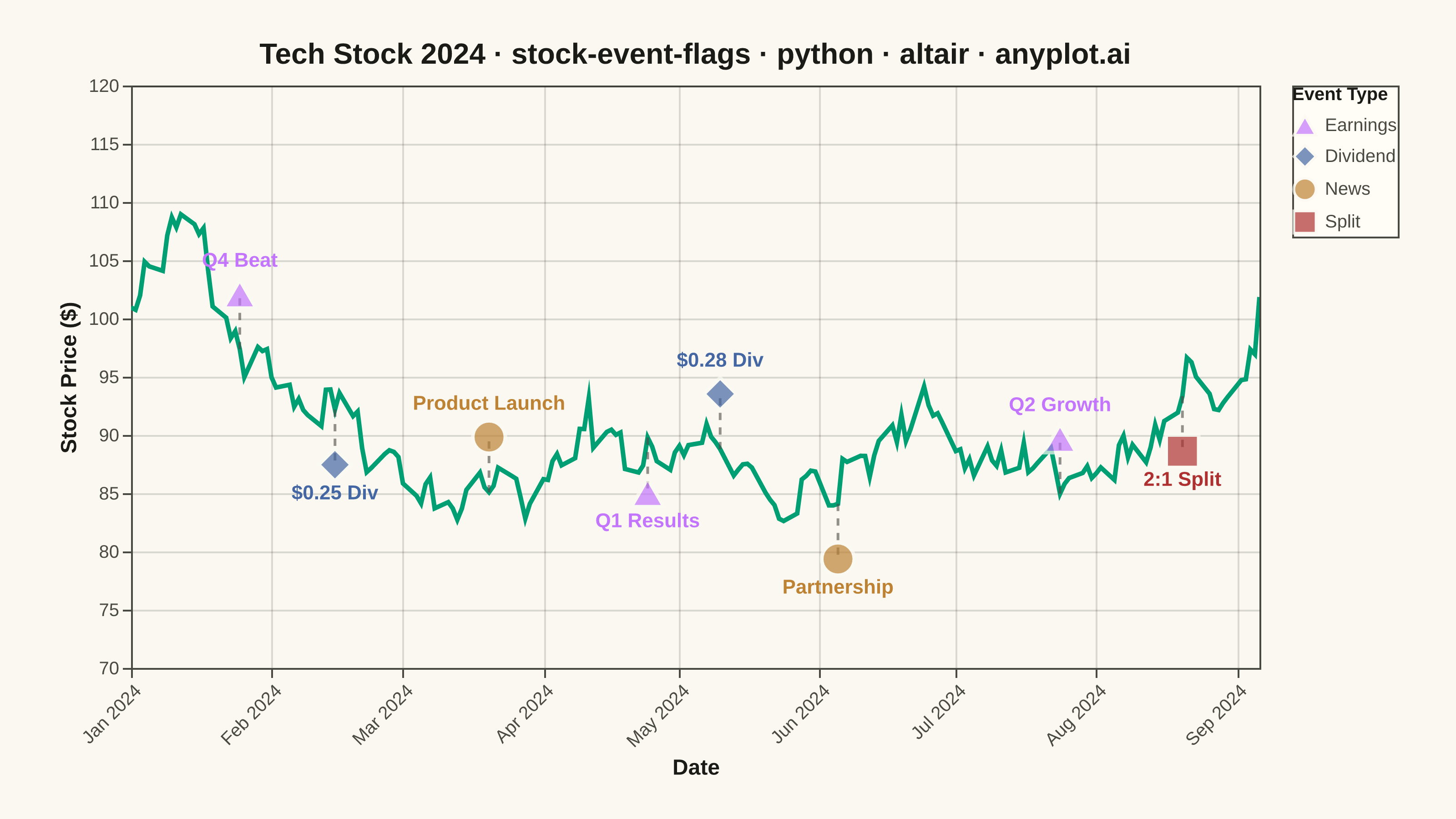
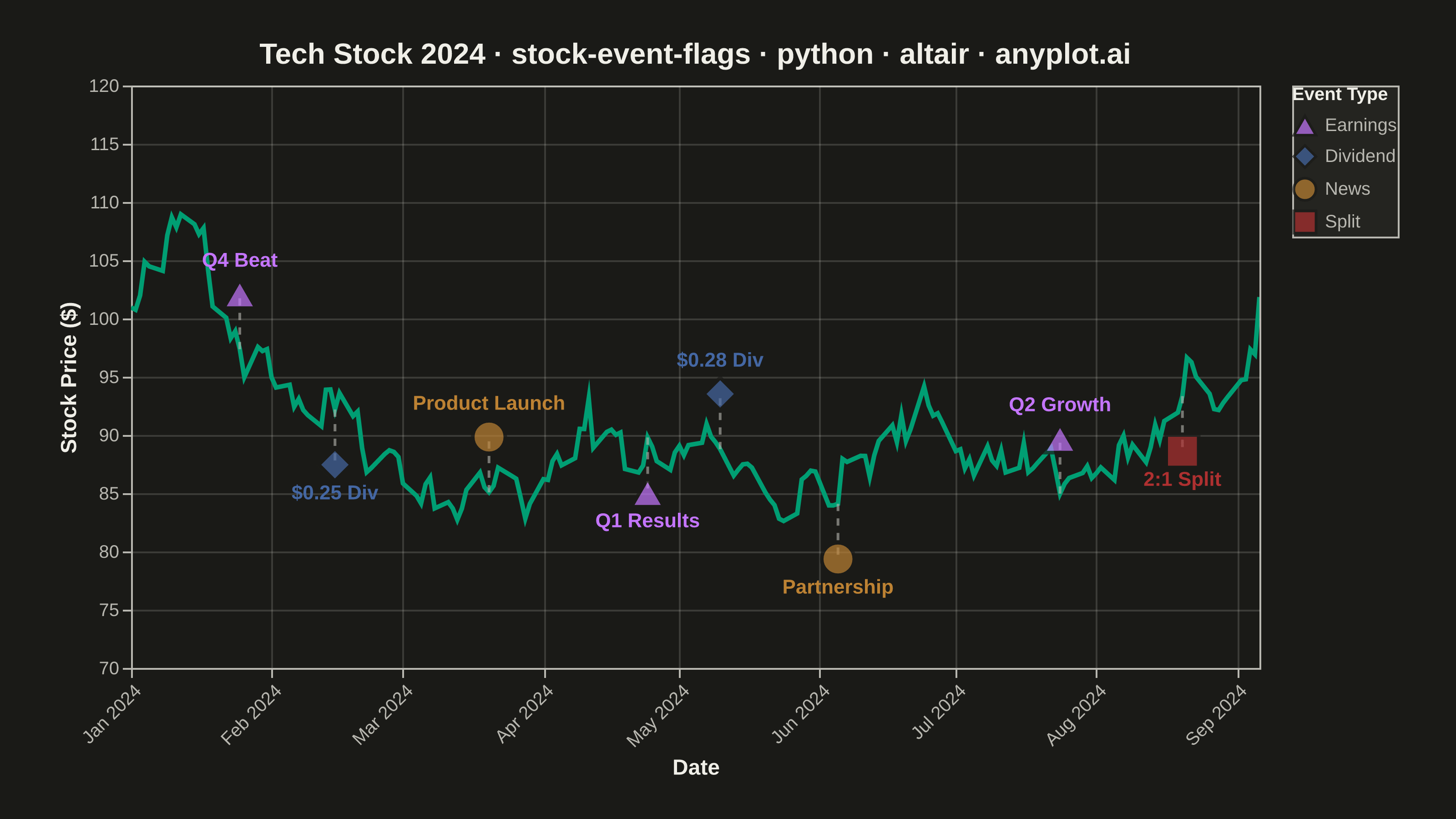
A stock price chart with flag-style markers annotating significant events such as earnings releases, dividends, stock splits, or news events. Unlike simple line annotations, flags are positioned above or below the price data with connector lines and styled icons that distinguish event types. This visualization is standard in financial trading platforms, enabling investors to correlate price movements with corporate actions and market events at a glance.
""" anyplot.ai
stock-event-flags: Stock Chart with Event Flags
Library: altair 6.1.0 | Python 3.13.13
Quality: 90/100 | Updated: 2026-05-27
"""

import os
import sys


# Prevent this file from shadowing the installed altair package
sys.path[:] = [p for p in sys.path if os.path.abspath(p or ".") != os.path.dirname(os.path.abspath(__file__))]

import altair as alt
import numpy as np
import pandas as pd
from PIL import Image


# Theme tokens
THEME = os.getenv("ANYPLOT_THEME", "light")
PAGE_BG = "#FAF8F1" if THEME == "light" else "#1A1A17"
ELEVATED_BG = "#FFFDF6" if THEME == "light" else "#242420"
INK = "#1A1A17" if THEME == "light" else "#F0EFE8"
INK_SOFT = "#4A4A44" if THEME == "light" else "#B8B7B0"
BRAND = "#009E73"  # anyplot position 1 — price line

# Event type colors — Imprint palette positions 2–5
EVENT_COLORS = {"Earnings": "#C475FD", "Dividend": "#4467A3", "News": "#BD8233", "Split": "#AE3030"}
EVENT_SHAPES = {"Earnings": "triangle-up", "Dividend": "diamond", "News": "circle", "Split": "square"}

# Data
np.random.seed(42)
dates = pd.date_range("2024-01-01", periods=180, freq="B")
rets = np.random.normal(0.0005, 0.018, len(dates))
prices = 100 * np.exp(np.cumsum(rets))
df_price = pd.DataFrame({"date": dates, "close": prices})

events = [
    {"event_date": "2024-01-25", "event_type": "Earnings", "event_label": "Q4 Beat"},
    {"event_date": "2024-02-15", "event_type": "Dividend", "event_label": "$0.25 Div"},
    {"event_date": "2024-03-20", "event_type": "News", "event_label": "Product Launch"},
    {"event_date": "2024-04-24", "event_type": "Earnings", "event_label": "Q1 Results"},
    {"event_date": "2024-05-10", "event_type": "Dividend", "event_label": "$0.28 Div"},
    {"event_date": "2024-06-05", "event_type": "News", "event_label": "Partnership"},
    {"event_date": "2024-07-24", "event_type": "Earnings", "event_label": "Q2 Growth"},
    {"event_date": "2024-08-20", "event_type": "Split", "event_label": "2:1 Split"},
]

df_events = pd.DataFrame(events)
df_events["event_date"] = pd.to_datetime(df_events["event_date"])
df_events = df_events.merge(
    df_price.rename(columns={"date": "event_date", "close": "price_at_event"}), on="event_date", how="left"
)

for idx, row in df_events.iterrows():
    if pd.isna(row["price_at_event"]):
        ni = (df_price["date"] - row["event_date"]).abs().idxmin()
        df_events.loc[idx, "price_at_event"] = df_price.loc[ni, "close"]
        df_events.loc[idx, "event_date"] = df_price.loc[ni, "date"]

y_min, y_max = df_price["close"].min(), df_price["close"].max()
flag_offset = (y_max - y_min) * 0.18

df_events["above"] = df_events.index % 2 == 0
df_events["flag_y"] = df_events.apply(
    lambda r: r["price_at_event"] + flag_offset if r["above"] else r["price_at_event"] - flag_offset, axis=1
)

df_above = df_events[df_events["above"]].copy()
df_below = df_events[~df_events["above"]].copy()

# Connector data — None rows create line breaks in Vega-Lite
conn_rows = []
for _, row in df_events.iterrows():
    conn_rows.append({"event_date": row["event_date"], "y": row["price_at_event"]})
    conn_rows.append({"event_date": row["event_date"], "y": row["flag_y"]})
    conn_rows.append({"event_date": row["event_date"], "y": None})
df_conn = pd.DataFrame(conn_rows)

# Shared scales
color_scale = alt.Scale(domain=list(EVENT_COLORS.keys()), range=list(EVENT_COLORS.values()))
shape_scale = alt.Scale(domain=list(EVENT_SHAPES.keys()), range=list(EVENT_SHAPES.values()))
y_domain = [y_min - flag_offset * 1.8, y_max + flag_offset * 1.8]

# Chart layers
price_line = (
    alt.Chart(df_price)
    .mark_line(strokeWidth=2.5, color=BRAND)
    .encode(
        x=alt.X("date:T", title="Date", axis=alt.Axis(format="%b %Y", labelAngle=-45)),
        y=alt.Y("close:Q", title="Stock Price ($)", scale=alt.Scale(domain=y_domain)),
        tooltip=[alt.Tooltip("date:T", title="Date"), alt.Tooltip("close:Q", title="Price", format="$.2f")],
    )
)

connector_lines = (
    alt.Chart(df_conn)
    .mark_line(strokeDash=[4, 4], strokeWidth=1.5, opacity=0.6, color=INK_SOFT)
    .encode(x="event_date:T", y="y:Q", detail="event_date:T")
)

flags = (
    alt.Chart(df_events)
    .mark_point(size=320, filled=True, strokeWidth=2, stroke=PAGE_BG)
    .encode(
        x="event_date:T",
        y="flag_y:Q",
        color=alt.Color("event_type:N", scale=color_scale, legend=alt.Legend(title="Event Type")),
        shape=alt.Shape("event_type:N", scale=shape_scale, legend=None),
        tooltip=[
            alt.Tooltip("event_date:T", title="Date"),
            alt.Tooltip("event_type:N", title="Type"),
            alt.Tooltip("event_label:N", title="Event"),
            alt.Tooltip("price_at_event:Q", title="Price", format="$.2f"),
        ],
    )
)

labels_above = (
    alt.Chart(df_above)
    .mark_text(fontSize=11, fontWeight="bold", dy=-18)
    .encode(
        x="event_date:T",
        y="flag_y:Q",
        text="event_label:N",
        color=alt.Color("event_type:N", scale=color_scale, legend=None),
    )
)

labels_below = (
    alt.Chart(df_below)
    .mark_text(fontSize=11, fontWeight="bold", dy=16)
    .encode(
        x="event_date:T",
        y="flag_y:Q",
        text="event_label:N",
        color=alt.Color("event_type:N", scale=color_scale, legend=None),
    )
)

# Title with length-scaled fontsize
title_str = "Tech Stock 2024 · stock-event-flags · python · altair · anyplot.ai"
n = len(title_str)
ratio = 67 / n if n > 67 else 1.0
title_fs = max(11, round(16 * ratio))

chart = (
    (price_line + connector_lines + flags + labels_above + labels_below)
    .properties(
        width=620, height=320, background=PAGE_BG, title=alt.Title(title_str, fontSize=title_fs, anchor="middle")
    )
    .configure_view(fill=PAGE_BG, stroke=INK_SOFT)
    .configure_axis(
        labelFontSize=10,
        titleFontSize=12,
        domainColor=INK_SOFT,
        tickColor=INK_SOFT,
        gridColor=INK,
        gridOpacity=0.15,
        labelColor=INK_SOFT,
        titleColor=INK,
    )
    .configure_title(color=INK)
    .configure_legend(
        fillColor=ELEVATED_BG,
        strokeColor=INK_SOFT,
        labelFontSize=10,
        titleFontSize=10,
        labelColor=INK_SOFT,
        titleColor=INK,
        symbolSize=150,
    )
    .interactive()
)

# Save PNG with PIL padding to exactly 3200×1800
chart.save(f"plot-{THEME}.png", scale_factor=4.0)

TW, TH = 3200, 1800
_img = Image.open(f"plot-{THEME}.png").convert("RGB")
_w, _h = _img.size
if _w > TW or _h > TH:
    raise SystemExit(
        f"altair vl-convert produced {_w}x{_h}, exceeds target {TW}x{TH}. "
        "Shrink chart .properties(width=, height=) values and re-render."
    )
if _w < TW or _h < TH:
    _canvas = Image.new("RGB", (TW, TH), PAGE_BG)
    _canvas.paste(_img, ((TW - _w) // 2, (TH - _h) // 2))
    _canvas.save(f"plot-{THEME}.png")

chart.save(f"plot-{THEME}.html")
Runnable source as JSON, for any HTTP client: https://api.anyplot.ai/specs/stock-event-flags/altair/code. Any spec id and library id listed in llms-full.txt fit the same URL shape; every URL below is complete and callable.
{
  "spec_id": "stock-event-flags",
  "language": "python",
  "library": "altair",
  "page": "https://anyplot.ai/stock-event-flags/python/altair",
  "hub": "https://anyplot.ai/stock-event-flags",
  "code_json": "https://api.anyplot.ai/specs/stock-event-flags/altair/code",
  "spec_json": "https://api.anyplot.ai/specs/stock-event-flags",
  "render_light_png": "https://storage.googleapis.com/anyplot-images/plots/stock-event-flags/python/altair/plot-light.png",
  "render_dark_png": "https://storage.googleapis.com/anyplot-images/plots/stock-event-flags/python/altair/plot-dark.png",
  "interactive_light_html": "https://storage.googleapis.com/anyplot-images/plots/stock-event-flags/python/altair/plot-light.html",
  "interactive_dark_html": "https://storage.googleapis.com/anyplot-images/plots/stock-event-flags/python/altair/plot-dark.html",
  "quality_score": 90.0,
  "license": "MIT",
  "guide": "https://anyplot.ai/llms.txt"
}
Part of Stock Chart with Event Flags on anyplot.ai.