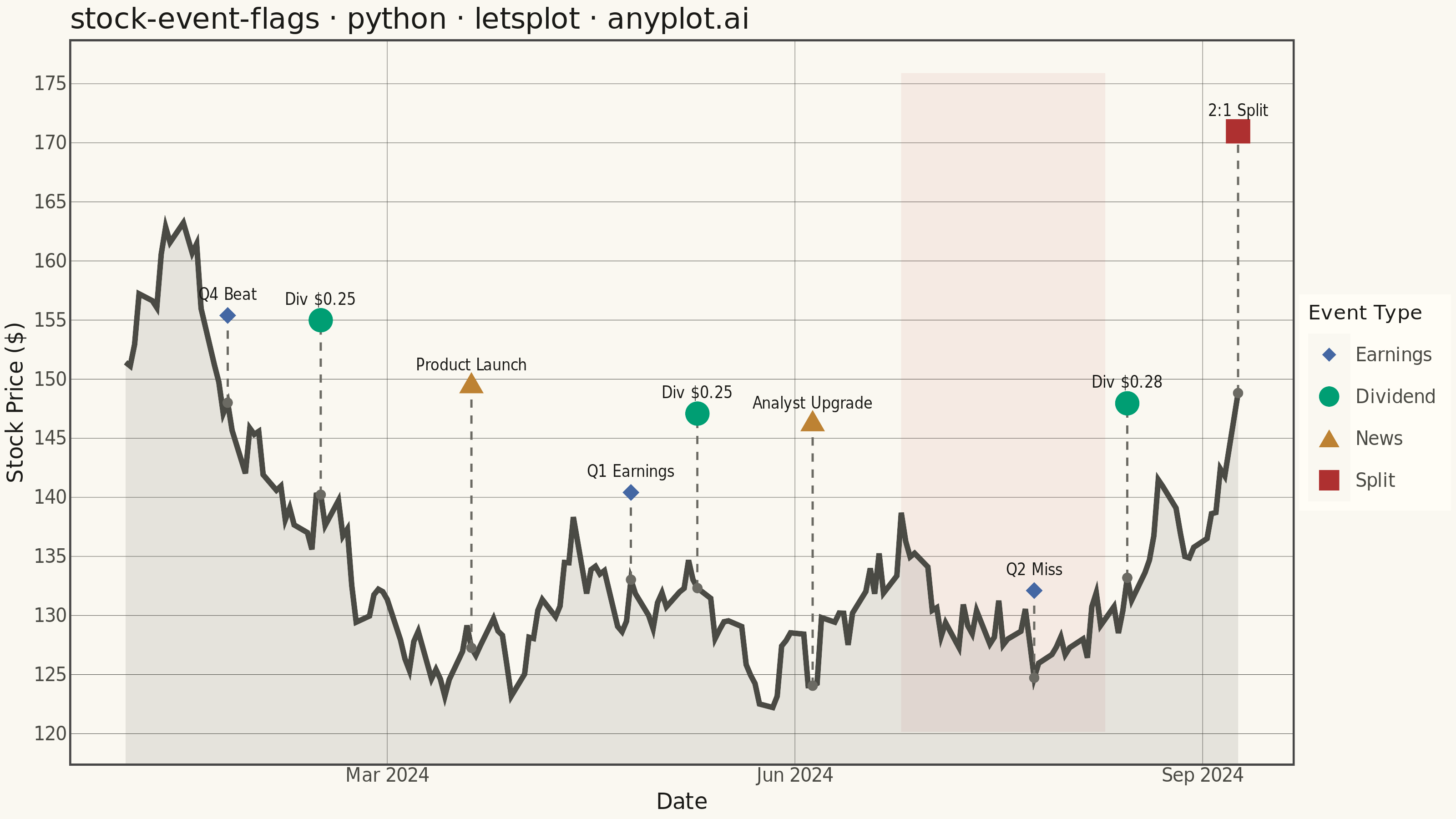
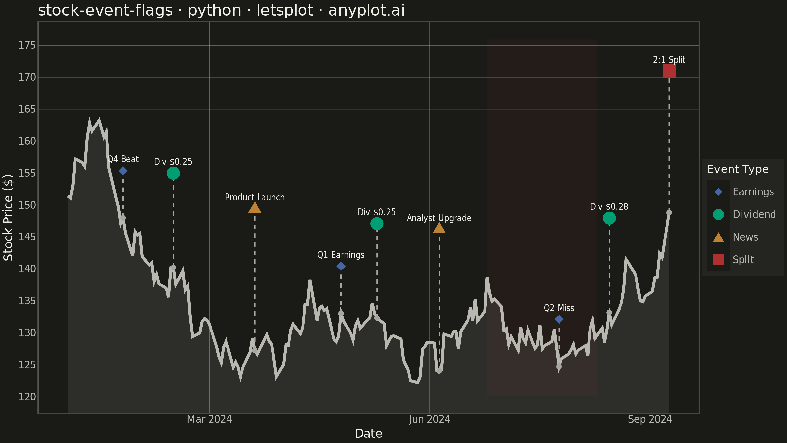
A stock price chart with flag-style markers annotating significant events such as earnings releases, dividends, stock splits, or news events. Unlike simple line annotations, flags are positioned above or below the price data with connector lines and styled icons that distinguish event types. This visualization is standard in financial trading platforms, enabling investors to correlate price movements with corporate actions and market events at a glance.
""" anyplot.ai
stock-event-flags: Stock Chart with Event Flags
Library: letsplot 4.10.1 | Python 3.13.13
Quality: 86/100 | Updated: 2026-05-27
"""

import os

import numpy as np
import pandas as pd
from lets_plot import (
    LetsPlot,
    aes,
    element_blank,
    element_line,
    element_rect,
    element_text,
    geom_area,
    geom_line,
    geom_point,
    geom_rect,
    geom_segment,
    geom_text,
    ggplot,
    ggsave,
    ggsize,
    labs,
    layer_tooltips,
    scale_color_manual,
    scale_shape_manual,
    scale_x_datetime,
    scale_y_continuous,
    theme,
    theme_minimal,
)


LetsPlot.setup_html()

# Theme tokens
THEME = os.getenv("ANYPLOT_THEME", "light")
PAGE_BG = "#FAF8F1" if THEME == "light" else "#1A1A17"
ELEVATED_BG = "#FFFDF6" if THEME == "light" else "#242420"
INK = "#1A1A17" if THEME == "light" else "#F0EFE8"
INK_SOFT = "#4A4A44" if THEME == "light" else "#B8B7B0"
INK_MUTED = "#6B6A63" if THEME == "light" else "#A8A79F"
BRAND = "#009E73"  # Imprint palette position 1

# Data
np.random.seed(42)
n_days = 180
dates = pd.date_range(start="2024-01-02", periods=n_days, freq="B")

returns = np.random.normal(0.0005, 0.018, n_days)
close_prices = 150 * np.cumprod(1 + returns)
df_price = pd.DataFrame({"date": dates, "close": close_prices})

events = [
    {"date": "2024-01-25", "type": "Earnings", "label": "Q4 Beat"},
    {"date": "2024-02-15", "type": "Dividend", "label": "Div $0.25"},
    {"date": "2024-03-20", "type": "News", "label": "Product Launch"},
    {"date": "2024-04-25", "type": "Earnings", "label": "Q1 Earnings"},
    {"date": "2024-05-10", "type": "Dividend", "label": "Div $0.25"},
    {"date": "2024-06-05", "type": "News", "label": "Analyst Upgrade"},
    {"date": "2024-07-25", "type": "Earnings", "label": "Q2 Miss"},
    {"date": "2024-08-15", "type": "Dividend", "label": "Div $0.28"},
    {"date": "2024-09-12", "type": "Split", "label": "2:1 Split"},
]

df_events = pd.DataFrame(events)
df_events["date"] = pd.to_datetime(df_events["date"])

# Match each event to the nearest trading day
event_prices = []
event_dates_matched = []
for event_date in df_events["date"]:
    idx = np.abs(df_price["date"] - event_date).argmin()
    event_prices.append(df_price.iloc[idx]["close"])
    event_dates_matched.append(df_price.iloc[idx]["date"])

df_events["price"] = event_prices
df_events["date_matched"] = event_dates_matched

# Three-tier staggered flag heights — wider spacing reduces Jan/Feb crowding
price_range = close_prices.max() - close_prices.min()
tier_offsets = [price_range * 0.18, price_range * 0.36, price_range * 0.54]
df_events["flag_y"] = [p + tier_offsets[i % 3] for i, p in enumerate(event_prices)]

# Y axis limits: give 10% headroom above highest flag and 5% below price floor
y_min = close_prices.min() - price_range * 0.05
y_max = df_events["flag_y"].max() + price_range * 0.12

# Shaded band for Q2 Miss period — connects the earnings event to the price drop
df_q2_band = pd.DataFrame(
    {"xmin": [pd.Timestamp("2024-06-25")], "xmax": [pd.Timestamp("2024-08-10")], "ymin": [y_min], "ymax": [y_max]}
)

# Plot
title = "stock-event-flags · python · letsplot · anyplot.ai"
n_title = len(title)
title_fontsize = round(16 * 67 / n_title) if n_title > 67 else 16

# Semantic color mapping — Imprint palette with finance semantics
# Dividend→green (income), Earnings→blue (reporting), News→ochre, Split→red (major change)
event_color_map = {"Earnings": "#4467A3", "Dividend": BRAND, "News": "#BD8233", "Split": "#AE3030"}
# Distinct shapes per event type: diamond, circle, triangle, square
event_shape_map = {"Earnings": 18, "Dividend": 16, "News": 17, "Split": 15}

anyplot_theme = theme(
    plot_background=element_rect(fill=PAGE_BG, color=PAGE_BG),
    panel_background=element_rect(fill=PAGE_BG),
    panel_grid_major=element_line(color=INK_SOFT, size=0.2),
    panel_grid_minor=element_blank(),
    axis_title=element_text(color=INK, size=12),
    axis_text=element_text(color=INK_SOFT, size=10),
    axis_line=element_line(color=INK_SOFT),
    plot_title=element_text(color=INK, size=title_fontsize),
    legend_background=element_rect(fill=ELEVATED_BG, color=INK_SOFT),
    legend_text=element_text(color=INK_SOFT, size=10),
    legend_title=element_text(color=INK, size=11),
    legend_position="right",
)

plot = (
    ggplot()
    + geom_rect(
        aes(xmin="xmin", xmax="xmax", ymin="ymin", ymax="ymax"),
        data=df_q2_band,
        fill="#AE3030",
        alpha=0.07,
        color="#AE3030",
        size=0,
    )
    + geom_area(aes(x="date", y="close"), data=df_price, fill=INK_SOFT, alpha=0.12)
    + geom_line(
        aes(x="date", y="close"),
        data=df_price,
        color=INK_SOFT,
        size=1.3,
        tooltips=layer_tooltips().line("@date").line("Price: $@close"),
    )
    + geom_segment(
        aes(x="date_matched", y="price", xend="date_matched", yend="flag_y"),
        data=df_events,
        color=INK_MUTED,
        size=0.5,
        linetype="dashed",
    )
    + geom_point(
        aes(x="date_matched", y="flag_y", color="type", shape="type"),
        data=df_events,
        size=6,
        tooltips=layer_tooltips().title("@type").line("@label").line("Date: @date_matched").line("Price: $@{price}"),
    )
    + geom_text(aes(x="date_matched", y="flag_y", label="label"), data=df_events, vjust=-1.5, size=4, color=INK)
    + geom_point(aes(x="date_matched", y="price"), data=df_events, color=INK_MUTED, size=2.5)
    + scale_color_manual(values=event_color_map, name="Event Type")
    + scale_shape_manual(values=event_shape_map, name="Event Type")
    + scale_x_datetime(format="%b %Y")
    + scale_y_continuous(limits=[y_min, y_max])
    + labs(x="Date", y="Stock Price ($)", title=title)
    + theme_minimal()
    + anyplot_theme
    + ggsize(800, 450)
)

ggsave(plot, f"plot-{THEME}.png", path=".", scale=4)
ggsave(plot, f"plot-{THEME}.html", path=".")
Runnable source as JSON, for any HTTP client: https://api.anyplot.ai/specs/stock-event-flags/letsplot/code. Any spec id and library id listed in llms-full.txt fit the same URL shape; every URL below is complete and callable.
{
  "spec_id": "stock-event-flags",
  "language": "python",
  "library": "letsplot",
  "page": "https://anyplot.ai/stock-event-flags/python/letsplot",
  "hub": "https://anyplot.ai/stock-event-flags",
  "code_json": "https://api.anyplot.ai/specs/stock-event-flags/letsplot/code",
  "spec_json": "https://api.anyplot.ai/specs/stock-event-flags",
  "render_light_png": "https://storage.googleapis.com/anyplot-images/plots/stock-event-flags/python/letsplot/plot-light.png",
  "render_dark_png": "https://storage.googleapis.com/anyplot-images/plots/stock-event-flags/python/letsplot/plot-dark.png",
  "interactive_light_html": "https://storage.googleapis.com/anyplot-images/plots/stock-event-flags/python/letsplot/plot-light.html",
  "interactive_dark_html": "https://storage.googleapis.com/anyplot-images/plots/stock-event-flags/python/letsplot/plot-dark.html",
  "quality_score": 86.0,
  "license": "MIT",
  "guide": "https://anyplot.ai/llms.txt"
}
Part of Stock Chart with Event Flags on anyplot.ai.