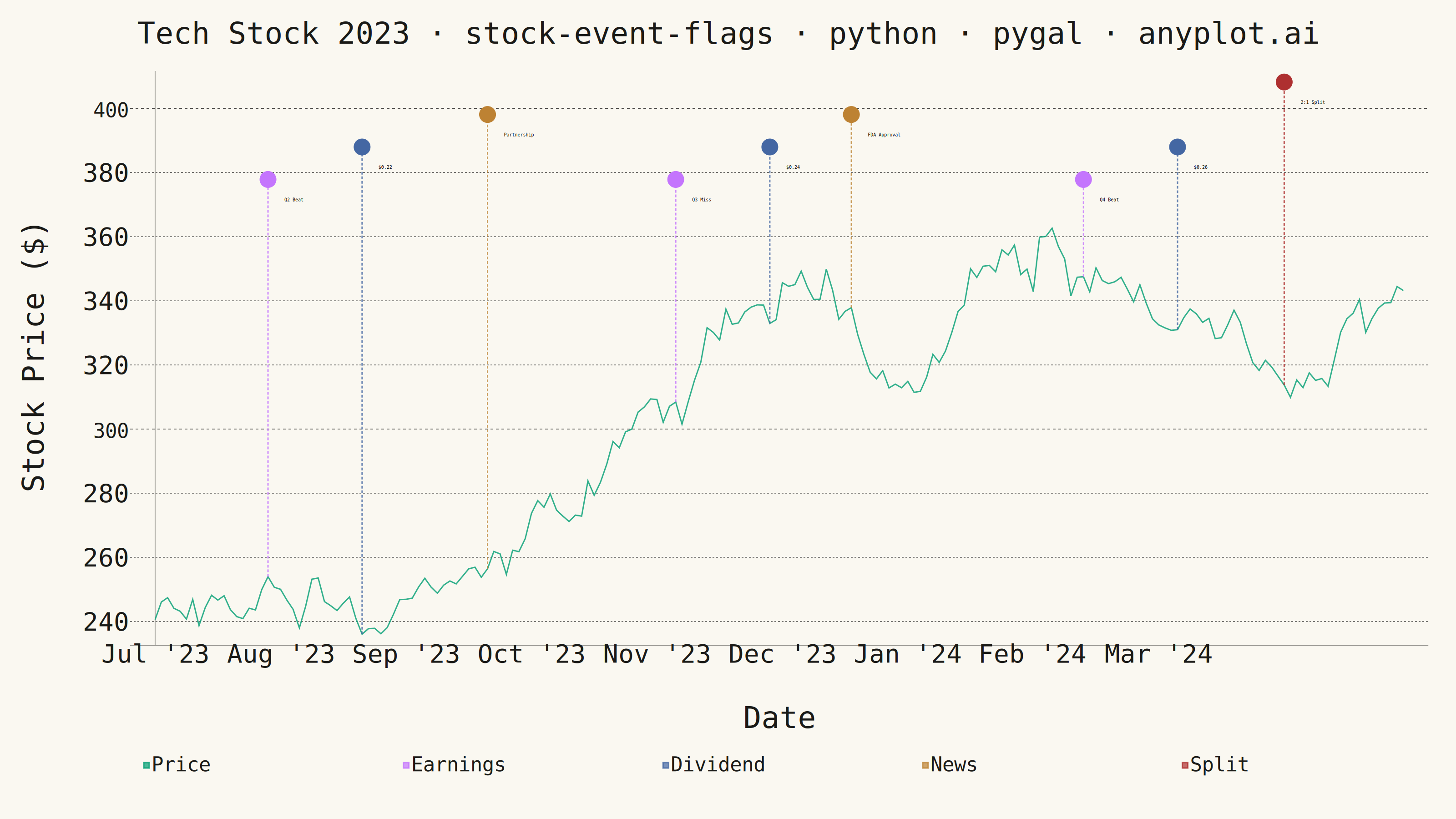
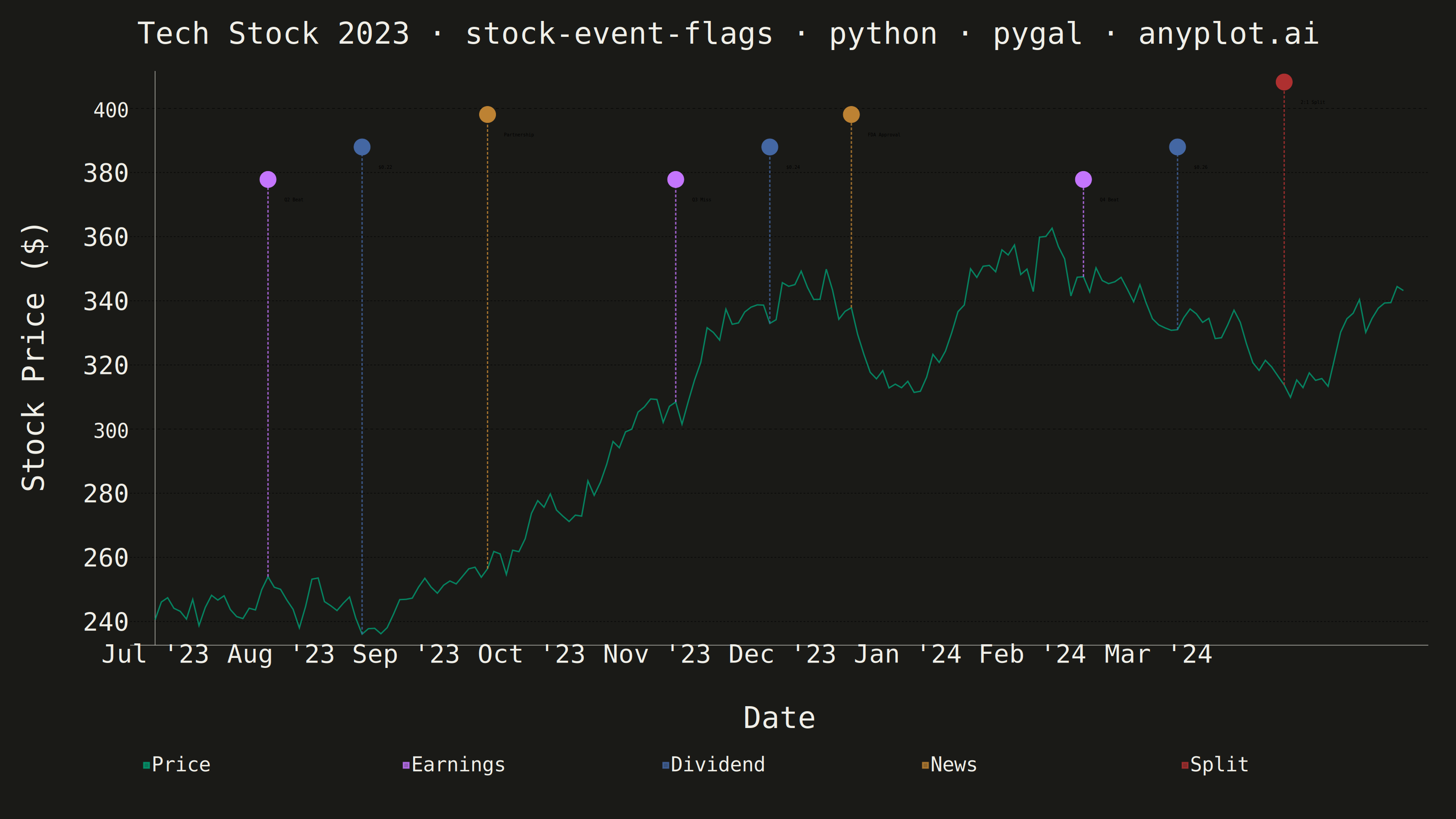
A stock price chart with flag-style markers annotating significant events such as earnings releases, dividends, stock splits, or news events. Unlike simple line annotations, flags are positioned above or below the price data with connector lines and styled icons that distinguish event types. This visualization is standard in financial trading platforms, enabling investors to correlate price movements with corporate actions and market events at a glance.
""" anyplot.ai
stock-event-flags: Stock Chart with Event Flags
Library: pygal 3.1.0 | Python 3.13.13
Quality: 83/100 | Updated: 2026-05-27
"""

import os

import numpy as np
import pandas as pd
import pygal
from pygal.style import Style


# Theme tokens
THEME = os.getenv("ANYPLOT_THEME", "light")
PAGE_BG = "#FAF8F1" if THEME == "light" else "#1A1A17"
INK = "#1A1A17" if THEME == "light" else "#F0EFE8"
INK_MUTED = "#6B6A63" if THEME == "light" else "#A8A79F"

# Data — seed 999, Jul 2023 start differentiates from sibling implementations
np.random.seed(999)
start_date = pd.Timestamp("2023-07-03")
trading_days = pd.bdate_range(start=start_date, periods=200)
initial_price = 240.0
returns = np.random.normal(0.0004, 0.016, len(trading_days))
prices = initial_price * np.cumprod(1 + returns)
df = pd.DataFrame({"date": trading_days, "close": prices})

# Events — corporate actions for a tech company over the period
events = [
    {"date": pd.Timestamp("2023-07-27"), "type": "earnings", "label": "Q2 Beat"},
    {"date": pd.Timestamp("2023-08-17"), "type": "dividend", "label": "$0.22"},
    {"date": pd.Timestamp("2023-09-14"), "type": "news", "label": "Partnership"},
    {"date": pd.Timestamp("2023-10-26"), "type": "earnings", "label": "Q3 Miss"},
    {"date": pd.Timestamp("2023-11-16"), "type": "dividend", "label": "$0.24"},
    {"date": pd.Timestamp("2023-12-05"), "type": "news", "label": "FDA Approval"},
    {"date": pd.Timestamp("2024-01-25"), "type": "earnings", "label": "Q4 Beat"},
    {"date": pd.Timestamp("2024-02-15"), "type": "dividend", "label": "$0.26"},
    {"date": pd.Timestamp("2024-03-11"), "type": "split", "label": "2:1 Split"},
]

# Event colors from Imprint palette (positions 2-5; position 1 reserved for price line)
event_type_colors = {
    "earnings": "#C475FD",  # lavender
    "dividend": "#4467A3",  # blue — steady income
    "news": "#BD8233",  # ochre — announcements
    "split": "#AE3030",  # red — significant corporate action
}

# Connector line width varies by event significance to create visual hierarchy
event_stroke_width = {
    "earnings": 3,  # notable — quarterly results move prices
    "split": 4,  # major corporate action, thickest connector
    "news": 2,
    "dividend": 2,
}

# Build full color sequence for pygal's cycling: price line + connectors + flag groups
connector_colors = [event_type_colors[e["type"]] for e in events]
flag_colors = [event_type_colors[t] for t in ["earnings", "dividend", "news", "split"]]
all_colors = tuple(["#009E73"] + connector_colors + flag_colors)

custom_style = Style(
    background=PAGE_BG,
    plot_background=PAGE_BG,
    foreground=INK,
    foreground_strong=INK,
    foreground_subtle=INK_MUTED,
    colors=all_colors,
    title_font_size=66,
    label_font_size=56,
    major_label_font_size=44,
    legend_font_size=44,
    value_font_size=36,
    stroke_width=3,
)

chart = pygal.XY(
    width=3200,
    height=1800,
    style=custom_style,
    title="Tech Stock 2023 · stock-event-flags · python · pygal · anyplot.ai",
    x_title="Date",
    y_title="Stock Price ($)",
    show_x_guides=False,
    show_y_guides=True,
    stroke=True,
    fill=False,
    show_legend=True,
    legend_at_bottom=True,
    legend_at_bottom_columns=5,
    dots_size=3,
    truncate_label=-1,
    truncate_legend=-1,
    margin=60,
    spacing=30,
    print_labels=True,
)

# Main stock price line (first series → #009E73 brand green)
price_points = [(i, df.iloc[i]["close"]) for i in range(len(df))]
chart.add("Price", price_points, dots_size=0, stroke_style={"width": 4})

# Date labels at monthly boundaries — replaces numeric trading day index with dates
# 9 months Jul '23 → Mar '24 over 200 trading days ≈ evenly distributed
chart.x_labels = ["Jul '23", "Aug '23", "Sep '23", "Oct '23", "Nov '23", "Dec '23", "Jan '24", "Feb '24", "Mar '24"]

# Flag positioning above the price range
min_price = df["close"].min()
max_price = df["close"].max()
price_range = max_price - min_price

event_heights = {"earnings": 0.12, "dividend": 0.20, "news": 0.28, "split": 0.36}

# Connector lines — dashed verticals from price level to flag position
# Width varies by event type to emphasize earnings and split events
for event in events:
    idx = df["date"].searchsorted(event["date"])
    if idx < len(df):
        flag_y = max_price + price_range * event_heights[event["type"]]
        price_at_event = df.iloc[idx]["close"]
        stroke_w = event_stroke_width[event["type"]]
        chart.add(
            None,
            [(idx, price_at_event), (idx, flag_y)],
            stroke=True,
            stroke_style={"width": stroke_w, "dasharray": "6,4"},
            show_dots=False,
        )

# Flag markers grouped by event type (drives legend)
# print_labels=True on chart makes event labels visible in the PNG render
for event_type in ["earnings", "dividend", "news", "split"]:
    type_events = [e for e in events if e["type"] == event_type]
    flag_y = max_price + price_range * event_heights[event_type]
    flag_points = [
        {"value": (df["date"].searchsorted(e["date"]), flag_y), "label": e["label"]}
        for e in type_events
        if df["date"].searchsorted(e["date"]) < len(df)
    ]
    chart.add(event_type.capitalize(), flag_points, stroke=False, show_dots=True, dots_size=18)

# Save
chart.render_to_png(f"plot-{THEME}.png")
with open(f"plot-{THEME}.html", "wb") as f:
    f.write(chart.render())
Runnable source as JSON, for any HTTP client: https://api.anyplot.ai/specs/stock-event-flags/pygal/code. Any spec id and library id listed in llms-full.txt fit the same URL shape; every URL below is complete and callable.
{
  "spec_id": "stock-event-flags",
  "language": "python",
  "library": "pygal",
  "page": "https://anyplot.ai/stock-event-flags/python/pygal",
  "hub": "https://anyplot.ai/stock-event-flags",
  "code_json": "https://api.anyplot.ai/specs/stock-event-flags/pygal/code",
  "spec_json": "https://api.anyplot.ai/specs/stock-event-flags",
  "render_light_png": "https://storage.googleapis.com/anyplot-images/plots/stock-event-flags/python/pygal/plot-light.png",
  "render_dark_png": "https://storage.googleapis.com/anyplot-images/plots/stock-event-flags/python/pygal/plot-dark.png",
  "interactive_light_html": "https://storage.googleapis.com/anyplot-images/plots/stock-event-flags/python/pygal/plot-light.html",
  "interactive_dark_html": "https://storage.googleapis.com/anyplot-images/plots/stock-event-flags/python/pygal/plot-dark.html",
  "quality_score": 83.0,
  "license": "MIT",
  "guide": "https://anyplot.ai/llms.txt"
}
Part of Stock Chart with Event Flags on anyplot.ai.