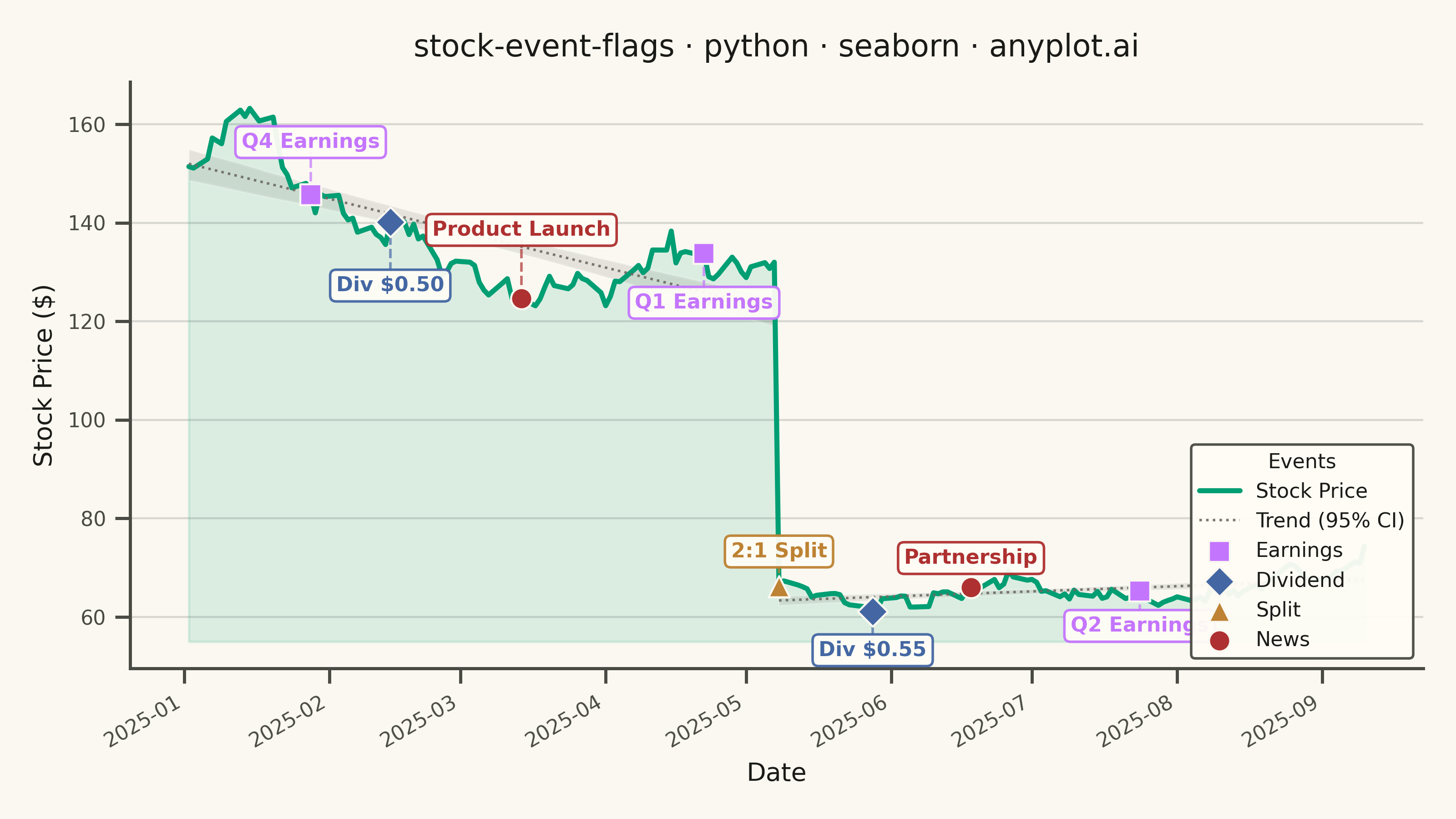
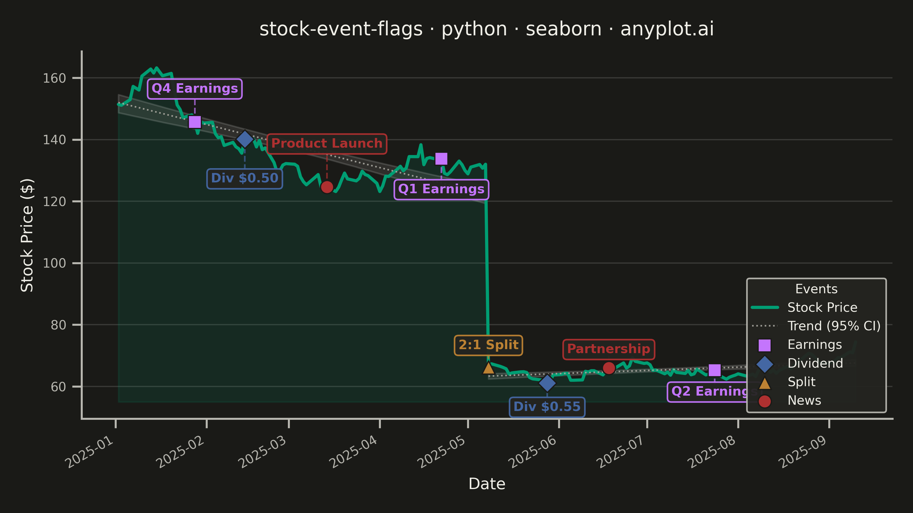
A stock price chart with flag-style markers annotating significant events such as earnings releases, dividends, stock splits, or news events. Unlike simple line annotations, flags are positioned above or below the price data with connector lines and styled icons that distinguish event types. This visualization is standard in financial trading platforms, enabling investors to correlate price movements with corporate actions and market events at a glance.
""" anyplot.ai
stock-event-flags: Stock Chart with Event Flags
Library: seaborn 0.13.2 | Python 3.13.13
Quality: 89/100 | Updated: 2026-05-27
"""

# When run directly (python seaborn.py), this directory is prepended to
# sys.path, which causes local files like matplotlib.py to shadow the
# installed matplotlib package.  Remove it so the venv package is found.
import pathlib as _pathlib
import sys as _sys


try:
    _here = str(_pathlib.Path(__file__).resolve().parent)
    _sys.path = [p for p in _sys.path if p not in ("", _here)]
except NameError:
    pass  # exec() context — sys.path is already clean
del _sys, _pathlib

import os

import matplotlib.dates as mdates
import matplotlib.pyplot as plt
import numpy as np
import pandas as pd
import seaborn as sns
from matplotlib.lines import Line2D


# Theme tokens
THEME = os.getenv("ANYPLOT_THEME", "light")
PAGE_BG = "#FAF8F1" if THEME == "light" else "#1A1A17"
ELEVATED_BG = "#FFFDF6" if THEME == "light" else "#242420"
INK = "#1A1A17" if THEME == "light" else "#F0EFE8"
INK_SOFT = "#4A4A44" if THEME == "light" else "#B8B7B0"
INK_MUTED = "#6B6A63" if THEME == "light" else "#A8A79F"

IMPRINT_PALETTE = ["#009E73", "#C475FD", "#4467A3", "#BD8233", "#AE3030", "#2ABCCD", "#954477", "#99B314"]
BRAND = IMPRINT_PALETTE[0]

sns.set_theme(
    style="ticks",
    rc={
        "figure.facecolor": PAGE_BG,
        "axes.facecolor": PAGE_BG,
        "axes.edgecolor": INK_SOFT,
        "axes.labelcolor": INK,
        "text.color": INK,
        "xtick.color": INK_SOFT,
        "ytick.color": INK_SOFT,
        "grid.color": INK,
        "grid.alpha": 0.15,
        "legend.facecolor": ELEVATED_BG,
        "legend.edgecolor": INK_SOFT,
    },
)

# Data — 180 trading days; 2:1 split applied at May 2025 to show real price adjustment
np.random.seed(42)
n_days = 180
dates = pd.date_range("2025-01-02", periods=n_days, freq="B")
returns = np.random.normal(0.0005, 0.018, n_days)
price = 150 * np.cumprod(1 + returns)

split_date = pd.Timestamp("2025-05-08")
split_idx = dates.searchsorted(split_date)
price[split_idx:] = price[split_idx:] * 0.5

df = pd.DataFrame({"date": dates, "close": price})
# Numeric x using matplotlib date floats — matches the internal scale of the date axis,
# so sns.regplot overlays correctly without a secondary axis
df["x_mpl"] = mdates.date2num(df["date"].values)

# Event type styling — Imprint palette positions 2–5
event_colors = {
    "earnings": IMPRINT_PALETTE[1],
    "dividend": IMPRINT_PALETTE[2],
    "split": IMPRINT_PALETTE[3],
    "news": IMPRINT_PALETTE[4],
}
event_markers = {"earnings": "s", "dividend": "D", "split": "^", "news": "o"}

events = pd.DataFrame(
    {
        "event_date": pd.to_datetime(
            [
                "2025-01-28",
                "2025-02-14",
                "2025-03-15",
                "2025-04-22",
                "2025-05-08",
                "2025-05-28",
                "2025-06-18",
                "2025-07-24",
            ]
        ),
        "event_type": ["earnings", "dividend", "news", "earnings", "split", "dividend", "news", "earnings"],
        "event_label": [
            "Q4 Earnings",
            "Div $0.50",
            "Product Launch",
            "Q1 Earnings",
            "2:1 Split",
            "Div $0.55",
            "Partnership",
            "Q2 Earnings",
        ],
    }
)

# Plot
fig, ax = plt.subplots(figsize=(8, 4.5), dpi=400, facecolor=PAGE_BG)
ax.set_facecolor(PAGE_BG)

# Stock price line (seaborn lineplot)
sns.lineplot(data=df, x="date", y="close", ax=ax, color=BRAND, linewidth=2.0, label="Stock Price")
y_base = df["close"].min() * 0.9
ax.fill_between(df["date"], y_base, df["close"], alpha=0.12, color=BRAND)

# Seaborn-distinctive: per-segment linear regression trend with 95% CI.
# Two separate regplots (pre- and post-split) avoid a spurious downward slope
# from the discontinuity; the CI bands give statistical context for each period.
for mask in [df["date"] < split_date, df["date"] >= split_date]:
    df_seg = df[mask]
    if len(df_seg) > 2:
        sns.regplot(
            data=df_seg,
            x="x_mpl",
            y="close",
            ax=ax,
            scatter=False,
            color=INK_MUTED,
            ci=95,
            line_kws={"linewidth": 1.0, "linestyle": ":", "alpha": 0.9},
        )

# Flags — percentage-based offset keeps proportions consistent across the split
for idx, (_, event) in enumerate(events.iterrows()):
    event_date = event["event_date"]
    event_type = event["event_type"]
    event_label = event["event_label"]

    closest_idx = int(np.abs(df["date"] - event_date).values.argmin())
    actual_date = df["date"].iloc[closest_idx]
    price_at_event = df["close"].iloc[closest_idx]

    flag_pct = price_at_event * 0.06 * (1 + (idx % 3) * 0.3)
    if idx % 2 == 0:
        flag_y = price_at_event + flag_pct
        va = "bottom"
    else:
        flag_y = price_at_event - flag_pct
        va = "top"

    color = event_colors[event_type]
    marker = event_markers[event_type]

    ax.plot([actual_date, actual_date], [price_at_event, flag_y], color=color, linestyle="--", linewidth=1.0, alpha=0.7)
    ax.scatter(
        [actual_date], [price_at_event], color=color, s=70, marker=marker, zorder=5, edgecolors=PAGE_BG, linewidths=0.8
    )
    ax.annotate(
        event_label,
        xy=(actual_date, flag_y),
        fontsize=8,
        fontweight="bold",
        color=color,
        ha="center",
        va=va,
        bbox={
            "boxstyle": "round,pad=0.3",
            "facecolor": ELEVATED_BG,
            "edgecolor": color,
            "linewidth": 1.0,
            "alpha": 0.95,
        },
    )

# Legend — lower right avoids the early-session price area and first-event flags
legend_elements = [
    Line2D([0], [0], color=BRAND, linewidth=2.0, label="Stock Price"),
    Line2D([0], [0], color=INK_MUTED, linewidth=1.0, linestyle=":", alpha=0.9, label="Trend (95% CI)"),
]
for etype, color in event_colors.items():
    legend_elements.append(
        plt.scatter(
            [],
            [],
            color=color,
            marker=event_markers[etype],
            s=70,
            label=etype.capitalize(),
            edgecolors=PAGE_BG,
            linewidths=0.8,
        )
    )

ax.legend(
    handles=legend_elements,
    loc="lower right",
    fontsize=8,
    title="Events",
    title_fontsize=8,
    facecolor=ELEVATED_BG,
    edgecolor=INK_SOFT,
    framealpha=0.95,
)

# Style
title = "stock-event-flags · python · seaborn · anyplot.ai"
ax.set_title(title, fontsize=12, fontweight="medium", color=INK, pad=10)
ax.set_xlabel("Date", fontsize=10, color=INK)
ax.set_ylabel("Stock Price ($)", fontsize=10, color=INK)
ax.tick_params(axis="both", labelsize=8, colors=INK_SOFT)
ax.spines["top"].set_visible(False)
ax.spines["right"].set_visible(False)
ax.spines["left"].set_color(INK_SOFT)
ax.spines["bottom"].set_color(INK_SOFT)
ax.yaxis.grid(True, alpha=0.15, linewidth=0.8, color=INK)

fig.autofmt_xdate(rotation=30)
plt.tight_layout()
plt.savefig(f"plot-{THEME}.png", dpi=400, facecolor=PAGE_BG)
Runnable source as JSON, for any HTTP client: https://api.anyplot.ai/specs/stock-event-flags/seaborn/code. Any spec id and library id listed in llms-full.txt fit the same URL shape; every URL below is complete and callable.
{
  "spec_id": "stock-event-flags",
  "language": "python",
  "library": "seaborn",
  "page": "https://anyplot.ai/stock-event-flags/python/seaborn",
  "hub": "https://anyplot.ai/stock-event-flags",
  "code_json": "https://api.anyplot.ai/specs/stock-event-flags/seaborn/code",
  "spec_json": "https://api.anyplot.ai/specs/stock-event-flags",
  "render_light_png": "https://storage.googleapis.com/anyplot-images/plots/stock-event-flags/python/seaborn/plot-light.png",
  "render_dark_png": "https://storage.googleapis.com/anyplot-images/plots/stock-event-flags/python/seaborn/plot-dark.png",
  "quality_score": 89.0,
  "license": "MIT",
  "guide": "https://anyplot.ai/llms.txt"
}
Part of Stock Chart with Event Flags on anyplot.ai.