The same plot in 14 other libraries — Python: Altair, Bokeh, lets-plot, Matplotlib, Plotly, plotnine, Pygal, Seaborn; Julia: Makie.jl; JavaScript: Chart.js, D3.js, Apache ECharts, Highcharts, MUI X Charts. Compare all 15 side by side: Stock Chart with Event Flags in Python, R, Julia and JavaScript.
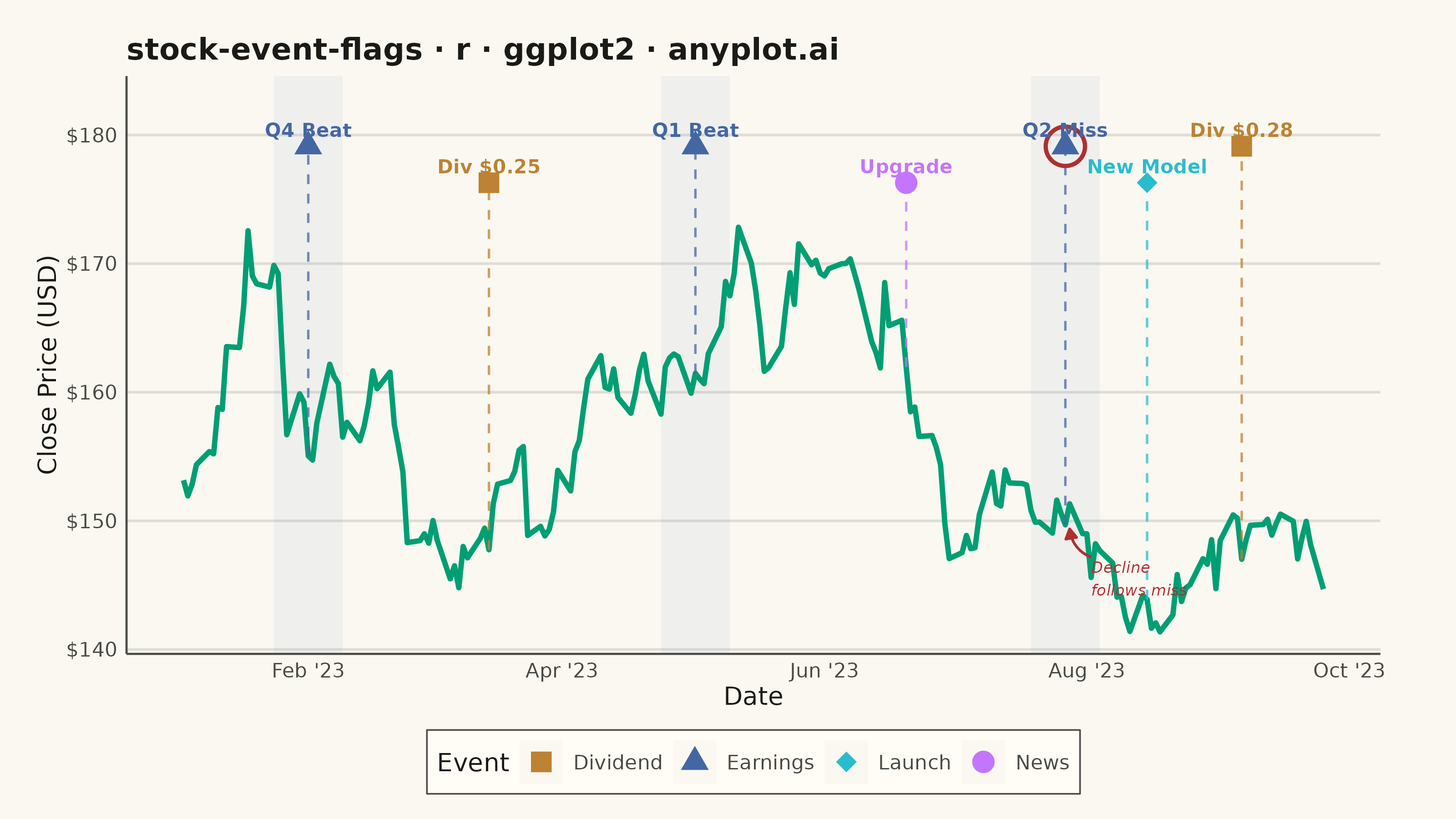
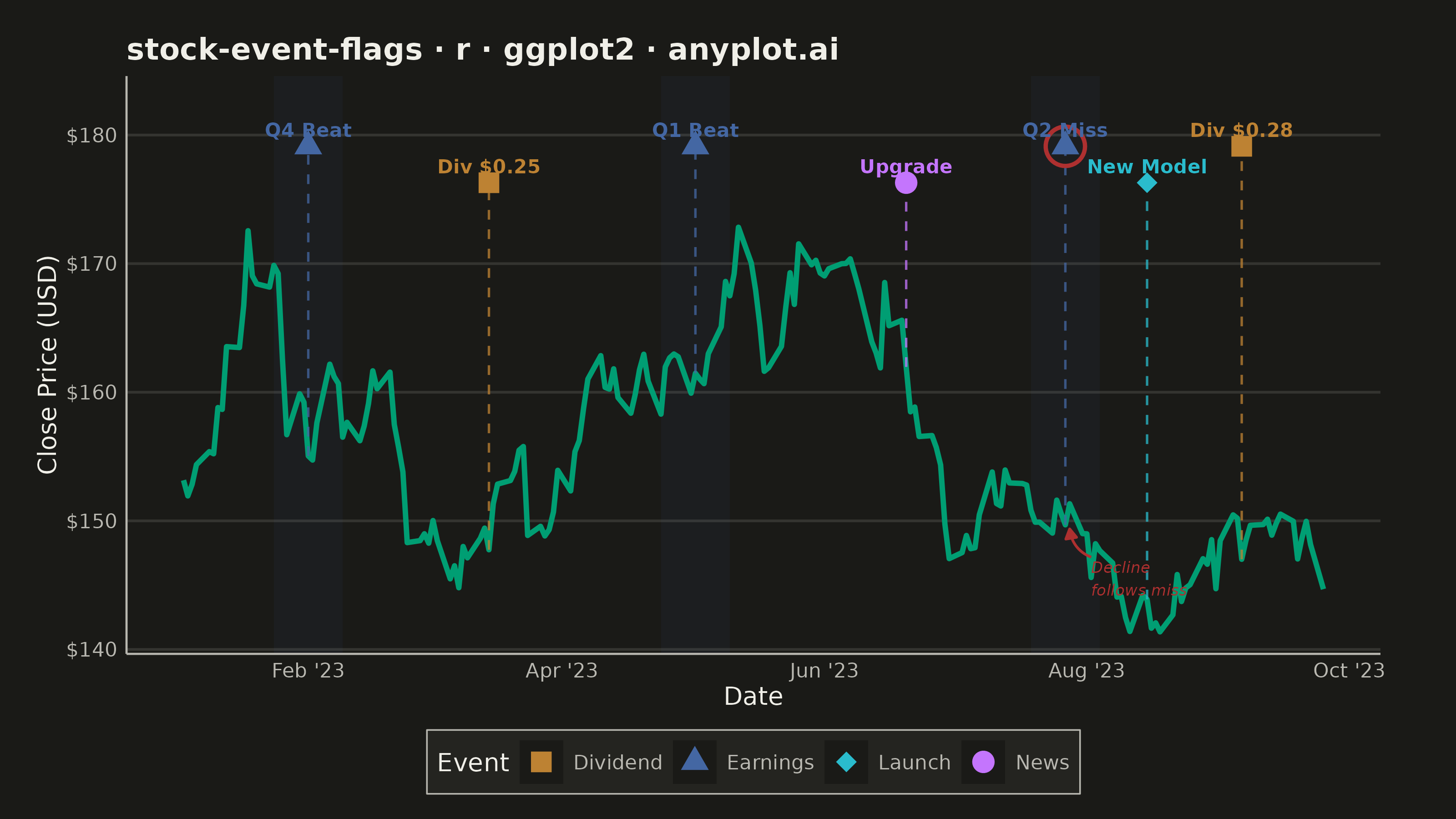
A stock price chart with flag-style markers annotating significant events such as earnings releases, dividends, stock splits, or news events. Unlike simple line annotations, flags are positioned above or below the price data with connector lines and styled icons that distinguish event types. This visualization is standard in financial trading platforms, enabling investors to correlate price movements with corporate actions and market events at a glance.
#' anyplot.ai
#' stock-event-flags: Stock Chart with Event Flags
#' Library: ggplot2 3.5.1 | R 4.4.1
#' Quality: 93/100 | Created: 2026-05-27

library(ggplot2)
library(dplyr)
library(scales)
library(ragg)

set.seed(42)

# Theme tokens
THEME       <- Sys.getenv("ANYPLOT_THEME", "light")
PAGE_BG     <- if (THEME == "light") "#FAF8F1" else "#1A1A17"
ELEVATED_BG <- if (THEME == "light") "#FFFDF6" else "#242420"
INK         <- if (THEME == "light") "#1A1A17" else "#F0EFE8"
INK_SOFT    <- if (THEME == "light") "#4A4A44" else "#B8B7B0"
GRID_COLOR  <- adjustcolor(INK, alpha.f = 0.12)

IMPRINT_PALETTE <- c("#009E73", "#C475FD", "#4467A3", "#BD8233",
                     "#AE3030", "#2ABCCD", "#954477", "#99B314")

EVENT_COLORS <- c(
  "Earnings" = IMPRINT_PALETTE[3],  # blue — financial results
  "Dividend" = IMPRINT_PALETTE[4],  # ochre — income
  "News"     = IMPRINT_PALETTE[2],  # lavender — analyst / market news
  "Launch"   = IMPRINT_PALETTE[6]   # cyan — product / tech
)

# Generate 190 trading days (weekdays only, Jan–Sep 2023)
all_days     <- seq(as.Date("2023-01-03"), as.Date("2023-12-29"), by = "day")
trading_days <- all_days[!weekdays(all_days) %in% c("Saturday", "Sunday")]
trading_days <- trading_days[seq_len(190)]

# Geometric random walk starting at $150 (fictional tech company)
returns      <- rnorm(190, mean = 0.0005, sd = 0.015)
close_prices <- 150 * cumprod(1 + returns)

price_df <- data.frame(
  date  = trading_days,
  close = close_prices
)

# Seven corporate events across the period
event_df <- data.frame(
  date       = as.Date(c(
    "2023-02-01", "2023-03-15", "2023-05-02",
    "2023-06-20", "2023-07-27", "2023-08-15",
    "2023-09-06"
  )),
  event_type = c(
    "Earnings", "Dividend", "Earnings",
    "News",     "Earnings", "Launch",
    "Dividend"
  ),
  label = c(
    "Q4 Beat", "Div $0.25", "Q1 Beat",
    "Upgrade", "Q2 Miss",   "New Model",
    "Div $0.28"
  ),
  stringsAsFactors = FALSE
)

# Attach closing price at each event date
event_df <- event_df |>
  left_join(price_df, by = "date")

# Stagger flag heights in two rows to prevent overlap
price_max   <- max(price_df$close)
price_range <- price_max - min(price_df$close)

event_df <- event_df |>
  mutate(
    row_alt = row_number() %% 2,
    flag_y  = price_max + price_range * (0.11 + row_alt * 0.09),
    is_miss = label == "Q2 Miss"
  )

y_ceiling <- price_max + price_range * 0.36

# Extract Q2 Miss row for targeted emphasis
miss_row   <- event_df[event_df$is_miss, ]
miss_date  <- miss_row$date
miss_close <- miss_row$close

# Earnings-season shading bands (±8 calendar days around each earnings release)
earnings_dates <- event_df$date[event_df$event_type == "Earnings"]
earnings_bands <- data.frame(
  xmin = earnings_dates - 8,
  xmax = earnings_dates + 8
)

title_str <- "stock-event-flags · r · ggplot2 · anyplot.ai"

p <- ggplot() +
  # Subtle earnings-window shading — highlights the quarterly reporting cadence
  geom_rect(
    data = earnings_bands,
    aes(xmin = xmin, xmax = xmax, ymin = -Inf, ymax = Inf),
    fill = IMPRINT_PALETTE[3], alpha = 0.06, inherit.aes = FALSE
  ) +
  # Price line (first categorical series = brand green)
  geom_line(
    data      = price_df,
    aes(x = date, y = close),
    color     = IMPRINT_PALETTE[1],
    linewidth = 1.0
  ) +
  # Dashed connectors from price level to flag
  geom_segment(
    data      = event_df,
    aes(x = date, xend = date, y = close, yend = flag_y, color = event_type),
    linetype  = "dashed",
    linewidth = 0.45,
    alpha     = 0.75,
    show.legend = FALSE
  ) +
  # Flag markers (shape encodes event type)
  geom_point(
    data = event_df,
    aes(x = date, y = flag_y, color = event_type, shape = event_type),
    size = 3.5
  ) +
  # Emphasis ring on Q2 Miss marker — matte red (semantic "loss") signals the miss
  geom_point(
    data = miss_row,
    aes(x = date, y = flag_y),
    shape = 1, size = 6.5, color = IMPRINT_PALETTE[5], stroke = 1.2,
    inherit.aes = FALSE
  ) +
  # Short labels above flags (size 2.7 for mobile readability)
  geom_text(
    data  = event_df,
    aes(x = date, y = flag_y, label = label, color = event_type),
    size  = 2.7,
    vjust = -0.65,
    fontface    = "bold",
    show.legend = FALSE
  ) +
  # Curved arrow callout: points to the price level at Q2 Miss, narrates the decline
  annotate(
    "curve",
    x    = miss_date + 6,
    xend = miss_date + 1,
    y    = miss_close - price_range * 0.08,
    yend = miss_close - price_range * 0.01,
    color     = IMPRINT_PALETTE[5],
    linewidth = 0.5,
    curvature = -0.3,
    arrow = arrow(length = unit(0.06, "inches"), type = "closed")
  ) +
  annotate(
    "text",
    x     = miss_date + 6,
    y     = miss_close - price_range * 0.09,
    label = "Decline\nfollows miss",
    color = IMPRINT_PALETTE[5],
    size  = 2.2,
    hjust = 0,
    vjust = 1,
    fontface = "italic"
  ) +
  scale_color_manual(values = EVENT_COLORS, name = "Event") +
  scale_shape_manual(
    values = c("Earnings" = 17L, "Dividend" = 15L, "News" = 19L, "Launch" = 18L),
    name   = "Event"
  ) +
  scale_x_date(date_breaks = "2 months", date_labels = "%b '%y") +
  scale_y_continuous(
    labels = scales::dollar_format(),
    limits = c(NA_real_, y_ceiling),
    expand = expansion(mult = c(0.04, 0.01))
  ) +
  labs(
    title = title_str,
    x     = "Date",
    y     = "Close Price (USD)"
  ) +
  theme_minimal(base_size = 8) +
  theme(
    plot.background    = element_rect(fill = PAGE_BG,      color = PAGE_BG),
    panel.background   = element_rect(fill = PAGE_BG,      color = NA),
    panel.grid.major.y = element_line(color = GRID_COLOR,  linewidth = 0.5),
    panel.grid.major.x = element_blank(),
    panel.grid.minor   = element_blank(),
    panel.border       = element_blank(),
    axis.line          = element_line(color = INK_SOFT,    linewidth = 0.4),
    axis.title         = element_text(color = INK,         size = 10),
    axis.text          = element_text(color = INK_SOFT,    size = 8),
    plot.title         = element_text(color = INK,         size = 12,
                                      face = "bold"),
    legend.background  = element_rect(fill = ELEVATED_BG,  color = INK_SOFT,
                                      linewidth = 0.3),
    legend.key         = element_rect(fill = PAGE_BG,      color = NA),
    legend.text        = element_text(color = INK_SOFT,    size = 8),
    legend.title       = element_text(color = INK,         size = 10),
    legend.position    = "bottom",
    legend.direction   = "horizontal",
    plot.margin        = margin(15, 30, 10, 15)
  )

ggsave(
  filename = sprintf("plot-%s.png", THEME),
  plot     = p,
  device   = ragg::agg_png,
  width    = 8,
  height   = 4.5,
  units    = "in",
  dpi      = 400
)
Runnable source as JSON, for any HTTP client: https://api.anyplot.ai/specs/stock-event-flags/ggplot2/code. Any spec id and library id listed in llms-full.txt fit the same URL shape; every URL below is complete and callable.
{
  "spec_id": "stock-event-flags",
  "language": "r",
  "library": "ggplot2",
  "page": "https://anyplot.ai/stock-event-flags/r/ggplot2",
  "hub": "https://anyplot.ai/stock-event-flags",
  "code_json": "https://api.anyplot.ai/specs/stock-event-flags/ggplot2/code",
  "spec_json": "https://api.anyplot.ai/specs/stock-event-flags",
  "render_light_png": "https://storage.googleapis.com/anyplot-images/plots/stock-event-flags/r/ggplot2/plot-light.png",
  "render_dark_png": "https://storage.googleapis.com/anyplot-images/plots/stock-event-flags/r/ggplot2/plot-dark.png",
  "quality_score": 93.0,
  "license": "MIT",
  "guide": "https://anyplot.ai/llms.txt"
}
Part of Stock Chart with Event Flags on anyplot.ai.