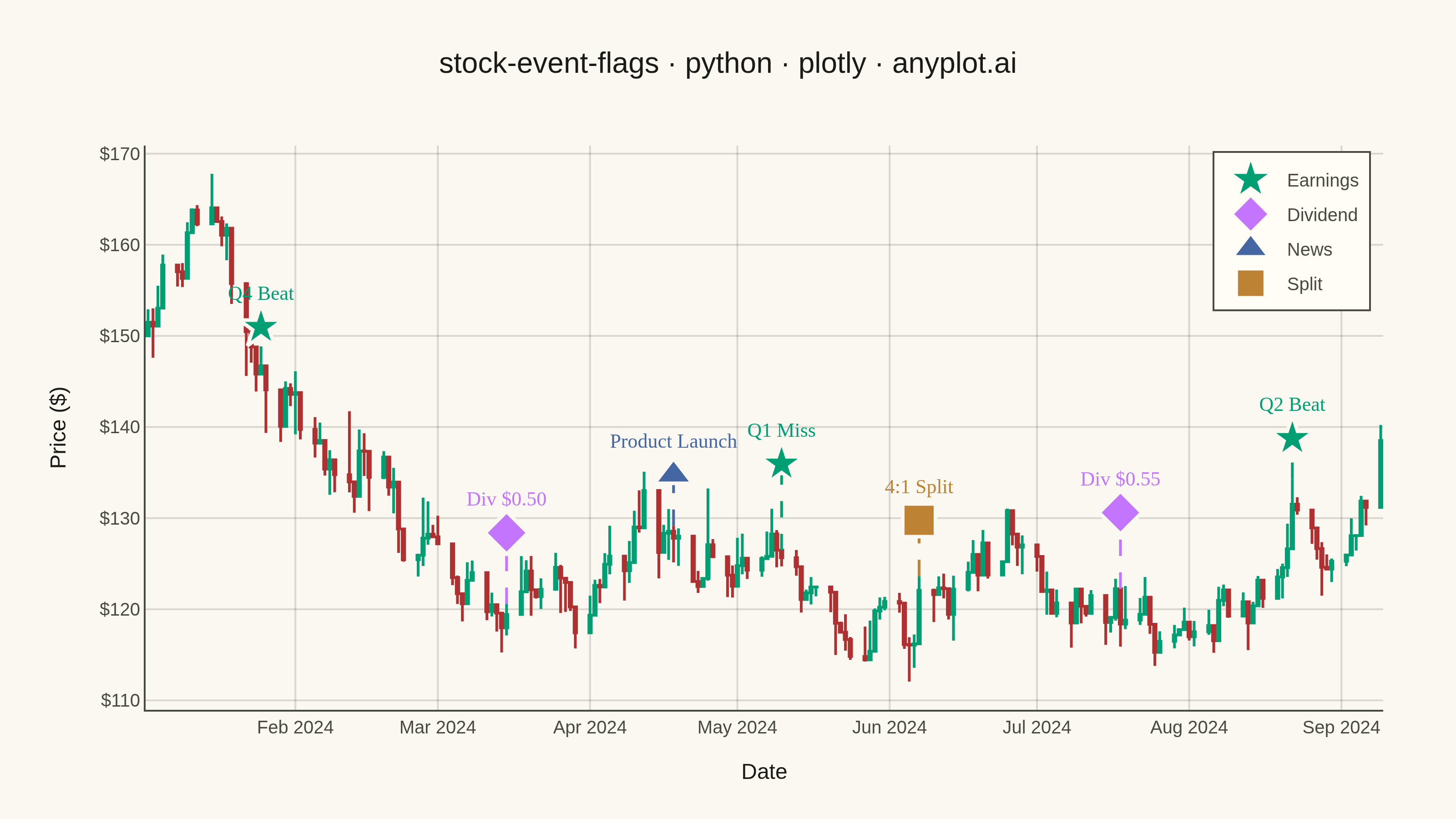
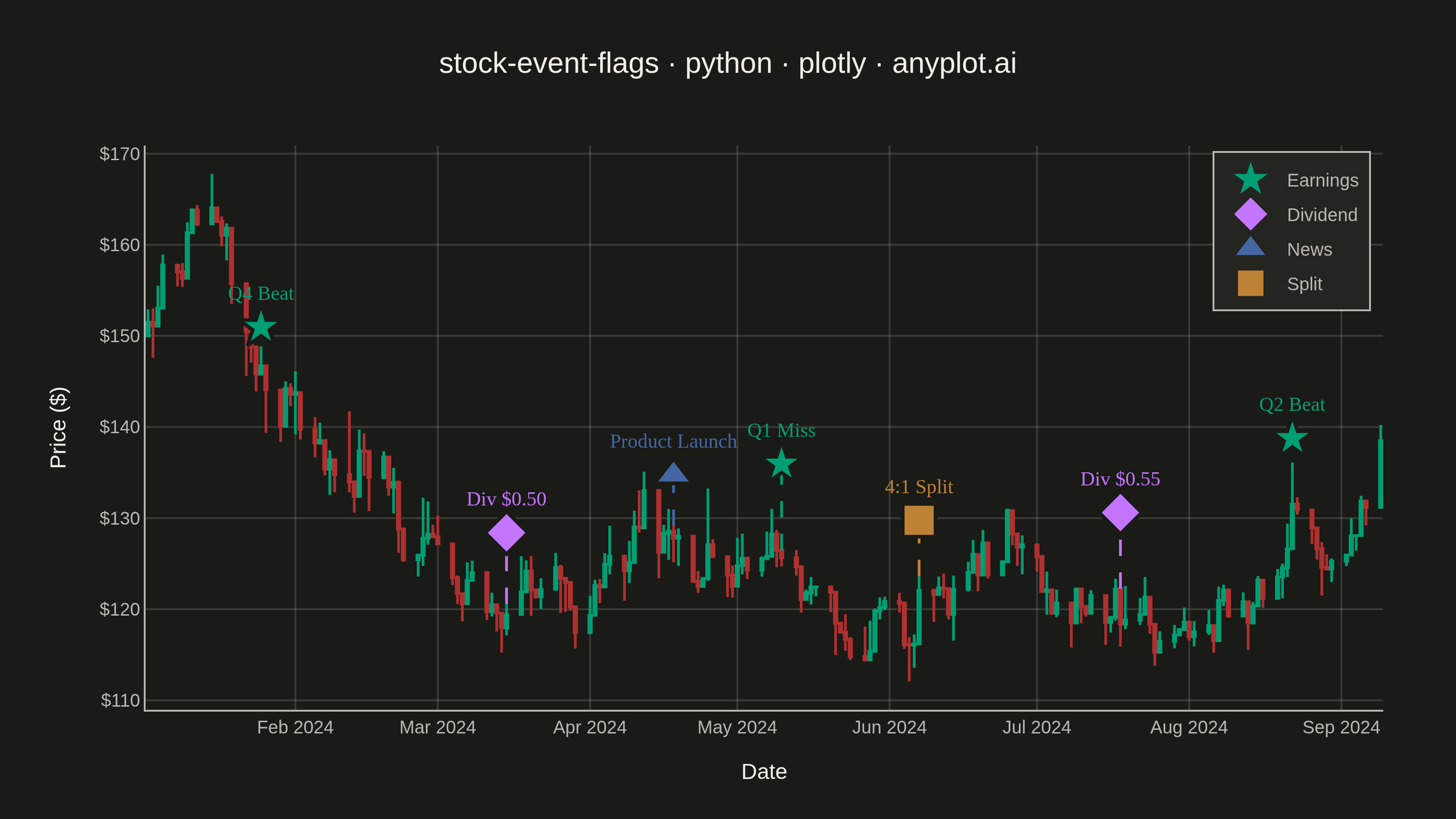
A stock price chart with flag-style markers annotating significant events such as earnings releases, dividends, stock splits, or news events. Unlike simple line annotations, flags are positioned above or below the price data with connector lines and styled icons that distinguish event types. This visualization is standard in financial trading platforms, enabling investors to correlate price movements with corporate actions and market events at a glance.
""" anyplot.ai
stock-event-flags: Stock Chart with Event Flags
Library: plotly 6.7.0 | Python 3.13.13
Quality: 92/100 | Updated: 2026-05-27
"""

import os

import numpy as np
import pandas as pd
import plotly.graph_objects as go


# Theme tokens
THEME = os.getenv("ANYPLOT_THEME", "light")
PAGE_BG = "#FAF8F1" if THEME == "light" else "#1A1A17"
ELEVATED_BG = "#FFFDF6" if THEME == "light" else "#242420"
INK = "#1A1A17" if THEME == "light" else "#F0EFE8"
INK_SOFT = "#4A4A44" if THEME == "light" else "#B8B7B0"
GRID = "rgba(26,26,23,0.15)" if THEME == "light" else "rgba(240,239,232,0.15)"

IMPRINT_PALETTE = ["#009E73", "#C475FD", "#4467A3", "#BD8233", "#AE3030", "#2ABCCD", "#954477", "#99B314"]

# Event type colors — Imprint palette positions 0→3 in canonical order
event_colors = {
    "Earnings": IMPRINT_PALETTE[0],  # #009E73 brand green
    "Dividend": IMPRINT_PALETTE[1],  # #C475FD lavender
    "News": IMPRINT_PALETTE[2],  # #4467A3 blue
    "Split": IMPRINT_PALETTE[3],  # #BD8233 ochre
}
event_symbols = {"Earnings": "star", "Dividend": "diamond", "News": "triangle-up", "Split": "square"}

# Data
np.random.seed(42)
n_days = 180
dates = pd.date_range(start="2024-01-02", periods=n_days, freq="B")

initial_price = 150.0
returns = np.random.randn(n_days) * 0.02
close_prices = initial_price * np.exp(np.cumsum(returns))
high_prices = close_prices * (1 + np.abs(np.random.randn(n_days)) * 0.015)
low_prices = close_prices * (1 - np.abs(np.random.randn(n_days)) * 0.015)
open_prices = np.roll(close_prices, 1)
open_prices[0] = initial_price

high_prices = np.maximum(high_prices, np.maximum(open_prices, close_prices))
low_prices = np.minimum(low_prices, np.minimum(open_prices, close_prices))

# Convert dates to strings for kaleido/plotly JSON serialization
date_strings = dates.strftime("%Y-%m-%d")

df = pd.DataFrame(
    {"date": date_strings, "open": open_prices, "high": high_prices, "low": low_prices, "close": close_prices}
)

events = pd.DataFrame(
    {
        "event_date": [
            "2024-01-25",
            "2024-03-15",
            "2024-04-18",
            "2024-05-10",
            "2024-06-07",
            "2024-07-18",
            "2024-08-22",
        ],
        "event_type": ["Earnings", "Dividend", "News", "Earnings", "Split", "Dividend", "Earnings"],
        "event_label": ["Q4 Beat", "Div $0.50", "Product Launch", "Q1 Miss", "4:1 Split", "Div $0.55", "Q2 Beat"],
    }
)

# Plot
fig = go.Figure()

# Candlestick — semantic colors: green=bullish, red=bearish
fig.add_trace(
    go.Candlestick(
        x=df["date"],
        open=df["open"],
        high=df["high"],
        low=df["low"],
        close=df["close"],
        name="Price",
        increasing_line_color="#009E73",
        decreasing_line_color="#AE3030",
        increasing_fillcolor="#009E73",
        decreasing_fillcolor="#AE3030",
        line_width=1.5,
        showlegend=False,
    )
)

# Event flags with alternating heights to reduce visual clustering
price_range = df["high"].max() - df["low"].min()
flag_height_offsets = [0.07, 0.14, 0.10, 0.17, 0.11, 0.15, 0.08]

for i, (_, event) in enumerate(events.iterrows()):
    event_date = event["event_date"]
    # Find closest trading day (string comparison works for ISO date strings)
    date_idx = (pd.to_datetime(df["date"]) - pd.to_datetime(event_date)).abs().argmin()
    actual_date = df["date"].iloc[date_idx]
    price_at_event = df["high"].iloc[date_idx]

    height_offset = flag_height_offsets[i % len(flag_height_offsets)]
    flag_y = price_at_event + price_range * height_offset

    color = event_colors.get(event["event_type"], IMPRINT_PALETTE[0])
    symbol = event_symbols.get(event["event_type"], "circle")

    # Vertical dashed connector line
    fig.add_trace(
        go.Scatter(
            x=[actual_date, actual_date],
            y=[price_at_event, flag_y],
            mode="lines",
            line={"color": color, "width": 1.5, "dash": "dash"},
            showlegend=False,
            hoverinfo="skip",
        )
    )

    # Flag marker with label
    fig.add_trace(
        go.Scatter(
            x=[actual_date],
            y=[flag_y],
            mode="markers+text",
            marker={"size": 18, "color": color, "symbol": symbol, "line": {"color": PAGE_BG, "width": 2}},
            text=[event["event_label"]],
            textposition="top center",
            textfont={"size": 11, "color": color, "family": "Arial Black"},
            name=event["event_type"],
            showlegend=False,
            hovertemplate=(
                f"<b>{event['event_type']}</b><br>{event['event_label']}<br>Date: %{{x|%Y-%m-%d}}<extra></extra>"
            ),
        )
    )

# Legend entries for event types only — no redundant Price entry
for event_type in event_colors:
    fig.add_trace(
        go.Scatter(
            x=[None],
            y=[None],
            mode="markers",
            marker={"size": 14, "color": event_colors[event_type], "symbol": event_symbols[event_type]},
            name=event_type,
        )
    )

title = "stock-event-flags · python · plotly · anyplot.ai"

fig.update_layout(
    autosize=False,
    paper_bgcolor=PAGE_BG,
    plot_bgcolor=PAGE_BG,
    font={"color": INK},
    title={"text": title, "font": {"size": 16, "color": INK}, "x": 0.5, "xanchor": "center"},
    xaxis={
        "title": {"text": "Date", "font": {"size": 12, "color": INK}},
        "tickfont": {"size": 10, "color": INK_SOFT},
        "rangeslider": {"visible": False},
        "gridcolor": GRID,
        "showgrid": True,
        "showline": True,
        "mirror": False,
        "linecolor": INK_SOFT,
        "zerolinecolor": INK_SOFT,
    },
    yaxis={
        "title": {"text": "Price ($)", "font": {"size": 12, "color": INK}},
        "tickfont": {"size": 10, "color": INK_SOFT},
        "tickformat": "$.0f",
        "gridcolor": GRID,
        "showgrid": True,
        "showline": True,
        "mirror": False,
        "linecolor": INK_SOFT,
        "zerolinecolor": INK_SOFT,
    },
    legend={
        "yanchor": "top",
        "y": 0.99,
        "xanchor": "right",
        "x": 0.99,
        "bgcolor": ELEVATED_BG,
        "bordercolor": INK_SOFT,
        "borderwidth": 1,
        "font": {"size": 10, "color": INK_SOFT},
    },
    margin={"l": 80, "r": 40, "t": 80, "b": 60},
    hovermode="x unified",
)

# Save
fig.write_image(f"plot-{THEME}.png", width=800, height=450, scale=4)
fig.write_html(f"plot-{THEME}.html", include_plotlyjs="cdn")
Runnable source as JSON, for any HTTP client: https://api.anyplot.ai/specs/stock-event-flags/plotly/code. Any spec id and library id listed in llms-full.txt fit the same URL shape; every URL below is complete and callable.
{
  "spec_id": "stock-event-flags",
  "language": "python",
  "library": "plotly",
  "page": "https://anyplot.ai/stock-event-flags/python/plotly",
  "hub": "https://anyplot.ai/stock-event-flags",
  "code_json": "https://api.anyplot.ai/specs/stock-event-flags/plotly/code",
  "spec_json": "https://api.anyplot.ai/specs/stock-event-flags",
  "render_light_png": "https://storage.googleapis.com/anyplot-images/plots/stock-event-flags/python/plotly/plot-light.png",
  "render_dark_png": "https://storage.googleapis.com/anyplot-images/plots/stock-event-flags/python/plotly/plot-dark.png",
  "interactive_light_html": "https://storage.googleapis.com/anyplot-images/plots/stock-event-flags/python/plotly/plot-light.html",
  "interactive_dark_html": "https://storage.googleapis.com/anyplot-images/plots/stock-event-flags/python/plotly/plot-dark.html",
  "quality_score": 92.0,
  "license": "MIT",
  "guide": "https://anyplot.ai/llms.txt"
}
Part of Stock Chart with Event Flags on anyplot.ai.