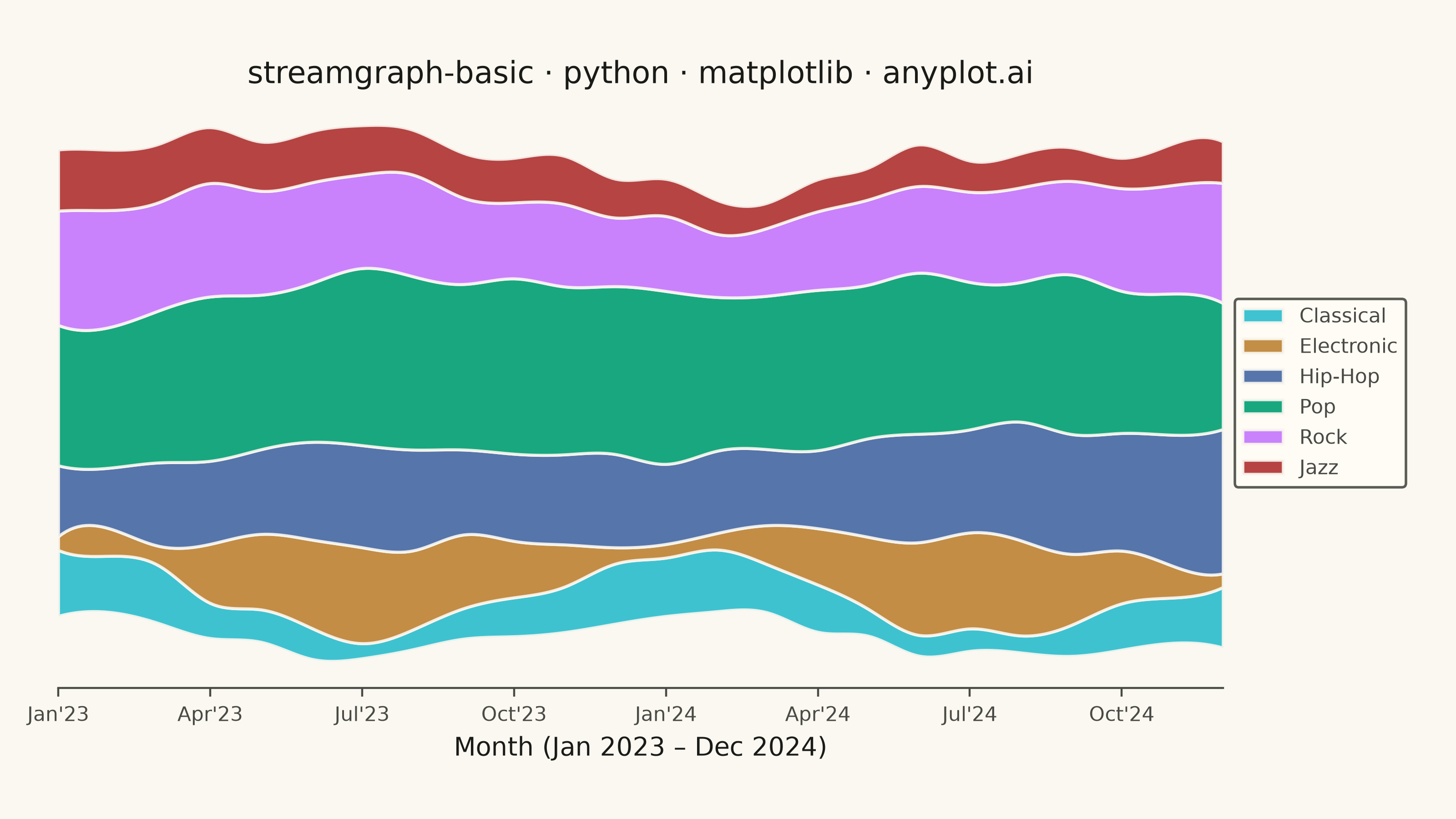
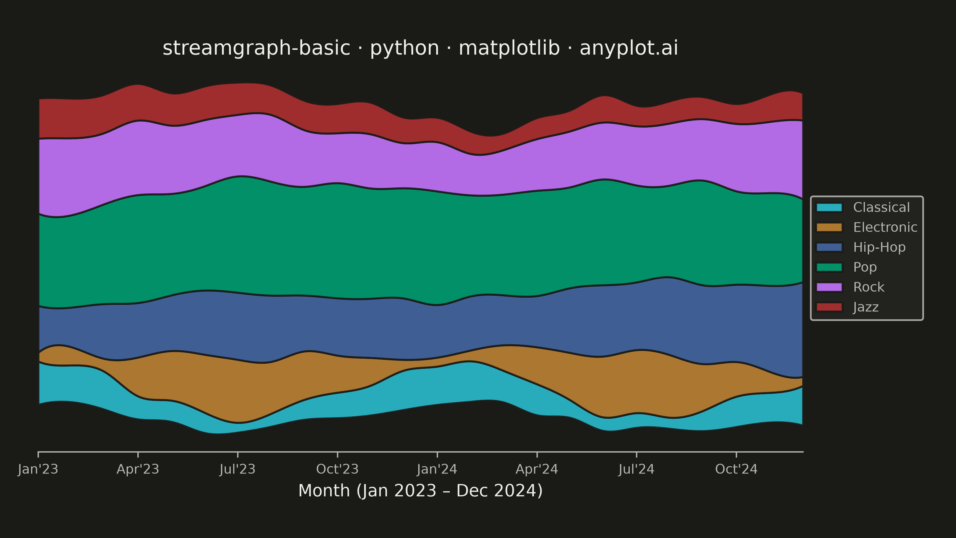
A streamgraph (also known as a stacked area chart with a centered baseline) displaying the composition of multiple categories over time with smooth, flowing curves. Unlike traditional stacked area charts, streamgraphs use a symmetric baseline centered around the x-axis, creating an organic, river-like appearance that emphasizes the overall shape and relative proportions of each category while minimizing the visual distortion of individual layers.
""" anyplot.ai
streamgraph-basic: Basic Stream Graph
Library: matplotlib 3.11.1 | Python 3.13.14
Quality: 92/100 | Updated: 2026-08-05
"""

import os

import matplotlib.pyplot as plt
import numpy as np
from scipy.interpolate import make_interp_spline


THEME = os.getenv("ANYPLOT_THEME", "light")
PAGE_BG = "#FAF8F1" if THEME == "light" else "#1A1A17"
ELEVATED_BG = "#FFFDF6" if THEME == "light" else "#242420"
INK = "#1A1A17" if THEME == "light" else "#F0EFE8"
INK_SOFT = "#4A4A44" if THEME == "light" else "#B8B7B0"

# Imprint palette — first series always #009E73, positions 1-6 in canonical order
IMPRINT = ["#009E73", "#C475FD", "#4467A3", "#BD8233", "#AE3030", "#2ABCCD"]

np.random.seed(42)

months = np.arange(24)
month_labels = [
    "Jan'23",
    "Feb'23",
    "Mar'23",
    "Apr'23",
    "May'23",
    "Jun'23",
    "Jul'23",
    "Aug'23",
    "Sep'23",
    "Oct'23",
    "Nov'23",
    "Dec'23",
    "Jan'24",
    "Feb'24",
    "Mar'24",
    "Apr'24",
    "May'24",
    "Jun'24",
    "Jul'24",
    "Aug'24",
    "Sep'24",
    "Oct'24",
    "Nov'24",
    "Dec'24",
]

# Monthly streaming hours by music genre — diverse trend patterns
pop = 50 + 10 * np.sin(months / 6) + np.random.randn(24) * 3 + months * 0.3
rock = 35 + 8 * np.cos(months / 4) + np.random.randn(24) * 2
hiphop = 25 + months * 0.8 + 5 * np.sin(months / 3) + np.random.randn(24) * 3
electronic = 20 + 15 * np.sin((months - 3) / 6 * np.pi) + np.random.randn(24) * 2
jazz = 18 - months * 0.15 + 4 * np.cos(months / 5) + np.random.randn(24) * 1.5
classical = 15 + 8 * np.cos(months / 6 * np.pi) + np.random.randn(24) * 1.5

data_raw = [pop, rock, hiphop, electronic, jazz, classical]
for arr in data_raw:
    np.maximum(arr, 5, out=arr)

categories = ["Pop", "Rock", "Hip-Hop", "Electronic", "Jazz", "Classical"]

# Cubic spline interpolation → smooth, flowing curves
months_fine = np.linspace(0, 23, 300)
data_smooth = np.array([np.maximum(make_interp_spline(months, series, k=3)(months_fine), 1.0) for series in data_raw])

# Inside-out layer ordering (Byron & Wattenberg): the highest-volume genre sits
# in the visual center with progressively smaller genres flanking it, so the
# dominant trend (Pop) reads immediately without needing a text callout.
totals = data_smooth.sum(axis=1)
ranked = np.argsort(totals)[::-1]
left_side, right_side = [], []
for rank, idx in enumerate(ranked):
    (right_side if rank % 2 == 0 else left_side).append(idx)
stack_order = left_side[::-1] + right_side

stacked_data = data_smooth[stack_order]
stacked_colors = [IMPRINT[i] for i in stack_order]
stacked_labels = [categories[i] for i in stack_order]

fig, ax = plt.subplots(figsize=(8, 4.5), dpi=400, facecolor=PAGE_BG)
ax.set_facecolor(PAGE_BG)

ax.stackplot(
    months_fine,
    stacked_data,
    labels=stacked_labels,
    colors=stacked_colors,
    baseline="wiggle",
    alpha=0.9,
    edgecolor=PAGE_BG,
    linewidth=1.2,
)

title = "streamgraph-basic · python · matplotlib · anyplot.ai"
ax.set_title(title, fontsize=12, color=INK, fontweight="medium")
ax.set_xlabel("Month (Jan 2023 – Dec 2024)", fontsize=10, color=INK)

tick_positions = list(range(0, 24, 3))
ax.set_xticks(tick_positions)
ax.set_xticklabels([month_labels[i] for i in tick_positions], fontsize=8)
ax.tick_params(axis="x", colors=INK_SOFT, labelcolor=INK_SOFT)
ax.set_yticks([])

ax.spines["top"].set_visible(False)
ax.spines["right"].set_visible(False)
ax.spines["left"].set_visible(False)
ax.spines["bottom"].set_color(INK_SOFT)

ax.set_xlim(months_fine[0], months_fine[-1])

# Legend sits outside the axes (right margin) — the streamgraph fills nearly
# the full plot height everywhere, so an inside legend would always cover data.
leg = ax.legend(loc="center left", bbox_to_anchor=(1.01, 0.5), fontsize=8, framealpha=0.9, borderaxespad=0)
leg.get_frame().set_facecolor(ELEVATED_BG)
leg.get_frame().set_edgecolor(INK_SOFT)
plt.setp(leg.get_texts(), color=INK_SOFT)

fig.subplots_adjust(left=0.04, right=0.84, top=0.88, bottom=0.16)
plt.savefig(f"plot-{THEME}.png", dpi=400, facecolor=PAGE_BG)
Runnable source as JSON, for any HTTP client: https://api.anyplot.ai/specs/streamgraph-basic/matplotlib/code. Any spec id and library id listed in llms-full.txt fit the same URL shape; every URL below is complete and callable.
{
  "spec_id": "streamgraph-basic",
  "language": "python",
  "library": "matplotlib",
  "page": "https://anyplot.ai/streamgraph-basic/python/matplotlib",
  "hub": "https://anyplot.ai/streamgraph-basic",
  "code_json": "https://api.anyplot.ai/specs/streamgraph-basic/matplotlib/code",
  "spec_json": "https://api.anyplot.ai/specs/streamgraph-basic",
  "render_light_png": "https://storage.googleapis.com/anyplot-images/plots/streamgraph-basic/python/matplotlib/plot-light.png",
  "render_dark_png": "https://storage.googleapis.com/anyplot-images/plots/streamgraph-basic/python/matplotlib/plot-dark.png",
  "quality_score": 92.0,
  "license": "MIT",
  "guide": "https://anyplot.ai/llms.txt"
}
Part of Basic Stream Graph on anyplot.ai.