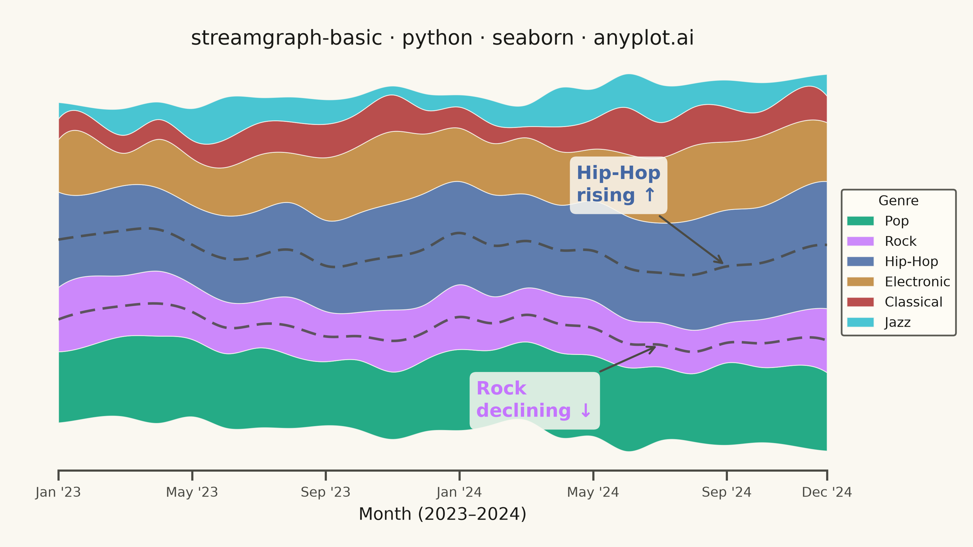
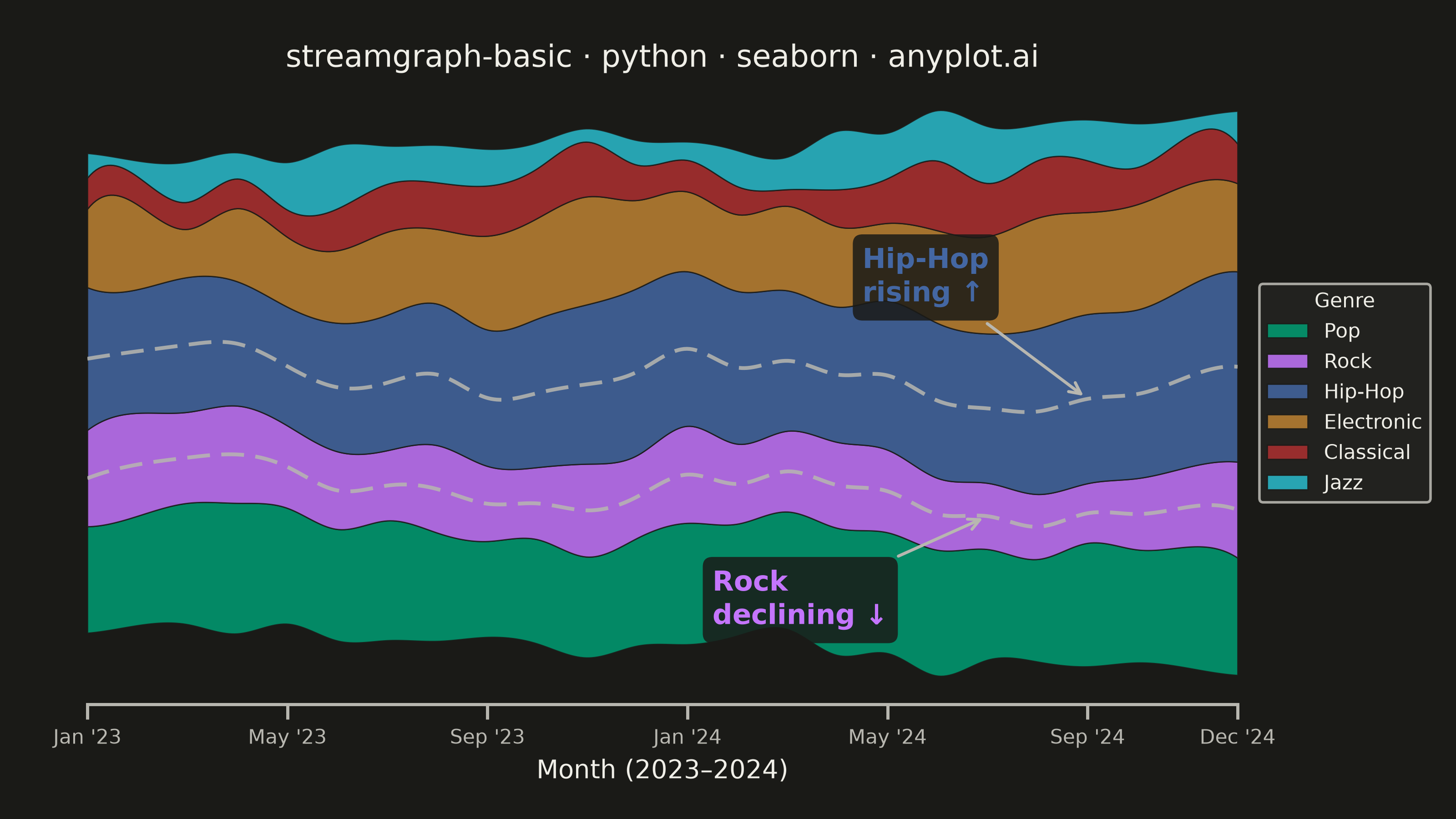
A streamgraph (also known as a stacked area chart with a centered baseline) displaying the composition of multiple categories over time with smooth, flowing curves. Unlike traditional stacked area charts, streamgraphs use a symmetric baseline centered around the x-axis, creating an organic, river-like appearance that emphasizes the overall shape and relative proportions of each category while minimizing the visual distortion of individual layers.
""" anyplot.ai
streamgraph-basic: Basic Stream Graph
Library: seaborn 0.13.2 | Python 3.13.14
Quality: 89/100 | Updated: 2026-08-05
"""

import os

import matplotlib.pyplot as plt
import numpy as np
import pandas as pd
import seaborn as sns
from scipy.interpolate import make_interp_spline


THEME = os.getenv("ANYPLOT_THEME", "light")
PAGE_BG = "#FAF8F1" if THEME == "light" else "#1A1A17"
ELEVATED_BG = "#FFFDF6" if THEME == "light" else "#242420"
INK = "#1A1A17" if THEME == "light" else "#F0EFE8"
INK_SOFT = "#4A4A44" if THEME == "light" else "#B8B7B0"

IMPRINT = ["#009E73", "#C475FD", "#4467A3", "#BD8233", "#AE3030", "#2ABCCD"]

sns.set_theme(
    style="ticks",
    rc={
        "figure.facecolor": PAGE_BG,
        "axes.facecolor": PAGE_BG,
        "axes.edgecolor": INK_SOFT,
        "axes.labelcolor": INK,
        "text.color": INK,
        "xtick.color": INK_SOFT,
        "ytick.color": INK_SOFT,
        "grid.color": INK,
        "grid.alpha": 0.10,
        "legend.facecolor": ELEVATED_BG,
        "legend.edgecolor": INK_SOFT,
    },
)

# Data — monthly streaming hours by music genre over 2 years
np.random.seed(42)

months = pd.date_range("2023-01", periods=24, freq="ME")
genres = ["Pop", "Rock", "Hip-Hop", "Electronic", "Classical", "Jazz"]

data = {}
for i, genre in enumerate(genres):
    base = [40, 35, 50, 30, 15, 12][i]
    trend = np.linspace(0, [10, -5, 15, 8, 2, 5][i], 24)
    seasonal = 5 * np.sin(np.linspace(0, 4 * np.pi, 24) + i)
    noise = np.random.randn(24) * 3
    data[genre] = np.maximum(base + trend + seasonal + noise, 5)

df = pd.DataFrame(data, index=months)

# Streamgraph: centered baseline
values = df.values
cumsum = np.cumsum(values, axis=1)
total = cumsum[:, -1]
baseline = -total / 2

lowers = np.column_stack([baseline + cumsum[:, i] - values[:, i] for i in range(len(genres))])
uppers = np.column_stack([baseline + cumsum[:, i] for i in range(len(genres))])

# Smooth spline interpolation for flowing curves
x_numeric = np.arange(len(months), dtype=float)
x_smooth = np.linspace(0, len(months) - 1, 400)

# Plot — landscape 3200×1800 px (figsize=(8, 4.5) × dpi=400, no bbox_inches='tight')
fig, ax = plt.subplots(figsize=(8, 4.5), dpi=400, facecolor=PAGE_BG)
ax.set_facecolor(PAGE_BG)

# Store splines to reuse for trend lines and annotations
splines = []
for i in range(len(genres)):
    spl_lower = make_interp_spline(x_numeric, lowers[:, i], k=3)
    spl_upper = make_interp_spline(x_numeric, uppers[:, i], k=3)
    splines.append((spl_lower, spl_upper))
    ax.fill_between(
        x_smooth,
        spl_lower(x_smooth),
        spl_upper(x_smooth),
        label=genres[i],
        color=IMPRINT[i],
        alpha=0.85,
        edgecolor=PAGE_BG,
        linewidth=0.5,
    )

# Seaborn-native center-line trend highlights for Hip-Hop and Rock
# sns.lineplot adds a genuine seaborn plotting element over the streams.
# Drawn in INK_SOFT (not the stream's own color) so the dashed overlay stays
# visible against its same-hue band instead of blending in.
for gname, linestyle in [("Hip-Hop", (0, (6, 3))), ("Rock", (0, (6, 3)))]:
    gi = genres.index(gname)
    spl_lo, spl_up = splines[gi]
    center_vals = (spl_lo(x_smooth) + spl_up(x_smooth)) / 2
    center_df = pd.DataFrame({"x": x_smooth, "y": center_vals})
    sns.lineplot(
        data=center_df,
        x="x",
        y="y",
        ax=ax,
        color=INK_SOFT,
        linewidth=1.5,
        linestyle=linestyle,
        alpha=0.85,
        legend=False,
    )

# Data storytelling: annotate the two dominant narrative threads
hip_hop_idx = genres.index("Hip-Hop")
rock_idx = genres.index("Rock")

# Hip-Hop center near month 20 (growth is visible by then)
hh_x = 20
hh_center = (splines[hip_hop_idx][0](hh_x) + splines[hip_hop_idx][1](hh_x)) / 2
ax.annotate(
    "Hip-Hop\nrising ↑",
    xy=(hh_x, hh_center),
    xytext=(hh_x - 4.5, hh_center + 38),
    fontsize=11,
    fontweight="bold",
    color=IMPRINT[hip_hop_idx],
    arrowprops={"arrowstyle": "->", "color": INK_SOFT, "lw": 1.2},
    bbox={"boxstyle": "round,pad=0.35", "facecolor": PAGE_BG, "edgecolor": "none", "alpha": 0.85},
)

# Rock center near month 18 (decline well established)
rk_x = 18
rk_center = (splines[rock_idx][0](rk_x) + splines[rock_idx][1](rk_x)) / 2
ax.annotate(
    "Rock\ndeclining ↓",
    xy=(rk_x, rk_center),
    xytext=(rk_x - 5.5, rk_center - 42),
    fontsize=11,
    fontweight="bold",
    color=IMPRINT[rock_idx],
    arrowprops={"arrowstyle": "->", "color": INK_SOFT, "lw": 1.2},
    bbox={"boxstyle": "round,pad=0.35", "facecolor": PAGE_BG, "edgecolor": "none", "alpha": 0.85},
)

# Style
tick_positions = [0, 4, 8, 12, 16, 20, 23]
tick_labels = [months[i].strftime("%b '%y") for i in tick_positions]
ax.set_xticks(tick_positions)
ax.set_xticklabels(tick_labels, fontsize=8, color=INK_SOFT)

ax.set_xlim(0, len(months) - 1)
ax.set_yticks([])
ax.set_ylabel("")
ax.set_xlabel("Month (2023–2024)", fontsize=10, color=INK)
ax.set_title("streamgraph-basic · python · seaborn · anyplot.ai", fontsize=12, fontweight="medium", color=INK)

ax.legend(
    loc="center left",
    bbox_to_anchor=(1.01, 0.5),
    fontsize=8,
    title="Genre",
    title_fontsize=8,
    facecolor=ELEVATED_BG,
    edgecolor=INK_SOFT,
    framealpha=0.9,
)

sns.despine(ax=ax, left=True, bottom=False)
ax.spines["bottom"].set_color(INK_SOFT)

fig.subplots_adjust(left=0.06, right=0.85, top=0.90, bottom=0.14)
plt.savefig(f"plot-{THEME}.png", dpi=400, facecolor=PAGE_BG)
Runnable source as JSON, for any HTTP client: https://api.anyplot.ai/specs/streamgraph-basic/seaborn/code. Any spec id and library id listed in llms-full.txt fit the same URL shape; every URL below is complete and callable.
{
  "spec_id": "streamgraph-basic",
  "language": "python",
  "library": "seaborn",
  "page": "https://anyplot.ai/streamgraph-basic/python/seaborn",
  "hub": "https://anyplot.ai/streamgraph-basic",
  "code_json": "https://api.anyplot.ai/specs/streamgraph-basic/seaborn/code",
  "spec_json": "https://api.anyplot.ai/specs/streamgraph-basic",
  "render_light_png": "https://storage.googleapis.com/anyplot-images/plots/streamgraph-basic/python/seaborn/plot-light.png",
  "render_dark_png": "https://storage.googleapis.com/anyplot-images/plots/streamgraph-basic/python/seaborn/plot-dark.png",
  "quality_score": 89.0,
  "license": "MIT",
  "guide": "https://anyplot.ai/llms.txt"
}
Part of Basic Stream Graph on anyplot.ai.