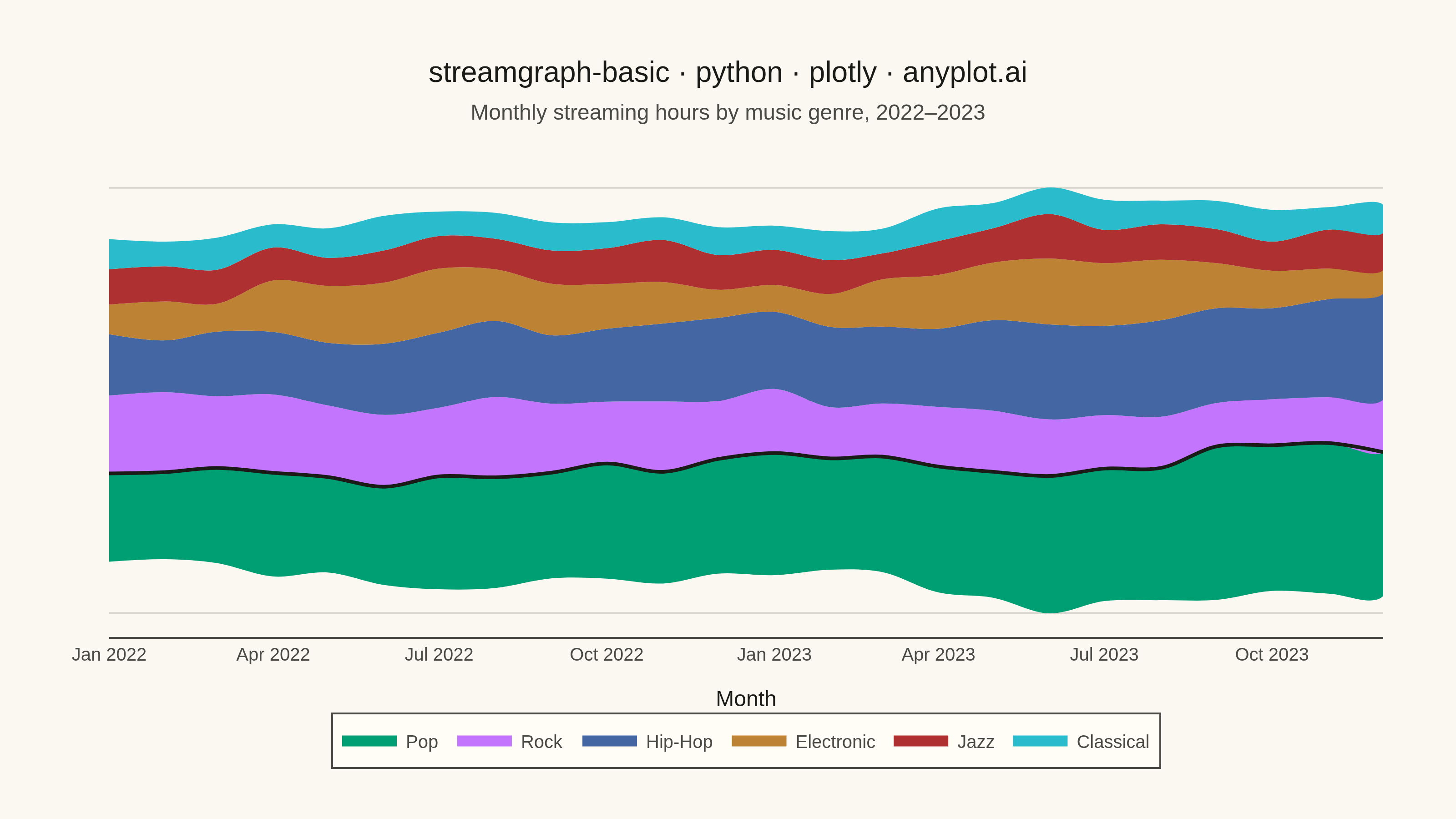
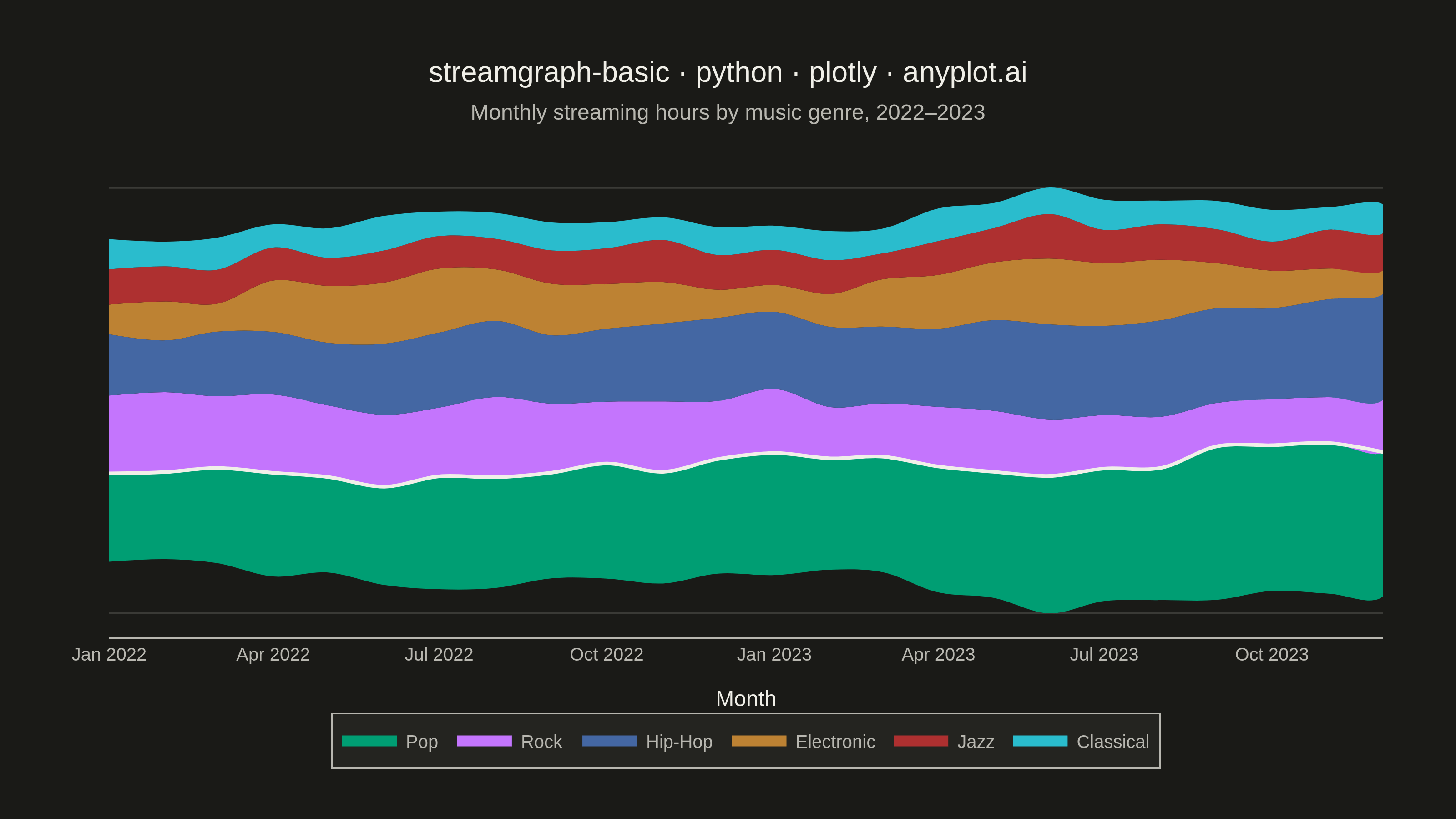
A streamgraph (also known as a stacked area chart with a centered baseline) displaying the composition of multiple categories over time with smooth, flowing curves. Unlike traditional stacked area charts, streamgraphs use a symmetric baseline centered around the x-axis, creating an organic, river-like appearance that emphasizes the overall shape and relative proportions of each category while minimizing the visual distortion of individual layers.
""" anyplot.ai
streamgraph-basic: Basic Stream Graph
Library: plotly 6.9.0 | Python 3.13.14
Quality: 91/100 | Updated: 2026-08-05
"""

import sys


sys.path.pop(0)

import os

import numpy as np
import pandas as pd
import plotly.graph_objects as go


# Theme tokens
THEME = os.getenv("ANYPLOT_THEME", "light")
PAGE_BG = "#FAF8F1" if THEME == "light" else "#1A1A17"
ELEVATED_BG = "#FFFDF6" if THEME == "light" else "#242420"
INK = "#1A1A17" if THEME == "light" else "#F0EFE8"
INK_SOFT = "#4A4A44" if THEME == "light" else "#B8B7B0"
GRID = "rgba(26,26,23,0.15)" if THEME == "light" else "rgba(240,239,232,0.15)"

# Imprint palette — first series always #009E73
IMPRINT = ["#009E73", "#C475FD", "#4467A3", "#BD8233", "#AE3030", "#2ABCCD"]

# Data - Monthly streaming hours by music genre over 2 years.
# Each genre gets its own trend so the shape itself tells a story: Pop's
# share visibly grows while Rock fades, Electronic pulses with summer
# festival season, and Jazz/Classical stay steady — no annotations needed.
np.random.seed(42)
months = pd.date_range(start="2022-01-01", periods=24, freq="ME")
genres = ["Pop", "Rock", "Hip-Hop", "Electronic", "Jazz", "Classical"]

data = {}
data["Pop"] = 40 + np.linspace(0, 32, 24) + np.random.randn(24) * 3
data["Rock"] = 38 - np.linspace(0, 16, 24) + np.random.randn(24) * 2.5
data["Hip-Hop"] = 28 + np.linspace(0, 18, 24) + np.random.randn(24) * 2.5
data["Electronic"] = 22 + 8 * np.sin(np.linspace(0, 4 * np.pi, 24) - np.pi / 2) + np.random.randn(24) * 2
data["Jazz"] = 16 + np.random.randn(24) * 2
data["Classical"] = 13 + np.random.randn(24) * 1.5
for genre in genres:
    data[genre] = np.maximum(data[genre], 5)

df = pd.DataFrame(data, index=months)
month_labels = months.strftime("%Y-%m").tolist()

# Calculate streamgraph layout (centered baseline)
values_array = df.values.T  # Shape: (n_genres, n_time_points)
n_genres, n_time = values_array.shape

cumsum = np.vstack([np.zeros(n_time), np.cumsum(values_array, axis=0)])
total = cumsum[-1]
offset = total / 2

# Plot
fig = go.Figure()

for i, genre in enumerate(genres):
    values = values_array[i]
    y_lower = cumsum[i] - offset
    y_upper = cumsum[i + 1] - offset
    share = values / total * 100

    x_fill = month_labels + month_labels[::-1]
    y_fill = list(y_upper) + list(y_lower)[::-1]
    customdata = np.stack([np.concatenate([values, values[::-1]]), np.concatenate([share, share[::-1]])], axis=-1)

    if i == 0:
        pop_y_upper = y_upper  # traced as a top-layer highlight after the loop

    fig.add_trace(
        go.Scatter(
            x=x_fill,
            y=y_fill,
            fill="toself",
            fillcolor=IMPRINT[i],
            opacity=1.0,
            line={"color": IMPRINT[i], "width": 0.5, "shape": "spline", "smoothing": 1.0},
            name=genre,
            mode="none",
            customdata=customdata,
            hovertemplate=f"<b>{genre}</b> — %{{x}}<br>%{{customdata[0]:.0f}} hrs (%{{customdata[1]:.0f}}% share)<extra></extra>",
            hoveron="fills",
        )
    )

# Pop is the story's focal point: an ink-toned highlight line traces its crest
# on top of every fill, giving it clear visual weight without dimming the
# other streams (all keep full opacity — no subtle-opacity trick).
fig.add_trace(
    go.Scatter(
        x=month_labels,
        y=pop_y_upper,
        mode="lines",
        line={"color": INK, "width": 2, "shape": "spline", "smoothing": 1.0},
        showlegend=False,
        hoverinfo="skip",
    )
)

subtitle = f"<span style='font-size:12px;color:{INK_SOFT}'>Monthly streaming hours by music genre, 2022–2023</span>"

fig.update_layout(
    autosize=False,
    width=800,
    height=450,
    title={
        "text": f"streamgraph-basic · python · plotly · anyplot.ai<br>{subtitle}",
        "font": {"size": 16, "color": INK},
        "x": 0.5,
        "xanchor": "center",
    },
    xaxis={
        "title": {"text": "Month", "font": {"size": 12, "color": INK}},
        "tickfont": {"size": 10, "color": INK_SOFT},
        "showgrid": False,
        "showline": True,
        "linecolor": INK_SOFT,
        "mirror": False,  # bottom spine only — no top spine
        "zeroline": False,
    },
    yaxis={
        "showticklabels": False,  # hide confusing centered-offset values
        "showgrid": True,
        "gridcolor": GRID,
        "gridwidth": 1,
        "zeroline": True,
        "zerolinecolor": INK_SOFT,
        "zerolinewidth": 1,
        "showline": False,  # no left spine (y labels hidden anyway)
        "mirror": False,
    },
    legend={
        "font": {"size": 10, "color": INK_SOFT},
        "bgcolor": ELEVATED_BG,
        "bordercolor": INK_SOFT,
        "borderwidth": 1,
        "orientation": "h",
        "yanchor": "top",
        "y": -0.16,
        "xanchor": "center",
        "x": 0.5,
    },
    paper_bgcolor=PAGE_BG,
    plot_bgcolor=PAGE_BG,
    hovermode="x unified",
    margin={"l": 60, "r": 40, "t": 90, "b": 100},
)

# Save
fig.write_image(f"plot-{THEME}.png", width=800, height=450, scale=4)
fig.write_html(f"plot-{THEME}.html", include_plotlyjs="cdn")
Runnable source as JSON, for any HTTP client: https://api.anyplot.ai/specs/streamgraph-basic/plotly/code. Any spec id and library id listed in llms-full.txt fit the same URL shape; every URL below is complete and callable.
{
  "spec_id": "streamgraph-basic",
  "language": "python",
  "library": "plotly",
  "page": "https://anyplot.ai/streamgraph-basic/python/plotly",
  "hub": "https://anyplot.ai/streamgraph-basic",
  "code_json": "https://api.anyplot.ai/specs/streamgraph-basic/plotly/code",
  "spec_json": "https://api.anyplot.ai/specs/streamgraph-basic",
  "render_light_png": "https://storage.googleapis.com/anyplot-images/plots/streamgraph-basic/python/plotly/plot-light.png",
  "render_dark_png": "https://storage.googleapis.com/anyplot-images/plots/streamgraph-basic/python/plotly/plot-dark.png",
  "interactive_light_html": "https://storage.googleapis.com/anyplot-images/plots/streamgraph-basic/python/plotly/plot-light.html",
  "interactive_dark_html": "https://storage.googleapis.com/anyplot-images/plots/streamgraph-basic/python/plotly/plot-dark.html",
  "quality_score": 91.0,
  "license": "MIT",
  "guide": "https://anyplot.ai/llms.txt"
}
Part of Basic Stream Graph on anyplot.ai.