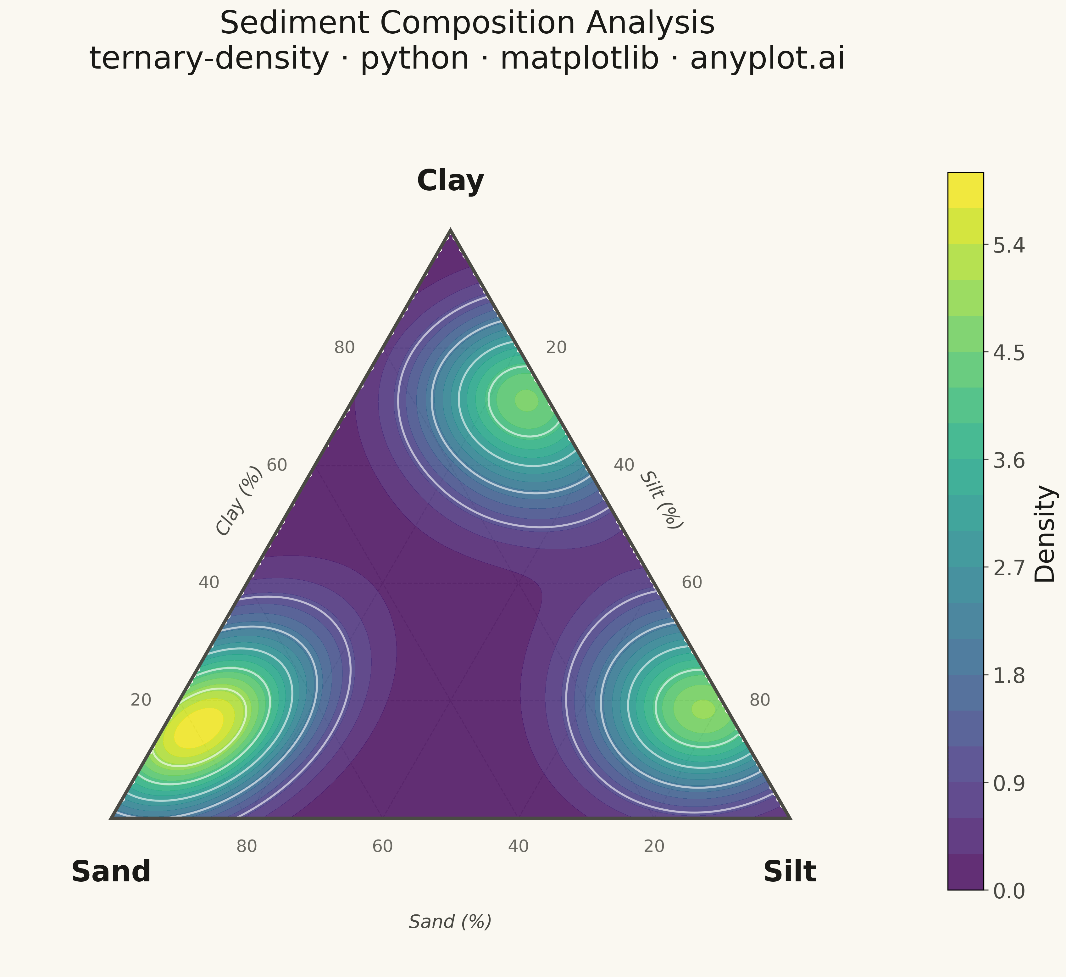
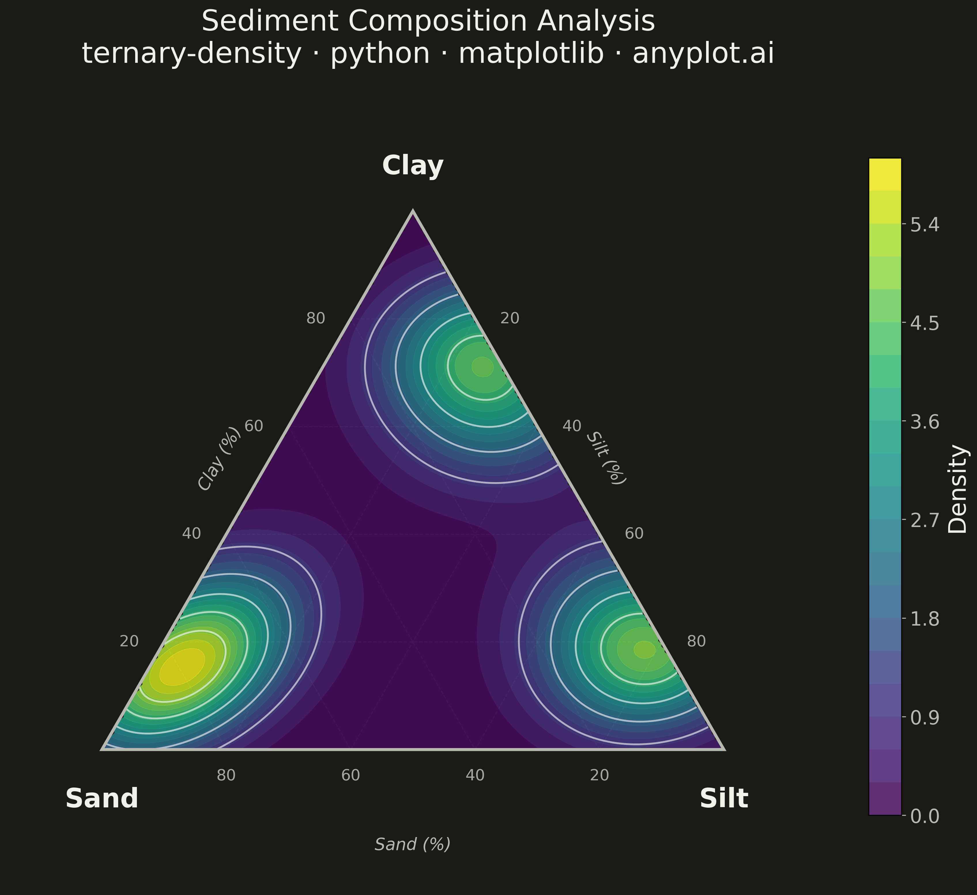
A ternary density plot combines a three-component ternary diagram with kernel density estimation to visualize where compositional data concentrates. Instead of showing individual points, this visualization uses a heatmap overlay to reveal the underlying probability distribution of compositions, making it ideal for identifying clusters, modes, and patterns in large compositional datasets.
""" anyplot.ai
ternary-density: Ternary Density Plot
Library: matplotlib 3.10.9 | Python 3.13.13
Quality: 92/100 | Updated: 2026-05-19
"""

import os

import matplotlib.pyplot as plt
import numpy as np
from matplotlib.patches import Polygon
from scipy.stats import gaussian_kde


# Theme tokens
THEME = os.getenv("ANYPLOT_THEME", "light")
PAGE_BG = "#FAF8F1" if THEME == "light" else "#1A1A17"
INK = "#1A1A17" if THEME == "light" else "#F0EFE8"
INK_SOFT = "#4A4A44" if THEME == "light" else "#B8B7B0"
INK_MUTED = "#6B6A63" if THEME == "light" else "#A8A79F"

SQ3H = np.sqrt(3) / 2  # sqrt(3)/2, reused throughout

# Data: sediment composition (sand/silt/clay) with three cluster types
np.random.seed(42)

n1 = 300
sand1 = np.random.beta(5, 2, n1) * 60 + 35
silt1 = np.random.beta(2, 3, n1) * (100 - sand1) * 0.6
clay1 = 100 - sand1 - silt1

n2 = 250
silt2 = np.random.beta(5, 2, n2) * 50 + 40
sand2 = np.random.beta(2, 4, n2) * (100 - silt2) * 0.5
clay2 = 100 - sand2 - silt2

n3 = 250
clay3 = np.random.beta(4, 2, n3) * 45 + 40
sand3 = np.random.beta(2, 5, n3) * (100 - clay3) * 0.4
silt3 = 100 - sand3 - clay3

sand = np.clip(np.concatenate([sand1, sand2, sand3]), 0, 100)
silt = np.clip(np.concatenate([silt1, silt2, silt3]), 0, 100)
clay = np.clip(np.concatenate([clay1, clay2, clay3]), 0, 100)
total = sand + silt + clay
sand, silt, clay = sand / total, silt / total, clay / total

# Ternary → Cartesian: Sand vertex (0,0), Silt vertex (1,0), Clay vertex (0.5, SQ3H)
# x = silt + 0.5 * clay,  y = SQ3H * clay
x_data = silt + 0.5 * clay
y_data = SQ3H * clay

# KDE density grid
grid_res = 200
xi = np.linspace(0, 1, grid_res)
yi = np.linspace(0, SQ3H, grid_res)
Xi, Yi = np.meshgrid(xi, yi)
Ci = Yi / SQ3H
Bi = Xi - 0.5 * Ci
Ai = 1 - Bi - Ci
mask = (Ai >= 0) & (Bi >= 0) & (Ci >= 0)

kde = gaussian_kde(np.vstack([x_data, y_data]), bw_method="silverman")
Z = kde(np.vstack([Xi.ravel(), Yi.ravel()])).reshape(Xi.shape)
Z = np.where(mask, Z, np.nan)

# Plot (12×12 → 3600×3600 px at 300 dpi, valid 1:1 format for symmetric plot)
fig, ax = plt.subplots(figsize=(12, 12), facecolor=PAGE_BG)
ax.set_facecolor(PAGE_BG)

# Triangle boundary
ax.add_patch(Polygon([[0, 0], [1, 0], [0.5, SQ3H]], fill=False, edgecolor=INK_SOFT, linewidth=2.5, zorder=10))

# Grid lines — three families, one per component (20/40/60/80%)
for lv in [0.2, 0.4, 0.6, 0.8]:
    # Constant Clay% — parallel to bottom Sand–Silt edge
    ax.plot(
        [0.5 * lv, 1 - 0.5 * lv],
        [SQ3H * lv, SQ3H * lv],
        color=INK_MUTED,
        linewidth=0.8,
        alpha=0.35,
        linestyle="--",
        zorder=1,
    )
    # Constant Silt% — parallel to left Sand–Clay edge
    ax.plot(
        [lv, 0.5 + 0.5 * lv], [0, SQ3H * (1 - lv)], color=INK_MUTED, linewidth=0.8, alpha=0.35, linestyle="--", zorder=1
    )
    # Constant Sand% — parallel to right Silt–Clay edge
    ax.plot(
        [0.5 * (1 - lv), 1 - lv],
        [SQ3H * (1 - lv), 0],
        color=INK_MUTED,
        linewidth=0.8,
        alpha=0.35,
        linestyle="--",
        zorder=1,
    )

# Density heatmap and contour lines
density_plot = ax.contourf(Xi, Yi, Z, levels=20, cmap="viridis", alpha=0.85, zorder=2)
ax.contour(Xi, Yi, Z, levels=6, colors="white", linewidths=1.5, alpha=0.6, zorder=3)

# Colorbar
cbar = plt.colorbar(density_plot, ax=ax, shrink=0.65, pad=0.02)
cbar.set_label("Density", fontsize=20, color=INK)
cbar.ax.tick_params(labelsize=16, colors=INK_SOFT)
cbar.ax.yaxis.label.set_color(INK)

# Vertex labels
ax.text(0, -0.06, "Sand", fontsize=22, ha="center", va="top", fontweight="bold", color=INK)
ax.text(1, -0.06, "Silt", fontsize=22, ha="center", va="top", fontweight="bold", color=INK)
ax.text(0.5, SQ3H + 0.05, "Clay", fontsize=22, ha="center", va="bottom", fontweight="bold", color=INK)

# Edge tick labels — each edge shows a DIFFERENT component's % scale
for pct in [20, 40, 60, 80]:
    f = pct / 100
    # Bottom edge: Sand% decreasing left→right (100% at Sand vertex, 0% at Silt vertex)
    # At Sand=f, Silt=1-f, Clay=0 → x = 1-f, y = 0
    ax.text(1 - f, -0.03, f"{pct}", fontsize=13, ha="center", va="top", color=INK_MUTED)
    # Left edge: Clay% increasing bottom→top (0% at Sand vertex, 100% at Clay vertex)
    # At Clay=f, Sand=1-f, Silt=0 → x = 0.5·f, y = SQ3H·f
    ax.text(0.5 * f - 0.04, SQ3H * f, f"{pct}", fontsize=13, ha="right", va="center", color=INK_MUTED)
    # Right edge: Silt% decreasing bottom→top (100% at Silt vertex, 0% at Clay vertex)
    # At Silt=f, Sand=0, Clay=1-f → x = 0.5+0.5·f, y = SQ3H·(1-f)
    ax.text(0.5 + 0.5 * f + 0.04, SQ3H * (1 - f), f"{pct}", fontsize=13, ha="left", va="center", color=INK_MUTED)

# Axis direction labels outside each edge (identify which component the ticks measure)
ax.text(0.5, -0.14, "Sand (%)", fontsize=14, ha="center", va="top", color=INK_SOFT, style="italic")
ax.text(
    0.19, SQ3H * 0.54, "Clay (%)", fontsize=14, ha="center", va="center", color=INK_SOFT, style="italic", rotation=60
)
ax.text(
    0.81, SQ3H * 0.54, "Silt (%)", fontsize=14, ha="center", va="center", color=INK_SOFT, style="italic", rotation=-60
)

# Title
ax.set_title(
    "Sediment Composition Analysis\nternary-density · python · matplotlib · anyplot.ai", fontsize=24, pad=20, color=INK
)

ax.set_xlim(-0.15, 1.2)
ax.set_ylim(-0.22, SQ3H + 0.2)
ax.set_aspect("equal")
ax.axis("off")

plt.tight_layout()
plt.savefig(f"plot-{THEME}.png", dpi=300, bbox_inches="tight", facecolor=PAGE_BG)
Runnable source as JSON, for any HTTP client: https://api.anyplot.ai/specs/ternary-density/matplotlib/code. Any spec id and library id listed in llms-full.txt fit the same URL shape; every URL below is complete and callable.
{
  "spec_id": "ternary-density",
  "language": "python",
  "library": "matplotlib",
  "page": "https://anyplot.ai/ternary-density/python/matplotlib",
  "hub": "https://anyplot.ai/ternary-density",
  "code_json": "https://api.anyplot.ai/specs/ternary-density/matplotlib/code",
  "spec_json": "https://api.anyplot.ai/specs/ternary-density",
  "render_light_png": "https://storage.googleapis.com/anyplot-images/plots/ternary-density/python/matplotlib/plot-light.png",
  "render_dark_png": "https://storage.googleapis.com/anyplot-images/plots/ternary-density/python/matplotlib/plot-dark.png",
  "quality_score": 92.0,
  "license": "MIT",
  "guide": "https://anyplot.ai/llms.txt"
}
Part of Ternary Density Plot on anyplot.ai.