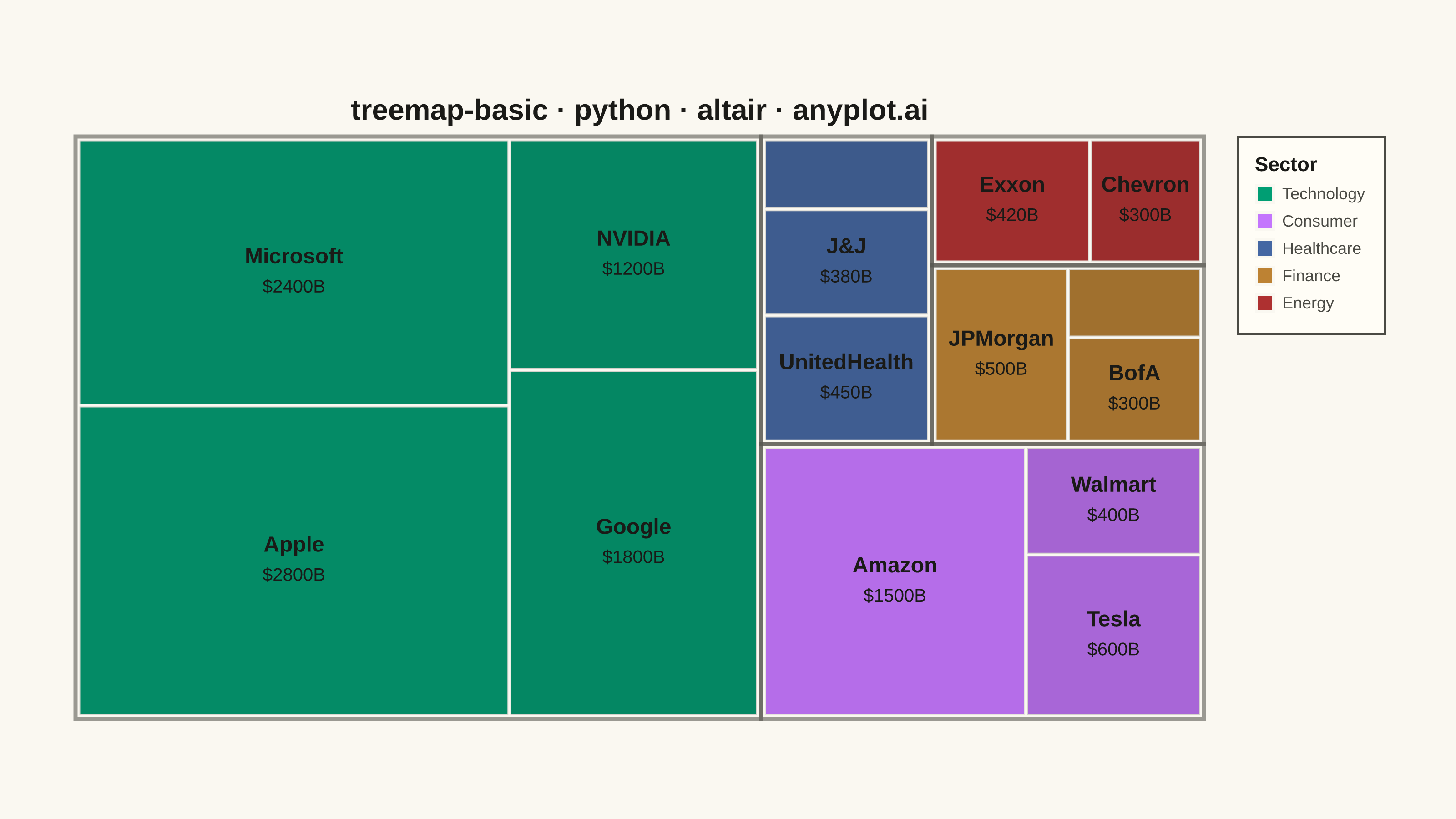
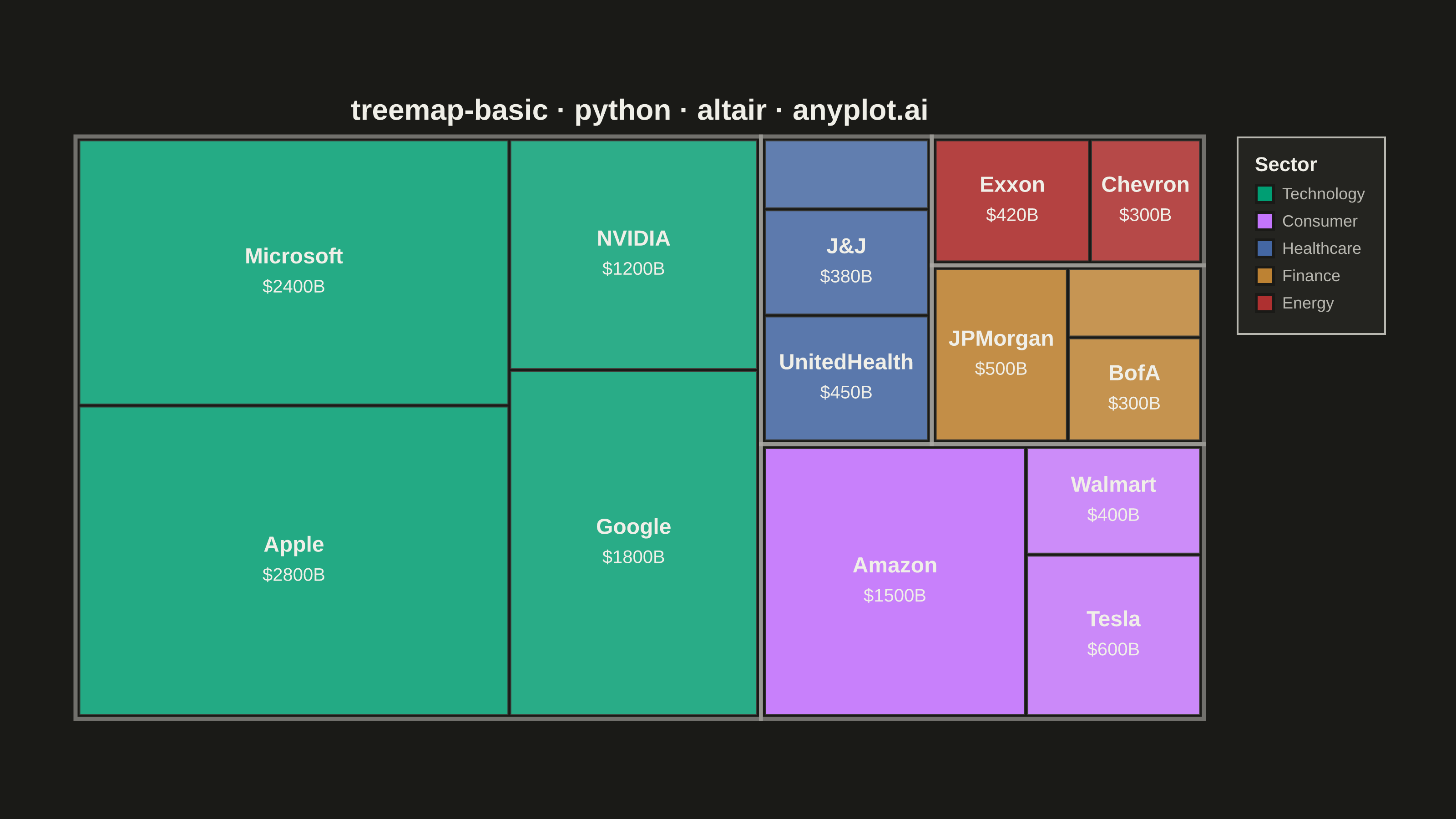
A treemap displaying hierarchical data as nested rectangles, where each rectangle's area is proportional to its value. This visualization excels at showing part-to-whole relationships in hierarchical structures, making it easy to spot large and small items at a glance. Treemaps efficiently use screen space to display large amounts of hierarchical data in a compact form.
""" anyplot.ai
treemap-basic: Basic Treemap
Library: altair 6.2.2 | Python 3.13.14
Quality: 90/100 | Updated: 2026-08-04
"""

import os
import sys

import pandas as pd


_script_dir = os.path.dirname(os.path.abspath(__file__))
if _script_dir in sys.path:
    sys.path.remove(_script_dir)
import altair as alt
from PIL import Image


# Theme tokens
THEME = os.getenv("ANYPLOT_THEME", "light")
PAGE_BG = "#FAF8F1" if THEME == "light" else "#1A1A17"
ELEVATED_BG = "#FFFDF6" if THEME == "light" else "#242420"
INK = "#1A1A17" if THEME == "light" else "#F0EFE8"
INK_SOFT = "#4A4A44" if THEME == "light" else "#B8B7B0"

# Imprint palette (categorical, canonical order)
IMPRINT = ["#009E73", "#C475FD", "#4467A3", "#BD8233", "#AE3030", "#2ABCCD", "#954477"]

# Data - market capitalization by sector and company (billions USD)
data = [
    {"category": "Technology", "subcategory": "Apple", "value": 2800},
    {"category": "Technology", "subcategory": "Microsoft", "value": 2400},
    {"category": "Technology", "subcategory": "Google", "value": 1800},
    {"category": "Technology", "subcategory": "NVIDIA", "value": 1200},
    {"category": "Finance", "subcategory": "JPMorgan", "value": 500},
    {"category": "Finance", "subcategory": "BofA", "value": 300},
    {"category": "Finance", "subcategory": "Wells Fargo", "value": 200},
    {"category": "Healthcare", "subcategory": "UnitedHealth", "value": 450},
    {"category": "Healthcare", "subcategory": "J&J", "value": 380},
    {"category": "Healthcare", "subcategory": "Pfizer", "value": 250},
    {"category": "Energy", "subcategory": "Exxon", "value": 420},
    {"category": "Energy", "subcategory": "Chevron", "value": 300},
    {"category": "Consumer", "subcategory": "Amazon", "value": 1500},
    {"category": "Consumer", "subcategory": "Walmart", "value": 400},
    {"category": "Consumer", "subcategory": "Tesla", "value": 600},
]
df = pd.DataFrame(data)

# Canvas dimensions - Altair inner view (see prompts/library/altair.md "Canvas")
width = 620
height = 320


# --- Squarified treemap layout (Bruls, Huizing & van Wijk, 2000) -----------
# A strip layout (categories as plain vertical bands) produces elongated,
# hard-to-scan slivers for small subcategories. Squarifying keeps every
# rectangle's aspect ratio close to 1:1, which is both easier to read and
# closer to how disk-usage / finance treemap tools lay hierarchy out.
def squarify(sizes, x, y, w, h):
    """Lay `sizes` (already normalized so sum(sizes) == w * h) into the
    x, y, w, h rectangle. Returns rects in the same order as `sizes`."""
    sizes = list(sizes)
    rects = []
    while sizes:
        side = min(w, h)
        row = [sizes[0]]
        for size in sizes[1:]:
            if _worst_ratio([*row, size], side) <= _worst_ratio(row, side):
                row.append(size)
            else:
                break
        row_sum = sum(row)
        if w >= h:
            row_w = row_sum / h
            ry = y
            for size in row:
                rh = (size / row_sum) * h
                rects.append((x, ry, row_w, rh))
                ry += rh
            x, w = x + row_w, w - row_w
        else:
            row_h = row_sum / w
            rx = x
            for size in row:
                rw = (size / row_sum) * w
                rects.append((rx, y, rw, row_h))
                rx += rw
            y, h = y + row_h, h - row_h
        sizes = sizes[len(row) :]
    return rects


def _worst_ratio(row, side):
    row_sum = sum(row)
    row_max, row_min = max(row), min(row)
    return max((side**2 * row_max) / row_sum**2, row_sum**2 / (side**2 * row_min))


def normalize(values, area):
    total = sum(values)
    return [v / total * area for v in values]


GUTTER_OUTER = 3.2  # gap between category groups, in view units
GUTTER_INNER = 1.1  # gap between subcategory cells within a group

category_totals = df.groupby("category")["value"].sum().sort_values(ascending=False)
sorted_cats = list(category_totals.index)
color_map = {cat: IMPRINT[i % len(IMPRINT)] for i, cat in enumerate(sorted_cats)}

cat_sizes = normalize(list(category_totals.to_numpy()), width * height)
cat_boxes_raw = squarify(cat_sizes, 0, 0, width, height)

category_boxes = []
all_rects = []
for cat, (cx, cy, cw, ch) in zip(sorted_cats, cat_boxes_raw, strict=True):
    category_boxes.append({"category": cat, "x": cx, "y": cy, "x2": cx + cw, "y2": cy + ch})

    # Inset the group so a visible gap separates it from its neighbors.
    ix, iy = cx + GUTTER_OUTER / 2, cy + GUTTER_OUTER / 2
    iw, ih = max(cw - GUTTER_OUTER, 1.0), max(ch - GUTTER_OUTER, 1.0)

    cat_df = df[df["category"] == cat].sort_values("value", ascending=False)
    cat_total = cat_df["value"].sum()
    sub_sizes = normalize(list(cat_df["value"].to_numpy()), iw * ih)
    sub_boxes = squarify(sub_sizes, ix, iy, iw, ih)

    for (_, row), (sx, sy, sw, sh) in zip(cat_df.iterrows(), sub_boxes, strict=True):
        gx, gy = min(GUTTER_INNER / 2, sw / 3), min(GUTTER_INNER / 2, sh / 3)
        dx, dy = max(sw - 2 * gx, 0.5), max(sh - 2 * gy, 0.5)
        all_rects.append(
            {
                "category": cat,
                "subcategory": row["subcategory"],
                "value": row["value"],
                "share_of_category": row["value"] / cat_total,
                "x": sx + gx,
                "y": sy + gy,
                "x2": sx + gx + dx,
                "y2": sy + gy + dy,
                "x_center": sx + gx + dx / 2,
                "y_center": sy + gy + dy / 2,
                "area": dx * dy,
            }
        )

category_df = pd.DataFrame(category_boxes)
rects_df = pd.DataFrame(all_rects)
rects_df["display_value"] = rects_df["value"].apply(lambda v: f"${v}B")

min_area_for_label = width * height * 0.018

# Group outline - a heavier border around each category shows the nesting
# depth (group -> item) independently of color.
group_outline = (
    alt.Chart(category_df)
    .mark_rect(filled=False, stroke=INK_SOFT, strokeWidth=2.2, strokeOpacity=0.55)
    .encode(
        x=alt.X("x:Q", scale=alt.Scale(domain=[0, width]), axis=None),
        y=alt.Y("y:Q", scale=alt.Scale(domain=[0, height]), axis=None),
        x2="x2:Q",
        y2="y2:Q",
    )
)

# Hover selection - a distinctly Altair/Vega-Lite feature (a declarative
# param bound to encoding channels) rather than a plain static layer.
hover = alt.selection_point(on="pointerover", fields=["subcategory"], empty=False)

cells = (
    alt.Chart(rects_df)
    .mark_rect()
    .encode(
        x=alt.X("x:Q", scale=alt.Scale(domain=[0, width]), axis=None),
        y=alt.Y("y:Q", scale=alt.Scale(domain=[0, height]), axis=None),
        x2="x2:Q",
        y2="y2:Q",
        color=alt.Color(
            "category:N",
            scale=alt.Scale(domain=list(color_map.keys()), range=list(color_map.values())),
            legend=alt.Legend(
                title="Sector",
                titleFontSize=11,
                labelFontSize=9,
                labelLimit=200,
                padding=10,
                symbolSize=90,
                orient="right",
                fillColor=ELEVATED_BG,
                strokeColor=INK_SOFT,
                titleColor=INK,
                labelColor=INK_SOFT,
            ),
        ),
        stroke=alt.condition(hover, alt.value(INK), alt.value(PAGE_BG)),
        strokeWidth=alt.condition(hover, alt.value(3.0), alt.value(1.0)),
        tooltip=[
            alt.Tooltip("category:N", title="Sector"),
            alt.Tooltip("subcategory:N", title="Company"),
            alt.Tooltip("display_value:N", title="Market Cap"),
        ],
    )
    .add_params(hover)
)

# Shading overlay - the smaller a cell is relative to its own sector, the
# more it is tinted toward the ink token. This reads as depth/weight within
# the hierarchy (per spec: "nesting depth or color shading intensity")
# without altering the underlying categorical hue used for the legend.
shading = (
    alt.Chart(rects_df)
    .mark_rect(fill=INK)
    .encode(
        x=alt.X("x:Q", scale=alt.Scale(domain=[0, width]), axis=None),
        y=alt.Y("y:Q", scale=alt.Scale(domain=[0, height]), axis=None),
        x2="x2:Q",
        y2="y2:Q",
        opacity=alt.Opacity("share_of_category:Q", scale=alt.Scale(domain=[0, 1], range=[0.22, 0.0]), legend=None),
    )
)

labels_df = rects_df[rects_df["area"] >= min_area_for_label]

name_labels = (
    alt.Chart(labels_df)
    .mark_text(fontSize=12, fontWeight="bold", color=INK, dy=-9)
    .encode(
        x=alt.X("x_center:Q", scale=alt.Scale(domain=[0, width])),
        y=alt.Y("y_center:Q", scale=alt.Scale(domain=[0, height])),
        text="subcategory:N",
    )
)

value_labels = (
    alt.Chart(labels_df)
    .mark_text(fontSize=10, color=INK, dy=8)
    .encode(
        x=alt.X("x_center:Q", scale=alt.Scale(domain=[0, width])),
        y=alt.Y("y_center:Q", scale=alt.Scale(domain=[0, height])),
        text="display_value:N",
    )
)

chart = (
    alt.layer(group_outline, cells, shading, name_labels, value_labels)
    .properties(
        width=width,
        height=height,
        background=PAGE_BG,
        title=alt.Title(text="treemap-basic · python · altair · anyplot.ai", fontSize=16, anchor="middle", color=INK),
    )
    .configure_view(strokeWidth=0, fill=PAGE_BG)
    .configure_axis(domainColor=INK_SOFT, tickColor=INK_SOFT, labelColor=INK_SOFT, titleColor=INK)
    .configure_title(color=INK)
)

# Save outputs - hard target 3200x1800 (see prompts/library/altair.md "Canvas")
chart.save(f"plot-{THEME}.png", scale_factor=4.0)
chart.save(f"plot-{THEME}.html")

TW, TH = 3200, 1800
_img = Image.open(f"plot-{THEME}.png").convert("RGB")
_w, _h = _img.size
if _w > TW or _h > TH:
    raise SystemExit(
        f"altair vl-convert produced {_w}x{_h}, exceeds target {TW}x{TH}. "
        f"Shrink chart .properties(width=, height=) values and re-render."
    )
if _w < TW or _h < TH:
    _canvas = Image.new("RGB", (TW, TH), PAGE_BG)
    _canvas.paste(_img, ((TW - _w) // 2, (TH - _h) // 2))
    _canvas.save(f"plot-{THEME}.png")
Runnable source as JSON, for any HTTP client: https://api.anyplot.ai/specs/treemap-basic/altair/code. Any spec id and library id listed in llms-full.txt fit the same URL shape; every URL below is complete and callable.
{
  "spec_id": "treemap-basic",
  "language": "python",
  "library": "altair",
  "page": "https://anyplot.ai/treemap-basic/python/altair",
  "hub": "https://anyplot.ai/treemap-basic",
  "code_json": "https://api.anyplot.ai/specs/treemap-basic/altair/code",
  "spec_json": "https://api.anyplot.ai/specs/treemap-basic",
  "render_light_png": "https://storage.googleapis.com/anyplot-images/plots/treemap-basic/python/altair/plot-light.png",
  "render_dark_png": "https://storage.googleapis.com/anyplot-images/plots/treemap-basic/python/altair/plot-dark.png",
  "interactive_light_html": "https://storage.googleapis.com/anyplot-images/plots/treemap-basic/python/altair/plot-light.html",
  "interactive_dark_html": "https://storage.googleapis.com/anyplot-images/plots/treemap-basic/python/altair/plot-dark.html",
  "quality_score": 90.0,
  "license": "MIT",
  "guide": "https://anyplot.ai/llms.txt"
}
Part of Basic Treemap on anyplot.ai.