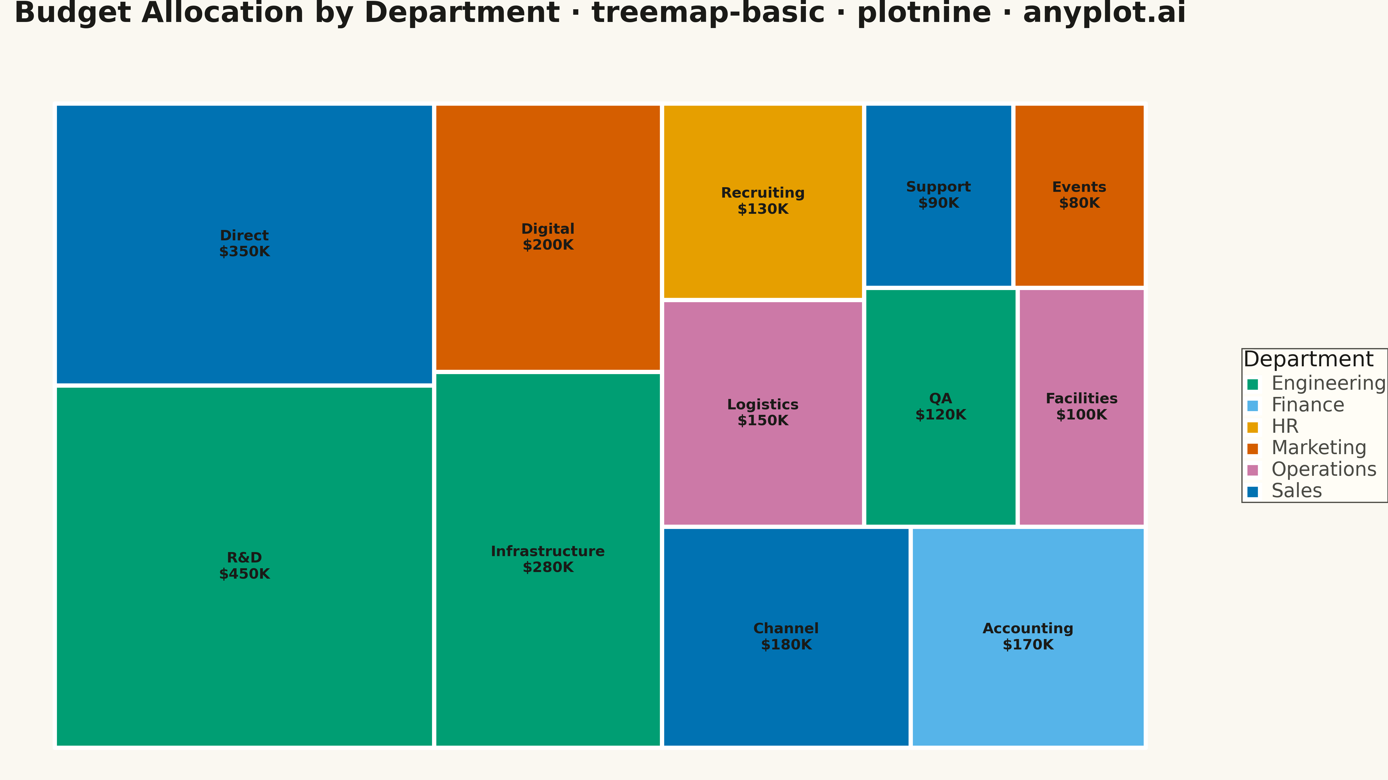
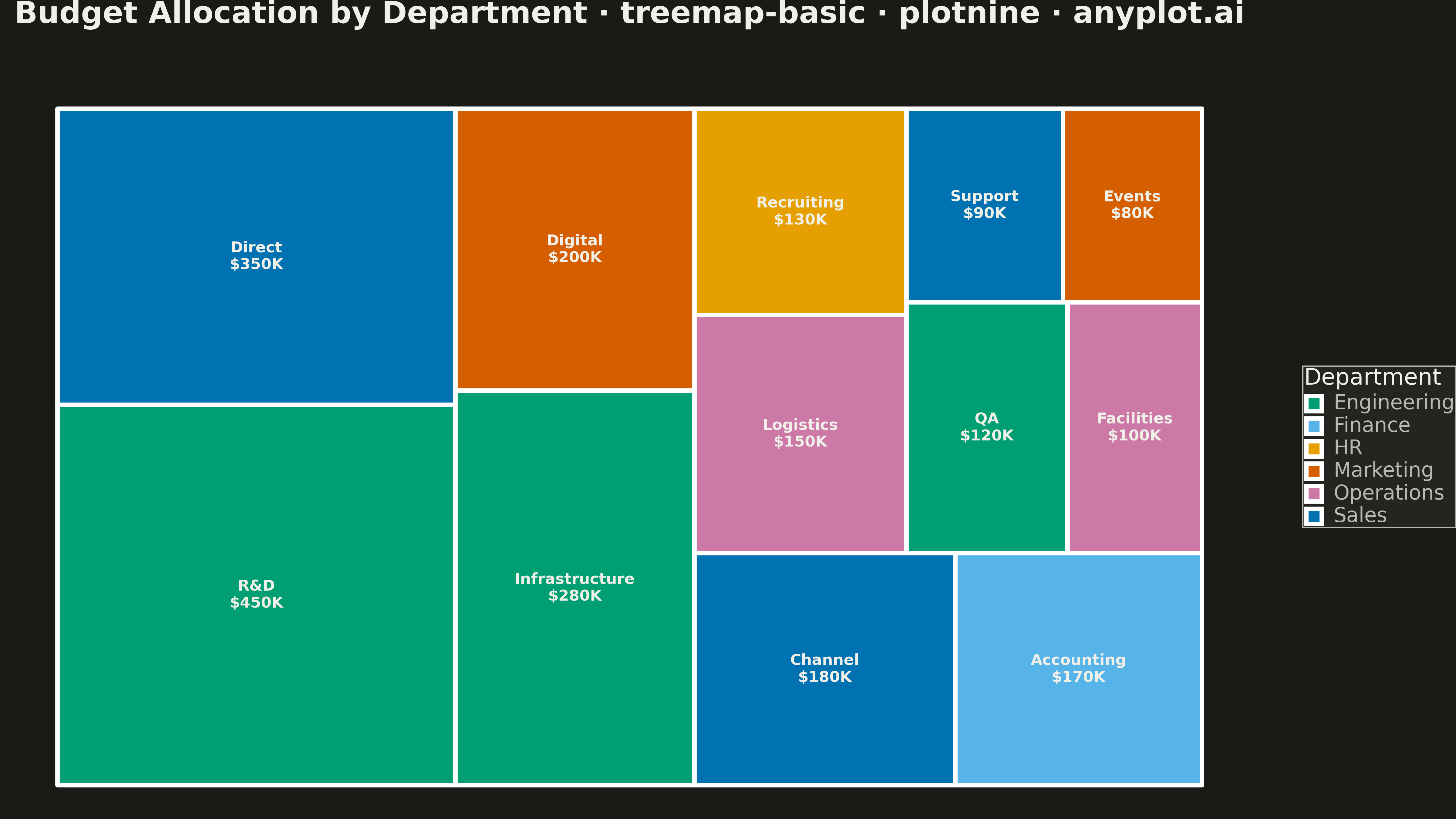
A treemap displaying hierarchical data as nested rectangles, where each rectangle's area is proportional to its value. This visualization excels at showing part-to-whole relationships in hierarchical structures, making it easy to spot large and small items at a glance. Treemaps efficiently use screen space to display large amounts of hierarchical data in a compact form.
""" anyplot.ai
treemap-basic: Basic Treemap
Library: plotnine 0.15.4 | Python 3.13.13
Quality: 80/100 | Updated: 2026-05-05
"""

import pandas as pd
from plotnine import aes, element_text, geom_rect, geom_text, ggplot, labs, scale_fill_manual, theme, theme_void


# Data - Budget allocation by department
data = {
    "category": [
        "Engineering",
        "Engineering",
        "Engineering",
        "Marketing",
        "Marketing",
        "Sales",
        "Sales",
        "Sales",
        "Operations",
        "Operations",
        "HR",
        "Finance",
    ],
    "subcategory": [
        "R&D",
        "Infrastructure",
        "QA",
        "Digital",
        "Events",
        "Direct",
        "Channel",
        "Support",
        "Logistics",
        "Facilities",
        "Recruiting",
        "Accounting",
    ],
    "value": [450, 280, 120, 200, 80, 350, 180, 90, 150, 100, 130, 170],
}
df = pd.DataFrame(data)

# Sort by value descending for better treemap layout
df = df.sort_values("value", ascending=False).reset_index(drop=True)

# Squarified treemap layout algorithm (inline)
values = df["value"].tolist()
x, y, width, height = 0, 0, 100, 56.25  # 16:9 aspect ratio
total = sum(values)
rects = []
remaining = list(enumerate(values))
curr_x, curr_y = x, y
curr_w, curr_h = width, height

while remaining:
    # Decide layout direction (horizontal or vertical)
    horizontal = curr_w >= curr_h
    remaining_total = sum(v for _, v in remaining)
    area_scale = (curr_w * curr_h) / remaining_total if remaining_total > 0 else 0

    best_row = []
    best_ratio = float("inf")

    for i in range(1, len(remaining) + 1):
        row = remaining[:i]
        row_sum = sum(v for _, v in row)
        row_area = row_sum * area_scale

        if horizontal:
            row_width = row_area / curr_h if curr_h > 0 else 0
            ratios = []
            for _, v in row:
                rect_h = (v * area_scale / row_width) if row_width > 0 else 0
                if rect_h > 0 and row_width > 0:
                    ratio = max(row_width / rect_h, rect_h / row_width)
                    ratios.append(ratio)
        else:
            row_height = row_area / curr_w if curr_w > 0 else 0
            ratios = []
            for _, v in row:
                rect_w = (v * area_scale / row_height) if row_height > 0 else 0
                if rect_w > 0 and row_height > 0:
                    ratio = max(rect_w / row_height, row_height / rect_w)
                    ratios.append(ratio)

        if ratios:
            max_ratio = max(ratios)
            if max_ratio <= best_ratio:
                best_ratio = max_ratio
                best_row = row
            else:
                break

    if not best_row:
        best_row = remaining[:1]

    # Place the best row
    row_sum = sum(v for _, v in best_row)
    row_area = row_sum * area_scale

    if horizontal:
        row_width = row_area / curr_h if curr_h > 0 else 0
        rect_y = curr_y
        for idx, v in best_row:
            rect_h = (v * area_scale / row_width) if row_width > 0 else 0
            rects.append({"idx": idx, "x": curr_x, "y": rect_y, "dx": row_width, "dy": rect_h})
            rect_y += rect_h
        curr_x += row_width
        curr_w -= row_width
    else:
        row_height = row_area / curr_w if curr_w > 0 else 0
        rect_x = curr_x
        for idx, v in best_row:
            rect_w = (v * area_scale / row_height) if row_height > 0 else 0
            rects.append({"idx": idx, "x": rect_x, "y": curr_y, "dx": rect_w, "dy": row_height})
            rect_x += rect_w
        curr_y += row_height
        curr_h -= row_height

    remaining = remaining[len(best_row) :]

# Sort by original index
rects.sort(key=lambda r: r["idx"])
rects = [{"x": r["x"], "y": r["y"], "dx": r["dx"], "dy": r["dy"]} for r in rects]

# Add rectangle coordinates to dataframe
df["x"] = [r["x"] for r in rects]
df["y"] = [r["y"] for r in rects]
df["dx"] = [r["dx"] for r in rects]
df["dy"] = [r["dy"] for r in rects]

# Calculate rectangle bounds for geom_rect
df["xmin"] = df["x"]
df["xmax"] = df["x"] + df["dx"]
df["ymin"] = df["y"]
df["ymax"] = df["y"] + df["dy"]

# Calculate center for labels
df["xcenter"] = df["x"] + df["dx"] / 2
df["ycenter"] = df["y"] + df["dy"] / 2

# Create combined label with value
df["label"] = df["subcategory"] + "\n$" + df["value"].astype(str) + "K"

# Color palette for categories (Python Blue and Yellow first, then colorblind-safe)
category_colors = {
    "Engineering": "#306998",  # Python Blue
    "Marketing": "#FFD43B",  # Python Yellow
    "Sales": "#4ECDC4",  # Teal
    "Operations": "#FF6B6B",  # Coral
    "HR": "#95E1A3",  # Light green
    "Finance": "#DDA0DD",  # Plum
}

# Create plot
plot = (
    ggplot(df)
    + geom_rect(aes(xmin="xmin", xmax="xmax", ymin="ymin", ymax="ymax", fill="category"), color="white", size=2)
    + geom_text(aes(x="xcenter", y="ycenter", label="label"), size=12, color="black", fontweight="bold")
    + scale_fill_manual(values=category_colors)
    + labs(title="Budget Allocation by Department · treemap-basic · plotnine · pyplots.ai", fill="Department")
    + theme_void()
    + theme(
        figure_size=(16, 9),
        plot_title=element_text(size=24, ha="center", weight="bold", margin={"b": 20}),
        legend_title=element_text(size=18),
        legend_text=element_text(size=16),
        legend_position="right",
    )
)

# Save
plot.save("plot.png", dpi=300, verbose=False)
Runnable source as JSON, for any HTTP client: https://api.anyplot.ai/specs/treemap-basic/plotnine/code. Any spec id and library id listed in llms-full.txt fit the same URL shape; every URL below is complete and callable.
{
  "spec_id": "treemap-basic",
  "language": "python",
  "library": "plotnine",
  "page": "https://anyplot.ai/treemap-basic/python/plotnine",
  "hub": "https://anyplot.ai/treemap-basic",
  "code_json": "https://api.anyplot.ai/specs/treemap-basic/plotnine/code",
  "spec_json": "https://api.anyplot.ai/specs/treemap-basic",
  "render_light_png": "https://storage.googleapis.com/anyplot-images/plots/treemap-basic/python/plotnine/plot-light.png",
  "render_dark_png": "https://storage.googleapis.com/anyplot-images/plots/treemap-basic/python/plotnine/plot-dark.png",
  "quality_score": 80.0,
  "license": "MIT",
  "guide": "https://anyplot.ai/llms.txt"
}
Part of Basic Treemap on anyplot.ai.