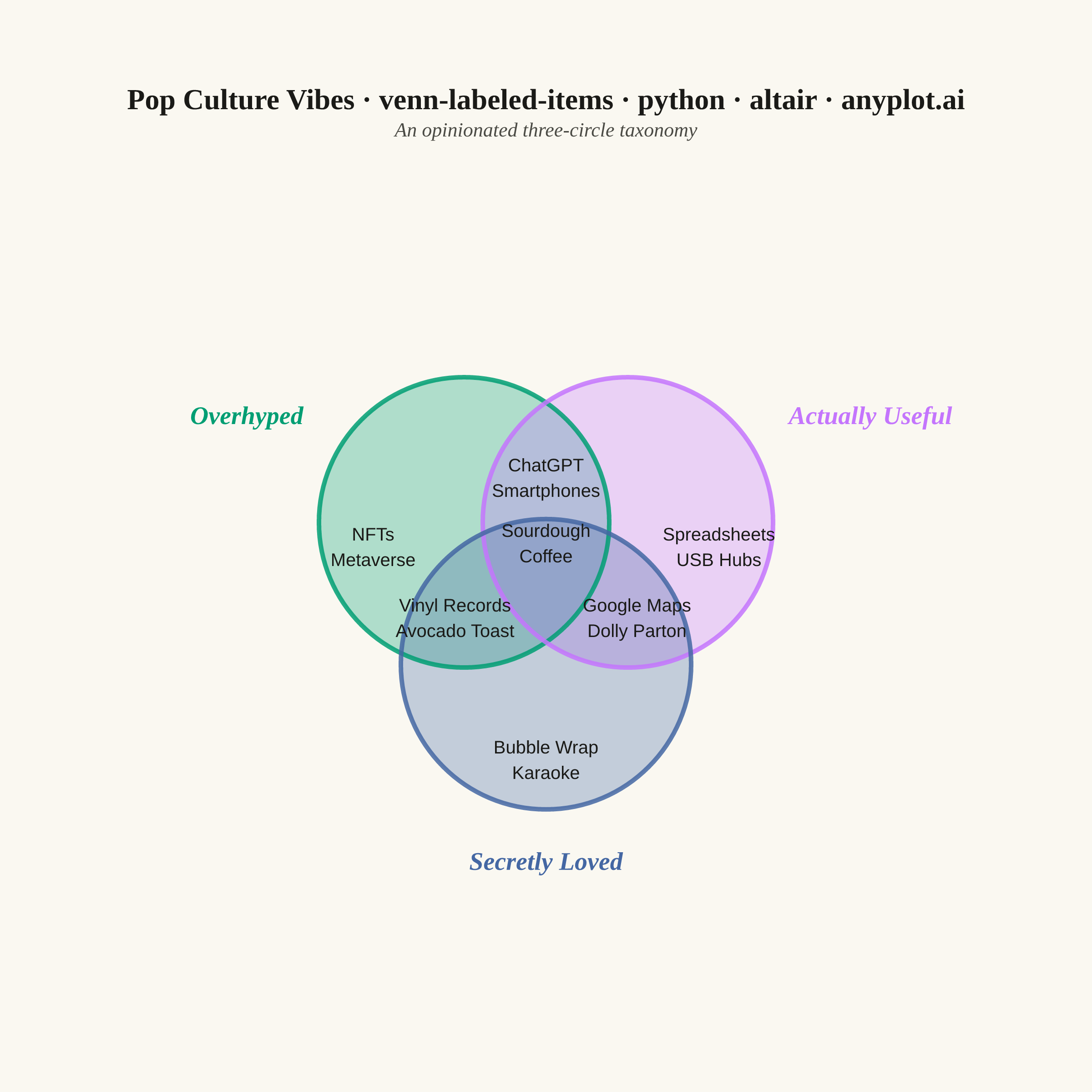
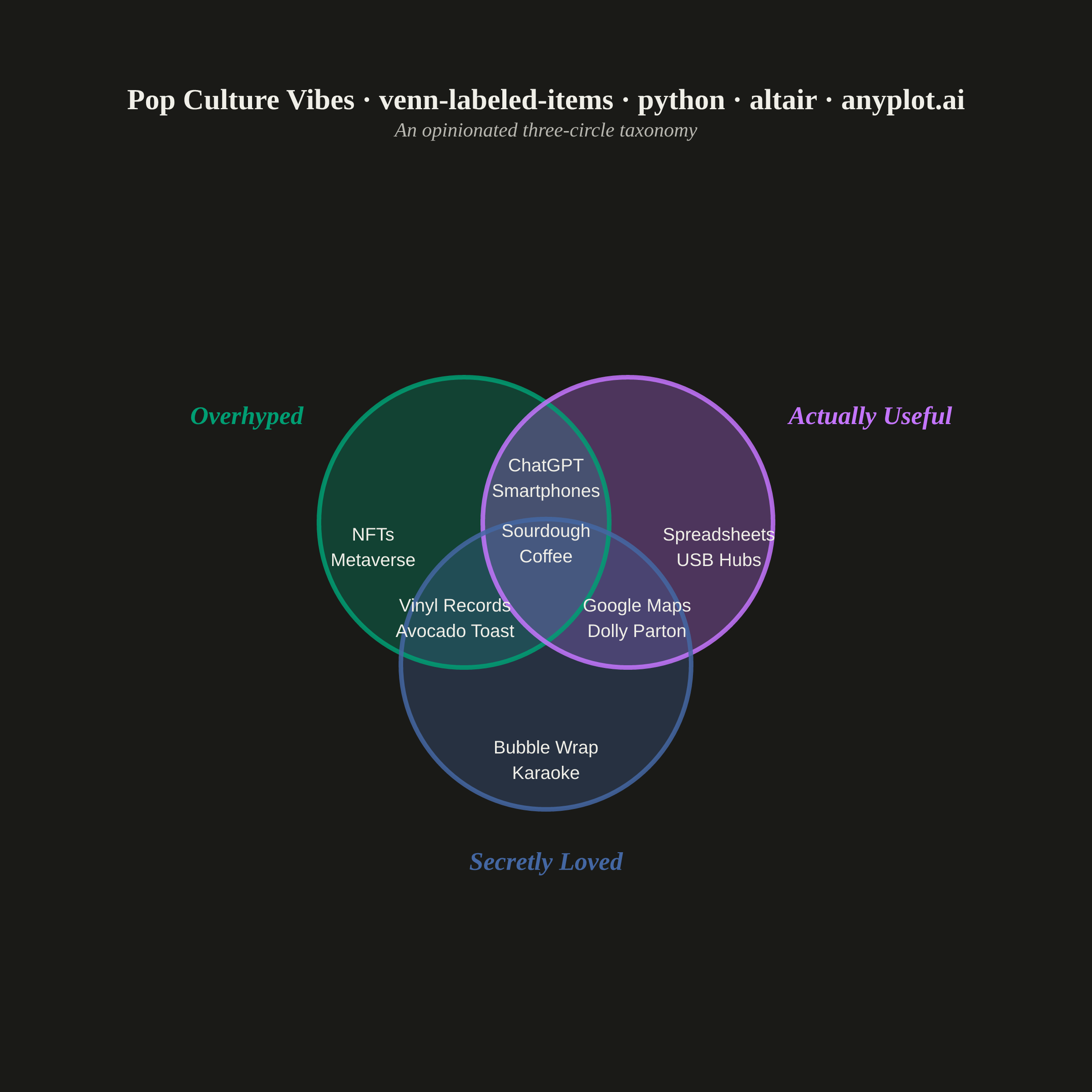
An editorial, WIRED "Chartgeist"-style three-circle Venn diagram where pop-culture items — products, people, trends, apps — are plotted as labeled points inside each zone rather than represented as numeric counts. Three overlapping circles define witty, opinionated categories (e.g., "Overhyped", "Actually Useful", "Secretly Loved"), and each item lives in exactly one of the seven interior regions (or outside all circles). Unlike a classic proportional Venn, the "data" here is categorical set-membership plus a human label, making the plot ideal for commentary, taxonomy, and discussion rather than quantitative analysis.
""" anyplot.ai
venn-labeled-items: Chartgeist-Style Venn Diagram with Labeled Items
Library: altair 6.2.2 | Python 3.13.14
Quality: 85/100 | Updated: 2026-06-25
"""

import importlib
import math
import os
import sys
from collections import defaultdict


# Drop script dir from sys.path so `altair` package resolves, not this file
sys.path[:] = [p for p in sys.path if os.path.abspath(p or ".") != os.path.dirname(os.path.abspath(__file__))]
alt = importlib.import_module("altair")
pd = importlib.import_module("pandas")

THEME = os.getenv("ANYPLOT_THEME", "light")
PAGE_BG = "#FAF8F1" if THEME == "light" else "#1A1A17"
INK = "#1A1A17" if THEME == "light" else "#F0EFE8"
INK_SOFT = "#4A4A44" if THEME == "light" else "#B8B7B0"

# Imprint palette — first series is always #009E73
COLOR_A = "#009E73"
COLOR_B = "#C475FD"
COLOR_C = "#4467A3"

# Canvas: square 2400×2400 target (inner view 500×460, scale_factor=4.0)
CANVAS_W = 500
CANVAS_H = 460
TARGET_W, TARGET_H = 2400, 2400

# Symmetric three-circle Venn layout in a 500×460 coordinate space.
# center_y=240 (below midpoint) shifts diagram toward canvas bottom, reducing empty lower space.
center_x, center_y = 250.0, 240.0
RADIUS = 90.0
OFFSET = RADIUS / math.sqrt(3)  # ≈ 51.96

cx_a = center_x - OFFSET * math.sin(math.radians(60))  # ≈ 205
cy_a = center_y + OFFSET * math.cos(math.radians(60))  # ≈ 266
cx_b = center_x + OFFSET * math.sin(math.radians(60))  # ≈ 295
cy_b = cy_a
cx_c = center_x  # 250
cy_c = center_y - OFFSET  # ≈ 188

df_circles = pd.DataFrame(
    [
        {"name": "Overhyped", "x": cx_a, "y": cy_a, "color": COLOR_A},
        {"name": "Actually Useful", "x": cx_b, "y": cy_b, "color": COLOR_B},
        {"name": "Secretly Loved", "x": cx_c, "y": cy_c, "color": COLOR_C},
    ]
)

# Category labels — placed outside each circle on the side away from the diagram centre
label_a_x = cx_a + math.cos(math.radians(150)) * (RADIUS + 12)
label_a_y = cy_a + math.sin(math.radians(150)) * (RADIUS + 12)
label_b_x = cx_b + math.cos(math.radians(30)) * (RADIUS + 12)
label_b_y = cy_b + math.sin(math.radians(30)) * (RADIUS + 12)
label_c_x = cx_c
label_c_y = cy_c - (RADIUS + 12)

items_raw = [
    ("NFTs", "A"),
    ("Metaverse", "A"),
    ("Spreadsheets", "B"),
    ("USB Hubs", "B"),
    ("Bubble Wrap", "C"),
    ("Karaoke", "C"),
    ("ChatGPT", "AB"),
    ("Smartphones", "AB"),
    ("Vinyl Records", "AC"),
    ("Avocado Toast", "AC"),
    ("Google Maps", "BC"),
    ("Dolly Parton", "BC"),
    ("Sourdough", "ABC"),
    ("Coffee", "ABC"),
]

# Geometric centroids of each Venn region, verified to lie in the correct zone.
# AC/BC pushed outward (x±50) and downward (y-41) from original to separate from
# the ABC centroid, eliminating the collision in the densely-packed centre cluster.
zone_centers = {
    "A": (155.0, 252.0),
    "B": (345.0, 252.0),
    "C": (250.0, 135.0),
    "AB": (250.0, 290.0),
    "AC": (200.0, 213.0),
    "BC": (300.0, 213.0),
    "ABC": (250.0, 254.0),
}

LINE_HEIGHT = 14.0
zone_to_items = defaultdict(list)
for lbl, zone in items_raw:
    zone_to_items[zone].append(lbl)

records = []
for zone, labels in zone_to_items.items():
    cx_zone, cy_zone = zone_centers[zone]
    n = len(labels)
    start_y = cy_zone + (n - 1) * LINE_HEIGHT / 2
    for idx, label in enumerate(labels):
        records.append({"label": label, "zone": zone, "x": cx_zone, "y": start_y - idx * LINE_HEIGHT})
df_items = pd.DataFrame(records)

domain_x = [0, CANVAS_W]
domain_y = [0, CANVAS_H]
# circle_size: mark_point size is area in px² at view scale; radius = RADIUS px (1 data unit = 1 px here)
circle_size = math.pi * RADIUS * RADIUS

filled_circles = (
    alt.Chart(df_circles)
    .mark_point(shape="circle", filled=True, opacity=0.30, strokeWidth=0)
    .encode(
        x=alt.X("x:Q", scale=alt.Scale(domain=domain_x), axis=None),
        y=alt.Y("y:Q", scale=alt.Scale(domain=domain_y), axis=None),
        color=alt.Color("color:N", scale=None, legend=None),
        size=alt.value(circle_size),
    )
)

outline_circles = (
    alt.Chart(df_circles)
    .mark_point(shape="circle", filled=False, strokeWidth=2.5, opacity=0.85)
    .encode(
        x=alt.X("x:Q", scale=alt.Scale(domain=domain_x), axis=None),
        y=alt.Y("y:Q", scale=alt.Scale(domain=domain_y), axis=None),
        stroke=alt.Color("color:N", scale=None, legend=None),
        size=alt.value(circle_size),
    )
)

label_a = (
    alt.Chart(pd.DataFrame([{"x": label_a_x, "y": label_a_y}]))
    .mark_text(
        text="Overhyped",
        fontSize=14,
        fontWeight="bold",
        fontStyle="italic",
        font="serif",
        color=COLOR_A,
        align="right",
        baseline="bottom",
    )
    .encode(
        x=alt.X("x:Q", scale=alt.Scale(domain=domain_x), axis=None),
        y=alt.Y("y:Q", scale=alt.Scale(domain=domain_y), axis=None),
    )
)

label_b = (
    alt.Chart(pd.DataFrame([{"x": label_b_x, "y": label_b_y}]))
    .mark_text(
        text="Actually Useful",
        fontSize=14,
        fontWeight="bold",
        fontStyle="italic",
        font="serif",
        color=COLOR_B,
        align="left",
        baseline="bottom",
    )
    .encode(
        x=alt.X("x:Q", scale=alt.Scale(domain=domain_x), axis=None),
        y=alt.Y("y:Q", scale=alt.Scale(domain=domain_y), axis=None),
    )
)

label_c = (
    alt.Chart(pd.DataFrame([{"x": label_c_x, "y": label_c_y}]))
    .mark_text(
        text="Secretly Loved",
        fontSize=14,
        fontWeight="bold",
        fontStyle="italic",
        font="serif",
        color=COLOR_C,
        align="center",
        baseline="top",
    )
    .encode(
        x=alt.X("x:Q", scale=alt.Scale(domain=domain_x), axis=None),
        y=alt.Y("y:Q", scale=alt.Scale(domain=domain_y), axis=None),
    )
)

item_labels = (
    alt.Chart(df_items)
    .mark_text(fontSize=10, color=INK, fontWeight="normal")
    .encode(
        x=alt.X("x:Q", scale=alt.Scale(domain=domain_x), axis=None),
        y=alt.Y("y:Q", scale=alt.Scale(domain=domain_y), axis=None),
        text="label:N",
    )
)

chart = (
    alt.layer(filled_circles, outline_circles, label_a, label_b, label_c, item_labels)
    .properties(
        width=CANVAS_W,
        height=CANVAS_H,
        background=PAGE_BG,
        title=alt.Title(
            text="Pop Culture Vibes · venn-labeled-items · python · altair · anyplot.ai",
            subtitle="An opinionated three-circle taxonomy",
            fontSize=16,
            subtitleFontSize=11,
            color=INK,
            subtitleColor=INK_SOFT,
            anchor="middle",
            font="serif",
            subtitleFont="serif",
            subtitleFontStyle="italic",
            offset=16,
        ),
        padding={"left": 20, "right": 20, "top": 10, "bottom": 10},
    )
    .configure_view(fill=PAGE_BG, stroke=None)
)

chart.save(f"plot-{THEME}.png", scale_factor=4.0)

# Pad to exact 2400×2400 — vl-convert may land slightly short; never crop
from PIL import Image as PILImage


_img = PILImage.open(f"plot-{THEME}.png").convert("RGB")
_w, _h = _img.size
if _w > TARGET_W or _h > TARGET_H:
    raise SystemExit(
        f"vl-convert produced {_w}×{_h}, exceeds target {TARGET_W}×{TARGET_H}. Shrink chart width/height and re-render."
    )
if _w < TARGET_W or _h < TARGET_H:
    _canvas = PILImage.new("RGB", (TARGET_W, TARGET_H), PAGE_BG)
    _canvas.paste(_img, ((TARGET_W - _w) // 2, (TARGET_H - _h) // 2))
    _canvas.save(f"plot-{THEME}.png")

chart.save(f"plot-{THEME}.html")
Runnable source as JSON, for any HTTP client: https://api.anyplot.ai/specs/venn-labeled-items/altair/code. Any spec id and library id listed in llms-full.txt fit the same URL shape; every URL below is complete and callable.
{
  "spec_id": "venn-labeled-items",
  "language": "python",
  "library": "altair",
  "page": "https://anyplot.ai/venn-labeled-items/python/altair",
  "hub": "https://anyplot.ai/venn-labeled-items",
  "code_json": "https://api.anyplot.ai/specs/venn-labeled-items/altair/code",
  "spec_json": "https://api.anyplot.ai/specs/venn-labeled-items",
  "render_light_png": "https://storage.googleapis.com/anyplot-images/plots/venn-labeled-items/python/altair/plot-light.png",
  "render_dark_png": "https://storage.googleapis.com/anyplot-images/plots/venn-labeled-items/python/altair/plot-dark.png",
  "interactive_light_html": "https://storage.googleapis.com/anyplot-images/plots/venn-labeled-items/python/altair/plot-light.html",
  "interactive_dark_html": "https://storage.googleapis.com/anyplot-images/plots/venn-labeled-items/python/altair/plot-dark.html",
  "quality_score": 85.0,
  "license": "MIT",
  "guide": "https://anyplot.ai/llms.txt"
}
Part of Chartgeist-Style Venn Diagram with Labeled Items on anyplot.ai.