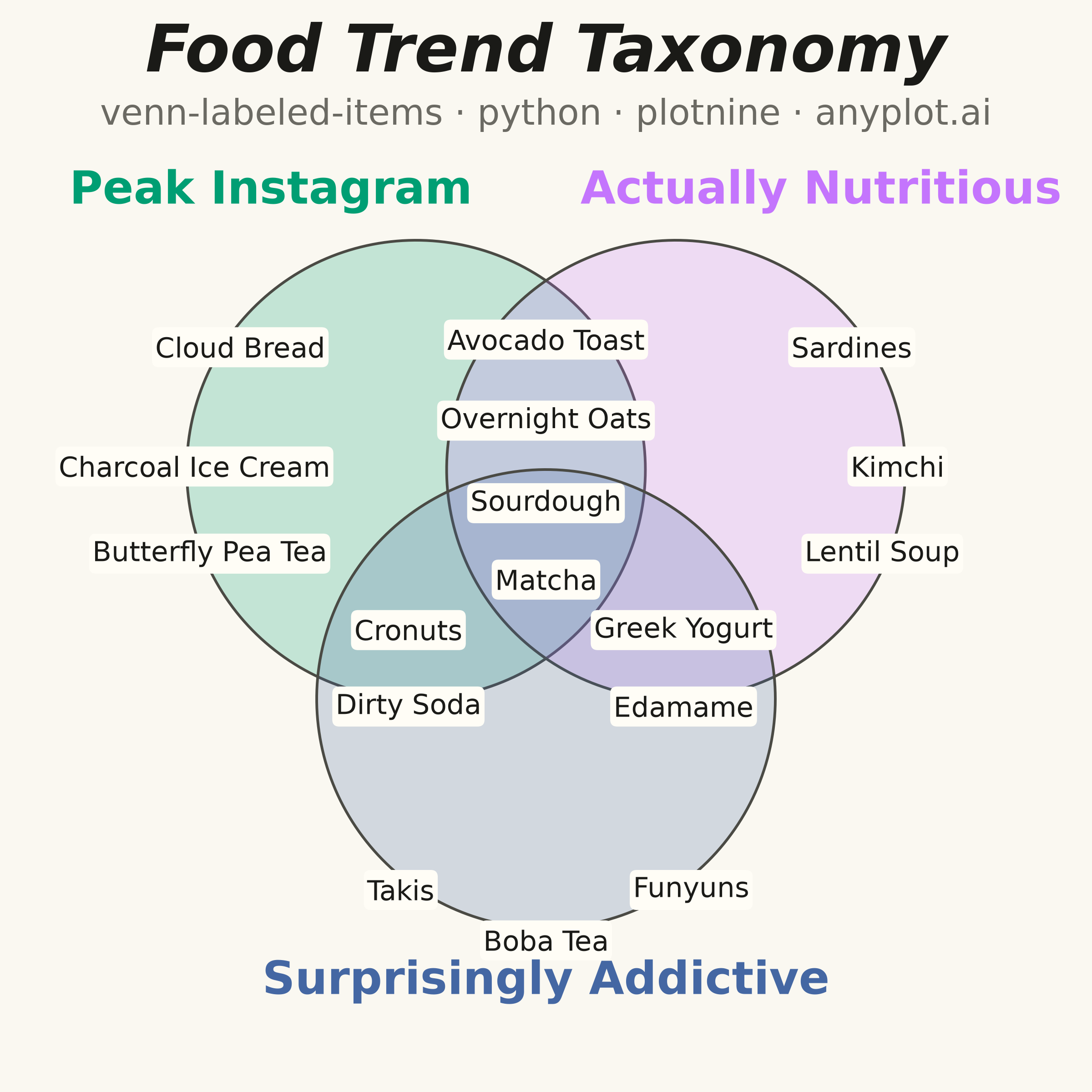
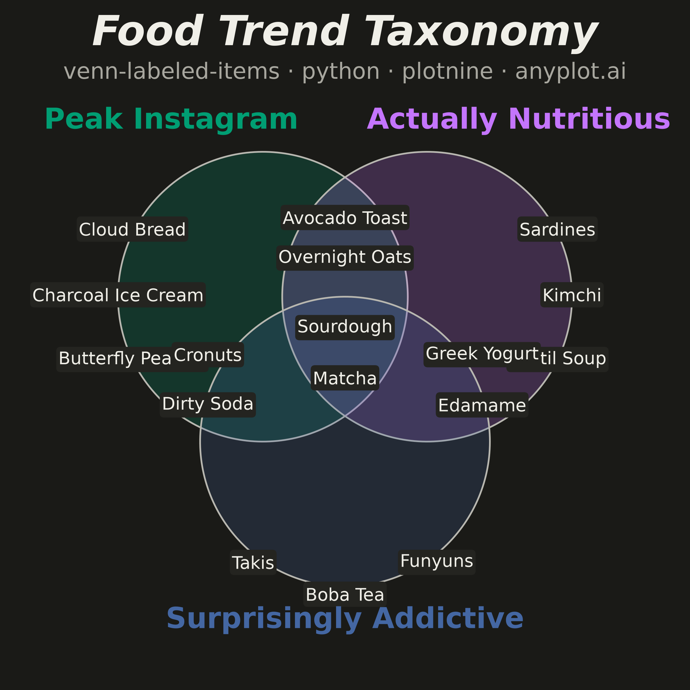
An editorial, WIRED "Chartgeist"-style three-circle Venn diagram where pop-culture items — products, people, trends, apps — are plotted as labeled points inside each zone rather than represented as numeric counts. Three overlapping circles define witty, opinionated categories (e.g., "Overhyped", "Actually Useful", "Secretly Loved"), and each item lives in exactly one of the seven interior regions (or outside all circles). Unlike a classic proportional Venn, the "data" here is categorical set-membership plus a human label, making the plot ideal for commentary, taxonomy, and discussion rather than quantitative analysis.
""" anyplot.ai
venn-labeled-items: Chartgeist-Style Venn Diagram with Labeled Items
Library: plotnine 0.15.7 | Python 3.13.14
Quality: 88/100 | Updated: 2026-06-25
"""

import os
import sys


_HERE = os.path.dirname(os.path.abspath(__file__))
sys.path = [p for p in sys.path if os.path.abspath(p) != _HERE]

import numpy as np
import pandas as pd
from plotnine import (
    aes,
    coord_fixed,
    element_blank,
    element_rect,
    geom_label,
    geom_polygon,
    geom_text,
    ggplot,
    scale_color_identity,
    scale_fill_identity,
    scale_x_continuous,
    scale_y_continuous,
    theme,
)


# Theme tokens
THEME = os.getenv("ANYPLOT_THEME", "light")
PAGE_BG = "#FAF8F1" if THEME == "light" else "#1A1A17"
ELEVATED_BG = "#FFFDF6" if THEME == "light" else "#242420"
INK = "#1A1A17" if THEME == "light" else "#F0EFE8"
INK_SOFT = "#4A4A44" if THEME == "light" else "#B8B7B0"
INK_MUTED = "#6B6A63" if THEME == "light" else "#A8A79F"

# Imprint palette positions 1–3
COLOR_A = "#009E73"
COLOR_B = "#C475FD"
COLOR_C = "#4467A3"

# Symmetric three-circle Venn geometry
RADIUS = 1.5
circle_meta = [
    ("Peak Instagram", -0.85, 0.50, COLOR_A),
    ("Actually Nutritious", 0.85, 0.50, COLOR_B),
    ("Surprisingly Addictive", 0.00, -1.00, COLOR_C),
]

theta = np.linspace(0, 2 * np.pi, 240)
circle_rows = []
for name, cx, cy, color in circle_meta:
    for t in theta:
        circle_rows.append({"name": name, "x": cx + RADIUS * np.cos(t), "y": cy + RADIUS * np.sin(t), "fill": color})
circles_df = pd.DataFrame(circle_rows)

# Items placed in their assigned Venn zones
items_df = pd.DataFrame(
    [
        # A only — Peak Instagram (upper-left)
        ("Cloud Bread", -2.00, 1.30),
        ("Charcoal Ice Cream", -2.30, 0.52),
        ("Butterfly Pea Tea", -2.20, -0.05),
        # B only — Actually Nutritious (upper-right)
        ("Sardines", 2.00, 1.30),
        ("Kimchi", 2.30, 0.52),
        ("Lentil Soup", 2.20, -0.05),
        # C only — Surprisingly Addictive (bottom)
        ("Takis", -0.95, -2.25),
        ("Boba Tea", 0.00, -2.58),
        ("Funyuns", 0.95, -2.25),
        # A ∩ B — photogenic and nutritious (top center)
        ("Avocado Toast", 0.00, 1.35),
        ("Overnight Oats", 0.00, 0.82),
        # A ∩ C — photogenic and addictive (lower left, centered in zone)
        ("Cronuts", -0.90, -0.55),
        ("Dirty Soda", -0.90, -1.05),
        # B ∩ C — nutritious and addictive (lower right, centered in zone)
        ("Greek Yogurt", 0.90, -0.55),
        ("Edamame", 0.90, -1.05),
        # A ∩ B ∩ C (center)
        ("Sourdough", 0.00, 0.28),
        ("Matcha", 0.00, -0.22),
    ],
    columns=["label", "x", "y"],
)

# Consolidated category labels — one DataFrame, one geom_text layer
cat_df = pd.DataFrame(
    {
        "label": ["Peak Instagram", "Actually Nutritious", "Surprisingly Addictive"],
        "x": [-1.80, 1.80, 0.00],
        "y": [2.32, 2.32, -2.85],
        "color": [COLOR_A, COLOR_B, COLOR_C],
    }
)

# Editorial title and spec subtitle
title_df = pd.DataFrame({"label": ["Food Trend Taxonomy"], "x": [0.0], "y": [3.22], "color": [INK]})
subtitle_df = pd.DataFrame(
    {"label": ["venn-labeled-items · python · plotnine · anyplot.ai"], "x": [0.0], "y": [2.82], "color": [INK_MUTED]}
)

# Plot
plot = (
    ggplot()
    + geom_polygon(
        data=circles_df, mapping=aes(x="x", y="y", group="name", fill="fill"), color=INK_SOFT, alpha=0.22, size=0.6
    )
    # geom_label gives each item a clean background box — more readable in overlapping zones
    + geom_label(
        data=items_df,
        mapping=aes(x="x", y="y", label="label"),
        size=11,
        color=INK,
        fill=ELEVATED_BG,
        label_size=0,
        label_padding=0.12,
        family="serif",
    )
    # Consolidated category label layer (was three separate geom_text calls)
    + geom_text(
        data=cat_df,
        mapping=aes(x="x", y="y", label="label", color="color"),
        size=18,
        fontweight="bold",
        family="serif",
        ha="center",
    )
    + geom_text(
        data=title_df,
        mapping=aes(x="x", y="y", label="label", color="color"),
        size=26,
        fontweight="bold",
        fontstyle="italic",
        family="serif",
    )
    + geom_text(data=subtitle_df, mapping=aes(x="x", y="y", label="label", color="color"), size=14, family="serif")
    + scale_fill_identity()
    + scale_color_identity()
    + scale_x_continuous(limits=(-3.5, 3.5), expand=(0, 0))
    + scale_y_continuous(limits=(-3.5, 3.5), expand=(0, 0))
    + coord_fixed(ratio=1)
    + theme(
        figure_size=(6, 6),
        plot_background=element_rect(fill=PAGE_BG, color=PAGE_BG),
        panel_background=element_rect(fill=PAGE_BG, color=PAGE_BG),
        axis_title=element_blank(),
        axis_text=element_blank(),
        axis_ticks=element_blank(),
        axis_line=element_blank(),
        panel_grid_major=element_blank(),
        panel_grid_minor=element_blank(),
        legend_position="none",
    )
)

plot.save(f"plot-{THEME}.png", dpi=400, width=6, height=6, units="in", verbose=False)
Runnable source as JSON, for any HTTP client: https://api.anyplot.ai/specs/venn-labeled-items/plotnine/code. Any spec id and library id listed in llms-full.txt fit the same URL shape; every URL below is complete and callable.
{
  "spec_id": "venn-labeled-items",
  "language": "python",
  "library": "plotnine",
  "page": "https://anyplot.ai/venn-labeled-items/python/plotnine",
  "hub": "https://anyplot.ai/venn-labeled-items",
  "code_json": "https://api.anyplot.ai/specs/venn-labeled-items/plotnine/code",
  "spec_json": "https://api.anyplot.ai/specs/venn-labeled-items",
  "render_light_png": "https://storage.googleapis.com/anyplot-images/plots/venn-labeled-items/python/plotnine/plot-light.png",
  "render_dark_png": "https://storage.googleapis.com/anyplot-images/plots/venn-labeled-items/python/plotnine/plot-dark.png",
  "quality_score": 88.0,
  "license": "MIT",
  "guide": "https://anyplot.ai/llms.txt"
}
Part of Chartgeist-Style Venn Diagram with Labeled Items on anyplot.ai.