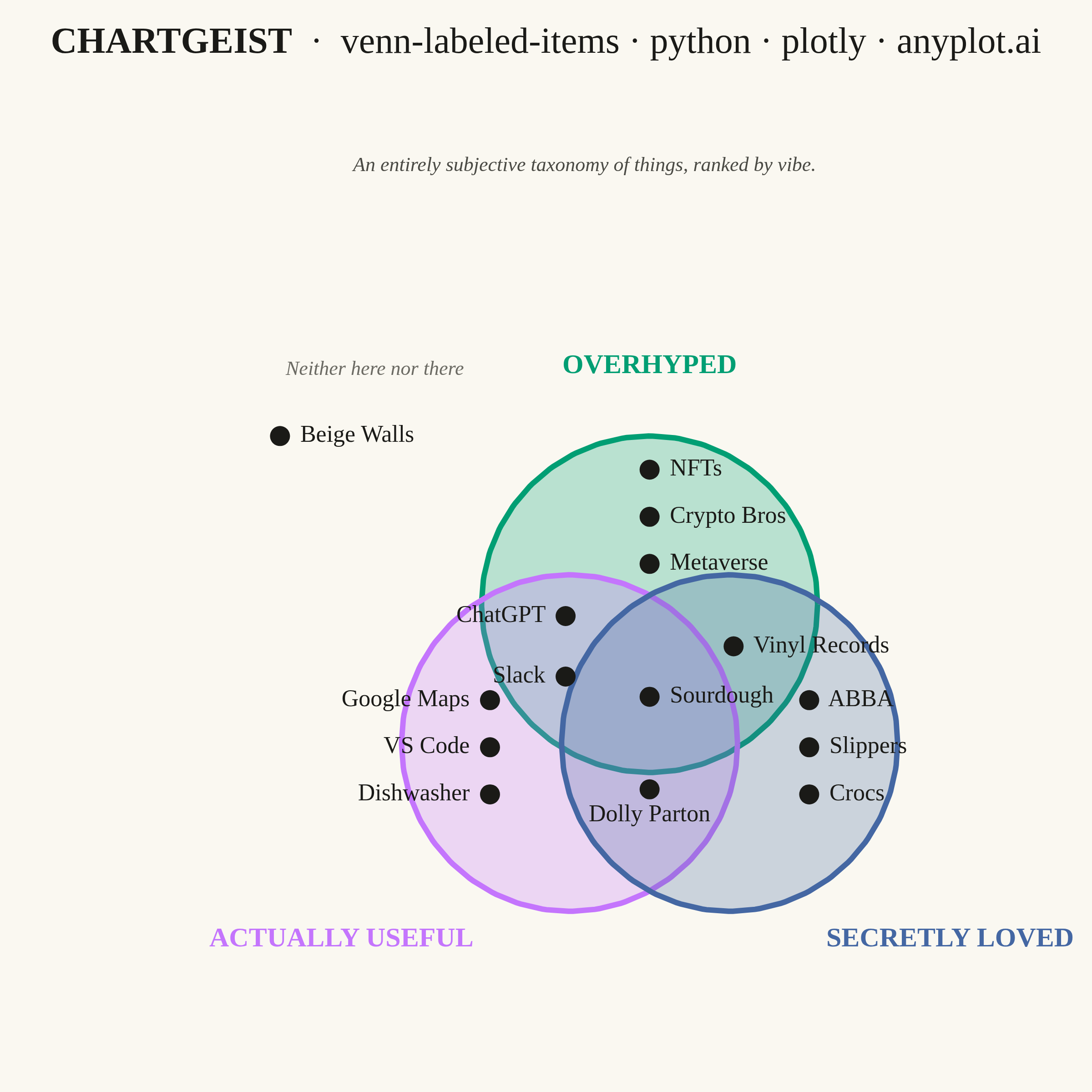
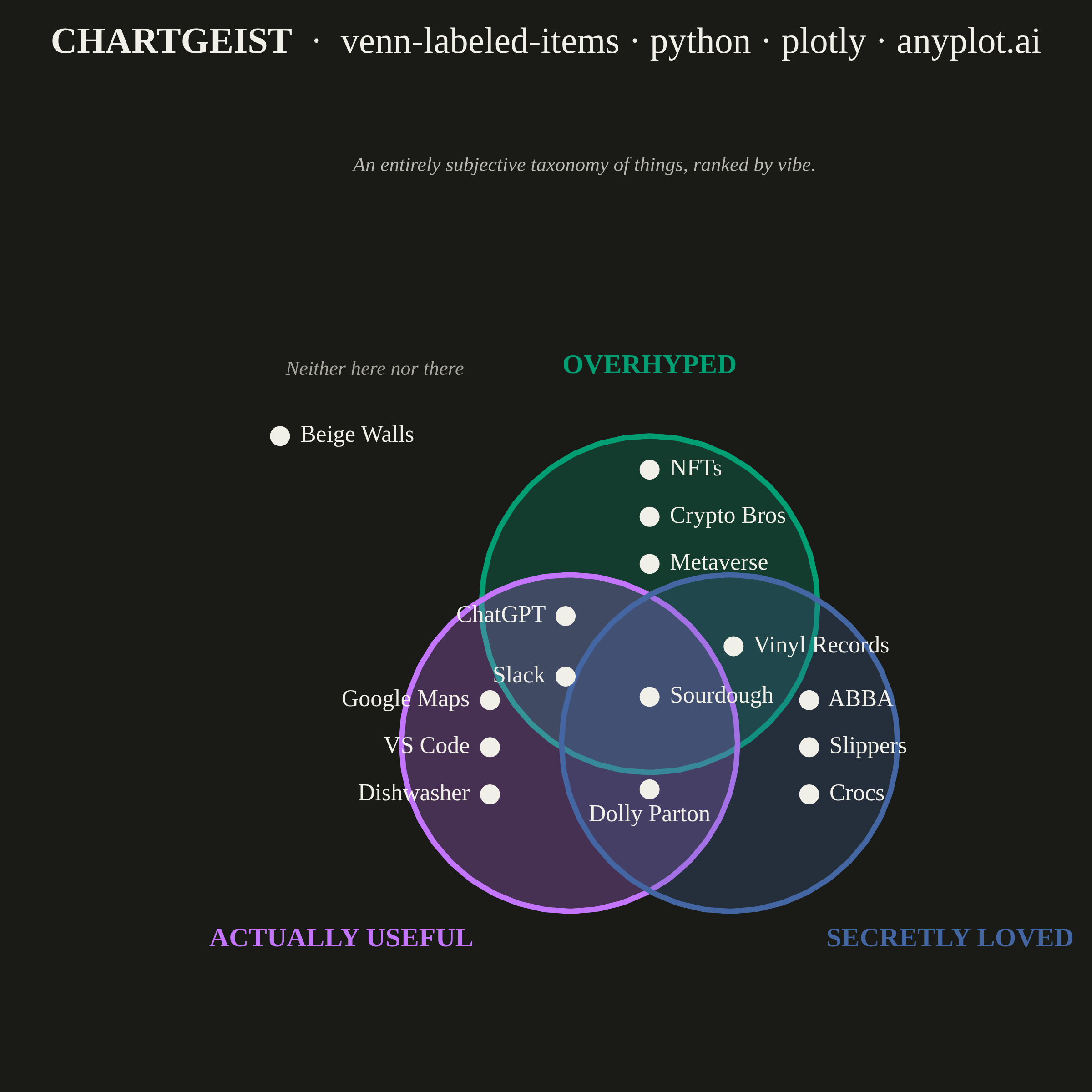
An editorial, WIRED "Chartgeist"-style three-circle Venn diagram where pop-culture items — products, people, trends, apps — are plotted as labeled points inside each zone rather than represented as numeric counts. Three overlapping circles define witty, opinionated categories (e.g., "Overhyped", "Actually Useful", "Secretly Loved"), and each item lives in exactly one of the seven interior regions (or outside all circles). Unlike a classic proportional Venn, the "data" here is categorical set-membership plus a human label, making the plot ideal for commentary, taxonomy, and discussion rather than quantitative analysis.
""" anyplot.ai
venn-labeled-items: Chartgeist-Style Venn Diagram with Labeled Items
Library: plotly 6.8.0 | Python 3.13.14
Quality: 84/100 | Updated: 2026-06-25
"""

import os

import numpy as np
import plotly.graph_objects as go


# Theme tokens
THEME = os.getenv("ANYPLOT_THEME", "light")
PAGE_BG = "#FAF8F1" if THEME == "light" else "#1A1A17"
INK = "#1A1A17" if THEME == "light" else "#F0EFE8"
INK_SOFT = "#4A4A44" if THEME == "light" else "#B8B7B0"
INK_MUTED = "#6B6A63" if THEME == "light" else "#A8A79F"

# Imprint categorical palette — first series is brand green
CIRCLE_COLORS = ["#009E73", "#C475FD", "#4467A3"]
CIRCLE_FILLS = ["rgba(0, 158, 115, 0.26)", "rgba(196, 117, 253, 0.26)", "rgba(68, 103, 163, 0.26)"]

# Data: editorial Chartgeist-style commentary on tech/culture
circles = [{"name": "Overhyped"}, {"name": "Actually Useful"}, {"name": "Secretly Loved"}]

items = [
    {"label": "NFTs", "zone": "A"},
    {"label": "Crypto Bros", "zone": "A"},
    {"label": "Metaverse", "zone": "A"},
    {"label": "Google Maps", "zone": "B"},
    {"label": "VS Code", "zone": "B"},
    {"label": "Dishwasher", "zone": "B"},
    {"label": "ABBA", "zone": "C"},
    {"label": "Slippers", "zone": "C"},
    {"label": "Crocs", "zone": "C"},
    {"label": "ChatGPT", "zone": "AB"},
    {"label": "Slack", "zone": "AB"},
    {"label": "Vinyl Records", "zone": "AC"},
    {"label": "Dolly Parton", "zone": "BC"},
    {"label": "Sourdough", "zone": "ABC"},
    {"label": "Beige Walls", "zone": "outside"},
]

# Three-circle symmetric Venn layout
radius = 1.0
angles = [np.pi / 2, np.pi / 2 + 2 * np.pi / 3, np.pi / 2 + 4 * np.pi / 3]
center_dist = 0.55
cx = [center_dist * np.cos(a) for a in angles]
cy = [center_dist * np.sin(a) for a in angles]

# Per-zone anchor (x, y, textposition) with outward-pointing alignment:
# items in the left sector point left ('middle left'), right sector point right,
# bottom-center zone floats below its marker, outside cluster reads rightward.
zone_anchors = {
    "A": (0.0, 1.07, "middle right"),
    "B": (-0.95, -0.30, "middle left"),
    "C": (0.95, -0.30, "middle right"),
    "AB": (-0.50, 0.30, "middle left"),
    "AC": (0.50, 0.30, "middle right"),
    "BC": (0.0, -0.55, "bottom center"),
    "ABC": (0.0, 0.0, "middle right"),
    "outside": (-2.20, 1.55, "middle right"),
}

# Spread offsets when multiple items share a zone (in data units, spread vertically)
zone_offsets = {
    1: [(0.0, 0.0)],
    2: [(0.0, 0.18), (0.0, -0.18)],
    3: [(0.0, 0.28), (0.0, 0.0), (0.0, -0.28)],
    4: [(0.0, 0.42), (0.0, 0.14), (0.0, -0.14), (0.0, -0.42)],
}

# Group items by zone, compute final coords
zones_grouped: dict[str, list[str]] = {}
for it in items:
    zones_grouped.setdefault(it["zone"], []).append(it["label"])

placed = []
for zone, labels in zones_grouped.items():
    ax, ay, tpos = zone_anchors[zone]
    n = len(labels)
    offsets = zone_offsets.get(n, [(i * 0.28 - 0.14 * (n - 1), 0.0) for i in range(n)])
    for label, (dx, dy) in zip(labels, offsets, strict=False):
        placed.append((ax + dx, ay + dy, label, zone, tpos))

# Build figure
fig = go.Figure()

# Filled circles
theta = np.linspace(0, 2 * np.pi, 240)
for i in range(3):
    fig.add_trace(
        go.Scatter(
            x=cx[i] + radius * np.cos(theta),
            y=cy[i] + radius * np.sin(theta),
            fill="toself",
            fillcolor=CIRCLE_FILLS[i],
            line={"color": CIRCLE_COLORS[i], "width": 3},
            mode="lines",
            name=circles[i]["name"],
            showlegend=False,
            hoverinfo="skip",
        )
    )

# Item markers + labels — one trace per text position to mix alignments
for tpos in sorted({p[4] for p in placed}):
    pts = [p for p in placed if p[4] == tpos]
    fig.add_trace(
        go.Scatter(
            x=[p[0] for p in pts],
            y=[p[1] for p in pts],
            mode="markers+text",
            marker={"size": 11, "color": INK, "line": {"width": 0}},
            text=[f" {p[2]} " for p in pts],
            textposition=tpos,
            textfont={"family": "Georgia, 'Times New Roman', serif", "size": 13, "color": INK},
            hovertext=[f"{p[2]} — {p[3]}" for p in pts],
            hoverinfo="text",
            showlegend=False,
        )
    )

# Category labels outside each circle
category_label_positions = [
    (cx[0], cy[0] + radius + 0.32, "center", "bottom"),
    (cx[1] - radius * 0.55, cy[1] - radius - 0.05, "right", "top"),
    (cx[2] + radius * 0.55, cy[2] - radius - 0.05, "left", "top"),
]

for i, (lx, ly, xa, ya) in enumerate(category_label_positions):
    fig.add_annotation(
        x=lx,
        y=ly,
        text=f"<b>{circles[i]['name'].upper()}</b>",
        showarrow=False,
        font={"family": "Georgia, 'Times New Roman', serif", "size": 15, "color": CIRCLE_COLORS[i]},
        xanchor=xa,
        yanchor=ya,
    )

# Hint label for the "outside" cluster
fig.add_annotation(
    x=-2.20,
    y=1.87,
    text="<i>Neither here nor there</i>",
    showarrow=False,
    font={"family": "Georgia, 'Times New Roman', serif", "size": 11, "color": INK_MUTED},
    xanchor="left",
    yanchor="bottom",
)

# Editorial subtitle / kicker
fig.add_annotation(
    xref="paper",
    yref="paper",
    x=0.5,
    y=1.005,
    text="<i>An entirely subjective taxonomy of things, ranked by vibe.</i>",
    showarrow=False,
    font={"family": "Georgia, 'Times New Roman', serif", "size": 11, "color": INK_SOFT},
    xanchor="center",
    yanchor="bottom",
)

# Use explicit x/y ranges with equal pixel density (no scaleanchor) so circles render round.
# Base canvas: 600×600, margins l=80 r=40 t=100 b=60 → plot area 480×440 px.
# x range 5.2 units → 480/5.2 ≈ 92.3 px/unit; y range 4.76 units → 440/4.76 ≈ 92.4 px/unit.
# y range shifted up 0.41 units to centre diagram and eliminate bottom dead space.
fig.update_layout(
    autosize=False,
    title={
        "text": "<b>CHARTGEIST</b>  ·  venn-labeled-items · python · plotly · anyplot.ai",
        "font": {"family": "Georgia, 'Times New Roman', serif", "size": 20, "color": INK},
        "x": 0.5,
        "xanchor": "center",
        "y": 0.975,
    },
    paper_bgcolor=PAGE_BG,
    plot_bgcolor=PAGE_BG,
    showlegend=False,
    xaxis={"visible": False, "range": [-3.0, 2.2]},
    yaxis={"visible": False, "range": [-1.7, 3.06]},
    margin={"l": 80, "r": 40, "t": 100, "b": 60},
    font={"family": "Georgia, 'Times New Roman', serif", "color": INK},
)

# Square canvas — canonical plotly square: width=600, height=600, scale=4 → 2400×2400 px
fig.write_image(f"plot-{THEME}.png", width=600, height=600, scale=4)
fig.write_html(f"plot-{THEME}.html", include_plotlyjs="cdn")
Runnable source as JSON, for any HTTP client: https://api.anyplot.ai/specs/venn-labeled-items/plotly/code. Any spec id and library id listed in llms-full.txt fit the same URL shape; every URL below is complete and callable.
{
  "spec_id": "venn-labeled-items",
  "language": "python",
  "library": "plotly",
  "page": "https://anyplot.ai/venn-labeled-items/python/plotly",
  "hub": "https://anyplot.ai/venn-labeled-items",
  "code_json": "https://api.anyplot.ai/specs/venn-labeled-items/plotly/code",
  "spec_json": "https://api.anyplot.ai/specs/venn-labeled-items",
  "render_light_png": "https://storage.googleapis.com/anyplot-images/plots/venn-labeled-items/python/plotly/plot-light.png",
  "render_dark_png": "https://storage.googleapis.com/anyplot-images/plots/venn-labeled-items/python/plotly/plot-dark.png",
  "interactive_light_html": "https://storage.googleapis.com/anyplot-images/plots/venn-labeled-items/python/plotly/plot-light.html",
  "interactive_dark_html": "https://storage.googleapis.com/anyplot-images/plots/venn-labeled-items/python/plotly/plot-dark.html",
  "quality_score": 84.0,
  "license": "MIT",
  "guide": "https://anyplot.ai/llms.txt"
}
Part of Chartgeist-Style Venn Diagram with Labeled Items on anyplot.ai.