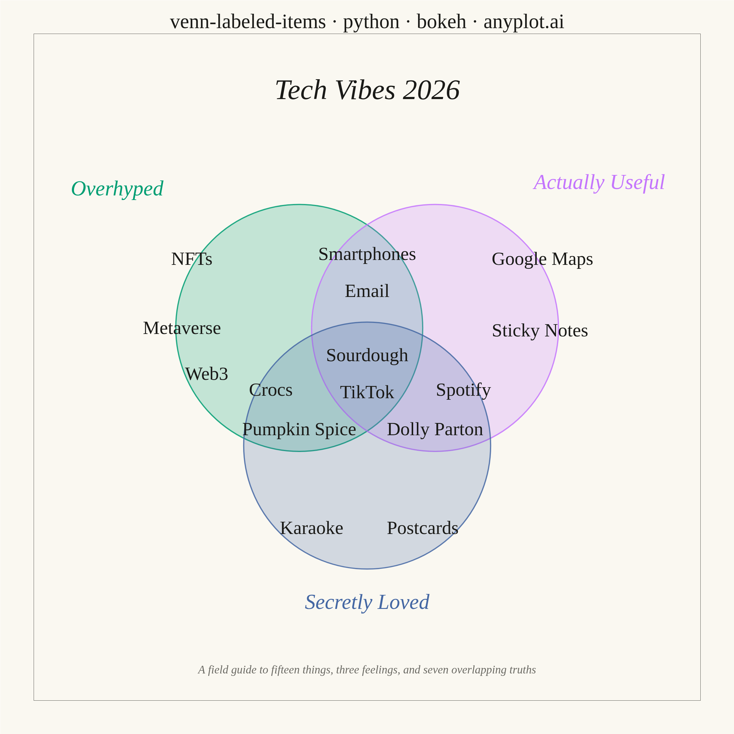
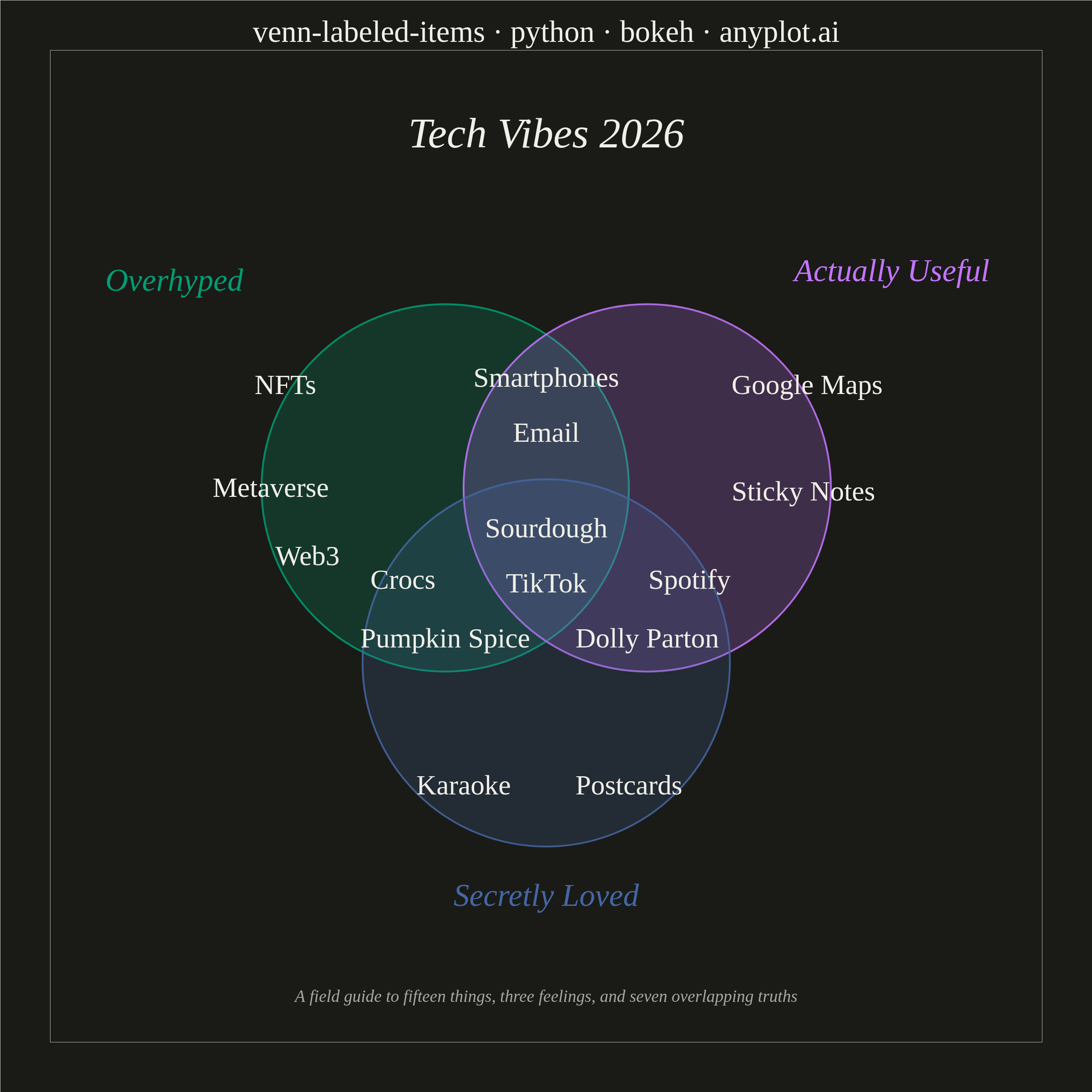
An editorial, WIRED "Chartgeist"-style three-circle Venn diagram where pop-culture items — products, people, trends, apps — are plotted as labeled points inside each zone rather than represented as numeric counts. Three overlapping circles define witty, opinionated categories (e.g., "Overhyped", "Actually Useful", "Secretly Loved"), and each item lives in exactly one of the seven interior regions (or outside all circles). Unlike a classic proportional Venn, the "data" here is categorical set-membership plus a human label, making the plot ideal for commentary, taxonomy, and discussion rather than quantitative analysis.
""" anyplot.ai
venn-labeled-items: Chartgeist-Style Venn Diagram with Labeled Items
Library: bokeh 3.9.1 | Python 3.13.14
Quality: 90/100 | Updated: 2026-06-25
"""

import os
import time
from pathlib import Path

import numpy as np
from bokeh.core.property.vectorization import value as bk_value
from bokeh.io import output_file, save
from bokeh.models import ColumnDataSource, HoverTool, Label
from bokeh.plotting import figure
from selenium import webdriver
from selenium.webdriver.chrome.options import Options


# Theme tokens
THEME = os.getenv("ANYPLOT_THEME", "light")
PAGE_BG = "#FAF8F1" if THEME == "light" else "#1A1A17"
INK = "#1A1A17" if THEME == "light" else "#F0EFE8"
INK_SOFT = "#4A4A44" if THEME == "light" else "#B8B7B0"
INK_MUTED = "#6B6A63" if THEME == "light" else "#A8A79F"

# Imprint palette — positions 1-3 for the three circles
COLOR_A = "#009E73"  # Overhyped — brand green (Imprint position 1)
COLOR_B = "#C475FD"  # Actually Useful — lavender (Imprint position 2)
COLOR_C = "#4467A3"  # Secretly Loved — blue (Imprint position 3)

# Geometry — equilateral triangle of centers (apex pointing down)
r = 1.0
s = 1.1
h_low = s * np.sqrt(3) / 6
center_a = (-s / 2, h_low)
center_b = (s / 2, h_low)
center_c = (0.0, -2 * h_low)

# Data — circle categories with editorial labels positioned outside each circle
circles = [
    {"name": "Overhyped", "color": COLOR_A, "center": center_a, "label_xy": (-1.65, 1.45), "align": "right"},
    {"name": "Actually Useful", "color": COLOR_B, "center": center_b, "label_xy": (1.35, 1.50), "align": "left"},
    {"name": "Secretly Loved", "color": COLOR_C, "center": center_c, "label_xy": (0.0, -1.90), "align": "center"},
]

# Items across all seven zones — ColumnDataSource for idiomatic Bokeh + HoverTool
items_data = {
    "label": [
        # A only — Overhyped
        "NFTs",
        "Metaverse",
        "Web3",
        # B only — Actually Useful
        "Google Maps",
        "Sticky Notes",
        # C only — Secretly Loved
        "Karaoke",
        "Postcards",
        # AB — Overhyped + Actually Useful
        "Smartphones",
        "Email",
        # AC — Overhyped + Secretly Loved
        "Crocs",
        "Pumpkin Spice",
        # BC — Actually Useful + Secretly Loved
        "Spotify",
        "Dolly Parton",
        # ABC — all three
        "Sourdough",
        "TikTok",
    ],
    "x": [-1.42, -1.50, -1.30, 1.42, 1.40, -0.45, 0.45, 0.00, 0.00, -0.78, -0.55, 0.78, 0.55, 0.00, 0.00],
    "y": [0.88, 0.32, -0.05, 0.88, 0.30, -1.30, -1.30, 0.92, 0.62, -0.18, -0.50, -0.18, -0.50, 0.10, -0.20],
    "zone": [
        "Overhyped only",
        "Overhyped only",
        "Overhyped only",
        "Actually Useful only",
        "Actually Useful only",
        "Secretly Loved only",
        "Secretly Loved only",
        "Overhyped + Actually Useful",
        "Overhyped + Actually Useful",
        "Overhyped + Secretly Loved",
        "Overhyped + Secretly Loved",
        "Actually Useful + Secretly Loved",
        "Actually Useful + Secretly Loved",
        "All three zones",
        "All three zones",
    ],
}
source = ColumnDataSource(data=items_data)

# Plot — square canvas suits the radial Venn layout
title = "venn-labeled-items · python · bokeh · anyplot.ai"
p = figure(
    width=2400,
    height=2400,
    title=title,
    x_range=(-2.7, 2.7),
    y_range=(-2.7, 2.7),
    toolbar_location=None,
    min_border_bottom=110,
    min_border_left=110,
    min_border_top=110,
    min_border_right=110,
)

# Invisible scatter points for HoverTool — shows zone membership in the HTML artifact
item_renderer = p.scatter(x="x", y="y", source=source, size=30, fill_alpha=0, line_color=None)
hover = HoverTool(renderers=[item_renderer], tooltips=[("Item", "@label"), ("Zone", "@zone")])
p.add_tools(hover)

# Three semi-transparent circles
for circle in circles:
    cx, cy = circle["center"]
    p.ellipse(
        x=cx,
        y=cy,
        width=2 * r,
        height=2 * r,
        fill_color=circle["color"],
        fill_alpha=0.22,
        line_color=circle["color"],
        line_width=4,
        line_alpha=0.85,
    )

# Category names outside each circle in the circle's own color
for circle in circles:
    lx, ly = circle["label_xy"]
    p.add_layout(
        Label(
            x=lx,
            y=ly,
            text=circle["name"],
            text_font="serif",
            text_font_size="52pt",
            text_font_style="italic",
            text_color=circle["color"],
            text_align=circle["align"],
            text_baseline="middle",
        )
    )

# Item labels — p.text() with ColumnDataSource is the idiomatic Bokeh pattern
# Set visual props on .glyph to pass literal values (not column refs) in Bokeh 3.x
text_renderer = p.text(
    x="x",
    y="y",
    text="label",
    source=source,
    text_font_size="46pt",
    text_color=INK,
    text_align="center",
    text_baseline="middle",
)
text_renderer.glyph.text_font = bk_value("serif")

# Editorial titles — witty header above diagram, subtitle below
p.add_layout(
    Label(
        x=0.0,
        y=2.25,
        text="Tech Vibes 2026",
        text_font="serif",
        text_font_size="70pt",
        text_font_style="italic",
        text_color=INK,
        text_align="center",
        text_baseline="middle",
    )
)
p.add_layout(
    Label(
        x=0.0,
        y=-2.45,
        text="A field guide to fifteen things, three feelings, and seven overlapping truths",
        text_font="serif",
        text_font_size="28pt",
        text_font_style="italic",
        text_color=INK_MUTED,
        text_align="center",
        text_baseline="middle",
    )
)

# Chrome — gridless editorial style
p.background_fill_color = PAGE_BG
p.border_fill_color = PAGE_BG
p.outline_line_color = INK_SOFT

p.title.text_font = "serif"
p.title.text_font_size = "50pt"
p.title.text_font_style = "normal"
p.title.text_color = INK
p.title.align = "center"

p.axis.visible = False
p.grid.visible = False

# Save — HTML first, then PNG via headless Selenium (export_png is not used)
output_file(f"plot-{THEME}.html")
save(p)

W, H = 2400, 2400
opts = Options()
for arg in (
    "--headless=new",
    "--no-sandbox",
    "--disable-dev-shm-usage",
    "--disable-gpu",
    f"--window-size={W},{H}",
    "--hide-scrollbars",
):
    opts.add_argument(arg)
driver = webdriver.Chrome(options=opts)
driver.set_window_size(W, H)
# Compensate for headless Chrome viewport offset (window size != inner viewport)
inner_w = driver.execute_script("return window.innerWidth")
inner_h = driver.execute_script("return window.innerHeight")
driver.set_window_size(W + (W - inner_w), H + (H - inner_h))
driver.get(f"file://{Path(f'plot-{THEME}.html').resolve()}")
time.sleep(3)
driver.save_screenshot(f"plot-{THEME}.png")
driver.quit()
Runnable source as JSON, for any HTTP client: https://api.anyplot.ai/specs/venn-labeled-items/bokeh/code. Any spec id and library id listed in llms-full.txt fit the same URL shape; every URL below is complete and callable.
{
  "spec_id": "venn-labeled-items",
  "language": "python",
  "library": "bokeh",
  "page": "https://anyplot.ai/venn-labeled-items/python/bokeh",
  "hub": "https://anyplot.ai/venn-labeled-items",
  "code_json": "https://api.anyplot.ai/specs/venn-labeled-items/bokeh/code",
  "spec_json": "https://api.anyplot.ai/specs/venn-labeled-items",
  "render_light_png": "https://storage.googleapis.com/anyplot-images/plots/venn-labeled-items/python/bokeh/plot-light.png",
  "render_dark_png": "https://storage.googleapis.com/anyplot-images/plots/venn-labeled-items/python/bokeh/plot-dark.png",
  "interactive_light_html": "https://storage.googleapis.com/anyplot-images/plots/venn-labeled-items/python/bokeh/plot-light.html",
  "interactive_dark_html": "https://storage.googleapis.com/anyplot-images/plots/venn-labeled-items/python/bokeh/plot-dark.html",
  "quality_score": 90.0,
  "license": "MIT",
  "guide": "https://anyplot.ai/llms.txt"
}
Part of Chartgeist-Style Venn Diagram with Labeled Items on anyplot.ai.