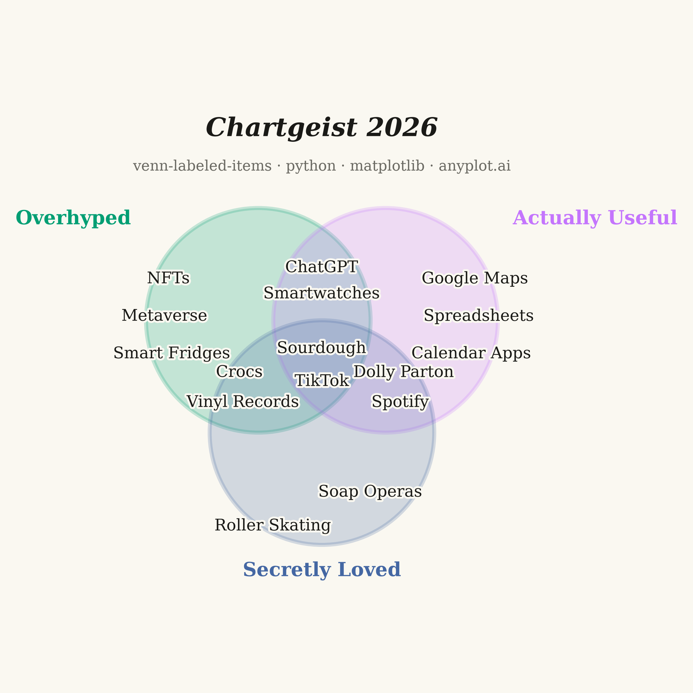
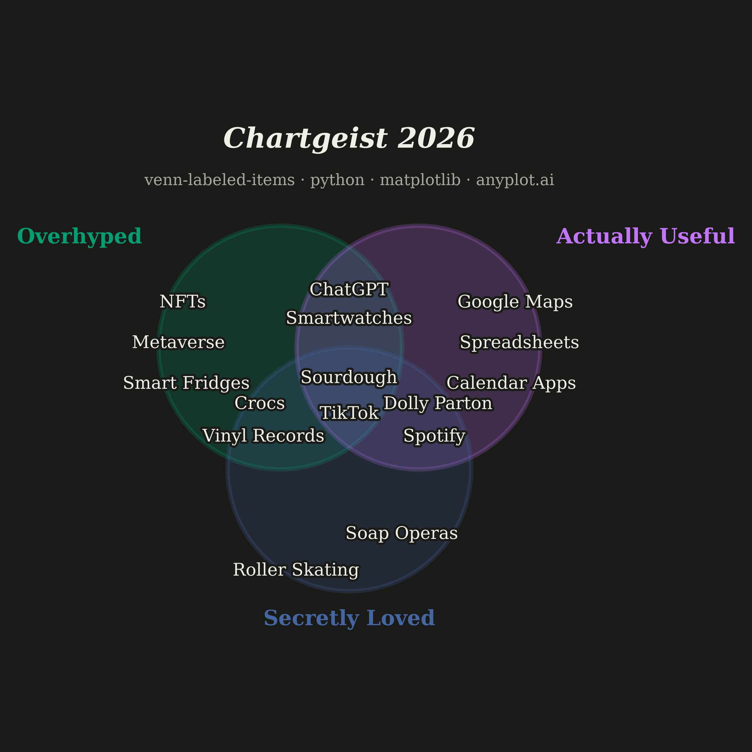
An editorial, WIRED "Chartgeist"-style three-circle Venn diagram where pop-culture items — products, people, trends, apps — are plotted as labeled points inside each zone rather than represented as numeric counts. Three overlapping circles define witty, opinionated categories (e.g., "Overhyped", "Actually Useful", "Secretly Loved"), and each item lives in exactly one of the seven interior regions (or outside all circles). Unlike a classic proportional Venn, the "data" here is categorical set-membership plus a human label, making the plot ideal for commentary, taxonomy, and discussion rather than quantitative analysis.
""" anyplot.ai
venn-labeled-items: Chartgeist-Style Venn Diagram with Labeled Items
Library: matplotlib 3.11.0 | Python 3.13.14
Quality: 85/100 | Updated: 2026-06-25
"""

import os

import matplotlib.patheffects as pe
import matplotlib.pyplot as plt
from matplotlib.patches import Circle


# Theme tokens
THEME = os.getenv("ANYPLOT_THEME", "light")
PAGE_BG = "#FAF8F1" if THEME == "light" else "#1A1A17"
INK = "#1A1A17" if THEME == "light" else "#F0EFE8"
INK_SOFT = "#4A4A44" if THEME == "light" else "#B8B7B0"
INK_MUTED = "#6B6A63" if THEME == "light" else "#A8A79F"

# Imprint palette — positions 1, 2, 3
COLOR_A = "#009E73"  # brand green — ALWAYS first series
COLOR_B = "#C475FD"  # lavender
COLOR_C = "#4467A3"  # blue

# Data: three Chartgeist-style traits
RADIUS = 1.5
circles = [
    {"name": "Overhyped", "center": (-0.85, 0.50), "color": COLOR_A},
    {"name": "Actually Useful", "center": (0.85, 0.50), "color": COLOR_B},
    {"name": "Secretly Loved", "center": (0.00, -1.00), "color": COLOR_C},
]

# Items placed inside their assigned zone (label, x, y)
items = [
    # A only — Overhyped
    ("NFTs", -2.05, 1.05),
    ("Metaverse", -2.10, 0.55),
    ("Smart Fridges", -2.00, 0.05),
    # B only — Actually Useful
    ("Google Maps", 2.05, 1.05),
    ("Spreadsheets", 2.10, 0.55),
    ("Calendar Apps", 2.00, 0.05),
    # C only — Secretly Loved
    ("Roller Skating", -0.65, -2.25),
    ("Soap Operas", 0.65, -1.80),
    # A ∩ B
    ("ChatGPT", 0.00, 1.20),
    ("Smartwatches", 0.00, 0.85),
    # A ∩ C
    ("Crocs", -1.10, -0.20),
    ("Vinyl Records", -1.05, -0.60),
    # B ∩ C
    ("Dolly Parton", 1.10, -0.20),
    ("Spotify", 1.05, -0.60),
    # A ∩ B ∩ C
    ("Sourdough", 0.00, 0.12),
    ("TikTok", 0.00, -0.32),
]

# Plot — square 2400 × 2400 px (symmetric Venn diagram)
fig, ax = plt.subplots(figsize=(6, 6), dpi=400, facecolor=PAGE_BG)
ax.set_facecolor(PAGE_BG)

# Three overlapping circles with semi-transparent Imprint palette fills
for circle in circles:
    ax.add_patch(
        Circle(
            circle["center"],
            RADIUS,
            facecolor=circle["color"],
            alpha=0.22,
            edgecolor=circle["color"],
            linewidth=2.5,
            zorder=1,
        )
    )

# Item labels with knockout stroke so text stays readable inside colored overlap regions
for label, x, y in items:
    txt = ax.text(x, y, label, fontsize=10, color=INK, ha="center", va="center", family="serif", zorder=3)
    txt.set_path_effects([pe.withStroke(linewidth=2.5, foreground=PAGE_BG)])

# Category labels outside each circle, on its outer side
category_positions = [
    ("Overhyped", -2.55, 1.85, "right", COLOR_A),
    ("Actually Useful", 2.55, 1.85, "left", COLOR_B),
    ("Secretly Loved", 0.00, -2.85, "center", COLOR_C),
]
for name, x, y, ha, color in category_positions:
    ax.text(x, y, name, fontsize=12, color=color, ha=ha, va="center", family="serif", fontweight="bold", zorder=4)

# Editorial title + canonical anyplot.ai attribution line
ax.text(
    0,
    3.05,
    "Chartgeist 2026",
    fontsize=16,
    color=INK,
    ha="center",
    va="center",
    family="serif",
    fontweight="bold",
    style="italic",
)
ax.text(
    0,
    2.55,
    "venn-labeled-items · python · matplotlib · anyplot.ai",
    fontsize=9,
    color=INK_MUTED,
    ha="center",
    va="center",
    family="serif",
)

# Frame — clean gridless composition
ax.set_xlim(-3.5, 3.5)
ax.set_ylim(-3.2, 3.5)
ax.set_aspect("equal")
ax.set_xticks([])
ax.set_yticks([])
for spine in ax.spines.values():
    spine.set_visible(False)

plt.tight_layout()
plt.savefig(f"plot-{THEME}.png", dpi=400, facecolor=PAGE_BG)
plt.close()
Runnable source as JSON, for any HTTP client: https://api.anyplot.ai/specs/venn-labeled-items/matplotlib/code. Any spec id and library id listed in llms-full.txt fit the same URL shape; every URL below is complete and callable.
{
  "spec_id": "venn-labeled-items",
  "language": "python",
  "library": "matplotlib",
  "page": "https://anyplot.ai/venn-labeled-items/python/matplotlib",
  "hub": "https://anyplot.ai/venn-labeled-items",
  "code_json": "https://api.anyplot.ai/specs/venn-labeled-items/matplotlib/code",
  "spec_json": "https://api.anyplot.ai/specs/venn-labeled-items",
  "render_light_png": "https://storage.googleapis.com/anyplot-images/plots/venn-labeled-items/python/matplotlib/plot-light.png",
  "render_dark_png": "https://storage.googleapis.com/anyplot-images/plots/venn-labeled-items/python/matplotlib/plot-dark.png",
  "quality_score": 85.0,
  "license": "MIT",
  "guide": "https://anyplot.ai/llms.txt"
}
Part of Chartgeist-Style Venn Diagram with Labeled Items on anyplot.ai.