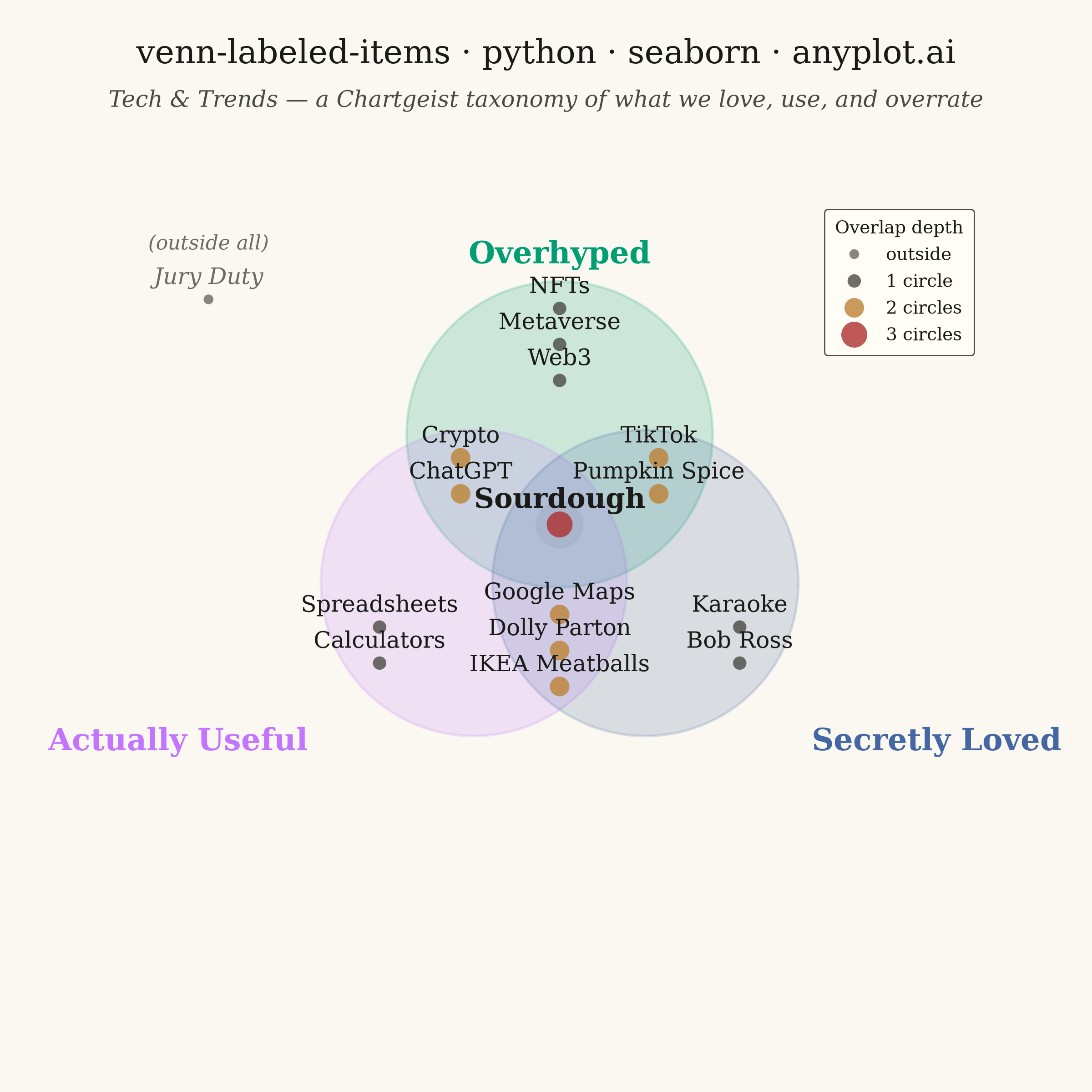
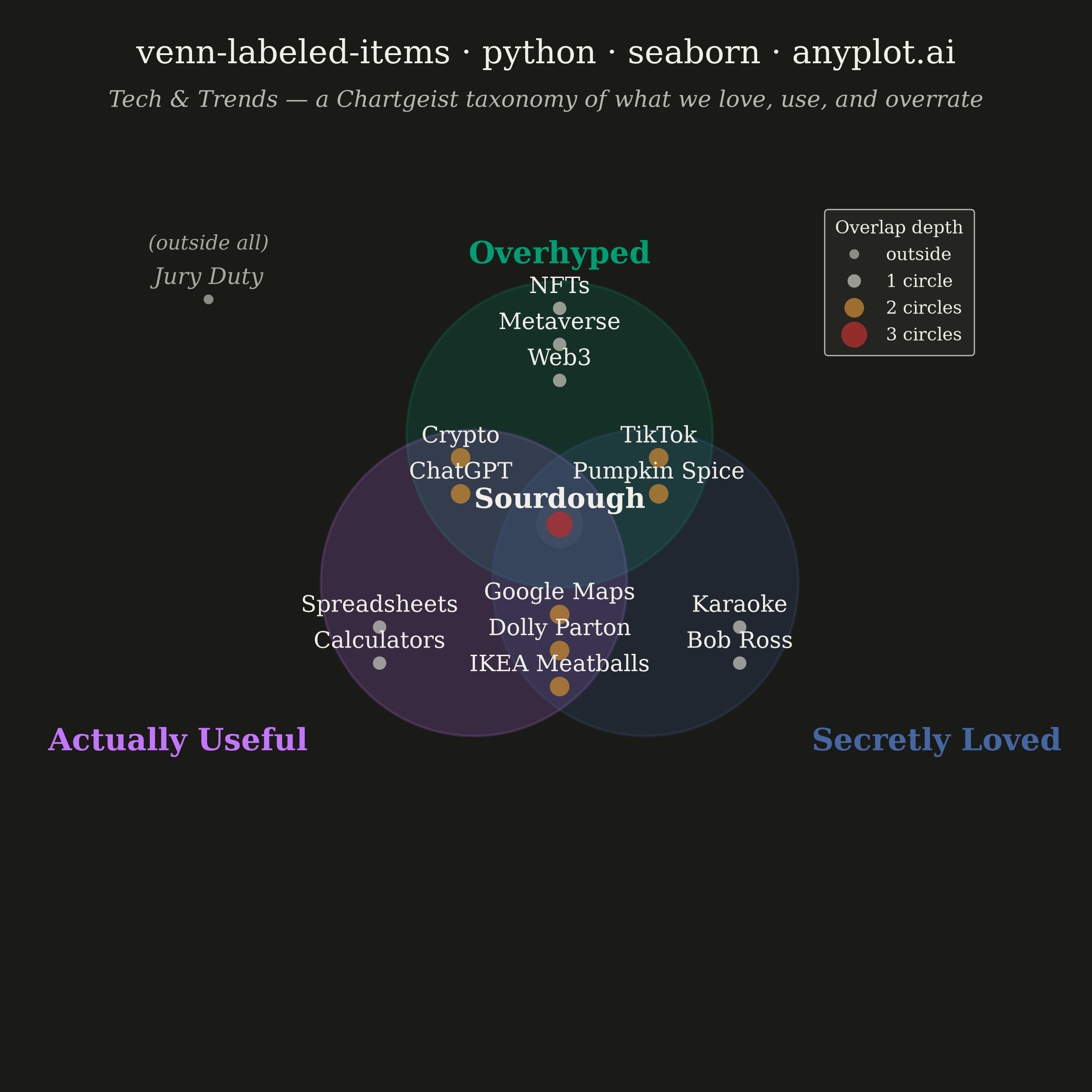
An editorial, WIRED "Chartgeist"-style three-circle Venn diagram where pop-culture items — products, people, trends, apps — are plotted as labeled points inside each zone rather than represented as numeric counts. Three overlapping circles define witty, opinionated categories (e.g., "Overhyped", "Actually Useful", "Secretly Loved"), and each item lives in exactly one of the seven interior regions (or outside all circles). Unlike a classic proportional Venn, the "data" here is categorical set-membership plus a human label, making the plot ideal for commentary, taxonomy, and discussion rather than quantitative analysis.
""" anyplot.ai
venn-labeled-items: Chartgeist-Style Venn Diagram with Labeled Items
Library: seaborn 0.13.2 | Python 3.13.14
Quality: 86/100 | Updated: 2026-06-25
"""

import os

import matplotlib.pyplot as plt
import pandas as pd
import seaborn as sns
from matplotlib.patches import Circle


# Theme tokens — Imprint palette chrome
THEME = os.getenv("ANYPLOT_THEME", "light")
PAGE_BG = "#FAF8F1" if THEME == "light" else "#1A1A17"
ELEVATED_BG = "#FFFDF6" if THEME == "light" else "#242420"
INK = "#1A1A17" if THEME == "light" else "#F0EFE8"
INK_SOFT = "#4A4A44" if THEME == "light" else "#B8B7B0"
INK_MUTED = "#6B6A63" if THEME == "light" else "#A8A79F"

# Imprint palette positions 1-3 for the three Venn circles
IMPRINT_GREEN = "#009E73"  # position 1 — Overhyped
IMPRINT_LAVENDER = "#C475FD"  # position 2 — Actually Useful
IMPRINT_BLUE = "#4467A3"  # position 3 — Secretly Loved

# Seaborn scatter palette: Imprint positions 4-5 + semantic anchors for overlap-depth hue
# Distinct from circle fill colors (positions 1-3) to avoid visual ambiguity
DEPTH_PALETTE = {
    "outside": INK_MUTED,  # semantic muted anchor: other/rest
    "1 circle": INK_SOFT,  # secondary chrome: baseline items
    "2 circles": "#BD8233",  # Imprint ochre (position 4): bridging items
    "3 circles": "#AE3030",  # Imprint matte red (position 5): convergence hot-spot
}
OVERLAP_ORDER = ["outside", "1 circle", "2 circles", "3 circles"]

sns.set_theme(
    style="white",
    rc={
        "figure.facecolor": PAGE_BG,
        "axes.facecolor": PAGE_BG,
        "axes.edgecolor": PAGE_BG,
        "axes.labelcolor": INK,
        "text.color": INK,
        "font.family": "serif",
        "legend.facecolor": ELEVATED_BG,
        "legend.edgecolor": INK_SOFT,
    },
)

# Data — tech & pop-culture taxonomy across three editorial lenses
circles = [
    {"name": "Overhyped", "color": IMPRINT_GREEN, "center": (0.00, 0.55)},
    {"name": "Actually Useful", "color": IMPRINT_LAVENDER, "center": (-0.476, -0.275)},
    {"name": "Secretly Loved", "color": IMPRINT_BLUE, "center": (0.476, -0.275)},
]

zone_items = {
    "A": ["NFTs", "Metaverse", "Web3"],
    "B": ["Spreadsheets", "Calculators"],
    "C": ["Karaoke", "Bob Ross"],
    "AB": ["Crypto", "ChatGPT"],
    "AC": ["TikTok", "Pumpkin Spice"],
    "BC": ["Google Maps", "Dolly Parton", "IKEA Meatballs"],
    "ABC": ["Sourdough"],
    "outside": ["Jury Duty"],
}

zone_centroids = {
    "A": (0.00, 1.05),
    "B": (-1.00, -0.62),
    "C": (1.00, -0.62),
    "AB": (-0.55, 0.32),
    "AC": (0.55, 0.32),
    "BC": (0.00, -0.65),
    "ABC": (0.00, 0.05),
    "outside": (-1.95, 1.30),
}

zone_to_overlap = {
    "outside": "outside",
    "A": "1 circle",
    "B": "1 circle",
    "C": "1 circle",
    "AB": "2 circles",
    "AC": "2 circles",
    "BC": "2 circles",
    "ABC": "3 circles",
}

# Long-form DataFrame: each row = one labeled item with x, y, and overlap category
rows = []
spacing = 0.20
for zone, labels in zone_items.items():
    cx, cy = zone_centroids[zone]
    n = len(labels)
    start_y = cy + (n - 1) * spacing / 2
    for i, label in enumerate(labels):
        rows.append({"label": label, "x": cx, "y": start_y - i * spacing, "overlap": zone_to_overlap[zone]})
items_df = pd.DataFrame(rows)

# Plot — square canvas for the symmetric Venn layout (2400×2400 px)
fig, ax = plt.subplots(figsize=(6, 6), dpi=400, facecolor=PAGE_BG)
ax.set_facecolor(PAGE_BG)
ax.set_aspect("equal")

r = 0.85
for c in circles:
    ax.add_patch(Circle(c["center"], radius=r, facecolor=c["color"], alpha=0.18, edgecolor=c["color"], linewidth=1.0))

# Subtle dashed highlight on the triple-overlap convergence zone
ax.add_patch(
    Circle(
        zone_centroids["ABC"],
        radius=0.13,
        facecolor=INK,
        alpha=0.05,
        edgecolor=INK_SOFT,
        linewidth=0.4,
        linestyle=(0, (2, 2)),
    )
)

# Seaborn hue+size scatter: overlap depth drives both marker color and size
# This makes seaborn's categorical hue encoding the central visual layer
sns.scatterplot(
    data=items_df,
    x="x",
    y="y",
    hue="overlap",
    size="overlap",
    sizes={"outside": 55, "1 circle": 75, "2 circles": 110, "3 circles": 160},
    palette=DEPTH_PALETTE,
    hue_order=OVERLAP_ORDER,
    size_order=OVERLAP_ORDER,
    alpha=0.80,
    edgecolor="none",
    legend="full",
    ax=ax,
)

# Style the seaborn legend: deduplicate hue+size entries, position in upper-right whitespace
handles, labels = ax.get_legend_handles_labels()
seen, h_dedup, l_dedup = set(), [], []
for h, lbl in zip(handles, labels, strict=False):
    if lbl not in seen:
        seen.add(lbl)
        h_dedup.append(h)
        l_dedup.append(lbl)
ax.legend(
    h_dedup,
    l_dedup,
    title="Overlap depth",
    loc="upper right",
    fontsize=7,
    title_fontsize=7,
    framealpha=1.0,
    facecolor=ELEVATED_BG,
    edgecolor=INK_SOFT,
    borderpad=0.6,
)
ax.get_legend().get_frame().set_linewidth(0.5)

# Category labels positioned outside each circle on its far side
ax.text(
    0,
    0.55 + r + 0.06,
    circles[0]["name"],
    ha="center",
    va="bottom",
    fontsize=12,
    fontweight="bold",
    color=circles[0]["color"],
    clip_on=False,
)
ax.text(
    -1.40,
    -0.275 - 0.80,
    circles[1]["name"],
    ha="right",
    va="top",
    fontsize=12,
    fontweight="bold",
    color=circles[1]["color"],
    clip_on=False,
)
ax.text(
    1.40,
    -0.275 - 0.80,
    circles[2]["name"],
    ha="left",
    va="top",
    fontsize=12,
    fontweight="bold",
    color=circles[2]["color"],
    clip_on=False,
)

# Item labels placed slightly above their dot markers
label_offset = 0.07
for _, row in items_df.iterrows():
    is_triple = row["overlap"] == "3 circles"
    is_outside = row["overlap"] == "outside"
    ax.text(
        row["x"],
        row["y"] + label_offset,
        row["label"],
        ha="center",
        va="bottom",
        fontsize=11 if is_triple else 10,
        fontweight="bold" if is_triple else "normal",
        color=INK_MUTED if is_outside else INK,
        style="italic" if is_outside else "normal",
        clip_on=False,
    )

# Parenthetical hint for the outside cluster
ax.text(
    -1.95, 1.55, "(outside all)", ha="center", va="bottom", fontsize=8, color=INK_MUTED, style="italic", clip_on=False
)

# Mandated title and editorial subtitle
title = "venn-labeled-items · python · seaborn · anyplot.ai"
fig.suptitle(title, fontsize=13, fontweight="medium", color=INK, y=0.965)
fig.text(
    0.5,
    0.918,
    "Tech & Trends — a Chartgeist taxonomy of what we love, use, and overrate",
    ha="center",
    va="top",
    fontsize=9,
    color=INK_SOFT,
    style="italic",
)

ax.set_xlim(-2.35, 2.35)
ax.set_ylim(-1.50, 1.85)
ax.axis("off")

# Save — bbox_inches omitted (defaults to None) to preserve the exact 2400×2400 canvas
plt.savefig(f"plot-{THEME}.png", dpi=400, facecolor=PAGE_BG)
Runnable source as JSON, for any HTTP client: https://api.anyplot.ai/specs/venn-labeled-items/seaborn/code. Any spec id and library id listed in llms-full.txt fit the same URL shape; every URL below is complete and callable.
{
  "spec_id": "venn-labeled-items",
  "language": "python",
  "library": "seaborn",
  "page": "https://anyplot.ai/venn-labeled-items/python/seaborn",
  "hub": "https://anyplot.ai/venn-labeled-items",
  "code_json": "https://api.anyplot.ai/specs/venn-labeled-items/seaborn/code",
  "spec_json": "https://api.anyplot.ai/specs/venn-labeled-items",
  "render_light_png": "https://storage.googleapis.com/anyplot-images/plots/venn-labeled-items/python/seaborn/plot-light.png",
  "render_dark_png": "https://storage.googleapis.com/anyplot-images/plots/venn-labeled-items/python/seaborn/plot-dark.png",
  "quality_score": 86.0,
  "license": "MIT",
  "guide": "https://anyplot.ai/llms.txt"
}
Part of Chartgeist-Style Venn Diagram with Labeled Items on anyplot.ai.