The same plot in 14 other libraries — Python: Altair, Bokeh, lets-plot, Matplotlib, Plotly, plotnine, Pygal, Seaborn; Julia: Makie.jl; JavaScript: Chart.js, D3.js, Apache ECharts, Highcharts, MUI X Charts. Compare all 15 side by side: Chartgeist-Style Venn Diagram with Labeled Items in Python, R, Julia and JavaScript.
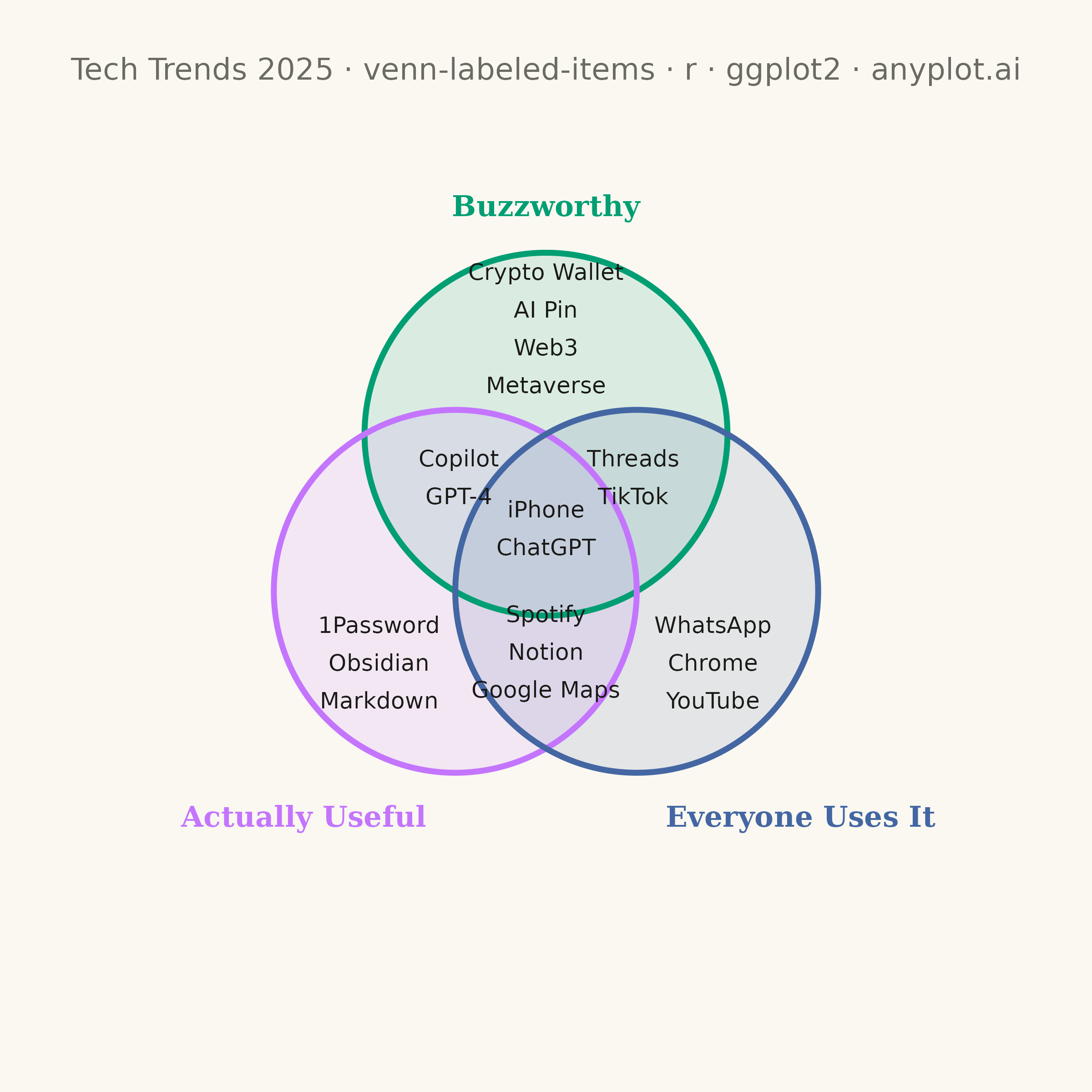
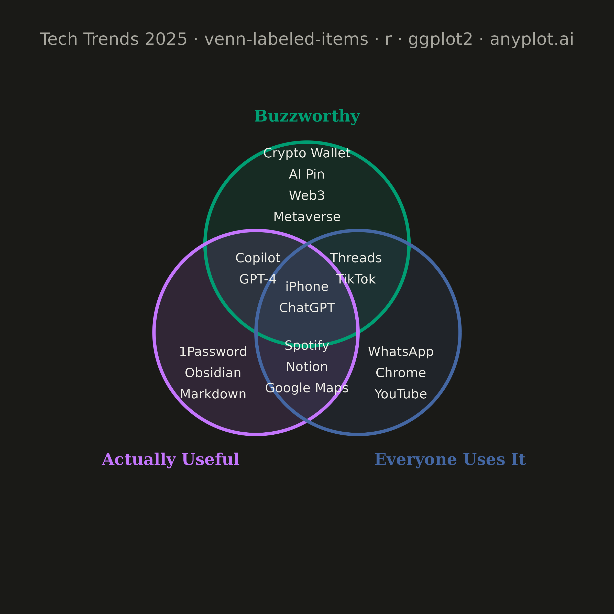
An editorial, WIRED "Chartgeist"-style three-circle Venn diagram where pop-culture items — products, people, trends, apps — are plotted as labeled points inside each zone rather than represented as numeric counts. Three overlapping circles define witty, opinionated categories (e.g., "Overhyped", "Actually Useful", "Secretly Loved"), and each item lives in exactly one of the seven interior regions (or outside all circles). Unlike a classic proportional Venn, the "data" here is categorical set-membership plus a human label, making the plot ideal for commentary, taxonomy, and discussion rather than quantitative analysis.
#' anyplot.ai
#' venn-labeled-items: Chartgeist-Style Venn Diagram with Labeled Items
#' Library: ggplot2 3.5.1 | R 4.4.1
#' Quality: 86/100 | Created: 2026-06-25

library(ggplot2)
library(dplyr)
library(ragg)

set.seed(42)

# Theme tokens
THEME       <- Sys.getenv("ANYPLOT_THEME", "light")
PAGE_BG     <- if (THEME == "light") "#FAF8F1" else "#1A1A17"
INK         <- if (THEME == "light") "#1A1A17" else "#F0EFE8"
INK_SOFT    <- if (THEME == "light") "#4A4A44" else "#B8B7B0"
INK_MUTED   <- if (THEME == "light") "#6B6A63" else "#A8A79F"

# Imprint palette — circles use first 3 positions
IMPRINT_PALETTE <- c("#009E73", "#C475FD", "#4467A3", "#BD8233",
                     "#AE3030", "#2ABCCD", "#954477", "#99B314")

# Circle geometry: symmetric equilateral triangle layout
r <- 2.5
d <- 2.5

cx_a <- 0;       cy_a <- d / sqrt(3)
cx_b <- -d / 2;  cy_b <- -d / (2 * sqrt(3))
cx_c <-  d / 2;  cy_c <- -d / (2 * sqrt(3))

# Circle coordinates — inlined
theta  <- seq(0, 2 * pi, length.out = 361)
circ_a <- data.frame(x = cx_a + r * cos(theta), y = cy_a + r * sin(theta))
circ_b <- data.frame(x = cx_b + r * cos(theta), y = cy_b + r * sin(theta))
circ_c <- data.frame(x = cx_c + r * cos(theta), y = cy_c + r * sin(theta))

# Tech trends 2025 items per zone
items <- data.frame(
  label = c(
    "Metaverse", "Web3", "AI Pin", "Crypto Wallet",
    "Markdown", "Obsidian", "1Password",
    "YouTube", "Chrome", "WhatsApp",
    "GPT-4", "Copilot",
    "TikTok", "Threads",
    "Google Maps", "Notion", "Spotify",
    "ChatGPT", "iPhone"
  ),
  zone = c(
    rep("A", 4), rep("B", 3), rep("C", 3),
    rep("AB", 2), rep("AC", 2), rep("BC", 3), rep("ABC", 2)
  ),
  stringsAsFactors = FALSE
)

# Zone anchor centers (hand-tuned for r=2.5, d=2.5 equilateral layout)
zone_anchors <- data.frame(
  zone = c("A",   "B",    "C",    "AB",   "AC",   "BC",   "ABC"),
  ax   = c(0.00, -2.30,   2.30,  -1.20,   1.20,   0.00,   0.00),
  ay   = c(2.90, -1.70,  -1.70,   0.85,   0.85,  -1.55,   0.15),
  stringsAsFactors = FALSE
)

# Spread items vertically within each zone
items <- items %>%
  left_join(zone_anchors, by = "zone") %>%
  group_by(zone) %>%
  mutate(
    idx    = row_number(),
    n_zone = n(),
    y_off  = (idx - (n_zone + 1) / 2) * 0.52,
    lx     = ax,
    ly     = ay + y_off
  ) %>%
  ungroup()

# Title (64 chars <= 67 baseline — use full 12pt)
plot_title <- "Tech Trends 2025 · venn-labeled-items · r · ggplot2 · anyplot.ai"

# Assemble plot
p <- ggplot() +
  # Semi-transparent circle fills (drawn back-to-front so overlaps blend)
  geom_polygon(data = circ_a, aes(x, y), fill = IMPRINT_PALETTE[1], alpha = 0.13, color = NA) +
  geom_polygon(data = circ_b, aes(x, y), fill = IMPRINT_PALETTE[2], alpha = 0.13, color = NA) +
  geom_polygon(data = circ_c, aes(x, y), fill = IMPRINT_PALETTE[3], alpha = 0.13, color = NA) +
  # Circle outlines
  geom_path(data = circ_a, aes(x, y), color = IMPRINT_PALETTE[1], linewidth = 1.1) +
  geom_path(data = circ_b, aes(x, y), color = IMPRINT_PALETTE[2], linewidth = 1.1) +
  geom_path(data = circ_c, aes(x, y), color = IMPRINT_PALETTE[3], linewidth = 1.1) +
  # Item labels inside zones
  geom_text(
    data     = items,
    aes(x = lx, y = ly, label = label),
    color    = INK,
    size     = 3.2,
    fontface = "plain"
  ) +
  # Category names positioned outside each circle
  annotate("text", x = 0,           y = cy_a + r + 0.65,
           label = "Buzzworthy",       color = IMPRINT_PALETTE[1],
           size = 4.0, fontface = "bold", hjust = 0.5, family = "serif") +
  annotate("text", x = cx_b - 0.4,  y = cy_b - r - 0.60,
           label = "Actually Useful",  color = IMPRINT_PALETTE[2],
           size = 4.0, fontface = "bold", hjust = 1.0, family = "serif") +
  annotate("text", x = cx_c + 0.4,  y = cy_c - r - 0.60,
           label = "Everyone Uses It", color = IMPRINT_PALETTE[3],
           size = 4.0, fontface = "bold", hjust = 0.0, family = "serif") +
  coord_fixed(
    xlim = c(-5.5, 5.5),
    ylim = c(-6.5, 5.5)
  ) +
  labs(title = plot_title) +
  theme_void() +
  theme(
    plot.background  = element_rect(fill = PAGE_BG, color = PAGE_BG),
    panel.background = element_rect(fill = PAGE_BG, color = NA),
    plot.title       = element_text(
      color  = INK_MUTED,
      size   = 12,
      hjust  = 0.5,
      margin = margin(t = 8, b = 4)
    ),
    plot.margin = margin(15, 15, 15, 15)
  )

# Save — square canvas: 6 x 6 in * 400 dpi = 2400 x 2400 px
ggsave(
  filename = sprintf("plot-%s.png", THEME),
  plot     = p,
  device   = ragg::agg_png,
  width    = 6,
  height   = 6,
  units    = "in",
  dpi      = 400
)
Runnable source as JSON, for any HTTP client: https://api.anyplot.ai/specs/venn-labeled-items/ggplot2/code. Any spec id and library id listed in llms-full.txt fit the same URL shape; every URL below is complete and callable.
{
  "spec_id": "venn-labeled-items",
  "language": "r",
  "library": "ggplot2",
  "page": "https://anyplot.ai/venn-labeled-items/r/ggplot2",
  "hub": "https://anyplot.ai/venn-labeled-items",
  "code_json": "https://api.anyplot.ai/specs/venn-labeled-items/ggplot2/code",
  "spec_json": "https://api.anyplot.ai/specs/venn-labeled-items",
  "render_light_png": "https://storage.googleapis.com/anyplot-images/plots/venn-labeled-items/r/ggplot2/plot-light.png",
  "render_dark_png": "https://storage.googleapis.com/anyplot-images/plots/venn-labeled-items/r/ggplot2/plot-dark.png",
  "quality_score": 86.0,
  "license": "MIT",
  "guide": "https://anyplot.ai/llms.txt"
}
Part of Chartgeist-Style Venn Diagram with Labeled Items on anyplot.ai.