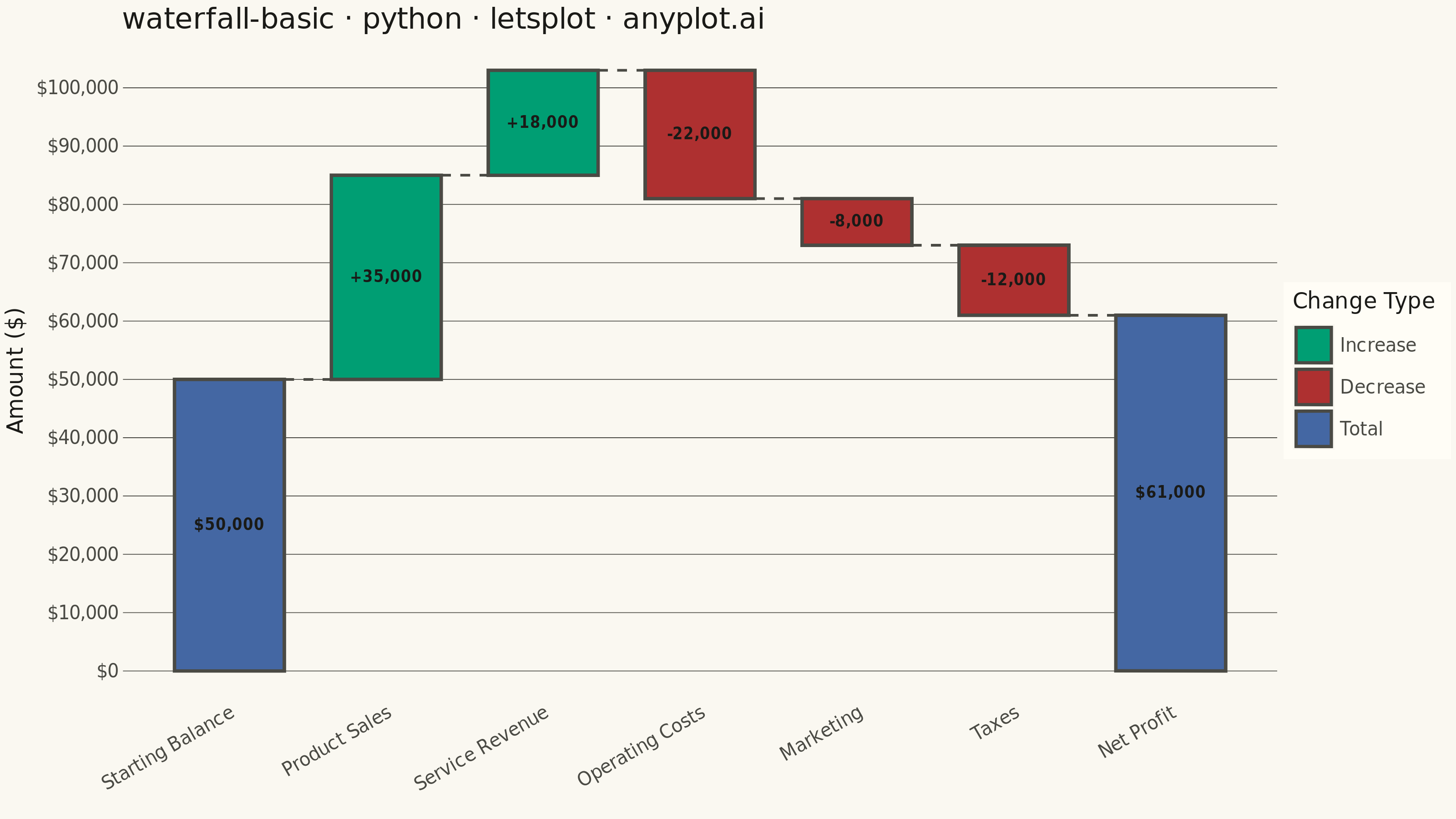
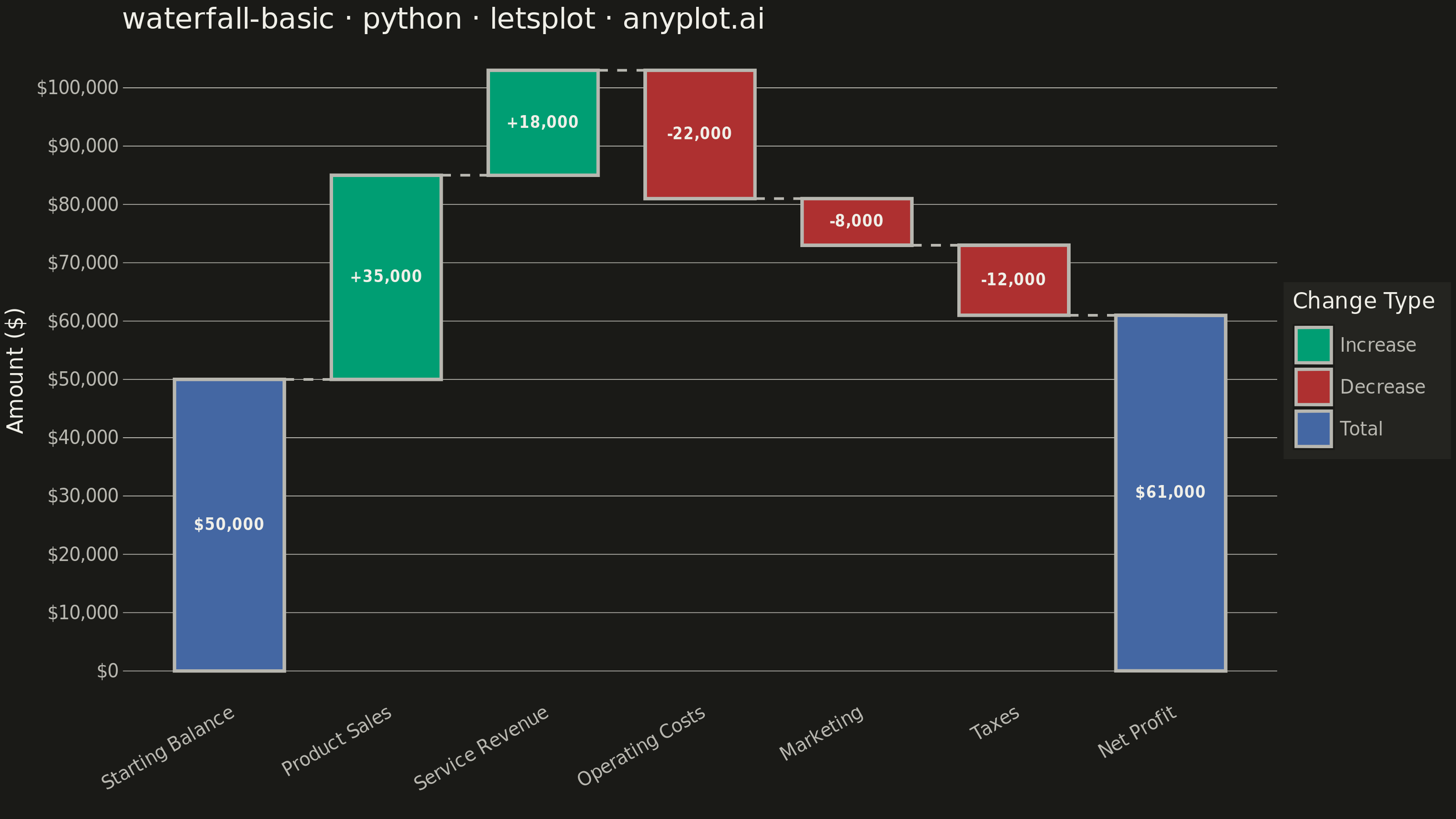
A waterfall chart visualizes how an initial value is affected by a series of intermediate positive or negative values, leading to a final value. Each bar represents a change from the previous cumulative total, with positive values extending upward and negative values extending downward. This chart type is essential for understanding cumulative effects and breaking down the components that contribute to a final result.
""" anyplot.ai
waterfall-basic: Basic Waterfall Chart
Library: letsplot 4.11.0 | Python 3.13.14
Quality: 90/100 | Updated: 2026-08-04
"""

import os

import pandas as pd
from lets_plot import (
    LetsPlot,
    aes,
    element_blank,
    element_line,
    element_rect,
    element_text,
    geom_rect,
    geom_segment,
    geom_text,
    ggplot,
    ggsize,
    labs,
    layer_tooltips,
    scale_fill_manual,
    scale_x_continuous,
    scale_y_continuous,
    theme,
    theme_minimal,
)
from lets_plot.export import ggsave


LetsPlot.setup_html()

# Theme tokens
THEME = os.getenv("ANYPLOT_THEME", "light")
PAGE_BG = "#FAF8F1" if THEME == "light" else "#1A1A17"
ELEVATED_BG = "#FFFDF6" if THEME == "light" else "#242420"
INK = "#1A1A17" if THEME == "light" else "#F0EFE8"
INK_SOFT = "#4A4A44" if THEME == "light" else "#B8B7B0"

# Imprint palette, with a semantic exception for the profit/loss convention:
# green for gains, matte red for losses (both drawn from the Imprint pool),
# blue for the start/end total bars per the spec's "blue or gray" example.
BRAND = "#009E73"  # Position 1 - green (increase)
NEGATIVE = "#AE3030"  # Position 5 - matte red, semantic anchor for loss (decrease)
TOTAL = "#4467A3"  # Position 3 - blue (start/end totals)

# Data - Quarterly financial breakdown from revenue to net income
categories = [
    "Starting Balance",
    "Product Sales",
    "Service Revenue",
    "Operating Costs",
    "Marketing",
    "Taxes",
    "Net Profit",
]
values = [50000, 35000, 18000, -22000, -8000, -12000, 0]

# Calculate waterfall positions
running_total = 0
bar_starts = []
bar_ends = []
bar_colors = []

for i, (_cat, val) in enumerate(zip(categories, values, strict=True)):
    if i == 0:  # Starting balance - total bar
        bar_starts.append(0)
        bar_ends.append(val)
        bar_colors.append("total")
        running_total = val
    elif i == len(categories) - 1:  # Final total
        bar_starts.append(0)
        bar_ends.append(running_total)
        bar_colors.append("total")
    else:  # Intermediate changes
        if val >= 0:
            bar_starts.append(running_total)
            bar_ends.append(running_total + val)
            bar_colors.append("positive")
        else:
            bar_starts.append(running_total + val)
            bar_ends.append(running_total)
            bar_colors.append("negative")
        running_total += val

# Update final value for label
values[-1] = running_total

# Create DataFrame with pre-computed rectangle coordinates
bar_width = 0.35
x_positions = list(range(len(categories)))

df = pd.DataFrame(
    {
        "category": categories,
        "value": values,
        "ymin": bar_starts,
        "ymax": bar_ends,
        "color_type": bar_colors,
        "x_pos": x_positions,
        "xmin": [x - bar_width for x in x_positions],
        "xmax": [x + bar_width for x in x_positions],
    }
)

# Calculate label position (center of each bar)
df["label_y"] = (df["ymin"] + df["ymax"]) / 2

# Format values for labels
df["label"] = df.apply(
    lambda row: f"${row['value']:,.0f}" if row["color_type"] == "total" else f"{row['value']:+,.0f}", axis=1
)
df["tooltip_change"] = df.apply(
    lambda row: "Starting/ending total" if row["color_type"] == "total" else row["label"], axis=1
)

# Calculate connector line data (connects bars) - connect at the edge that
# matches the running total after this bar's change: ymin for decreases
# (post-decrease level), ymax for increases and totals (post-increase level)
connectors = []
for i in range(len(categories) - 1):
    y_val = df["ymin"].iloc[i] if df["color_type"].iloc[i] == "negative" else df["ymax"].iloc[i]
    connectors.append({"x_start": i + bar_width, "x_end": i + 1 - bar_width, "y": y_val})

connector_df = pd.DataFrame(connectors)

# Build waterfall chart
plot = (
    ggplot()
    # Draw bars using geom_rect with pre-computed coordinates; tooltip surfaces
    # the running-total range on hover, a lets-plot-specific interactive touch
    + geom_rect(
        data=df,
        mapping=aes(xmin="xmin", xmax="xmax", ymin="ymin", ymax="ymax", fill="color_type"),
        color=INK_SOFT,
        size=0.8,
        tooltips=layer_tooltips().line("@category").line("Change|@tooltip_change").line("Running total|$@ymax"),
    )
    # Connector lines between bars
    + geom_segment(
        data=connector_df,
        mapping=aes(x="x_start", xend="x_end", y="y", yend="y"),
        color=INK_SOFT,
        size=0.6,
        linetype="dashed",
    )
    # Value labels on bars
    + geom_text(data=df, mapping=aes(x="x_pos", y="label_y", label="label"), color=INK, size=4, fontface="bold")
    # Colors: Imprint palette with a profit/loss semantic exception
    + scale_fill_manual(
        values={"positive": BRAND, "negative": NEGATIVE, "total": TOTAL},
        name="Change Type",
        labels={"positive": "Increase", "negative": "Decrease", "total": "Total"},
    )
    # X axis with category labels
    + scale_x_continuous(breaks=x_positions, labels=categories)
    # Y axis
    + scale_y_continuous(format="${,.0f}")
    # Labels
    + labs(title="waterfall-basic · python · letsplot · anyplot.ai", x="", y="Amount ($)")
    # Theme
    + theme_minimal()
    + theme(
        plot_background=element_rect(fill=PAGE_BG, color=PAGE_BG),
        panel_background=element_rect(fill=PAGE_BG, color=PAGE_BG),
        panel_grid_major_y=element_line(color=INK_SOFT, size=0.4),
        panel_grid_major_x=element_blank(),
        panel_grid_minor=element_blank(),
        plot_title=element_text(size=16, color=INK),
        axis_title=element_text(size=12, color=INK),
        axis_text_x=element_text(size=10, color=INK_SOFT, angle=30),
        axis_text_y=element_text(size=10, color=INK_SOFT),
        legend_title=element_text(size=12, color=INK),
        legend_text=element_text(size=10, color=INK_SOFT),
        legend_background=element_rect(fill=ELEVATED_BG, color=INK_SOFT),
        legend_position="right",
    )
    + ggsize(800, 450)
)

# Save as PNG (scale 4x for 3200x1800)
ggsave(plot, f"plot-{THEME}.png", path=".", scale=4)

# Save as HTML for interactivity
ggsave(plot, f"plot-{THEME}.html", path=".")
Runnable source as JSON, for any HTTP client: https://api.anyplot.ai/specs/waterfall-basic/letsplot/code. Any spec id and library id listed in llms-full.txt fit the same URL shape; every URL below is complete and callable.
{
  "spec_id": "waterfall-basic",
  "language": "python",
  "library": "letsplot",
  "page": "https://anyplot.ai/waterfall-basic/python/letsplot",
  "hub": "https://anyplot.ai/waterfall-basic",
  "code_json": "https://api.anyplot.ai/specs/waterfall-basic/letsplot/code",
  "spec_json": "https://api.anyplot.ai/specs/waterfall-basic",
  "render_light_png": "https://storage.googleapis.com/anyplot-images/plots/waterfall-basic/python/letsplot/plot-light.png",
  "render_dark_png": "https://storage.googleapis.com/anyplot-images/plots/waterfall-basic/python/letsplot/plot-dark.png",
  "interactive_light_html": "https://storage.googleapis.com/anyplot-images/plots/waterfall-basic/python/letsplot/plot-light.html",
  "interactive_dark_html": "https://storage.googleapis.com/anyplot-images/plots/waterfall-basic/python/letsplot/plot-dark.html",
  "quality_score": 90.0,
  "license": "MIT",
  "guide": "https://anyplot.ai/llms.txt"
}
Part of Basic Waterfall Chart on anyplot.ai.