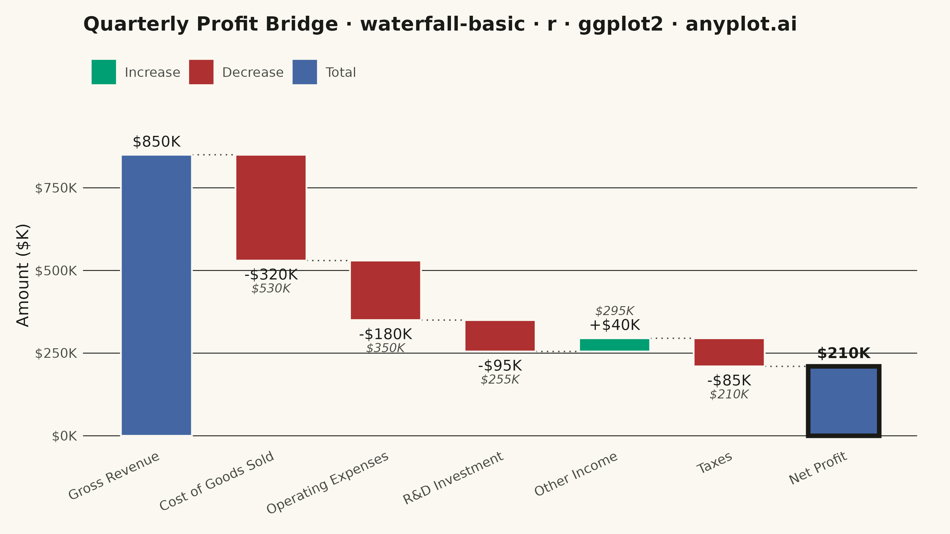
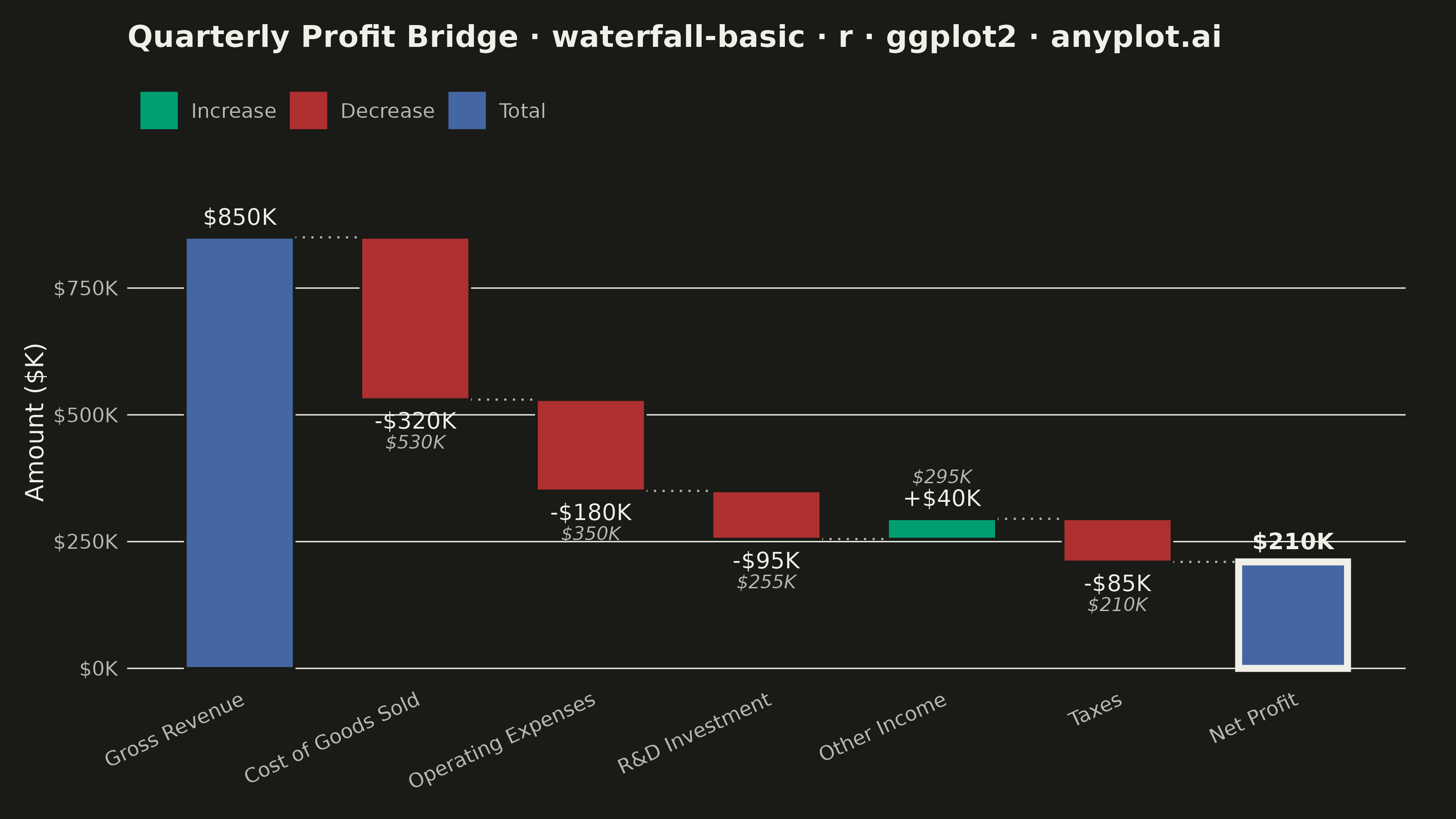
A waterfall chart visualizes how an initial value is affected by a series of intermediate positive or negative values, leading to a final value. Each bar represents a change from the previous cumulative total, with positive values extending upward and negative values extending downward. This chart type is essential for understanding cumulative effects and breaking down the components that contribute to a final result.
#' anyplot.ai
#' waterfall-basic: Basic Waterfall Chart
#' Library: ggplot2 3.5.1 | R 4.4.1
#' Quality: 91/100 | Created: 2026-08-04

library(ggplot2)
library(dplyr)
library(scales)
library(ragg)

set.seed(42)

# --- Theme tokens ------------------------------------------------------------
THEME       <- Sys.getenv("ANYPLOT_THEME", "light")
PAGE_BG     <- if (THEME == "light") "#FAF8F1" else "#1A1A17"
INK         <- if (THEME == "light") "#1A1A17" else "#F0EFE8"
INK_SOFT    <- if (THEME == "light") "#4A4A44" else "#B8B7B0"

# Imprint palette — profit/loss carry a strong sentiment color cue (see
# default-style-guide.md "Semantic exception"), so increases use brand green,
# decreases use the matte-red semantic anchor, and totals use blue (position 3)
# to stand out as the spec's "distinct start/end total bars" requirement.
IMPRINT_INCREASE <- "#009E73"
IMPRINT_DECREASE <- "#AE3030"
IMPRINT_TOTAL    <- "#4467A3"

# --- Data: quarterly profit bridge, revenue to net profit ($K) --------------
steps <- tibble::tibble(
  category = factor(
    c(
      "Gross Revenue", "Cost of Goods Sold", "Operating Expenses",
      "R&D Investment", "Other Income", "Taxes", "Net Profit"
    ),
    levels = c(
      "Gross Revenue", "Cost of Goods Sold", "Operating Expenses",
      "R&D Investment", "Other Income", "Taxes", "Net Profit"
    )
  ),
  raw_value = c(850, -320, -180, -95, 40, -85, NA),
  is_total  = c(TRUE, FALSE, FALSE, FALSE, FALSE, FALSE, TRUE)
)

running <- numeric(nrow(steps))
cum <- 0
for (i in seq_len(nrow(steps))) {
  if (steps$is_total[i] && i == 1) {
    cum <- steps$raw_value[i]
  } else if (steps$is_total[i]) {
    steps$raw_value[i] <- cum
  } else {
    cum <- cum + steps$raw_value[i]
  }
  running[i] <- cum
}

steps <- steps %>%
  mutate(
    x_num    = row_number(),
    cum_end  = running,
    cum_prev = lag(cum_end, default = 0),
    ymin     = ifelse(is_total, 0, pmin(cum_prev, cum_end)),
    ymax     = ifelse(is_total, raw_value, pmax(cum_prev, cum_end)),
    type     = factor(
      case_when(
        is_total ~ "Total",
        raw_value >= 0 ~ "Increase",
        TRUE ~ "Decrease"
      ),
      levels = c("Increase", "Decrease", "Total")
    ),
    label = ifelse(
      is_total,
      dollar(raw_value, suffix = "K"),
      paste0(ifelse(raw_value >= 0, "+", "-"), dollar(abs(raw_value), suffix = "K"))
    ),
    label_y = ifelse(type == "Decrease", ymin - 25, ymax + 25),
    label_vjust = ifelse(type == "Decrease", 1, 0),
    # Secondary label: the literal running total reached after this step
    # (intermediate bars only — total bars already display cum_end as `label`).
    running_label = ifelse(is_total, NA_character_, dollar(cum_end, suffix = "K")),
    running_label_y = ifelse(type == "Decrease", ymin - 70, ymax + 70),
    is_final = row_number() == n(),
    label_face = ifelse(is_final, "bold", "plain")
  )

bar_width <- 0.62
connectors <- steps %>%
  mutate(x_to = lead(x_num) - bar_width / 2) %>%
  filter(row_number() < n()) %>%
  transmute(
    x_from = x_num + bar_width / 2,
    x_to,
    y = cum_end
  )

# --- Plot ---------------------------------------------------------------------
title_text <- "Quarterly Profit Bridge · waterfall-basic · r · ggplot2 · anyplot.ai"
title_n <- nchar(title_text)
title_size <- if (title_n > 67) max(round(12 * 67 / title_n), 8) else 12

p <- ggplot(steps) +
  geom_segment(
    data = connectors,
    aes(x = x_from, xend = x_to, y = y, yend = y),
    color = INK_SOFT, linewidth = 0.4, linetype = "dotted"
  ) +
  geom_rect(
    aes(xmin = x_num - bar_width / 2, xmax = x_num + bar_width / 2,
        ymin = ymin, ymax = ymax, fill = type),
    color = PAGE_BG, linewidth = 0.5
  ) +
  # Focal treatment for the bottom-line bar: bold outline on top of the fill.
  geom_rect(
    data = filter(steps, is_final),
    aes(xmin = x_num - bar_width / 2, xmax = x_num + bar_width / 2,
        ymin = ymin, ymax = ymax),
    fill = NA, color = INK, linewidth = 1.3
  ) +
  geom_text(
    aes(x = x_num, y = label_y, label = label, vjust = label_vjust, fontface = label_face),
    color = INK, size = 3.2
  ) +
  geom_text(
    data = filter(steps, !is_total),
    aes(x = x_num, y = running_label_y, label = running_label, vjust = label_vjust),
    color = INK_SOFT, size = 2.6, fontface = "italic"
  ) +
  scale_x_continuous(breaks = steps$x_num, labels = steps$category) +
  scale_y_continuous(
    labels = label_dollar(suffix = "K"),
    expand = expansion(mult = c(0.03, 0.14))
  ) +
  scale_fill_manual(
    values = c(
      "Increase" = IMPRINT_INCREASE,
      "Decrease" = IMPRINT_DECREASE,
      "Total"    = IMPRINT_TOTAL
    )
  ) +
  labs(x = NULL, y = "Amount ($K)", fill = NULL, title = title_text) +
  theme_minimal(base_size = 8)

# --- Style ---------------------------------------------------------------------
p <- p +
  theme(
    plot.background      = element_rect(fill = PAGE_BG, color = PAGE_BG),
    panel.background     = element_rect(fill = PAGE_BG, color = NA),
    panel.grid.major.x   = element_blank(),
    panel.grid.minor     = element_blank(),
    panel.grid.major.y   = element_line(color = INK, linewidth = 0.25),
    axis.title.y         = element_text(color = INK, size = 10),
    axis.text.x          = element_text(color = INK_SOFT, size = 8, angle = 25, hjust = 1),
    axis.text.y          = element_text(color = INK_SOFT, size = 8),
    axis.ticks           = element_blank(),
    axis.line            = element_blank(),
    plot.title           = element_text(color = INK, size = title_size, face = "bold", margin = margin(b = 10)),
    legend.position       = "top",
    legend.justification  = "left",
    legend.text           = element_text(color = INK_SOFT, size = 8),
    legend.key            = element_rect(fill = PAGE_BG, color = NA),
    plot.margin           = margin(t = 10, r = 20, b = 10, l = 10)
  )

# --- Save ---------------------------------------------------------------------
ggsave(
  filename = sprintf("plot-%s.png", THEME),
  plot     = p,
  device   = ragg::agg_png,
  width    = 8,
  height   = 4.5,
  units    = "in",
  dpi      = 400
)
Runnable source as JSON, for any HTTP client: https://api.anyplot.ai/specs/waterfall-basic/ggplot2/code. Any spec id and library id listed in llms-full.txt fit the same URL shape; every URL below is complete and callable.
{
  "spec_id": "waterfall-basic",
  "language": "r",
  "library": "ggplot2",
  "page": "https://anyplot.ai/waterfall-basic/r/ggplot2",
  "hub": "https://anyplot.ai/waterfall-basic",
  "code_json": "https://api.anyplot.ai/specs/waterfall-basic/ggplot2/code",
  "spec_json": "https://api.anyplot.ai/specs/waterfall-basic",
  "render_light_png": "https://storage.googleapis.com/anyplot-images/plots/waterfall-basic/r/ggplot2/plot-light.png",
  "render_dark_png": "https://storage.googleapis.com/anyplot-images/plots/waterfall-basic/r/ggplot2/plot-dark.png",
  "quality_score": 91.0,
  "license": "MIT",
  "guide": "https://anyplot.ai/llms.txt"
}
Part of Basic Waterfall Chart on anyplot.ai.