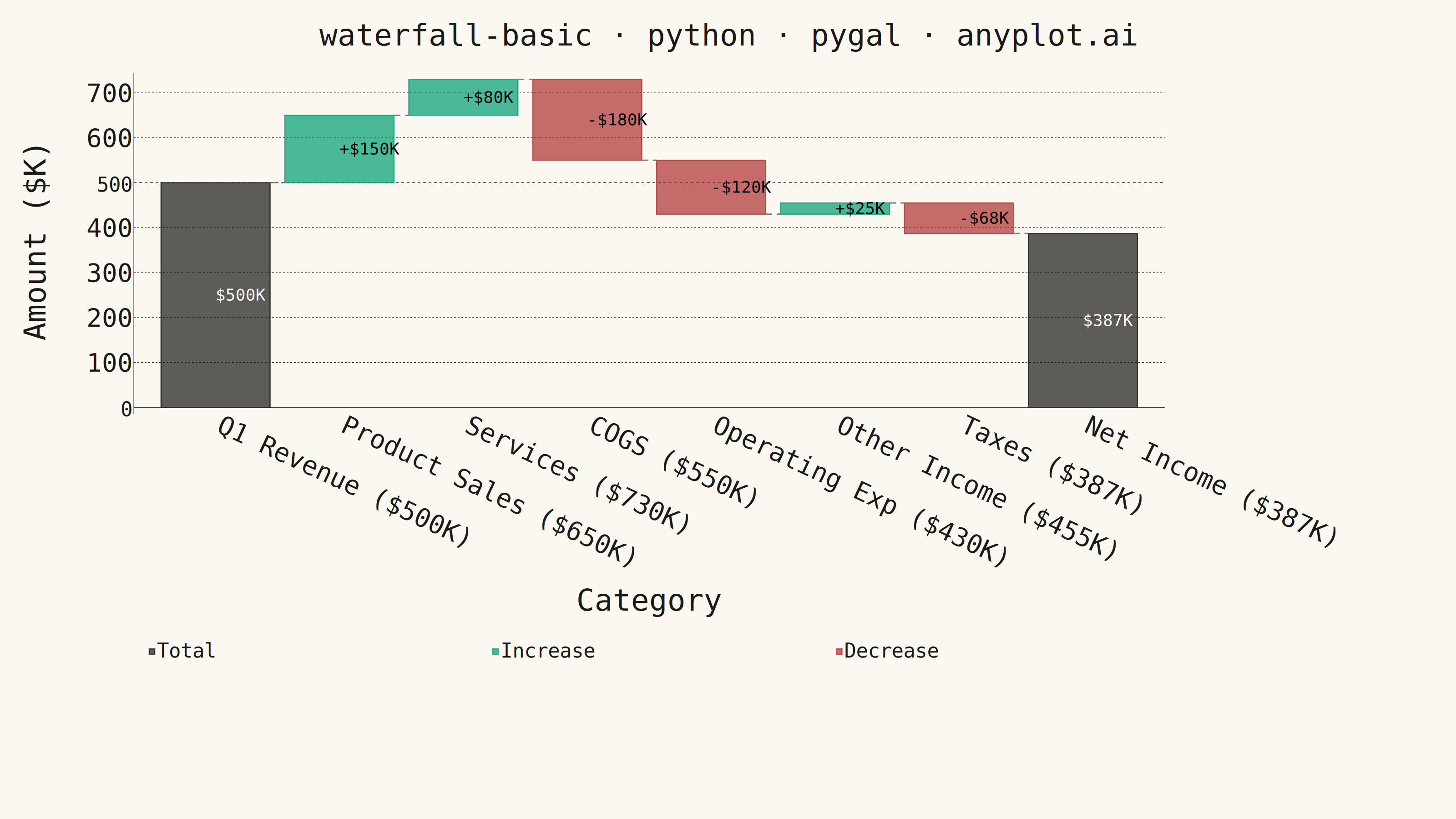
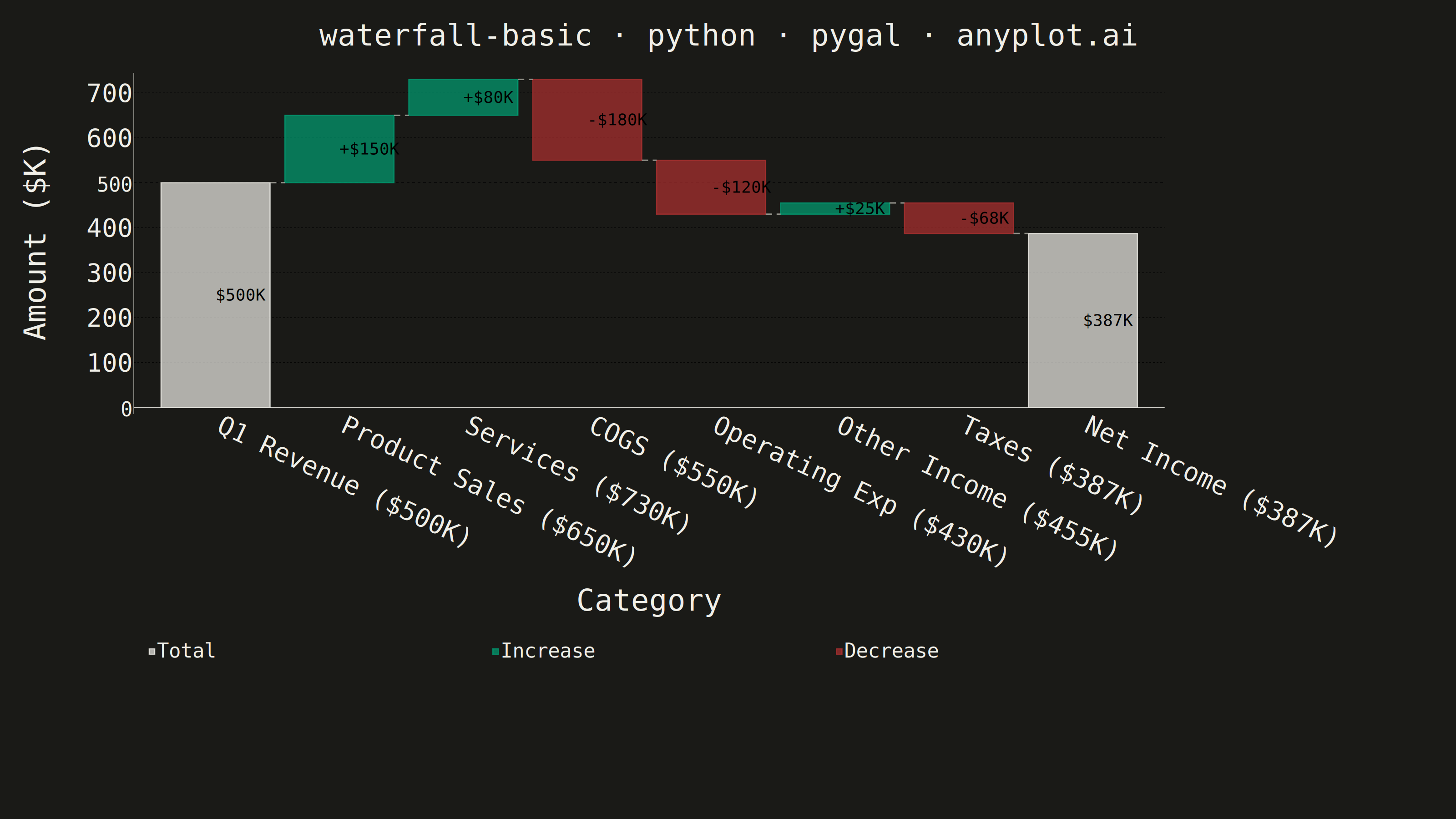
A waterfall chart visualizes how an initial value is affected by a series of intermediate positive or negative values, leading to a final value. Each bar represents a change from the previous cumulative total, with positive values extending upward and negative values extending downward. This chart type is essential for understanding cumulative effects and breaking down the components that contribute to a final result.
""" anyplot.ai
waterfall-basic: Basic Waterfall Chart
Library: pygal 3.1.3 | Python 3.13.14
Quality: 89/100 | Updated: 2026-08-04
"""

import os

import pygal
from pygal.style import Style


# Theme tokens (Imprint palette — see default-style-guide.md)
THEME = os.getenv("ANYPLOT_THEME", "light")
PAGE_BG = "#FAF8F1" if THEME == "light" else "#1A1A17"
INK = "#1A1A17" if THEME == "light" else "#F0EFE8"
INK_MUTED = "#6B6A63" if THEME == "light" else "#A8A79F"

# Semantic exception (default-style-guide.md "Color Philosophy"): sentiment/polarity
# categories map to their expected colors rather than plain ordinal position.
BRAND_GREEN = "#009E73"  # Imprint position 1 — gain / increase
SEMANTIC_RED = "#AE3030"  # Imprint position 5 — deferred loss/error anchor — decrease
NEUTRAL = INK  # theme-adaptive semantic anchor — totals / baseline

# Data: quarterly financial breakdown from revenue to net income
categories = ["Q1 Revenue", "Product Sales", "Services", "COGS", "Operating Exp", "Other Income", "Taxes", "Net Income"]
changes = [500, 150, 80, -180, -120, 25, -68, None]

# Running totals + per-bar geometry for the waterfall effect
running_total = 0
bar_bottoms, bar_heights, bar_types, display_values, running_totals = [], [], [], [], []

for i, val in enumerate(changes):
    if i == 0:
        bar_bottoms.append(0)
        bar_heights.append(val)
        bar_types.append("total")
        display_values.append(val)
        running_total = val
    elif val is None:
        bar_bottoms.append(0)
        bar_heights.append(running_total)
        bar_types.append("total")
        display_values.append(running_total)
    elif val >= 0:
        bar_bottoms.append(running_total)
        bar_heights.append(val)
        bar_types.append("positive")
        display_values.append(val)
        running_total += val
    else:
        running_total += val
        bar_bottoms.append(running_total)
        bar_heights.append(abs(val))
        bar_types.append("negative")
        display_values.append(val)
    running_totals.append(running_total)


class WaterfallChart(pygal.StackedBar):
    """StackedBar with dashed connector lines between waterfall steps.

    pygal has no native bar+line combo chart, so the connectors are drawn
    directly on the SVG plot layer, reusing the exact view/margin math
    StackedBar._bar() uses internally so the connector endpoints land
    pixel-exact on the bar edges.
    """

    def __init__(self, *args, connector_levels=None, connector_color="#000", **kwargs):
        self._connector_levels = connector_levels or []
        self._connector_color = connector_color
        super().__init__(*args, **kwargs)

    def _plot(self):
        super()._plot()
        n = self._len
        width_full = (self.view.x(1) - self.view.x(0)) / n
        margin = width_full * self._series_margin
        bar_width = width_full - 2 * margin
        node = self.svg.node(self.nodes["plot"], class_="waterfall-connectors")
        for i, level in enumerate(self._connector_levels):
            if level is None:
                continue
            x_right = self.view.x(i / n) + margin + bar_width
            x_left = self.view.x((i + 1) / n) + margin
            y = self.view.y(level)
            self.svg.line(
                node,
                [(x_right, y), (x_left, y)],
                style=(f"stroke:{self._connector_color};stroke-width:3;stroke-dasharray:14,10;fill:none;opacity:0.85"),
            )


# Theme-adaptive Style — first categorical series is always Imprint position 1
custom_style = Style(
    background=PAGE_BG,
    plot_background=PAGE_BG,
    foreground=INK,
    foreground_strong=INK,
    foreground_subtle=INK_MUTED,
    colors=("transparent", NEUTRAL, BRAND_GREEN, SEMANTIC_RED),
    title_font_size=66,
    label_font_size=56,
    major_label_font_size=44,
    legend_font_size=44,
    value_font_size=36,
    value_label_font_size=36,  # pygal renders print_labels() text (our "+$150K"
    # strings) through this separate key, NOT value_font_size — easy to miss since
    # it defaults to 10px regardless of the other sizes
    stroke_width=2.5,
)

chart = WaterfallChart(
    width=3200,
    height=1800,
    style=custom_style,
    title="waterfall-basic · python · pygal · anyplot.ai",
    x_title="Category",
    y_title="Amount ($K)",
    show_legend=True,
    legend_at_bottom=True,
    legend_at_bottom_columns=3,  # force Total/Increase/Decrease onto one row
    # instead of pygal's default ceil(sqrt(n)) grid, which scattered them 2x2
    show_y_guides=True,
    show_x_guides=False,
    print_labels=True,  # show the "+$150K" / "-$180K" strings from each point's
    # "label" key — plain print_values would print the raw stacked-segment height
    # instead (and, via StackedBar's none_to_zero adapter, a stray "0" for every
    # other series' empty slot at that category)
    print_values_position="center",
    truncate_legend=-1,
    truncate_label=-1,
    x_label_rotation=25,
    margin=60,
    margin_bottom=380,
    spacing=34,  # extra breathing room so the legend row doesn't crowd the x_title
    connector_levels=running_totals[:-1],
    connector_color=INK_MUTED,
)

# Set x-axis labels (category + running total)
labels_with_totals = [f"{cat} (${running_totals[i]}K)" for i, cat in enumerate(categories)]
chart.x_labels = labels_with_totals

# Build data series: spacer (invisible), totals, positive changes, negative changes
spacer_data, total_data, positive_data, negative_data = [], [], [], []

for i in range(len(categories)):
    bottom = bar_bottoms[i]
    height = bar_heights[i]
    btype = bar_types[i]
    disp_val = display_values[i]

    spacer_data.append({"value": bottom if bottom > 0 else None, "label": ""})

    if btype == "total":
        total_data.append({"value": height, "label": f"${disp_val}K"})
        positive_data.append({"value": None})
        negative_data.append({"value": None})
    elif btype == "positive":
        total_data.append({"value": None})
        positive_data.append({"value": height, "label": f"+${disp_val}K"})
        negative_data.append({"value": None})
    else:
        total_data.append({"value": None})
        positive_data.append({"value": None})
        negative_data.append({"value": height, "label": f"-${abs(disp_val)}K"})

# Add series in stack order (bottom to top). Series order fixes the Style.colors
# index: spacer(0)=transparent, Total(1)=neutral, Increase(2)=brand green
# (Imprint position 1 — semantic "gain"), Decrease(3)=matte red (Imprint
# position 5 — semantic "loss"), per default-style-guide.md Semantic Exception.
chart.add(None, spacer_data, stroke_style={"width": 0}, show_legend=False)
chart.add("Total", total_data)
chart.add("Increase", positive_data)
chart.add("Decrease", negative_data)

# Save outputs
chart.render_to_png(f"plot-{THEME}.png")
chart.render_to_file(f"plot-{THEME}.html")
Runnable source as JSON, for any HTTP client: https://api.anyplot.ai/specs/waterfall-basic/pygal/code. Any spec id and library id listed in llms-full.txt fit the same URL shape; every URL below is complete and callable.
{
  "spec_id": "waterfall-basic",
  "language": "python",
  "library": "pygal",
  "page": "https://anyplot.ai/waterfall-basic/python/pygal",
  "hub": "https://anyplot.ai/waterfall-basic",
  "code_json": "https://api.anyplot.ai/specs/waterfall-basic/pygal/code",
  "spec_json": "https://api.anyplot.ai/specs/waterfall-basic",
  "render_light_png": "https://storage.googleapis.com/anyplot-images/plots/waterfall-basic/python/pygal/plot-light.png",
  "render_dark_png": "https://storage.googleapis.com/anyplot-images/plots/waterfall-basic/python/pygal/plot-dark.png",
  "interactive_light_html": "https://storage.googleapis.com/anyplot-images/plots/waterfall-basic/python/pygal/plot-light.html",
  "interactive_dark_html": "https://storage.googleapis.com/anyplot-images/plots/waterfall-basic/python/pygal/plot-dark.html",
  "quality_score": 89.0,
  "license": "MIT",
  "guide": "https://anyplot.ai/llms.txt"
}
Part of Basic Waterfall Chart on anyplot.ai.