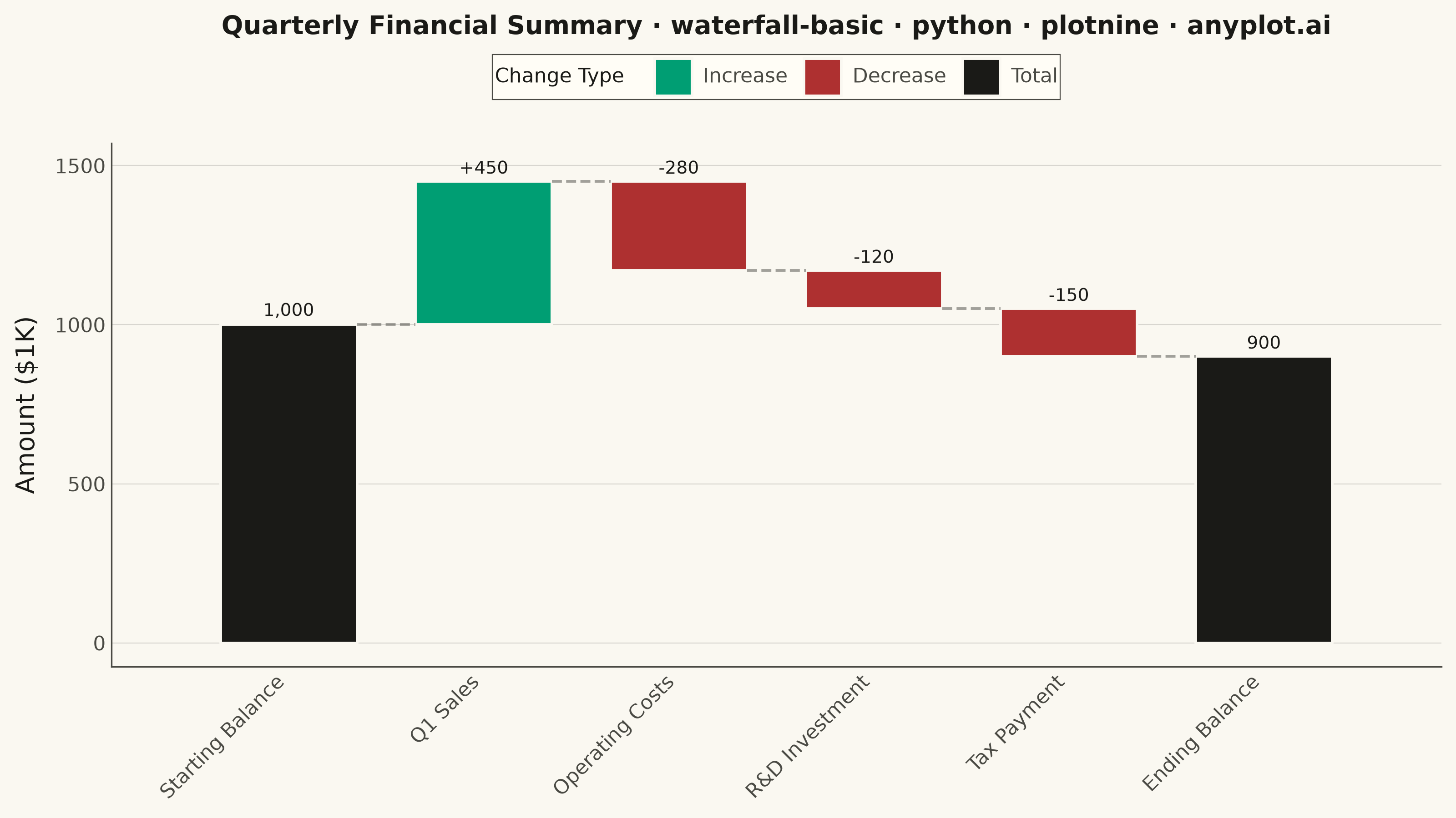
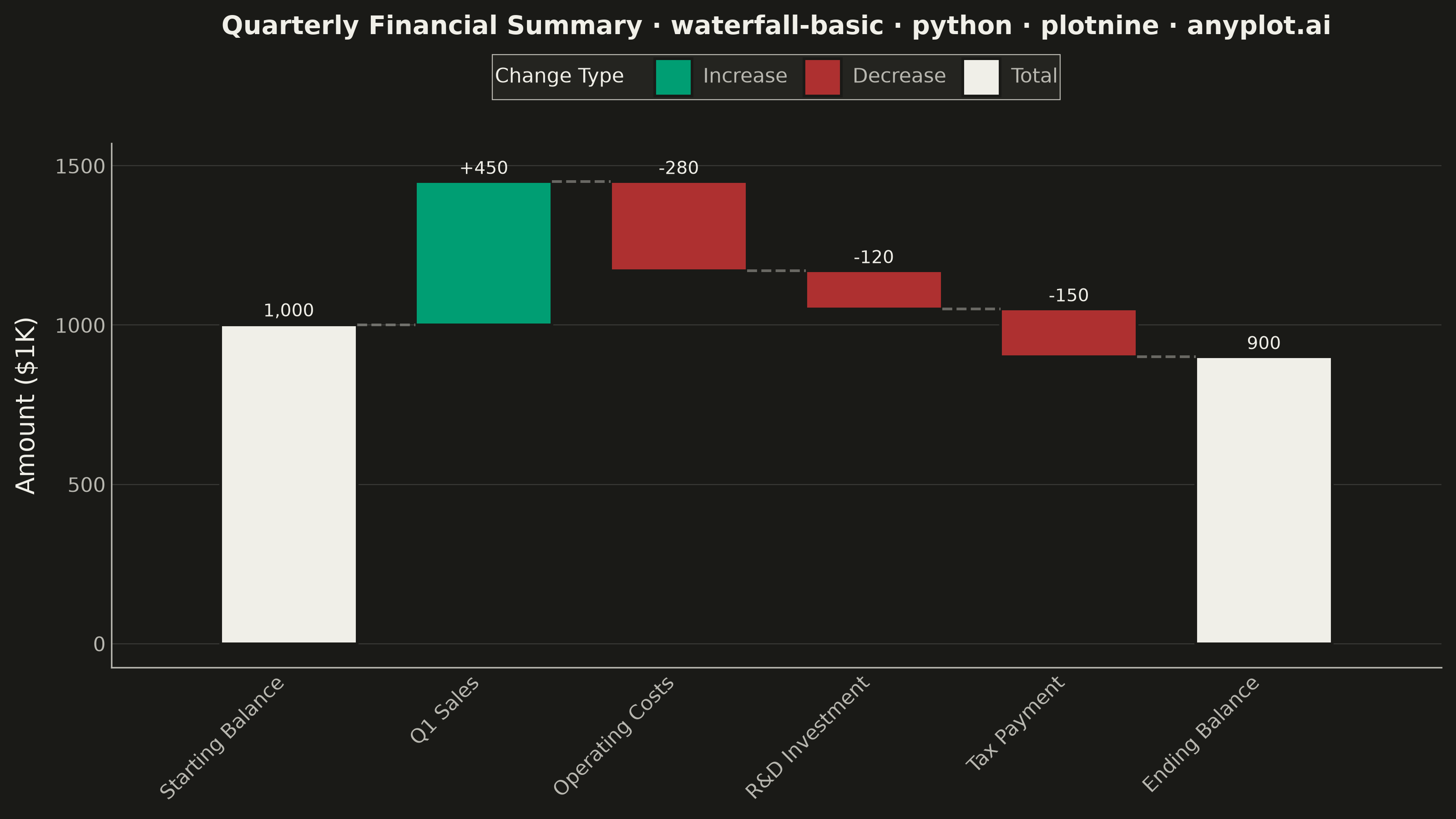
A waterfall chart visualizes how an initial value is affected by a series of intermediate positive or negative values, leading to a final value. Each bar represents a change from the previous cumulative total, with positive values extending upward and negative values extending downward. This chart type is essential for understanding cumulative effects and breaking down the components that contribute to a final result.
""" anyplot.ai
waterfall-basic: Basic Waterfall Chart
Library: plotnine 0.15.7 | Python 3.13.14
Quality: 92/100 | Created: 2026-08-04
"""

import os

import pandas as pd
from plotnine import (
    aes,
    element_blank,
    element_line,
    element_rect,
    element_text,
    geom_rect,
    geom_segment,
    geom_text,
    ggplot,
    labs,
    scale_fill_manual,
    scale_x_continuous,
    theme,
    theme_minimal,
)


# Theme tokens
THEME = os.getenv("ANYPLOT_THEME", "light")
PAGE_BG = "#FAF8F1" if THEME == "light" else "#1A1A17"
ELEVATED_BG = "#FFFDF6" if THEME == "light" else "#242420"
INK = "#1A1A17" if THEME == "light" else "#F0EFE8"
INK_SOFT = "#4A4A44" if THEME == "light" else "#B8B7B0"

# Imprint categorical palette - positive/negative reassigned via the finance
# semantic exception (profit/gain -> green, loss/down -> red); totals use the
# theme-adaptive neutral anchor so they read as part of the chart's structure.
IMPRINT_PALETTE = ["#009E73", "#C475FD", "#4467A3", "#BD8233", "#AE3030", "#2ABCCD", "#954477", "#99B314"]

# Data - quarterly financial breakdown
categories = ["Starting Balance", "Q1 Sales", "Operating Costs", "R&D Investment", "Tax Payment", "Ending Balance"]
values = [1000, 450, -280, -120, -150, 900]

df = pd.DataFrame({"category": categories, "value": values})
df["category"] = pd.Categorical(df["category"], categories=categories, ordered=True)

# Calculate cumulative waterfall positions
running_total = 0
starts = []
ends = []
bar_types = []

for i, val in enumerate(values):
    if i == 0:
        starts.append(0)
        ends.append(val)
        bar_types.append("total")
        running_total = val
    elif i == len(values) - 1:
        starts.append(0)
        ends.append(running_total)
        bar_types.append("total")
    else:
        if val >= 0:
            starts.append(running_total)
            ends.append(running_total + val)
            bar_types.append("positive")
        else:
            starts.append(running_total + val)
            ends.append(running_total)
            bar_types.append("negative")
        running_total += val

df["start"] = starts
df["end"] = ends
df["bar_type"] = pd.Categorical(bar_types, categories=["positive", "negative", "total"], ordered=True)
df["x_pos"] = range(len(categories))

# Value labels: signed deltas for changes, plain totals for start/end bars
label_offset = 45
df["label"] = [f"{v:+,}" if t != "total" else f"{v:,}" for v, t in zip(values, bar_types, strict=True)]
df["label_y"] = [e + label_offset if e >= s else e - label_offset for s, e in zip(starts, ends, strict=True)]

# Connector lines bridging each bar's running total to the next bar's start.
# The bridging y-value is always the post-change running total after step i:
# for a decrease bar that value lives in "start", not "end".
connectors = []
for i in range(len(df) - 1):
    bridge_y = df.iloc[i]["start"] if bar_types[i] == "negative" else df.iloc[i]["end"]
    connectors.append({"x_start": df.iloc[i]["x_pos"] + 0.35, "x_end": df.iloc[i + 1]["x_pos"] - 0.35, "y": bridge_y})
connector_df = pd.DataFrame(connectors) if connectors else pd.DataFrame()

colors = {"total": INK, "positive": IMPRINT_PALETTE[0], "negative": IMPRINT_PALETTE[4]}

# Title, scaled to the mandated ~67-char baseline
title = "Quarterly Financial Summary · waterfall-basic · python · plotnine · anyplot.ai"
title_fontsize = round(12 * min(1.0, 67 / len(title)))

plot = ggplot() + geom_rect(
    df,
    aes(xmin="x_pos - 0.35", xmax="x_pos + 0.35", ymin="start", ymax="end", fill="bar_type"),
    color=PAGE_BG,
    size=0.6,
)

if not connector_df.empty:
    plot = plot + geom_segment(
        connector_df,
        aes(x="x_start", xend="x_end", y="y", yend="y"),
        color=INK_SOFT,
        size=0.6,
        alpha=0.5,
        linetype="dashed",
    )

plot = (
    plot
    + geom_text(df, aes(x="x_pos", y="label_y", label="label"), size=7, color=INK)
    + scale_fill_manual(
        values=colors, name="Change Type", labels={"total": "Total", "positive": "Increase", "negative": "Decrease"}
    )
    + scale_x_continuous(breaks=list(range(len(categories))), labels=categories, limits=(-0.6, len(categories) - 0.4))
    + labs(x="", y="Amount ($1K)", title=title)
    + theme_minimal()
    + theme(
        figure_size=(8, 4.5),
        plot_background=element_rect(fill=PAGE_BG, color=PAGE_BG),
        panel_background=element_rect(fill=PAGE_BG),
        panel_border=element_blank(),
        panel_grid_major_x=element_blank(),
        panel_grid_major_y=element_line(color=INK, size=0.4, alpha=0.15),
        panel_grid_minor=element_blank(),
        axis_line_x=element_line(color=INK_SOFT, size=0.6),
        axis_line_y=element_line(color=INK_SOFT, size=0.6),
        axis_ticks_major=element_blank(),
        axis_title=element_text(size=10, color=INK),
        axis_text_x=element_text(size=8, color=INK_SOFT, angle=45, ha="right"),
        axis_text_y=element_text(size=8, color=INK_SOFT),
        plot_title=element_text(size=title_fontsize, color=INK, fontweight="bold"),
        legend_background=element_rect(fill=ELEVATED_BG, color=INK_SOFT, size=0.4),
        legend_text=element_text(size=8, color=INK_SOFT),
        legend_title=element_text(size=8, color=INK),
        legend_position="top",
        legend_key=element_blank(),
    )
)

plot.save(f"plot-{THEME}.png", dpi=400, width=8, height=4.5, units="in")
Runnable source as JSON, for any HTTP client: https://api.anyplot.ai/specs/waterfall-basic/plotnine/code. Any spec id and library id listed in llms-full.txt fit the same URL shape; every URL below is complete and callable.
{
  "spec_id": "waterfall-basic",
  "language": "python",
  "library": "plotnine",
  "page": "https://anyplot.ai/waterfall-basic/python/plotnine",
  "hub": "https://anyplot.ai/waterfall-basic",
  "code_json": "https://api.anyplot.ai/specs/waterfall-basic/plotnine/code",
  "spec_json": "https://api.anyplot.ai/specs/waterfall-basic",
  "render_light_png": "https://storage.googleapis.com/anyplot-images/plots/waterfall-basic/python/plotnine/plot-light.png",
  "render_dark_png": "https://storage.googleapis.com/anyplot-images/plots/waterfall-basic/python/plotnine/plot-dark.png",
  "quality_score": 92.0,
  "license": "MIT",
  "guide": "https://anyplot.ai/llms.txt"
}
Part of Basic Waterfall Chart on anyplot.ai.