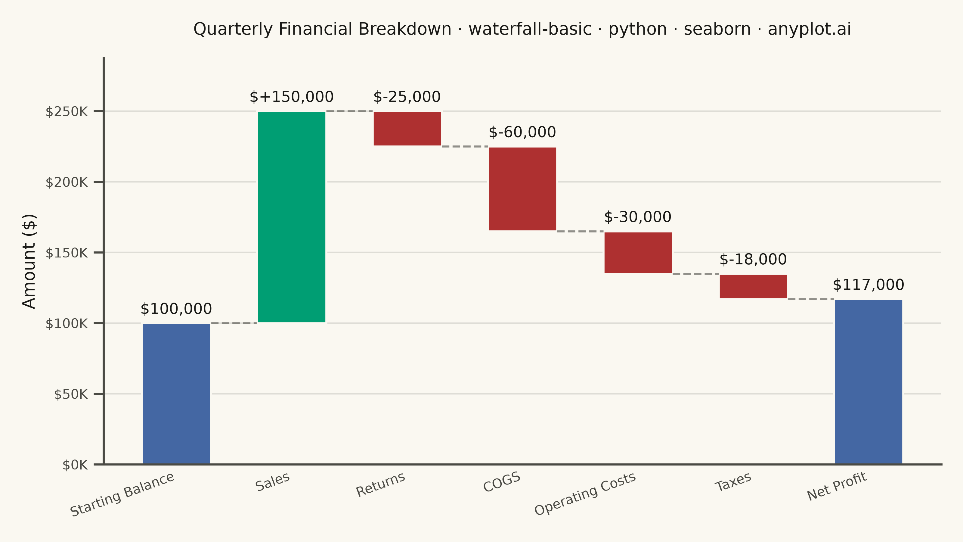
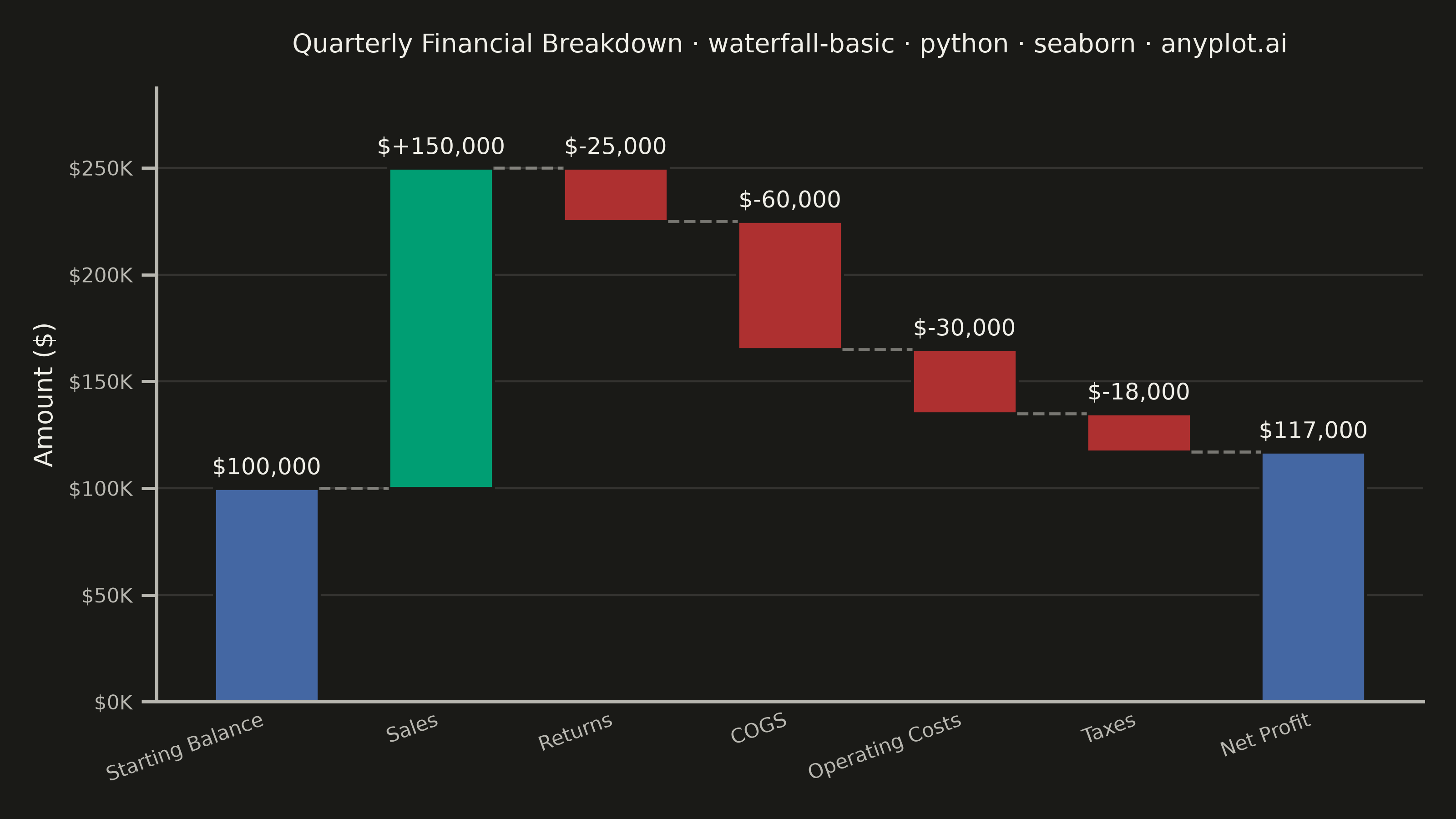
A waterfall chart visualizes how an initial value is affected by a series of intermediate positive or negative values, leading to a final value. Each bar represents a change from the previous cumulative total, with positive values extending upward and negative values extending downward. This chart type is essential for understanding cumulative effects and breaking down the components that contribute to a final result.
""" anyplot.ai
waterfall-basic: Basic Waterfall Chart
Library: seaborn 0.13.2 | Python 3.13.14
Quality: 87/100 | Updated: 2026-08-04
"""

import os

import matplotlib.pyplot as plt
import matplotlib.ticker as mticker
import pandas as pd
import seaborn as sns
from matplotlib.patches import Patch


# Theme tokens (see prompts/default-style-guide.md "Background" + "Theme-adaptive Chrome")
THEME = os.getenv("ANYPLOT_THEME", "light")
PAGE_BG = "#FAF8F1" if THEME == "light" else "#1A1A17"
INK = "#1A1A17" if THEME == "light" else "#F0EFE8"
INK_SOFT = "#4A4A44" if THEME == "light" else "#B8B7B0"

# Imprint palette — brand green for increases, semantic red for decreases,
# blue for the start/end totals (spec calls out "blue or gray" for totals).
# Sourced through sns.color_palette() rather than raw hex literals.
BRAND_GREEN, ACCENT_RED, ACCENT_BLUE = sns.color_palette(["#009E73", "#AE3030", "#4467A3"])

# Data: quarterly financial breakdown from revenue to net profit
categories = ["Starting Balance", "Sales", "Returns", "COGS", "Operating Costs", "Taxes", "Net Profit"]
values = [100000, 150000, -25000, -60000, -30000, -18000, 117000]
is_total = [True, False, False, False, False, False, True]

rows = []
cumulative = 0
for i, (cat, val, total) in enumerate(zip(categories, values, is_total, strict=True)):
    if total:
        start, end = 0, val if i == 0 else cumulative
        color = ACCENT_BLUE
    else:
        start, end = cumulative, cumulative + val
        color = BRAND_GREEN if val > 0 else ACCENT_RED
    cumulative = end
    rows.append({"category": cat, "value": val, "start": start, "end": end, "color": color, "is_total": total})

df = pd.DataFrame(rows)

# Style — theme-adaptive chrome via seaborn's rc override
sns.set_theme(
    style="ticks",
    rc={
        "figure.facecolor": PAGE_BG,
        "axes.facecolor": PAGE_BG,
        "axes.edgecolor": INK_SOFT,
        "axes.labelcolor": INK,
        "text.color": INK,
        "xtick.color": INK_SOFT,
        "ytick.color": INK_SOFT,
        "grid.color": INK,
        "grid.alpha": 0.12,
    },
)

# Plot — see default-style-guide.md "Visual Sizing Defaults" for canvas + sizing values
fig, ax = plt.subplots(figsize=(8, 4.5), dpi=400, facecolor=PAGE_BG)
ax.set_facecolor(PAGE_BG)

bar_width = 0.6
for idx, row in df.iterrows():
    bottom = min(row["start"], row["end"])
    height = abs(row["end"] - row["start"])
    ax.bar(idx, height, bar_width, bottom=bottom, color=row["color"], edgecolor=PAGE_BG, linewidth=1.2)

    # Connecting line to the next bar, emphasizing the cumulative flow
    if idx < len(df) - 1:
        sns.lineplot(
            x=[idx + bar_width / 2, idx + 1 - bar_width / 2],
            y=[row["end"], row["end"]],
            ax=ax,
            color=INK_SOFT,
            linewidth=1.2,
            linestyle="--",
            alpha=0.6,
            legend=False,
        )

    # Per-step delta label above each bar, plus a lighter running-total
    # label underneath for intermediate steps (spec: "Display running
    # total labels on or near bars for clarity").
    top = max(row["start"], row["end"])
    if row["is_total"]:
        ax.text(
            idx, top + 4000, f"${row['end']:,.0f}", ha="center", va="bottom", fontsize=9, color=INK, fontweight="medium"
        )
    else:
        ax.text(
            idx,
            top + 4000,
            f"${row['value']:+,.0f}",
            ha="center",
            va="bottom",
            fontsize=9,
            color=INK,
            fontweight="medium",
        )
        ax.text(idx, top + 15000, f"Total: ${row['end']:,.0f}", ha="center", va="bottom", fontsize=7, color=INK_SOFT)

# Style
ax.set_xticks(range(len(df)))
ax.set_xticklabels(df["category"], fontsize=8, rotation=20, ha="right")
ax.set_ylabel("Amount ($)", fontsize=10, color=INK)
title = "Quarterly Financial Breakdown · waterfall-basic · python · seaborn · anyplot.ai"
ax.set_title(title, fontsize=10, fontweight="medium", color=INK, pad=14)
ax.tick_params(axis="y", labelsize=8, colors=INK_SOFT)
ax.tick_params(axis="x", length=0)
sns.despine(ax=ax)
ax.spines["left"].set_color(INK_SOFT)
ax.spines["bottom"].set_color(INK_SOFT)
ax.set_ylim(0, max(df["end"].max(), df["start"].max()) * 1.25)
ax.yaxis.grid(True, alpha=0.12, linewidth=0.8)
ax.yaxis.set_major_formatter(mticker.FuncFormatter(lambda x, _: f"${x / 1000:.0f}K"))

# Legend clarifying the increase/decrease/total color convention
legend_handles = [
    Patch(facecolor=BRAND_GREEN, label="Increase"),
    Patch(facecolor=ACCENT_RED, label="Decrease"),
    Patch(facecolor=ACCENT_BLUE, label="Total"),
]
ax.legend(handles=legend_handles, loc="upper right", fontsize=8, frameon=False, labelcolor=INK)

# Save — bbox_inches MUST stay default (None) so figsize x dpi hits the exact canvas target
plt.tight_layout()
plt.savefig(f"plot-{THEME}.png", dpi=400, facecolor=PAGE_BG)
plt.close()
Runnable source as JSON, for any HTTP client: https://api.anyplot.ai/specs/waterfall-basic/seaborn/code. Any spec id and library id listed in llms-full.txt fit the same URL shape; every URL below is complete and callable.
{
  "spec_id": "waterfall-basic",
  "language": "python",
  "library": "seaborn",
  "page": "https://anyplot.ai/waterfall-basic/python/seaborn",
  "hub": "https://anyplot.ai/waterfall-basic",
  "code_json": "https://api.anyplot.ai/specs/waterfall-basic/seaborn/code",
  "spec_json": "https://api.anyplot.ai/specs/waterfall-basic",
  "render_light_png": "https://storage.googleapis.com/anyplot-images/plots/waterfall-basic/python/seaborn/plot-light.png",
  "render_dark_png": "https://storage.googleapis.com/anyplot-images/plots/waterfall-basic/python/seaborn/plot-dark.png",
  "quality_score": 87.0,
  "license": "MIT",
  "guide": "https://anyplot.ai/llms.txt"
}
Part of Basic Waterfall Chart on anyplot.ai.