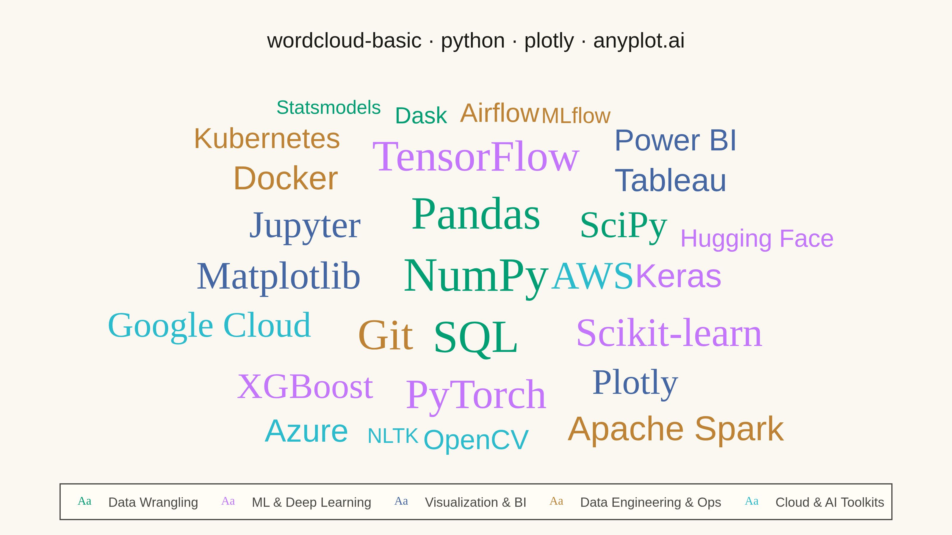
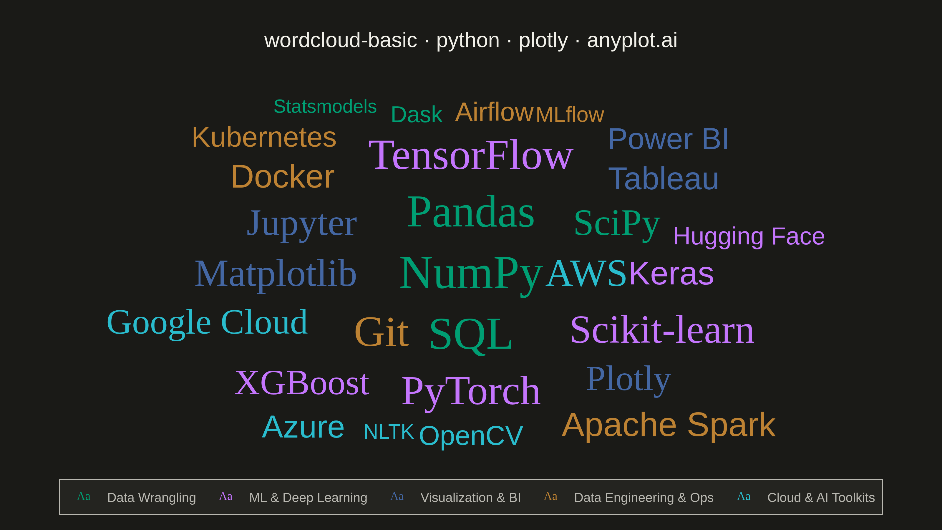
A word cloud displays text data where word size represents frequency or importance. Words are arranged to fill available space, creating a visual summary of text content that highlights prominent terms and patterns. This visualization is ideal for quickly identifying the most common themes or keywords in a body of text.
""" anyplot.ai
wordcloud-basic: Basic Word Cloud
Library: plotly 6.9.0 | Python 3.13.14
Quality: 89/100 | Updated: 2026-08-04
"""

import os

import plotly.graph_objects as go


# Theme tokens (see prompts/default-style-guide.md "Background" + "Theme-adaptive Chrome")
THEME = os.getenv("ANYPLOT_THEME", "light")
PAGE_BG = "#FAF8F1" if THEME == "light" else "#1A1A17"
ELEVATED_BG = "#FFFDF6" if THEME == "light" else "#242420"
INK = "#1A1A17" if THEME == "light" else "#F0EFE8"
INK_SOFT = "#4A4A44" if THEME == "light" else "#B8B7B0"

# Imprint categorical palette (colorblind-safe, canonical order) — one color per tool category
IMPRINT = ["#009E73", "#C475FD", "#4467A3", "#BD8233", "#2ABCCD"]

# Data - data-science tool ecosystem, grouped into categories (encoded via color)
# word: (frequency, category index, x, y) — positions solved by a bounding-box
# nearest-to-center packing pass so no two words overlap on the 800x450 canvas
word_data = {
    "NumPy": (95, 0, 0.500, 0.498),
    "Pandas": (92, 0, 0.500, 0.677),
    "SQL": (92, 0, 0.500, 0.320),
    "Git": (88, 3, 0.393, 0.326),
    "TensorFlow": (88, 1, 0.500, 0.843),
    "PyTorch": (85, 1, 0.500, 0.154),
    "Scikit-learn": (82, 1, 0.728, 0.333),
    "Matplotlib": (80, 2, 0.267, 0.498),
    "AWS": (80, 4, 0.638, 0.498),
    "Jupyter": (78, 2, 0.298, 0.646),
    "SciPy": (78, 0, 0.674, 0.646),
    "Plotly": (75, 2, 0.688, 0.191),
    "XGBoost": (75, 1, 0.298, 0.179),
    "Google Cloud": (75, 4, 0.185, 0.357),
    "Apache Spark": (72, 3, 0.736, 0.056),
    "Keras": (70, 1, 0.739, 0.498),
    "Docker": (70, 3, 0.275, 0.781),
    "Tableau": (68, 2, 0.730, 0.775),
    "Azure": (68, 4, 0.300, 0.050),
    "Power BI": (65, 2, 0.736, 0.892),
    "Kubernetes": (62, 3, 0.253, 0.898),
    "OpenCV": (60, 4, 0.500, 0.025),
    "Airflow": (58, 3, 0.528, 0.972),
    "Hugging Face": (55, 1, 0.832, 0.609),
    "Dask": (52, 0, 0.435, 0.965),
    "MLflow": (50, 3, 0.618, 0.965),
    "NLTK": (48, 4, 0.402, 0.038),
    "Statsmodels": (45, 0, 0.326, 0.990),
}
categories = [
    "Data Wrangling",
    "ML & Deep Learning",
    "Visualization & BI",
    "Data Engineering & Ops",
    "Cloud & AI Toolkits",
]

# Scale font sizes for the 800x450 logical canvas (scale=4 -> 3200x1800 source px)
min_size, max_size = 16, 40
freqs_all = [v[0] for v in word_data.values()]
min_freq, max_freq = min(freqs_all), max(freqs_all)

# Create figure — one trace per category so the legend groups words by theme
# and doubles as a click-to-toggle filter (Plotly's native legend interactivity)
fig = go.Figure()

for cat_idx, cat_name in enumerate(categories):
    entries = [(word, freq, x, y) for word, (freq, c, x, y) in word_data.items() if c == cat_idx]
    words = [e[0] for e in entries]
    freqs = [e[1] for e in entries]
    xs = [e[2] for e in entries]
    ys = [e[3] for e in entries]
    sizes = [min_size + (f - min_freq) / (max_freq - min_freq) * (max_size - min_size) for f in freqs]
    # Heavier weight for the most frequent tools adds a hierarchy cue beyond size alone
    families = ["Arial Black" if f >= 75 else "Arial" for f in freqs]

    fig.add_trace(
        go.Scatter(
            x=xs,
            y=ys,
            mode="text",
            text=words,
            textfont=dict(size=sizes, family=families, color=IMPRINT[cat_idx]),
            customdata=freqs,
            hovertemplate="<b>%{text}</b><br>Frequency: %{customdata}<extra></extra>",
            name=cat_name,
        )
    )

# Style — theme-adaptive chrome; axes hidden since position fills space, not a data scale
fig.update_layout(
    autosize=False,
    width=800,
    height=450,
    title=dict(
        text="wordcloud-basic · python · plotly · anyplot.ai", font=dict(size=18, color=INK), x=0.5, xanchor="center"
    ),
    xaxis=dict(showgrid=False, showticklabels=False, zeroline=False, range=[-0.02, 1.02]),
    yaxis=dict(showgrid=False, showticklabels=False, zeroline=False, range=[-0.03, 1.03]),
    paper_bgcolor=PAGE_BG,
    plot_bgcolor=PAGE_BG,
    font=dict(color=INK),
    margin=dict(l=30, r=30, t=80, b=25),
    legend=dict(
        orientation="h",
        y=-0.06,
        x=0.5,
        xanchor="center",
        bgcolor=ELEVATED_BG,
        bordercolor=INK_SOFT,
        borderwidth=1,
        font=dict(color=INK_SOFT, size=11),
    ),
    hoverlabel=dict(bgcolor=ELEVATED_BG, font=dict(color=INK_SOFT)),
)

# Save outputs
fig.write_image(f"plot-{THEME}.png", width=800, height=450, scale=4)
fig.write_html(f"plot-{THEME}.html", include_plotlyjs="cdn")
Runnable source as JSON, for any HTTP client: https://api.anyplot.ai/specs/wordcloud-basic/plotly/code. Any spec id and library id listed in llms-full.txt fit the same URL shape; every URL below is complete and callable.
{
  "spec_id": "wordcloud-basic",
  "language": "python",
  "library": "plotly",
  "page": "https://anyplot.ai/wordcloud-basic/python/plotly",
  "hub": "https://anyplot.ai/wordcloud-basic",
  "code_json": "https://api.anyplot.ai/specs/wordcloud-basic/plotly/code",
  "spec_json": "https://api.anyplot.ai/specs/wordcloud-basic",
  "render_light_png": "https://storage.googleapis.com/anyplot-images/plots/wordcloud-basic/python/plotly/plot-light.png",
  "render_dark_png": "https://storage.googleapis.com/anyplot-images/plots/wordcloud-basic/python/plotly/plot-dark.png",
  "interactive_light_html": "https://storage.googleapis.com/anyplot-images/plots/wordcloud-basic/python/plotly/plot-light.html",
  "interactive_dark_html": "https://storage.googleapis.com/anyplot-images/plots/wordcloud-basic/python/plotly/plot-dark.html",
  "quality_score": 89.0,
  "license": "MIT",
  "guide": "https://anyplot.ai/llms.txt"
}
Part of Basic Word Cloud on anyplot.ai.