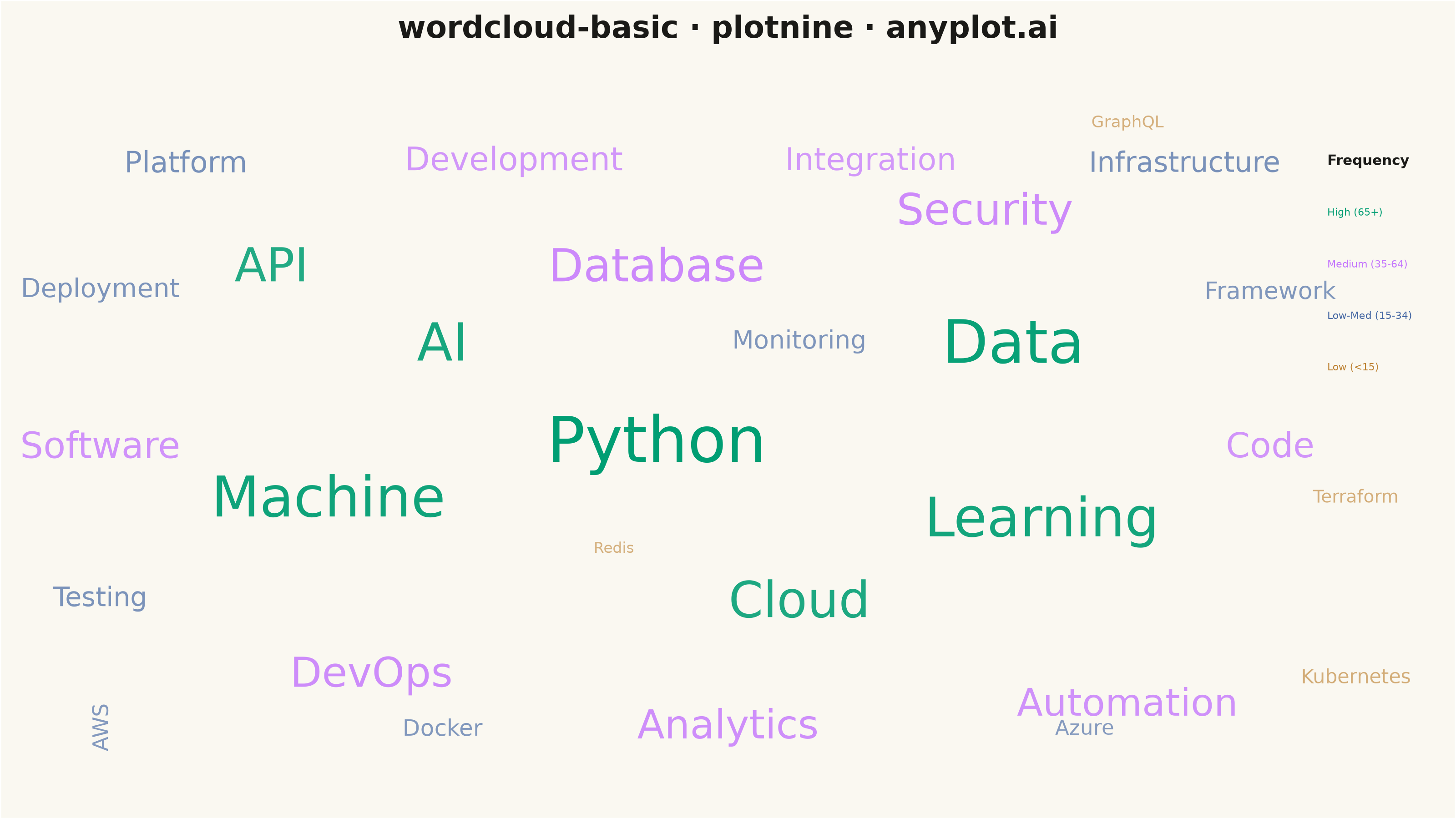
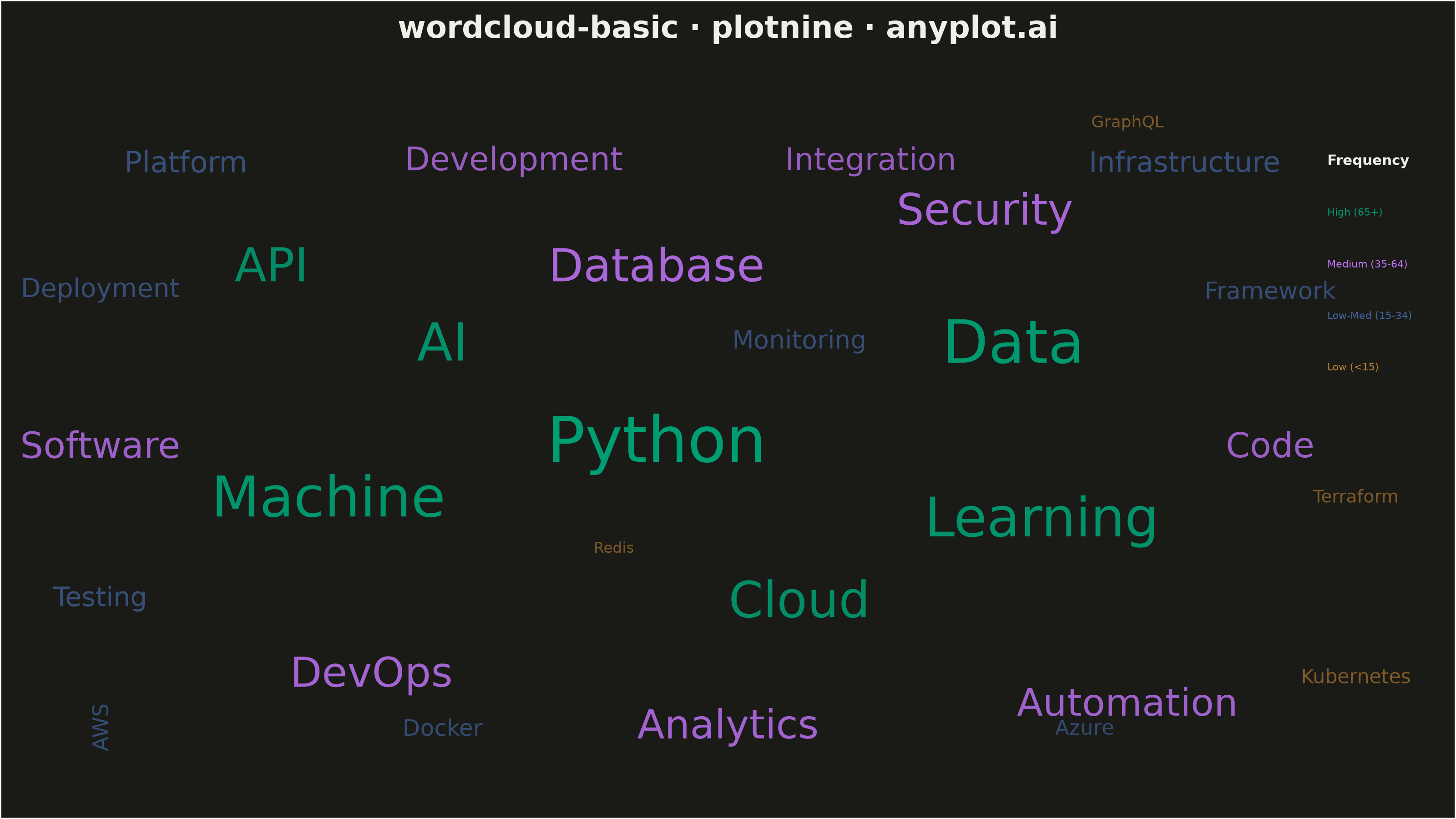
A word cloud displays text data where word size represents frequency or importance. Words are arranged to fill available space, creating a visual summary of text content that highlights prominent terms and patterns. This visualization is ideal for quickly identifying the most common themes or keywords in a body of text.
""" anyplot.ai
wordcloud-basic: Basic Word Cloud
Library: plotnine 0.15.7 | Python 3.13.14
Quality: 85/100 | Updated: 2026-08-04
"""

import os

import numpy as np
import pandas as pd
from plotnine import (
    aes,
    annotate,
    coord_cartesian,
    element_blank,
    element_rect,
    element_text,
    geom_text,
    ggplot,
    labs,
    scale_alpha_identity,
    scale_color_identity,
    scale_size_identity,
    theme,
)


# Theme tokens
THEME = os.getenv("ANYPLOT_THEME", "light")
PAGE_BG = "#FAF8F1" if THEME == "light" else "#1A1A17"
INK = "#1A1A17" if THEME == "light" else "#F0EFE8"
INK_SOFT = "#4A4A44" if THEME == "light" else "#B8B7B0"

# Imprint palette for frequency tiers
IMPRINT = ["#009E73", "#C475FD", "#4467A3", "#BD8233"]

# Word frequency data - technology survey responses
words_data = {
    "word": [
        "Python",
        "Data",
        "Machine",
        "Learning",
        "AI",
        "Cloud",
        "API",
        "Database",
        "Security",
        "DevOps",
        "Analytics",
        "Automation",
        "Software",
        "Code",
        "Development",
        "Integration",
        "Platform",
        "Infrastructure",
        "Testing",
        "Deployment",
        "Monitoring",
        "Framework",
        "Docker",
        "AWS",
        "Azure",
        "Kubernetes",
        "Terraform",
        "GraphQL",
        "Redis",
    ],
    "frequency": [
        95,
        88,
        82,
        78,
        75,
        70,
        65,
        62,
        58,
        55,
        52,
        48,
        45,
        42,
        38,
        35,
        32,
        30,
        28,
        26,
        24,
        22,
        20,
        18,
        16,
        14,
        11,
        8,
        6,
    ],
}

df = pd.DataFrame(words_data)

# Calculate font sizes (6-25 mm) for emphasis, and a subtle alpha ramp for depth
min_freq, max_freq = df["frequency"].min(), df["frequency"].max()
freq_norm = (df["frequency"] - min_freq) / (max_freq - min_freq)
df["size"] = 6 + freq_norm * 19
df["alpha"] = 0.6 + freq_norm * 0.4

# Sort by frequency descending
df = df.sort_values("frequency", ascending=False).reset_index(drop=True)

# Hand-crafted positions to ensure no overlap
positions = [
    (45, 28),  # Python (largest) - center
    (70, 36),  # Data
    (22, 24),  # Machine
    (72, 22),  # Learning
    (30, 36),  # AI
    (55, 16),  # Cloud
    (18, 42),  # API
    (45, 42),  # Database
    (68, 46),  # Security
    (25, 10),  # DevOps
    (50, 6),  # Analytics
    (78, 8),  # Automation
    (6, 28),  # Software
    (88, 28),  # Code
    (35, 50),  # Development
    (60, 50),  # Integration
    (12, 50),  # Platform
    (82, 50),  # Infrastructure
    (6, 16),  # Testing
    (6, 40),  # Deployment
    (55, 36),  # Monitoring
    (88, 40),  # Framework
    (30, 6),  # Docker
    (6, 6),  # AWS
    (75, 6),  # Azure
    (94, 10),  # Kubernetes - fills empty right margin below the legend
    (94, 24),  # Terraform - fills empty right margin below the legend
    (78, 53),  # GraphQL - fills empty upper-right quadrant
    (42, 20),  # Redis - fills gap between the mid-canvas clusters
]

df["x"] = [p[0] for p in positions]
df["y"] = [p[1] for p in positions]

# AWS sits alone in the bottom-left corner - rotate it for an organic word-cloud feel
df["angle"] = np.where(df["word"] == "AWS", 90, 0)

# Assign Imprint colors based on frequency tiers
colors = []
for freq in df["frequency"]:
    if freq >= 65:
        colors.append(IMPRINT[0])  # Brand green - highest
    elif freq >= 35:
        colors.append(IMPRINT[1])  # Lavender - medium-high
    elif freq >= 15:
        colors.append(IMPRINT[2])  # Blue - medium-low
    else:
        colors.append(IMPRINT[3])  # Ochre - lowest

df["color"] = colors

# Create legend using colored text labels instead of bullets
legend_df = pd.DataFrame(
    {
        "x": [92, 92, 92, 92],
        "y": [46, 42, 38, 34],
        "label": ["High (65+)", "Medium (35-64)", "Low-Med (15-34)", "Low (<15)"],
        "color": IMPRINT,
    }
)

# Create plot
plot = (
    ggplot(df, aes(x="x", y="y", label="word", size="size", color="color"))
    + geom_text(aes(alpha="alpha", angle="angle"), family="sans-serif", fontweight="normal", show_legend=False)
    + geom_text(
        data=legend_df, mapping=aes(x="x", y="y", label="label", color="color"), size=4, ha="left", show_legend=False
    )
    + annotate("text", x=92, y=50, label="Frequency", size=5.5, ha="left", fontweight="bold", color=INK)
    + scale_size_identity()
    + scale_color_identity()
    + scale_alpha_identity()
    + coord_cartesian(xlim=(0, 100), ylim=(0, 56.25), expand=False)
    + labs(title="wordcloud-basic · plotnine · anyplot.ai")
    + theme(
        figure_size=(8, 4.5),
        plot_title=element_text(size=12, ha="center", weight="bold", color=INK, margin={"b": 8}),
        panel_background=element_rect(fill=PAGE_BG, color=None),
        plot_background=element_rect(fill=PAGE_BG, color=None),
        panel_grid_major=element_blank(),
        panel_grid_minor=element_blank(),
        axis_text=element_blank(),
        axis_title=element_blank(),
        axis_ticks=element_blank(),
    )
)

# Save
plot.save(f"plot-{THEME}.png", dpi=400, width=8, height=4.5, units="in", verbose=False)
Runnable source as JSON, for any HTTP client: https://api.anyplot.ai/specs/wordcloud-basic/plotnine/code. Any spec id and library id listed in llms-full.txt fit the same URL shape; every URL below is complete and callable.
{
  "spec_id": "wordcloud-basic",
  "language": "python",
  "library": "plotnine",
  "page": "https://anyplot.ai/wordcloud-basic/python/plotnine",
  "hub": "https://anyplot.ai/wordcloud-basic",
  "code_json": "https://api.anyplot.ai/specs/wordcloud-basic/plotnine/code",
  "spec_json": "https://api.anyplot.ai/specs/wordcloud-basic",
  "render_light_png": "https://storage.googleapis.com/anyplot-images/plots/wordcloud-basic/python/plotnine/plot-light.png",
  "render_dark_png": "https://storage.googleapis.com/anyplot-images/plots/wordcloud-basic/python/plotnine/plot-dark.png",
  "quality_score": 85.0,
  "license": "MIT",
  "guide": "https://anyplot.ai/llms.txt"
}
Part of Basic Word Cloud on anyplot.ai.