The same plot in 14 other libraries — JavaScript: Chart.js, D3.js, Highcharts, MUI X Charts; Python: Altair, Bokeh, lets-plot, Matplotlib, Plotly, plotnine, Pygal, Seaborn; R: ggplot2; Julia: Makie.jl. Compare all 15 side by side: Stacked Area Chart in Python, R, Julia and JavaScript.
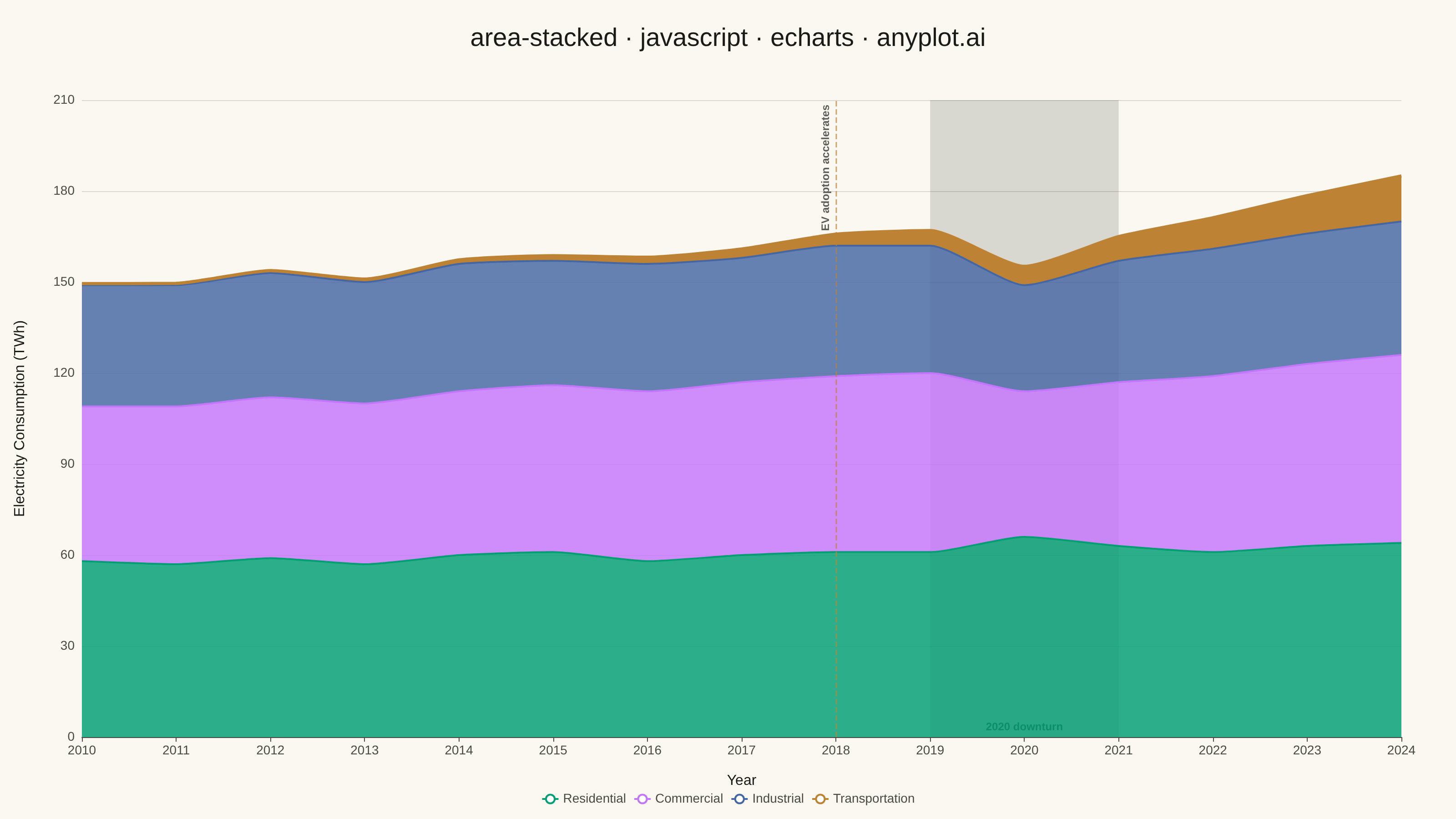
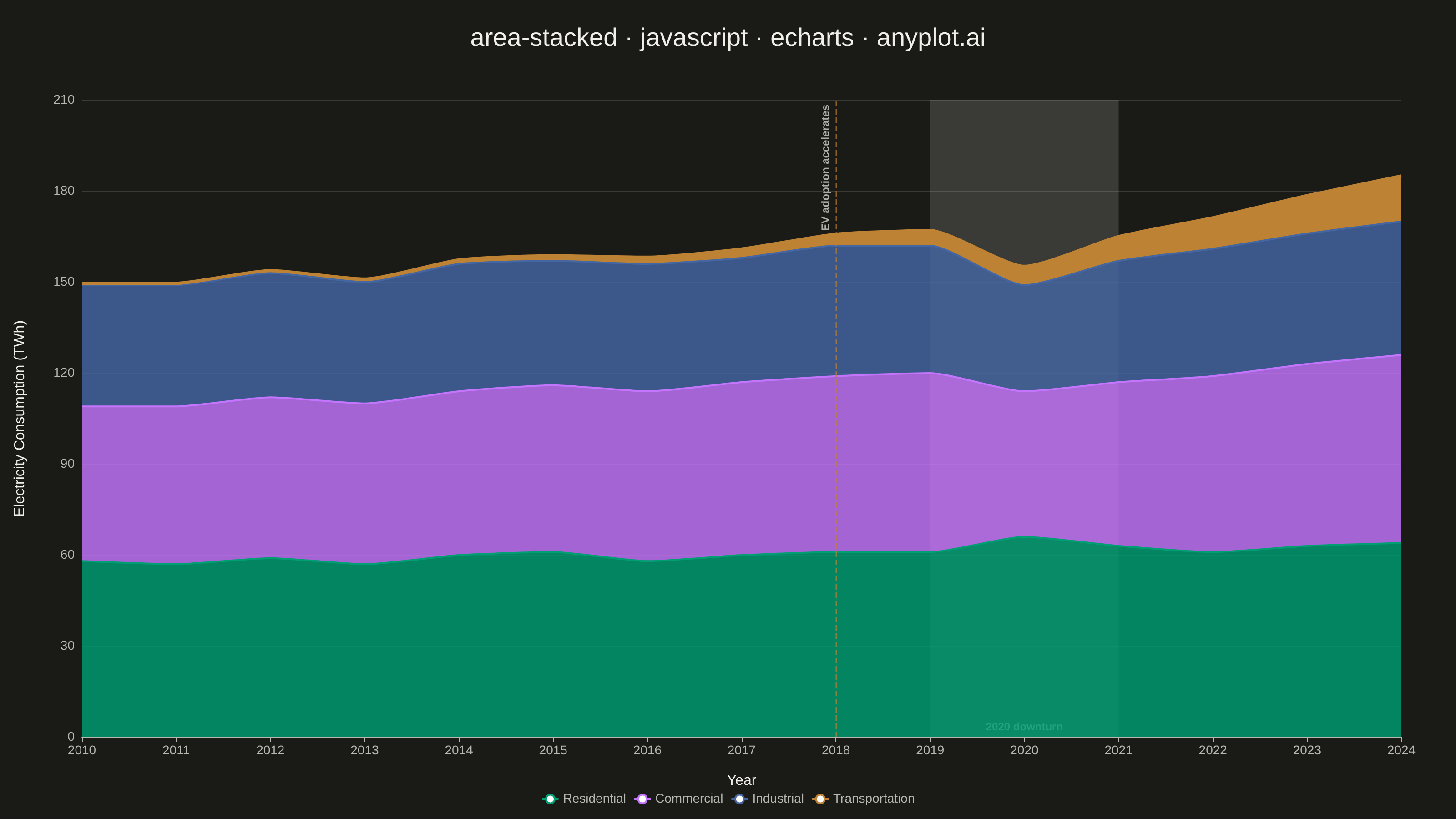
A stacked area chart displays multiple data series as areas stacked on top of each other, with each series starting where the previous one ends. This visualization emphasizes both individual contributions and cumulative totals over a continuous axis (typically time). It is ideal for showing how parts contribute to a whole while tracking changes over time, making patterns of composition and overall trends immediately visible.
// anyplot.ai
// area-stacked: Stacked Area Chart
// Library: echarts 6.1.0 | JavaScript 22.23.2
// Quality: 92/100 | Created: 2026-08-17

const t = window.ANYPLOT_TOKENS;

// --- Data (in-memory, deterministic) ----------------------------------------
// Electricity consumption by sector for a large multi-state utility holding
// company's service territory, 2010-2024 (TWh, illustrative) — a ~185 TWh
// footprint by 2024, in line with real multi-state utility holding companies
// rather than a small national grid.
// 2020 pulls commercial and industrial demand down (offices/plants idled)
// while residential ticks up (work-from-home) and the EV-charging
// transportation load keeps accelerating regardless of the downturn — a more
// directionally varied pattern than a uniform up-trend across all sectors.
const years = Array.from({ length: 15 }, (_, i) => String(2010 + i));

const residential = [58, 57, 59, 57, 60, 61, 58, 60, 61, 61, 66, 63, 61, 63, 64];
const commercial = [51, 52, 53, 53, 54, 55, 56, 57, 58, 59, 48, 54, 58, 60, 62];
const industrial = [40, 40, 41, 40, 42, 41, 42, 41, 43, 42, 35, 40, 42, 43, 44];
const transportation = [0.5, 0.6, 0.8, 1.0, 1.3, 1.7, 2.2, 2.9, 3.8, 5.0, 6.2, 8.0, 10.2, 12.5, 15.0];

// Order largest-to-smallest so the stack reads largest-at-bottom.
const series = [
  { name: "Residential", data: residential },
  { name: "Commercial", data: commercial },
  { name: "Industrial", data: industrial },
  { name: "Transportation", data: transportation },
];

// --- Init ---------------------------------------------------------------
const chart = echarts.init(document.getElementById("container"));

// --- Option ---------------------------------------------------------------
chart.setOption({
  animation: false,
  color: t.palette,
  backgroundColor: "transparent",
  title: {
    text: "area-stacked · javascript · echarts · anyplot.ai",
    left: "center",
    top: 24,
    textStyle: { color: t.ink, fontSize: 28, fontWeight: 500 },
  },
  tooltip: { trigger: "axis" },
  legend: {
    bottom: 10,
    textStyle: { color: t.inkSoft, fontSize: 14 },
    itemWidth: 18,
    itemHeight: 12,
  },
  grid: { left: 90, right: 60, top: 110, bottom: 90 },
  xAxis: {
    type: "category",
    data: years,
    boundaryGap: false,
    name: "Year",
    nameLocation: "middle",
    nameGap: 40,
    nameTextStyle: { color: t.ink, fontSize: 16 },
    axisLabel: { color: t.inkSoft, fontSize: 14 },
    axisLine: { lineStyle: { color: t.inkSoft } },
    splitLine: { show: false },
  },
  yAxis: {
    type: "value",
    min: 0,
    name: "Electricity Consumption (TWh)",
    nameLocation: "middle",
    nameGap: 60,
    nameTextStyle: { color: t.ink, fontSize: 16 },
    axisLabel: { color: t.inkSoft, fontSize: 14 },
    axisLine: { show: false },
    splitLine: { lineStyle: { color: t.grid } },
  },
  series: series.map((s, i) => {
    const isTransportation = s.name === "Transportation";
    return {
      name: s.name,
      type: "line",
      stack: "total",
      smooth: 0.2,
      showSymbol: false,
      // Transportation carries the story of this dataset (EV-charging load
      // growing ~30x over the period) — a bolder stroke pulls the eye to it
      // even though its absolute magnitude is the smallest of the four.
      lineStyle: { width: isTransportation ? 3.5 : 2, color: t.palette[i] },
      itemStyle: { color: t.palette[i] },
      // Full opacity on the (visually thin) Transportation band keeps it crisp
      // against the Industrial band beneath it; the other bands stay
      // semi-transparent so the boundary lines between them read clearly.
      areaStyle: { color: t.palette[i], opacity: isTransportation ? 1 : 0.82 },
      emphasis: { focus: "series" },
      data: s.data,
      // Both annotations live on Transportation since it's drawn last (on
      // top of the other bands), so the dashed line and the shaded band
      // stay visible instead of being occluded by later area fills.
      ...(isTransportation && {
        markLine: {
          silent: true,
          symbol: "none",
          lineStyle: { color: t.palette[i], type: "dashed", width: 1.5, opacity: 0.7 },
          label: {
            color: t.ink,
            fontSize: 12,
            fontWeight: 600,
            formatter: "EV adoption accelerates",
            position: "insideEndTop",
          },
          data: [{ xAxis: "2018" }],
        },
        markArea: {
          silent: true,
          itemStyle: { color: t.grid },
          label: {
            color: t.inkSoft,
            fontSize: 12,
            fontWeight: 600,
            position: "insideBottom",
            formatter: "2020 downturn",
          },
          data: [[{ xAxis: "2019" }, { xAxis: "2021" }]],
        },
      }),
    };
  }),
});
Runnable source as JSON, for any HTTP client: https://api.anyplot.ai/specs/area-stacked/echarts/code. Any spec id and library id listed in llms-full.txt fit the same URL shape; every URL below is complete and callable.
{
  "spec_id": "area-stacked",
  "language": "javascript",
  "library": "echarts",
  "page": "https://anyplot.ai/area-stacked/javascript/echarts",
  "hub": "https://anyplot.ai/area-stacked",
  "code_json": "https://api.anyplot.ai/specs/area-stacked/echarts/code",
  "spec_json": "https://api.anyplot.ai/specs/area-stacked",
  "render_light_png": "https://storage.googleapis.com/anyplot-images/plots/area-stacked/javascript/echarts/plot-light.png",
  "render_dark_png": "https://storage.googleapis.com/anyplot-images/plots/area-stacked/javascript/echarts/plot-dark.png",
  "interactive_light_html": "https://storage.googleapis.com/anyplot-images/plots/area-stacked/javascript/echarts/plot-light.html",
  "interactive_dark_html": "https://storage.googleapis.com/anyplot-images/plots/area-stacked/javascript/echarts/plot-dark.html",
  "quality_score": 92.0,
  "license": "MIT",
  "guide": "https://anyplot.ai/llms.txt"
}
Part of Stacked Area Chart on anyplot.ai.