The same plot in 14 other libraries — Python: Altair, Bokeh, lets-plot, Matplotlib, Plotly, plotnine, Pygal, Seaborn; Julia: Makie.jl; JavaScript: Chart.js, D3.js, Apache ECharts, Highcharts, MUI X Charts. Compare all 15 side by side: Stacked Area Chart in Python, R, Julia and JavaScript.
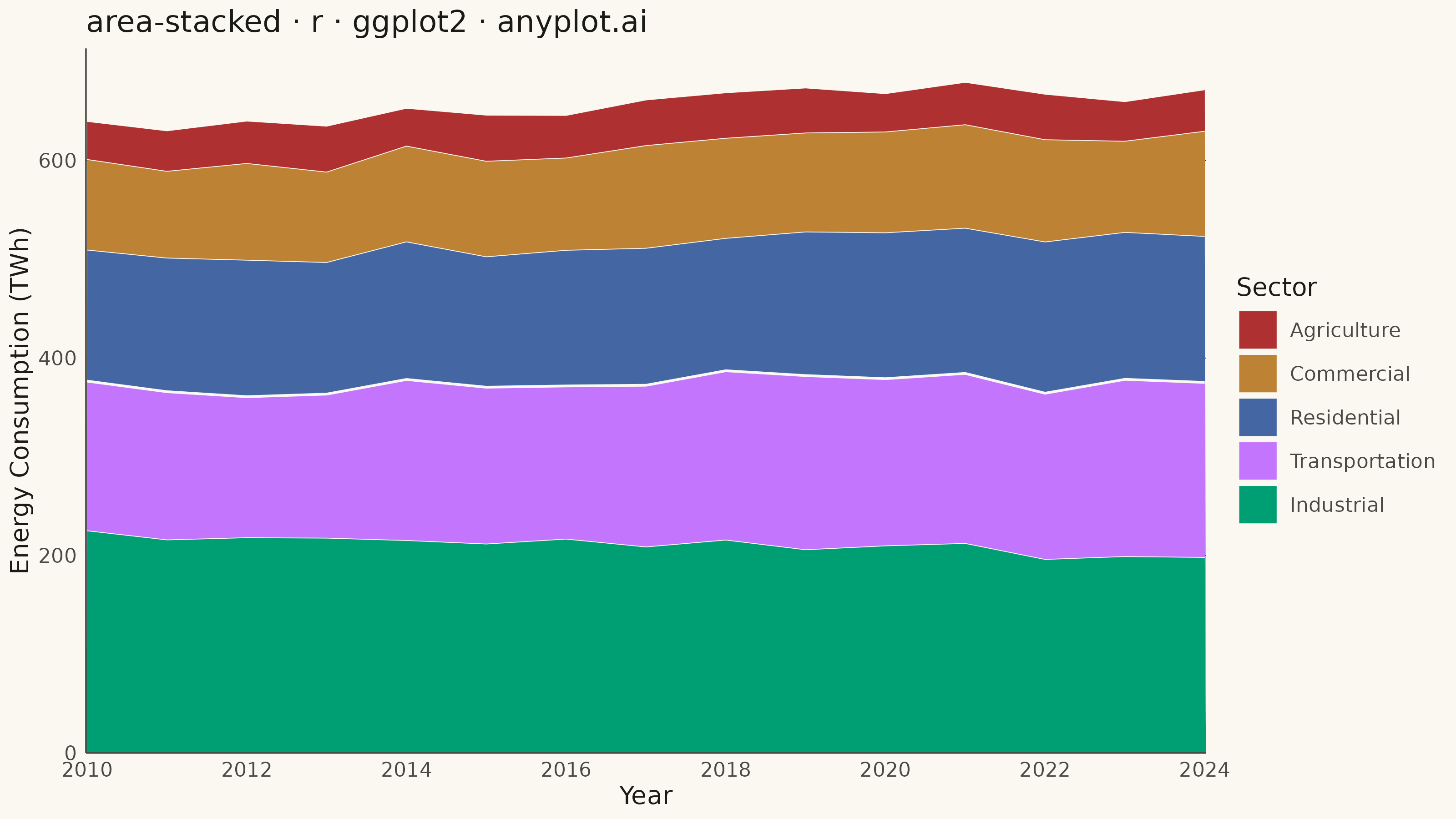
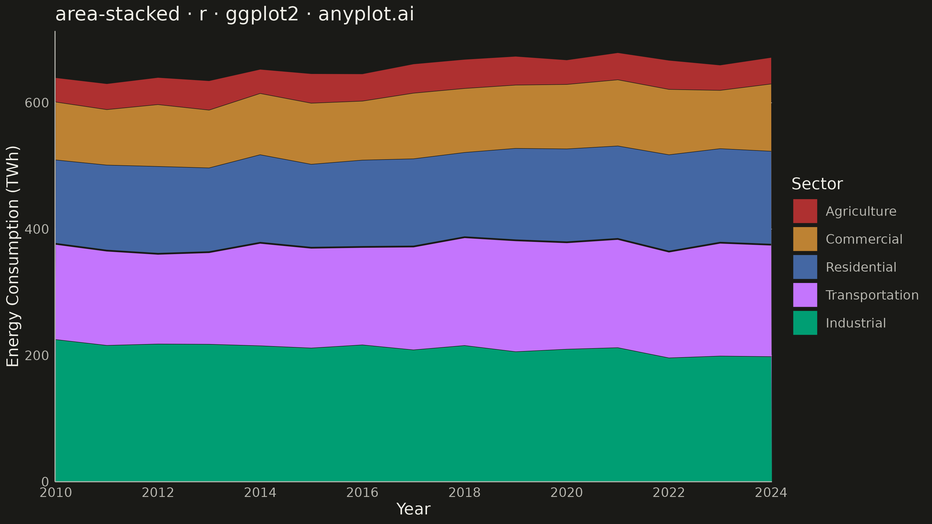
A stacked area chart displays multiple data series as areas stacked on top of each other, with each series starting where the previous one ends. This visualization emphasizes both individual contributions and cumulative totals over a continuous axis (typically time). It is ideal for showing how parts contribute to a whole while tracking changes over time, making patterns of composition and overall trends immediately visible.
#' anyplot.ai
#' area-stacked: Stacked Area Chart
#' Library: ggplot2 3.5.1 | R 4.4.1
#' Quality: 92/100 | Updated: 2026-08-18

library(ggplot2)
library(dplyr)
library(scales)
library(ragg)

set.seed(42)

# --- Theme tokens -------------------------------------------------------
THEME       <- Sys.getenv("ANYPLOT_THEME", "light")
PAGE_BG     <- if (THEME == "light") "#FAF8F1" else "#1A1A17"
INK         <- if (THEME == "light") "#1A1A17" else "#F0EFE8"
INK_SOFT    <- if (THEME == "light") "#4A4A44" else "#B8B7B0"

# Imprint palette, canonical order 1-5 (see prompts/default-style-guide.md
# "Categorical Palette")
IMPRINT_PALETTE <- c(
  "#009E73",  # 1 — Industrial (largest, brand green)
  "#C475FD",  # 2 — Transportation
  "#4467A3",  # 3 — Residential
  "#BD8233",  # 4 — Commercial
  "#AE3030"   # 5 — Agriculture
)

# --- Data -----------------------------------------------------------------
# Annual energy consumption by sector, largest contributor first so the
# stack reads largest-at-bottom (per spec notes).
years   <- 2010:2024
sectors <- c("Industrial", "Transportation", "Residential", "Commercial", "Agriculture")
base_twh  <- c(220, 150, 130, 90, 40)
trend_twh <- c(-1.5, 2.2, 1.6, 1.1, 0.3)  # electrification shifts share toward transport/residential

consumption <- vapply(seq_along(sectors), function(i) {
  pmax(base_twh[i] + trend_twh[i] * (years - years[1]) + rnorm(length(years), 0, 4), 5)
}, numeric(length(years)))

df <- tibble(
  year       = rep(years, times = length(sectors)),
  sector     = factor(rep(sectors, each = length(years)), levels = sectors),
  twh        = as.vector(consumption)
)

# Transportation has the steepest growth trend (electrification shifting
# demand its way) — a visibly bolder separator stroke gives it a focal point
# among the five stacked layers without adding a callout annotation. Fills
# stay fully opaque (no alpha) so the panel gridlines never bleed through.
linewidth_by_sector <- c(Industrial = 0.3, Transportation = 1.0, Residential = 0.3,
                          Commercial = 0.3, Agriculture = 0.3)

# --- Plot -------------------------------------------------------------------
p <- ggplot(df, aes(x = year, y = twh, fill = sector, linewidth = sector)) +
  geom_area(position = position_stack(reverse = TRUE), color = PAGE_BG) +
  scale_fill_manual(values = IMPRINT_PALETTE, name = "Sector",
                     guide = guide_legend(reverse = TRUE)) +
  scale_linewidth_manual(values = linewidth_by_sector, guide = "none") +
  scale_x_continuous(breaks = seq(2010, 2024, by = 2), expand = c(0, 0)) +
  scale_y_continuous(labels = label_number(),
                      expand = expansion(mult = c(0, 0.05))) +
  labs(
    title = "area-stacked · r · ggplot2 · anyplot.ai",
    x     = "Year",
    y     = "Energy Consumption (TWh)"
  ) +
  theme_minimal(base_size = 8) +
  theme(
    plot.background   = element_rect(fill = PAGE_BG, color = PAGE_BG),
    panel.background  = element_rect(fill = PAGE_BG, color = NA),
    panel.grid.major.x = element_blank(),
    panel.grid.minor   = element_blank(),
    panel.grid.major.y = element_line(color = INK, linewidth = 0.15),
    axis.line          = element_line(color = INK_SOFT, linewidth = 0.3),
    axis.ticks         = element_blank(),
    axis.title         = element_text(color = INK, size = 10),
    axis.text          = element_text(color = INK_SOFT, size = 8),
    plot.title         = element_text(color = INK, size = 12),
    legend.background  = element_blank(),
    legend.key         = element_blank(),
    legend.text        = element_text(color = INK_SOFT, size = 8),
    legend.title       = element_text(color = INK, size = 10),
    legend.position     = "right"
  )

# --- Save -------------------------------------------------------------------
ggsave(
  filename = sprintf("plot-%s.png", THEME),
  plot     = p,
  device   = ragg::agg_png,
  width    = 8,
  height   = 4.5,
  units    = "in",
  dpi      = 400
)
Runnable source as JSON, for any HTTP client: https://api.anyplot.ai/specs/area-stacked/ggplot2/code. Any spec id and library id listed in llms-full.txt fit the same URL shape; every URL below is complete and callable.
{
  "spec_id": "area-stacked",
  "language": "r",
  "library": "ggplot2",
  "page": "https://anyplot.ai/area-stacked/r/ggplot2",
  "hub": "https://anyplot.ai/area-stacked",
  "code_json": "https://api.anyplot.ai/specs/area-stacked/ggplot2/code",
  "spec_json": "https://api.anyplot.ai/specs/area-stacked",
  "render_light_png": "https://storage.googleapis.com/anyplot-images/plots/area-stacked/r/ggplot2/plot-light.png",
  "render_dark_png": "https://storage.googleapis.com/anyplot-images/plots/area-stacked/r/ggplot2/plot-dark.png",
  "quality_score": 92.0,
  "license": "MIT",
  "guide": "https://anyplot.ai/llms.txt"
}
Part of Stacked Area Chart on anyplot.ai.