The same plot in 14 other libraries — Python: Altair, Bokeh, lets-plot, Matplotlib, Plotly, plotnine, Pygal, Seaborn; R: ggplot2; JavaScript: Chart.js, D3.js, Apache ECharts, Highcharts, MUI X Charts. Compare all 15 side by side: Stacked Area Chart in Python, R, Julia and JavaScript.
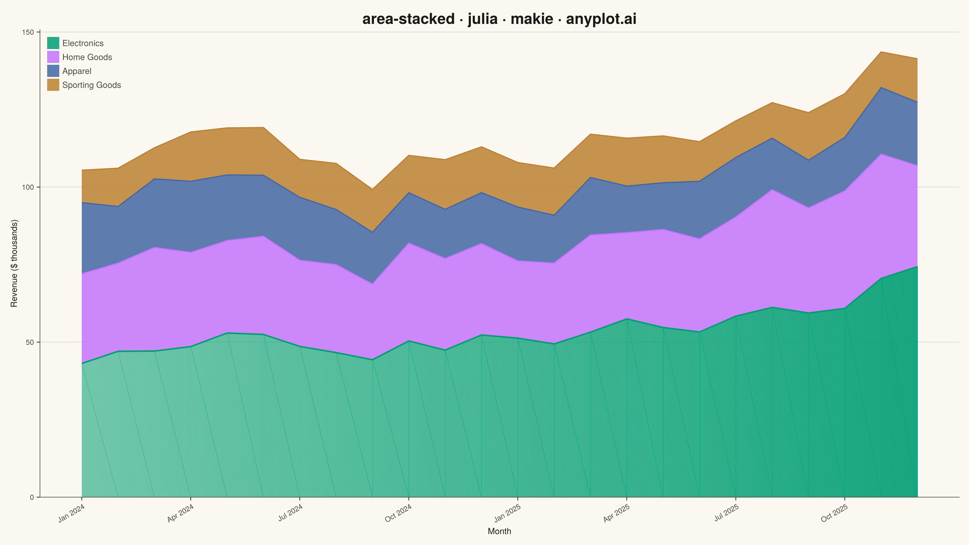
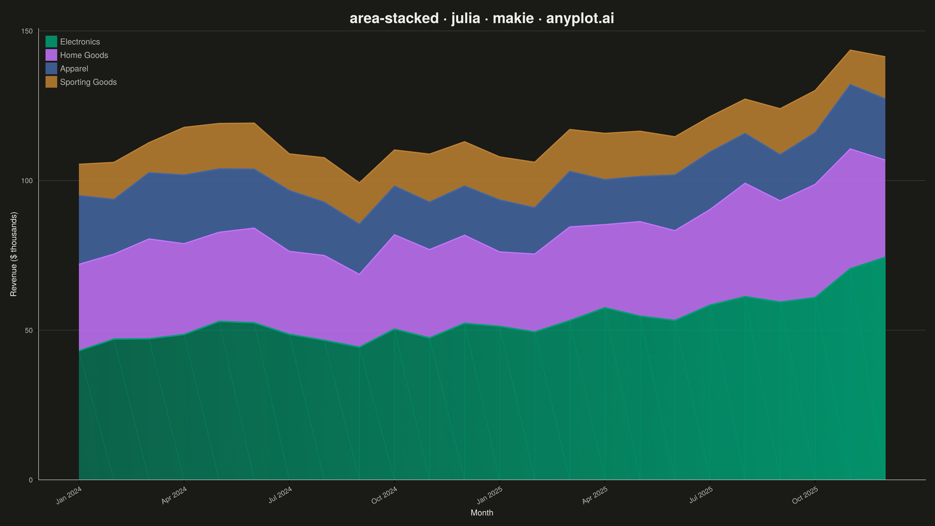
A stacked area chart displays multiple data series as areas stacked on top of each other, with each series starting where the previous one ends. This visualization emphasizes both individual contributions and cumulative totals over a continuous axis (typically time). It is ideal for showing how parts contribute to a whole while tracking changes over time, making patterns of composition and overall trends immediately visible.
# anyplot.ai
# area-stacked: Stacked Area Chart
# Library: makie 0.21.9 | Julia 1.11.9
# Quality: 87/100 | Created: 2026-08-17

using CairoMakie
using Colors
using Random

Random.seed!(42)

# --- Theme tokens -------------------------------------------------------------
THEME    = get(ENV, "ANYPLOT_THEME", "light")
PAGE_BG  = THEME == "light" ? colorant"#FAF8F1" : colorant"#1A1A17"
INK      = THEME == "light" ? colorant"#1A1A17" : colorant"#F0EFE8"
INK_SOFT = THEME == "light" ? colorant"#4A4A44" : colorant"#B8B7B0"
IMPRINT_PALETTE = [
    colorant"#009E73", colorant"#C475FD", colorant"#4467A3", colorant"#BD8233",
]

# --- Data -----------------------------------------------------------------------
# Monthly revenue ($ thousands) by product category, two years — largest series first
months = 1:24
month_labels = ["Jan 2024", "Apr 2024", "Jul 2024", "Oct 2024",
                "Jan 2025", "Apr 2025", "Jul 2025", "Oct 2025"]

electronics = 42 .+ 0.9 .* months .+ 4 .* sin.(months ./ 3) .+ randn(24) .* 3
home_goods  = 26 .+ 0.4 .* months .+ 3 .* sin.(months ./ 4 .+ 1) .+ randn(24) .* 2.5
apparel     = 18 .+ 0.15 .* months .+ 5 .* sin.(months ./ 6 .+ 2) .+ randn(24) .* 2
sporting    = 10 .+ 0.25 .* months .+ 2 .* sin.(months ./ 5) .+ randn(24) .* 1.5

electronics = max.(electronics, 5)
home_goods  = max.(home_goods, 4)
apparel     = max.(apparel, 3)
sporting    = max.(sporting, 2)

baseline = zeros(24)
cum1 = electronics
cum2 = cum1 .+ home_goods
cum3 = cum2 .+ apparel
cum4 = cum3 .+ sporting

# --- Plot -------------------------------------------------------------------------
fig = Figure(
    resolution      = (1600, 900),
    fontsize        = 14,
    backgroundcolor = PAGE_BG,
)

ax = Axis(
    fig[1, 1];
    title               = "area-stacked · julia · makie · anyplot.ai",
    titlesize           = 25,
    titlecolor          = INK,
    xlabel              = "Month",
    ylabel              = "Revenue (\$ thousands)",
    xlabelsize          = 14,
    ylabelsize          = 14,
    xlabelcolor         = INK,
    ylabelcolor         = INK,
    xticklabelsize      = 12,
    yticklabelsize      = 12,
    xticklabelcolor     = INK_SOFT,
    yticklabelcolor     = INK_SOFT,
    backgroundcolor     = PAGE_BG,
    topspinevisible     = false,
    rightspinevisible   = false,
    leftspinecolor      = INK_SOFT,
    bottomspinecolor    = INK_SOFT,
    xgridvisible        = false,
    ygridcolor          = RGBAf(INK.r, INK.g, INK.b, 0.15),
    xticks              = (1:3:22, month_labels),
    xticklabelrotation  = pi / 6,
)

band!(ax, months, baseline, cum1; color = (IMPRINT_PALETTE[1], 0.85))
band!(ax, months, cum1, cum2; color = (IMPRINT_PALETTE[2], 0.85))
band!(ax, months, cum2, cum3; color = (IMPRINT_PALETTE[3], 0.85))
band!(ax, months, cum3, cum4; color = (IMPRINT_PALETTE[4], 0.85))

lines!(ax, months, cum1; color = IMPRINT_PALETTE[1], linewidth = 2.5)
lines!(ax, months, cum2; color = IMPRINT_PALETTE[2], linewidth = 2)
lines!(ax, months, cum3; color = IMPRINT_PALETTE[3], linewidth = 2)
lines!(ax, months, cum4; color = IMPRINT_PALETTE[4], linewidth = 2)

ylims!(ax, 0, nothing)
xlims!(ax, 0.5, 29)

# Data-storytelling focal point: an end-of-line value label for Electronics
# (the dominant series), placed in the margin whitespace beyond the last data
# point so it reads against the page background — not against the colored
# fill — and stays legible in both themes without fighting CairoMakie's
# per-vertex triangulated color interpolation on `band!`.
lines!(ax, [months[end], months[end] + 1], [cum1[end], cum1[end]];
       color = INK_SOFT, linewidth = 1)
text!(ax, months[end] + 1.2, cum1[end];
      text = "Electronics\n\$$(round(Int, electronics[end]))k",
      color = INK, fontsize = 13, align = (:left, :center))

legend_labels = ["Electronics", "Home Goods", "Apparel", "Sporting Goods"]
legend_elements = [PolyElement(color = (c, 0.85)) for c in IMPRINT_PALETTE]
axislegend(ax, legend_elements, legend_labels; position = :lt, labelcolor = INK_SOFT, framevisible = false)

# --- Save -----------------------------------------------------------------------
save("plot-$(THEME).png", fig; px_per_unit = 2)
Runnable source as JSON, for any HTTP client: https://api.anyplot.ai/specs/area-stacked/makie/code. Any spec id and library id listed in llms-full.txt fit the same URL shape; every URL below is complete and callable.
{
  "spec_id": "area-stacked",
  "language": "julia",
  "library": "makie",
  "page": "https://anyplot.ai/area-stacked/julia/makie",
  "hub": "https://anyplot.ai/area-stacked",
  "code_json": "https://api.anyplot.ai/specs/area-stacked/makie/code",
  "spec_json": "https://api.anyplot.ai/specs/area-stacked",
  "render_light_png": "https://storage.googleapis.com/anyplot-images/plots/area-stacked/julia/makie/plot-light.png",
  "render_dark_png": "https://storage.googleapis.com/anyplot-images/plots/area-stacked/julia/makie/plot-dark.png",
  "quality_score": 87.0,
  "license": "MIT",
  "guide": "https://anyplot.ai/llms.txt"
}
Part of Stacked Area Chart on anyplot.ai.