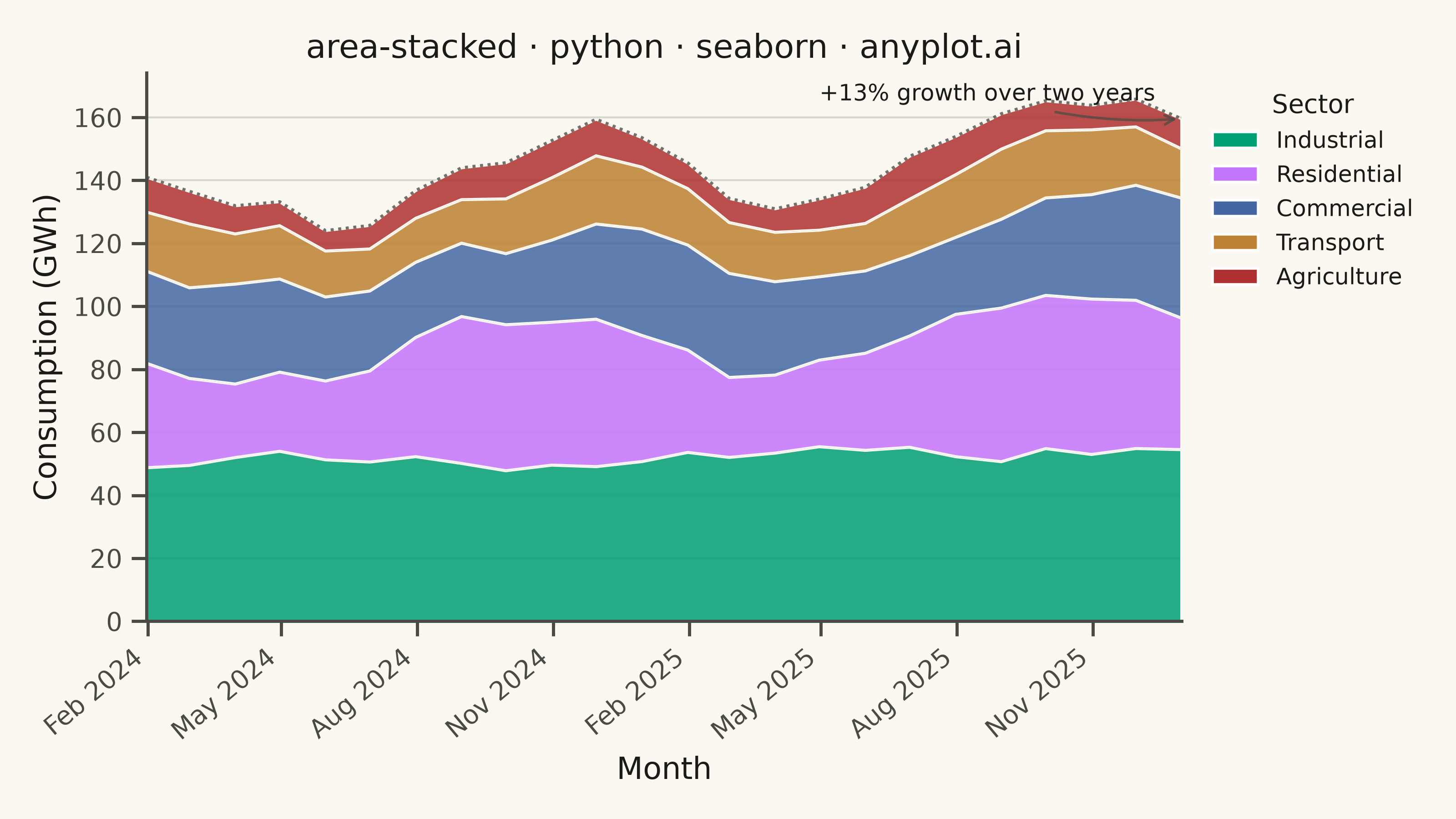
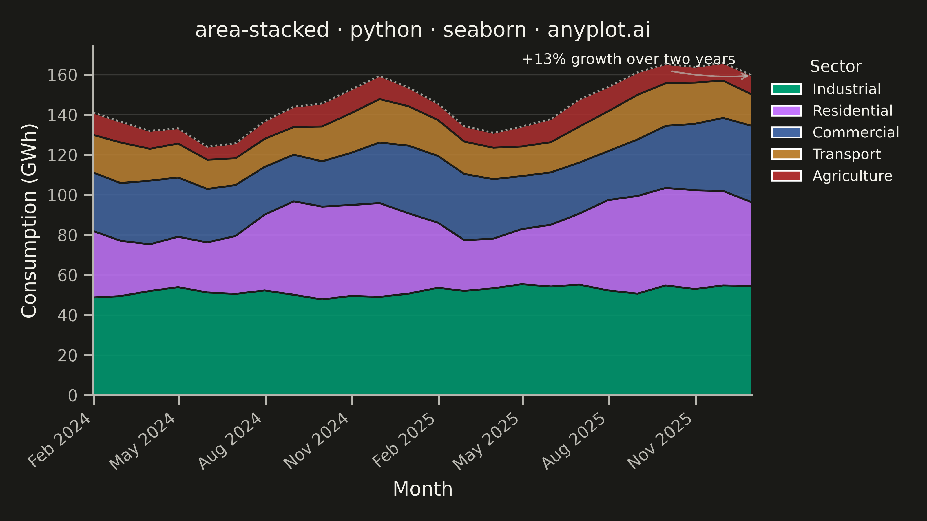
A stacked area chart displays multiple data series as areas stacked on top of each other, with each series starting where the previous one ends. This visualization emphasizes both individual contributions and cumulative totals over a continuous axis (typically time). It is ideal for showing how parts contribute to a whole while tracking changes over time, making patterns of composition and overall trends immediately visible.
""" anyplot.ai
area-stacked: Stacked Area Chart
Library: seaborn 0.13.2 | Python 3.13.15
Quality: 94/100 | Updated: 2026-08-17
"""

import os

import matplotlib.dates as mdates
import matplotlib.patches as mpatches
import matplotlib.pyplot as plt
import numpy as np
import pandas as pd
import seaborn as sns
import seaborn.objects as so


# Theme tokens (see prompts/default-style-guide.md "Theme-adaptive Chrome")
THEME = os.getenv("ANYPLOT_THEME", "light")
PAGE_BG = "#FAF8F1" if THEME == "light" else "#1A1A17"
ELEVATED_BG = "#FFFDF6" if THEME == "light" else "#242420"
INK = "#1A1A17" if THEME == "light" else "#F0EFE8"
INK_SOFT = "#4A4A44" if THEME == "light" else "#B8B7B0"

# Imprint palette — canonical order, first series always #009E73
IMPRINT_PALETTE = ["#009E73", "#C475FD", "#4467A3", "#BD8233", "#AE3030"]

sns.set_theme(
    style="ticks",
    rc={
        "figure.facecolor": PAGE_BG,
        "axes.facecolor": PAGE_BG,
        "axes.edgecolor": INK_SOFT,
        "axes.labelcolor": INK,
        "text.color": INK,
        "xtick.color": INK_SOFT,
        "ytick.color": INK_SOFT,
        "legend.facecolor": ELEVATED_BG,
        "legend.edgecolor": INK_SOFT,
    },
)
sns.set_palette(IMPRINT_PALETTE)

# Data: monthly energy consumption by sector over two years, with seasonality
np.random.seed(42)
months = pd.date_range("2024-01", periods=24, freq="ME")

# Industrial is baseload-driven, so its seasonal swing stays flat; residential
# is weather-driven, so its winter/summer peaks are cut sharper via a cubed wave.
industrial_base = 48 + np.sin(np.linspace(0, 4 * np.pi, 24)) * 2.5
residential_wave = np.sin(np.linspace(np.pi, 5 * np.pi, 24))
residential_base = 34 + np.sign(residential_wave) * np.abs(residential_wave) ** 0.6 * 10
commercial_base = 26 + np.sin(np.linspace(0.6, 4.6 * np.pi, 24)) * 5
transport_base = 16 + np.sin(np.linspace(1.2, 5.2 * np.pi, 24)) * 3
agriculture_base = 9 + np.sin(np.linspace(1.8, 5.8 * np.pi, 24)) * 2

growth = np.linspace(1.0, 1.18, 24)
industrial = (industrial_base * growth + np.random.randn(24) * 1.5).clip(30)
residential = (residential_base * growth + np.random.randn(24) * 1.5).clip(15)
commercial = (commercial_base * growth + np.random.randn(24) * 1.2).clip(12)
transport = (transport_base * growth + np.random.randn(24) * 0.8).clip(8)
agriculture = (agriculture_base * growth + np.random.randn(24) * 0.5).clip(4)

sectors = ["Industrial", "Residential", "Commercial", "Transport", "Agriculture"]
series = [industrial, residential, commercial, transport, agriculture]

# Long-form frame for the seaborn.objects interface below — ordered by size
# (largest first) so so.Stack() lays Industrial at the baseline, per spec.
long_df = pd.DataFrame(
    {"month": np.tile(months, len(sectors)), "sector": np.repeat(sectors, len(months)), "value": np.concatenate(series)}
)
long_df["sector"] = pd.Categorical(long_df["sector"], categories=sectors, ordered=True)

# Plot — see default-style-guide.md "Visual Sizing Defaults" for canvas + sizing
fig, ax = plt.subplots(figsize=(8, 4.5), dpi=400, facecolor=PAGE_BG)
ax.set_facecolor(PAGE_BG)

# Stacked bands via the seaborn.objects interface (so.Area + so.Stack) — the
# genuinely seaborn-native way to build a stacked area chart, rather than
# reaching for matplotlib's ax.stackplot(). Rendered onto our own pre-sized
# Axes so the Step-0 canvas contract still holds.
(
    so.Plot(long_df, x="month", y="value", color="sector")
    .add(so.Area(alpha=0.85, edgewidth=0.6, edgecolor=PAGE_BG), so.Stack())
    .scale(color=IMPRINT_PALETTE[: len(sectors)])
    .on(ax)
    .plot()
)
# so.Plot always attaches its own legend to the *figure*; hide it and build an
# axes-level legend instead so sns.move_legend (an Axes/Figure-only helper)
# and the outside-right docking below behave exactly as on other libraries.
fig.legends[0].set_visible(False)

# A crisp ink-colored line traces the cumulative total for emphasis, drawn via
# seaborn's own lineplot (not raw ax.plot) so the overlay is genuinely seaborn.
total = np.sum(series, axis=0)
total_df = pd.DataFrame({"month": months, "total": total})
sns.lineplot(data=total_df, x="month", y="total", ax=ax, color=INK, linewidth=1.2, alpha=0.6, linestyle=(0, (1, 1.5)))

ax.set_xlabel("Month", fontsize=12, color=INK)
ax.set_ylabel("Consumption (GWh)", fontsize=12, color=INK)
ax.set_title("area-stacked · python · seaborn · anyplot.ai", fontsize=13, fontweight="medium", color=INK)
ax.tick_params(axis="both", labelsize=10, colors=INK_SOFT)

ax.xaxis.set_major_locator(mdates.MonthLocator(interval=3))
ax.xaxis.set_major_formatter(mdates.DateFormatter("%b %Y"))
plt.setp(ax.xaxis.get_majorticklabels(), rotation=40, ha="right")

# Legend sits outside the stacked area (fully filled top-to-bottom, no clear
# gap to dock a legend inside) so it never occludes data. Handles are rebuilt
# as flat swatches (so.Area's own legend proxies inherit its 0.85 fill alpha,
# which reads muddier at legend-swatch size) and positioned with seaborn's
# move_legend — a seaborn-only convenience for repositioning/restyling a
# legend in one call — kept borderless for a lighter visual treatment.
legend_handles = [
    mpatches.Patch(facecolor=color, label=sector) for color, sector in zip(IMPRINT_PALETTE, sectors, strict=True)
]
ax.legend(handles=legend_handles, title="Sector")
sns.move_legend(
    ax, "upper left", bbox_to_anchor=(1.01, 1.0), frameon=False, fontsize=9, title_fontsize=10, labelcolor=INK
)
ax.get_legend().get_title().set_color(INK)

# Subtle y-axis grid only, per style guide
ax.yaxis.grid(True, alpha=0.15, linewidth=0.8, color=INK)
ax.set_axisbelow(True)

# L-shaped frame
sns.despine(ax=ax)
ax.spines["left"].set_color(INK_SOFT)
ax.spines["bottom"].set_color(INK_SOFT)

ax.set_ylim(bottom=0)
ax.margins(x=0)

# Callout highlighting the key trend: total consumption growth over the
# window. Anchored close to the final data point (short, local arrow) rather
# than sweeping across the whole width, so it can't be mistaken for a second
# trend line following a path the data doesn't actually take.
growth_pct = (total[-1] - total[0]) / total[0] * 100
top = ax.get_ylim()[1]
ax.annotate(
    f"+{growth_pct:.0f}% growth over two years",
    xy=(months[-1], total[-1]),
    xytext=(months[-9], top * 0.94),
    fontsize=9,
    color=INK,
    ha="left",
    va="bottom",
    arrowprops={"arrowstyle": "->", "color": INK_SOFT, "alpha": 0.7, "connectionstyle": "arc3,rad=0.1"},
)

plt.tight_layout()
plt.savefig(f"plot-{THEME}.png", dpi=400, facecolor=PAGE_BG)
Runnable source as JSON, for any HTTP client: https://api.anyplot.ai/specs/area-stacked/seaborn/code. Any spec id and library id listed in llms-full.txt fit the same URL shape; every URL below is complete and callable.
{
  "spec_id": "area-stacked",
  "language": "python",
  "library": "seaborn",
  "page": "https://anyplot.ai/area-stacked/python/seaborn",
  "hub": "https://anyplot.ai/area-stacked",
  "code_json": "https://api.anyplot.ai/specs/area-stacked/seaborn/code",
  "spec_json": "https://api.anyplot.ai/specs/area-stacked",
  "render_light_png": "https://storage.googleapis.com/anyplot-images/plots/area-stacked/python/seaborn/plot-light.png",
  "render_dark_png": "https://storage.googleapis.com/anyplot-images/plots/area-stacked/python/seaborn/plot-dark.png",
  "quality_score": 94.0,
  "license": "MIT",
  "guide": "https://anyplot.ai/llms.txt"
}
Part of Stacked Area Chart on anyplot.ai.