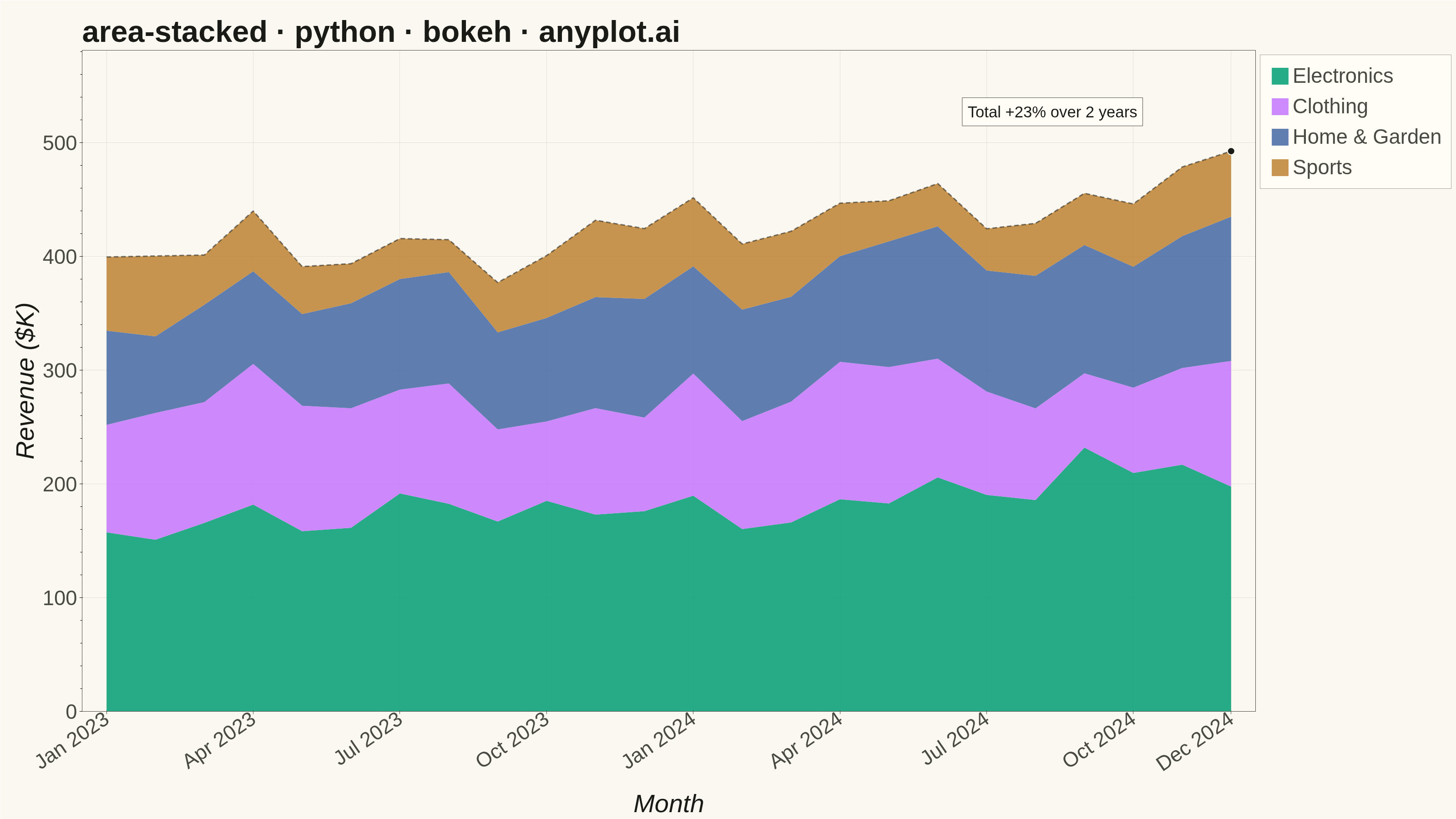
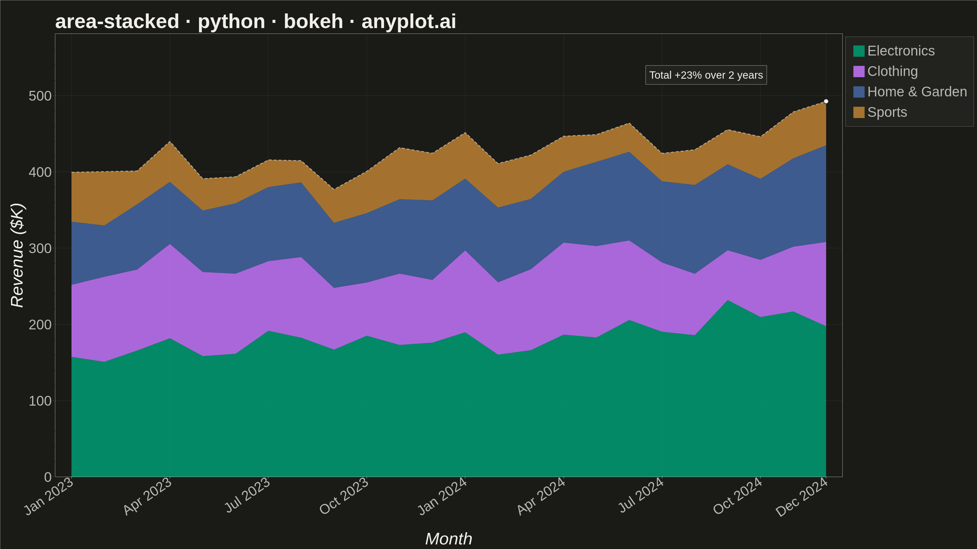
A stacked area chart displays multiple data series as areas stacked on top of each other, with each series starting where the previous one ends. This visualization emphasizes both individual contributions and cumulative totals over a continuous axis (typically time). It is ideal for showing how parts contribute to a whole while tracking changes over time, making patterns of composition and overall trends immediately visible.
""" anyplot.ai
area-stacked: Stacked Area Chart
Library: bokeh 3.9.2 | Python 3.13.15
Quality: 93/100 | Updated: 2026-08-17
"""

import os
import sys
import time
from pathlib import Path


# Remove current directory from sys.path to avoid shadowing bokeh module
if "" in sys.path:
    sys.path.remove("")
if "." in sys.path:
    sys.path.remove(".")

import numpy as np
import pandas as pd
from bokeh.io import output_file, save
from bokeh.models import ColumnDataSource, FixedTicker, HoverTool, Label, Legend
from bokeh.plotting import figure
from selenium import webdriver
from selenium.webdriver.chrome.options import Options


# Theme tokens
THEME = os.getenv("ANYPLOT_THEME", "light")
PAGE_BG = "#FAF8F1" if THEME == "light" else "#1A1A17"
ELEVATED_BG = "#FFFDF6" if THEME == "light" else "#242420"
INK = "#1A1A17" if THEME == "light" else "#F0EFE8"
INK_SOFT = "#4A4A44" if THEME == "light" else "#B8B7B0"

# Imprint palette (first series is always #009E73)
IMPRINT = [
    "#009E73",  # brand green
    "#C475FD",  # lavender
    "#4467A3",  # blue
    "#BD8233",  # ochre
]

# Data - Monthly revenue by product category over 2 years
np.random.seed(42)
months = pd.date_range("2023-01-01", periods=24, freq="MS")

# Generate realistic revenue data with trends
base_electronics = 150 + np.arange(24) * 3 + np.random.randn(24) * 15
base_clothing = 100 + np.sin(np.linspace(0, 4 * np.pi, 24)) * 20 + np.random.randn(24) * 10
base_home = 80 + np.arange(24) * 1.5 + np.random.randn(24) * 8
base_sports = 50 + np.cos(np.linspace(0, 4 * np.pi, 24)) * 15 + np.random.randn(24) * 5

# Ensure all values are positive
electronics = np.maximum(base_electronics, 20)
clothing = np.maximum(base_clothing, 15)
home_garden = np.maximum(base_home, 10)
sports = np.maximum(base_sports, 8)

# Order series by size (largest at bottom for better reading)
# Average values: Electronics (150+), Clothing (100+), Home (80+), Sports (50+)
series_data = [("Electronics", electronics), ("Clothing", clothing), ("Home & Garden", home_garden), ("Sports", sports)]

x_values = np.arange(len(months))
x_labels = [d.strftime("%b %Y") for d in months]

# Total-revenue trend line, used below as a focal-point overlay tracing the
# combined stack instead of leaving the top edge to speak for itself.
total = sum(values for _, values in series_data)
growth_pct = (total[-1] / total[0] - 1) * 100

# Create figure
title = "area-stacked · python · bokeh · anyplot.ai"
p = figure(
    width=3200,
    height=1800,
    title=title,
    x_axis_label="Month",
    y_axis_label="Revenue ($K)",
    x_range=(-0.5, 23.5),
    y_range=(0, total.max() * 1.18),
    toolbar_location=None,  # avoids the ~30-50px toolbar band shrinking the PNG below 3200x1800
    min_border_bottom=160,
    min_border_left=180,
    min_border_top=110,
    min_border_right=50,
)

# Stack the series bottom-to-top with bokeh's purpose-built varea_stack()
# helper: it derives the running y1/y2 bounds from the source columns itself
# and tags each renderer's `name` with the stacker column, which HoverTool's
# special `$name` variable then resolves per-band without a manual loop.
category_names = [name for name, _ in series_data]
source = ColumnDataSource(data={"x": x_values, "month": x_labels, **dict(series_data)})
renderers = p.varea_stack(stackers=category_names, x="x", color=IMPRINT, fill_alpha=0.85, source=source)
legend_items = [(name, [renderer]) for name, renderer in zip(category_names, renderers, strict=True)]

hover = HoverTool(
    renderers=renderers, tooltips=[("Month", "@month"), ("Category", "$name"), ("Value", "@$name{0,0} $K")]
)
p.add_tools(hover)

# Total-revenue trace: a thin neutral dashed line along the stack's top edge,
# with a marker + callout on the final month. Gives the composition a single
# explicit focal point (overall growth) on top of the implicit stacking story.
total_source = ColumnDataSource(data={"x": x_values, "y": total, "month": x_labels})
total_line = p.line(x="x", y="y", source=total_source, line_color=INK, line_alpha=0.55, line_width=3, line_dash=[10, 6])
p.add_tools(HoverTool(renderers=[total_line], tooltips=[("Month", "@month"), ("Total", "@y{0,0} $K")]))
p.scatter(x=[x_values[-1]], y=[total[-1]], size=16, fill_color=INK, line_color=PAGE_BG, line_width=2)

growth_label = Label(
    x=x_values[-1] - 5.5,
    y=total[-1] + total.max() * 0.045,
    text=f"Total +{growth_pct:.0f}% over 2 years",
    text_font_size="26pt",
    text_color=INK,
    background_fill_color=ELEVATED_BG,
    background_fill_alpha=0.9,
    border_line_color=INK_SOFT,
    padding=12,
)
p.add_layout(growth_label)

# Add legend
legend = Legend(items=legend_items, location="top_left")
legend.label_text_font_size = "34pt"
legend.glyph_height = 46
legend.glyph_width = 46
legend.spacing = 15
legend.padding = 20
legend.background_fill_color = ELEVATED_BG
legend.background_fill_alpha = 0.9
legend.border_line_color = INK_SOFT
legend.label_text_color = INK_SOFT
p.add_layout(legend, "right")

# Style text sizes for large canvas
p.title.text_font_size = "50pt"
p.title.text_color = INK
p.xaxis.axis_label_text_font_size = "42pt"
p.yaxis.axis_label_text_font_size = "42pt"
p.xaxis.axis_label_text_color = INK
p.yaxis.axis_label_text_color = INK
p.xaxis.major_label_text_font_size = "34pt"
p.yaxis.major_label_text_font_size = "34pt"
p.xaxis.major_label_text_color = INK_SOFT
p.yaxis.major_label_text_color = INK_SOFT

# Custom x-axis tick labels (show every 3 months)
p.xaxis.ticker = FixedTicker(ticks=[0, 3, 6, 9, 12, 15, 18, 21, 23])
p.xaxis.major_label_overrides = {i: x_labels[i] for i in range(len(x_labels))}
p.xaxis.major_label_orientation = 0.6

# Grid styling
p.xgrid.grid_line_color = INK
p.ygrid.grid_line_color = INK
p.xgrid.grid_line_alpha = 0.10
p.ygrid.grid_line_alpha = 0.10

# Background and borders
p.background_fill_color = PAGE_BG
p.border_fill_color = PAGE_BG
p.outline_line_color = INK_SOFT

# Axis styling
p.xaxis.axis_line_color = INK_SOFT
p.yaxis.axis_line_color = INK_SOFT
p.xaxis.major_tick_line_color = INK_SOFT
p.yaxis.major_tick_line_color = INK_SOFT

# Save HTML
output_file(f"plot-{THEME}.html")
save(p)

# Screenshot with headless Chrome
W, H = 3200, 1800
opts = Options()
for arg in (
    "--headless=new",
    "--no-sandbox",
    "--disable-dev-shm-usage",
    "--disable-gpu",
    f"--window-size={W},{H}",
    "--hide-scrollbars",
):
    opts.add_argument(arg)

driver = webdriver.Chrome(options=opts)
driver.set_window_size(W, H)
driver.get(f"file://{Path(f'plot-{THEME}.html').resolve()}")
# Headless Chrome's --window-size sets the OUTER window (reserves a phantom
# title-bar height even headless), so pin the viewport exactly via CDP.
driver.execute_cdp_cmd(
    "Emulation.setDeviceMetricsOverride", {"width": W, "height": H, "deviceScaleFactor": 1, "mobile": False}
)
time.sleep(3)
driver.save_screenshot(f"plot-{THEME}.png")
driver.quit()
Runnable source as JSON, for any HTTP client: https://api.anyplot.ai/specs/area-stacked/bokeh/code. Any spec id and library id listed in llms-full.txt fit the same URL shape; every URL below is complete and callable.
{
  "spec_id": "area-stacked",
  "language": "python",
  "library": "bokeh",
  "page": "https://anyplot.ai/area-stacked/python/bokeh",
  "hub": "https://anyplot.ai/area-stacked",
  "code_json": "https://api.anyplot.ai/specs/area-stacked/bokeh/code",
  "spec_json": "https://api.anyplot.ai/specs/area-stacked",
  "render_light_png": "https://storage.googleapis.com/anyplot-images/plots/area-stacked/python/bokeh/plot-light.png",
  "render_dark_png": "https://storage.googleapis.com/anyplot-images/plots/area-stacked/python/bokeh/plot-dark.png",
  "interactive_light_html": "https://storage.googleapis.com/anyplot-images/plots/area-stacked/python/bokeh/plot-light.html",
  "interactive_dark_html": "https://storage.googleapis.com/anyplot-images/plots/area-stacked/python/bokeh/plot-dark.html",
  "quality_score": 93.0,
  "license": "MIT",
  "guide": "https://anyplot.ai/llms.txt"
}
Part of Stacked Area Chart on anyplot.ai.