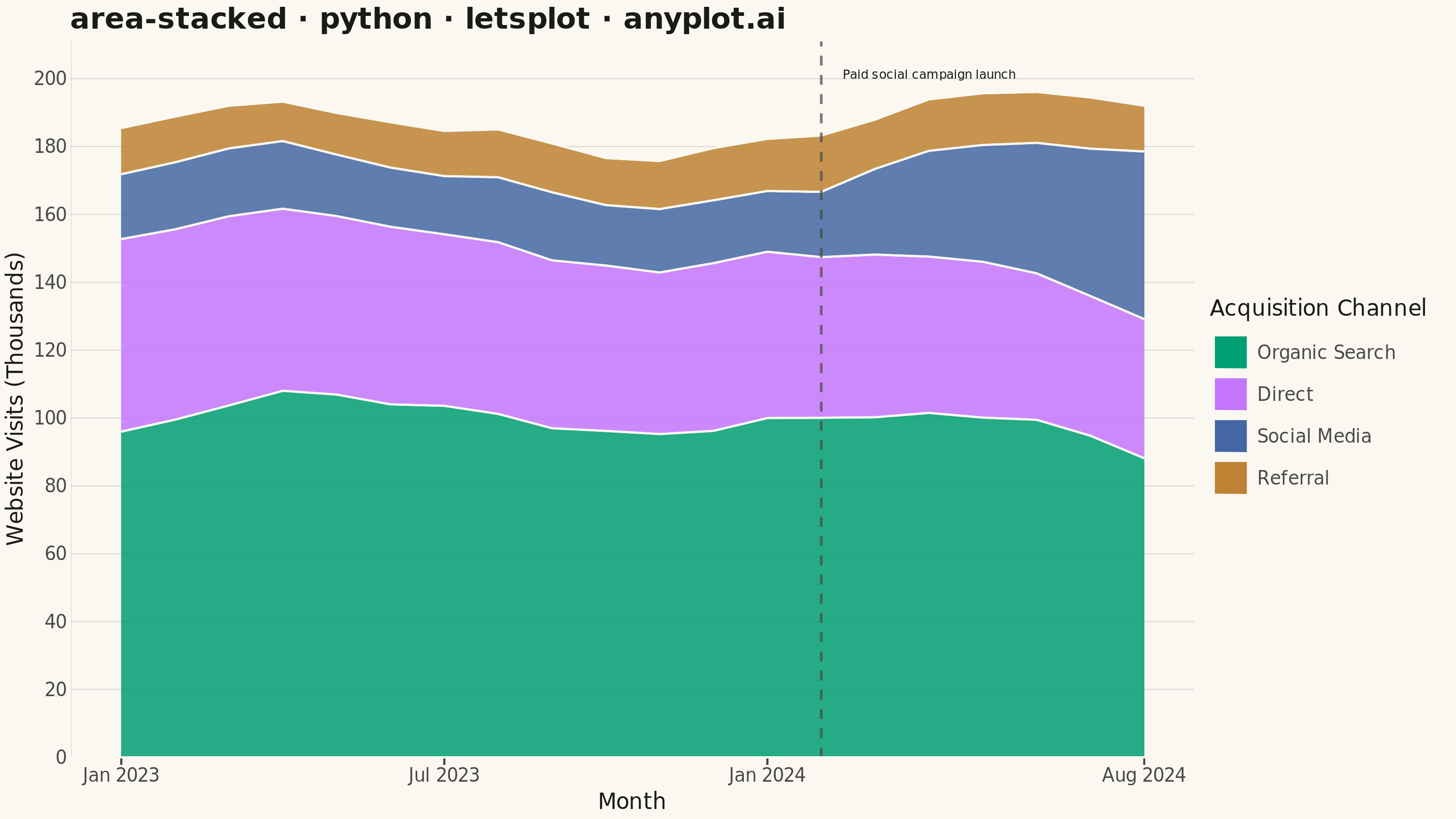
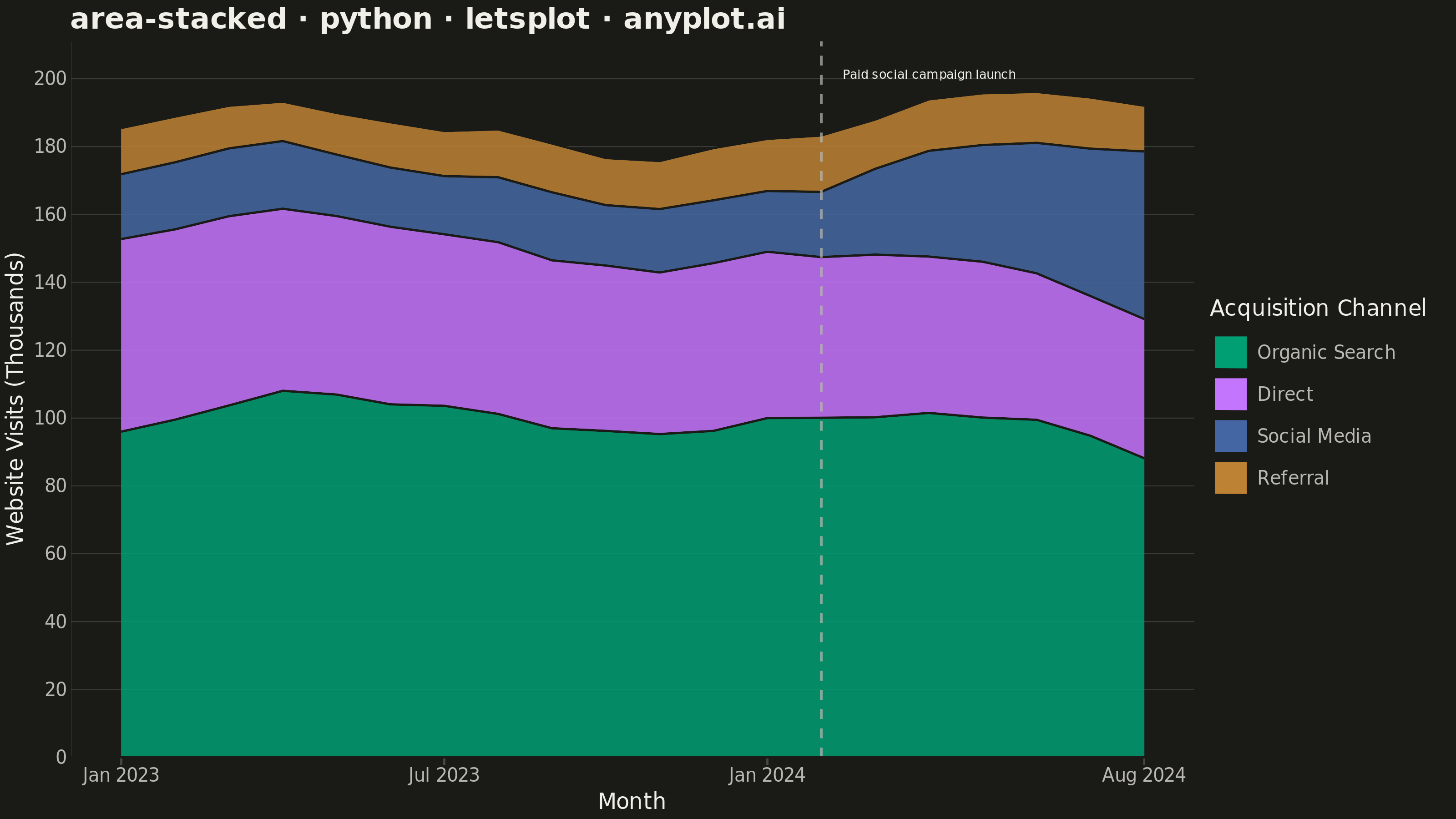
A stacked area chart displays multiple data series as areas stacked on top of each other, with each series starting where the previous one ends. This visualization emphasizes both individual contributions and cumulative totals over a continuous axis (typically time). It is ideal for showing how parts contribute to a whole while tracking changes over time, making patterns of composition and overall trends immediately visible.
""" anyplot.ai
area-stacked: Stacked Area Chart
Library: letsplot 4.11.0 | Python 3.13.15
Quality: 91/100 | Updated: 2026-08-17
"""

import os

import numpy as np
import pandas as pd
from lets_plot import (
    LetsPlot,
    aes,
    element_blank,
    element_line,
    element_rect,
    element_text,
    geom_area,
    geom_text,
    geom_vline,
    ggplot,
    ggsize,
    labs,
    layer_tooltips,
    scale_fill_manual,
    scale_x_continuous,
    scale_y_continuous,
    theme,
)
from lets_plot.export import ggsave


LetsPlot.setup_html()

# Theme tokens (see prompts/default-style-guide.md)
THEME = os.getenv("ANYPLOT_THEME", "light")
PAGE_BG = "#FAF8F1" if THEME == "light" else "#1A1A17"
INK = "#1A1A17" if THEME == "light" else "#F0EFE8"
INK_SOFT = "#4A4A44" if THEME == "light" else "#B8B7B0"
RULE = "rgba(26,26,23,0.15)" if THEME == "light" else "rgba(240,239,232,0.15)"

# Imprint palette (first series always #009E73)
IMPRINT = ["#009E73", "#C475FD", "#4467A3", "#BD8233"]
AMBER = "#DDCC77"  # semantic anchor for the campaign-launch event marker

# Data: monthly website visits by acquisition channel, Jan 2023 - Aug 2024
np.random.seed(42)
n_months = 20
months = pd.date_range("2023-01", periods=n_months, freq="ME")
t = np.arange(n_months)

# Organic search: steady, largest channel with mild seasonality
organic = 95 + 8 * np.sin(np.linspace(0, 3 * np.pi, n_months)) + np.cumsum(np.random.randn(n_months) * 2)
organic = np.maximum(organic, 60)

# Direct: stable, slowly tapering as other channels grow
direct = 55 - 0.4 * t + np.cumsum(np.random.randn(n_months) * 1.2)
direct = np.maximum(direct, 30)

# Social media: a paid campaign launches at month 13, sharply accelerating growth
campaign_start = 13
social_pre = 18 + 0.4 * t
social_post = 18 + 0.4 * campaign_start + (t - campaign_start) * 4.5
social = np.where(t < campaign_start, social_pre, social_post) + np.cumsum(np.random.randn(n_months) * 1.5)
social = np.maximum(social, 12)

# Referral: small, flat channel
referral = 14 + np.cumsum(np.random.randn(n_months) * 0.8)
referral = np.maximum(referral, 6)

# Create long-format dataframe for lets-plot
df = pd.DataFrame(
    {
        "MonthNum": np.tile(t, 4),
        "Visits": np.concatenate([organic, direct, social, referral]),
        "Channel": ["Organic Search"] * n_months
        + ["Direct"] * n_months
        + ["Social Media"] * n_months
        + ["Referral"] * n_months,
    }
)

# Reorder channels for stacking (largest at bottom)
channel_order = ["Organic Search", "Direct", "Social Media", "Referral"]
df["Channel"] = pd.Categorical(df["Channel"], categories=channel_order, ordered=True)

# Annotate the story: where the paid social campaign kicks off growth
stack_top_at_launch = (
    organic[campaign_start] + direct[campaign_start] + social[campaign_start] + referral[campaign_start]
)
callout_y = stack_top_at_launch + 18

# Richer tooltip: bolded channel title plus formatted visits (lets-plot-distinctive
# interactive feature, beyond a generic ggplot2-style port)
area_tooltips = layer_tooltips().title("@Channel").format("@Visits", ".0f").line("Visits|@Visits k")

# Create stacked area chart
plot = (
    ggplot(df, aes(x="MonthNum", y="Visits", fill="Channel"))
    + geom_area(alpha=0.85, position="stack", size=0.5, color=PAGE_BG, tooltips=area_tooltips)
    + geom_vline(xintercept=campaign_start, linetype="dashed", color=AMBER, size=0.8, alpha=0.9)
    + geom_text(
        x=campaign_start, y=callout_y, label="Paid social campaign launch", size=4.1, color=INK, hjust=0, nudge_x=0.4
    )
    + scale_fill_manual(values=IMPRINT)
    + scale_x_continuous(name="Month", breaks=[0, 6, 12, 19], labels=["Jan 2023", "Jul 2023", "Jan 2024", "Aug 2024"])
    + scale_y_continuous(name="Website Visits (Thousands)", format=",d")
    + labs(title="area-stacked · python · letsplot · anyplot.ai", fill="Acquisition Channel")
    + theme(
        plot_background=element_rect(fill=PAGE_BG, color=PAGE_BG),
        panel_background=element_rect(fill=PAGE_BG, color=PAGE_BG),
        panel_border=element_blank(),
        panel_grid_major_x=element_blank(),
        panel_grid_major_y=element_line(color=RULE, size=0.5),
        panel_grid_minor=element_blank(),
        plot_title=element_text(size=16, face="bold", color=INK),
        axis_title=element_text(size=12, color=INK),
        axis_text=element_text(size=10, color=INK_SOFT),
        axis_line_x=element_line(color=INK_SOFT),
        axis_line_y=element_line(color=INK_SOFT),
        legend_background=element_rect(fill=PAGE_BG, color=PAGE_BG),
        legend_title=element_text(size=12, color=INK),
        legend_text=element_text(size=10, color=INK_SOFT),
        legend_position="right",
    )
    + ggsize(800, 450)
)

# Save as PNG (scale 4x for 3200x1800 px)
ggsave(plot, f"plot-{THEME}.png", path=".", scale=4)

# Save interactive HTML version
ggsave(plot, f"plot-{THEME}.html", path=".")
Runnable source as JSON, for any HTTP client: https://api.anyplot.ai/specs/area-stacked/letsplot/code. Any spec id and library id listed in llms-full.txt fit the same URL shape; every URL below is complete and callable.
{
  "spec_id": "area-stacked",
  "language": "python",
  "library": "letsplot",
  "page": "https://anyplot.ai/area-stacked/python/letsplot",
  "hub": "https://anyplot.ai/area-stacked",
  "code_json": "https://api.anyplot.ai/specs/area-stacked/letsplot/code",
  "spec_json": "https://api.anyplot.ai/specs/area-stacked",
  "render_light_png": "https://storage.googleapis.com/anyplot-images/plots/area-stacked/python/letsplot/plot-light.png",
  "render_dark_png": "https://storage.googleapis.com/anyplot-images/plots/area-stacked/python/letsplot/plot-dark.png",
  "interactive_light_html": "https://storage.googleapis.com/anyplot-images/plots/area-stacked/python/letsplot/plot-light.html",
  "interactive_dark_html": "https://storage.googleapis.com/anyplot-images/plots/area-stacked/python/letsplot/plot-dark.html",
  "quality_score": 91.0,
  "license": "MIT",
  "guide": "https://anyplot.ai/llms.txt"
}
Part of Stacked Area Chart on anyplot.ai.