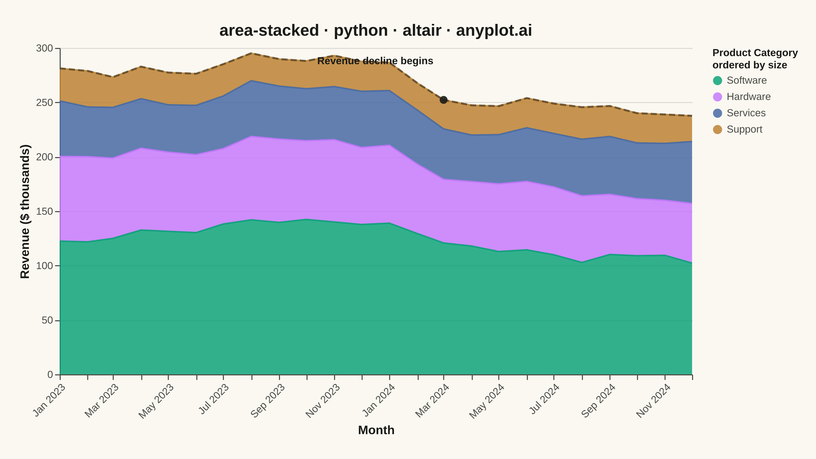
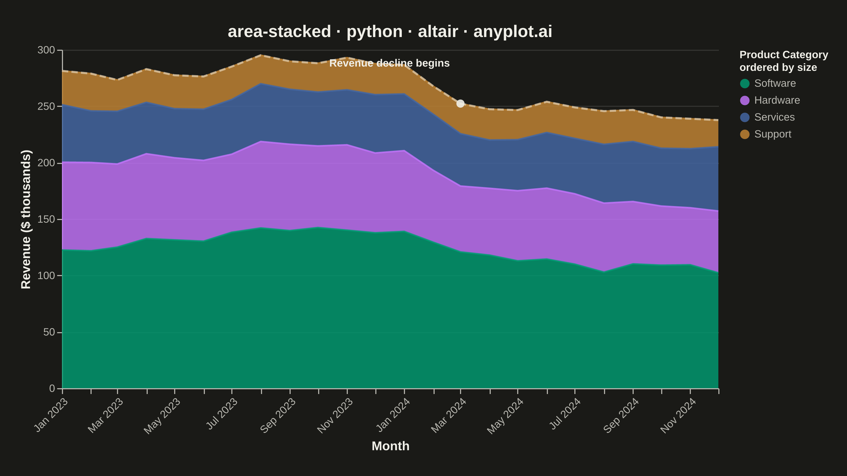
A stacked area chart displays multiple data series as areas stacked on top of each other, with each series starting where the previous one ends. This visualization emphasizes both individual contributions and cumulative totals over a continuous axis (typically time). It is ideal for showing how parts contribute to a whole while tracking changes over time, making patterns of composition and overall trends immediately visible.
""" anyplot.ai
area-stacked: Stacked Area Chart
Library: altair 6.2.2 | Python 3.13.15
Quality: 93/100 | Updated: 2026-08-17
"""

import os

import altair as alt
import numpy as np
import pandas as pd
from PIL import Image


# Theme tokens (Imprint palette — theme-adaptive chrome)
THEME = os.getenv("ANYPLOT_THEME", "light")
PAGE_BG = "#FAF8F1" if THEME == "light" else "#1A1A17"
ELEVATED_BG = "#FFFDF6" if THEME == "light" else "#242420"
INK = "#1A1A17" if THEME == "light" else "#F0EFE8"
INK_SOFT = "#4A4A44" if THEME == "light" else "#B8B7B0"

# Data: Monthly revenue by product category over two years
np.random.seed(42)
months = pd.date_range("2023-01", periods=24, freq="MS")

# Generate realistic revenue data with trends
base_software = 120 + np.cumsum(np.random.randn(24) * 5)
base_hardware = 80 + np.cumsum(np.random.randn(24) * 4)
base_services = 50 + np.cumsum(np.random.randn(24) * 3)
base_support = 30 + np.cumsum(np.random.randn(24) * 2)

# Ensure all values are positive
software = np.maximum(base_software, 20)
hardware = np.maximum(base_hardware, 15)
services = np.maximum(base_services, 10)
support = np.maximum(base_support, 5)

# Create long-form data for Altair
df = pd.DataFrame(
    {
        "Month": list(months) * 4,
        "Revenue": np.concatenate([software, hardware, services, support]),
        "Category": (["Software"] * 24 + ["Hardware"] * 24 + ["Services"] * 24 + ["Support"] * 24),
    }
)

# Define category order (largest at bottom for easier reading)
# Stack order: 1=bottom, 4=top
category_order = ["Software", "Hardware", "Services", "Support"]
stack_order = {"Software": 1, "Hardware": 2, "Services": 3, "Support": 4}
df["StackOrder"] = df["Category"].map(stack_order)

# Total revenue overlay, drawn as a dashed line tracing the top of the stack
totals = df.groupby("Month", as_index=False)["Revenue"].sum().rename(columns={"Revenue": "Total"})

# Annotation: callout the sustained revenue decline that starts ~Mar 2024
decline_month = pd.Timestamp("2024-03-01")
decline_total = float(totals.loc[totals["Month"] == decline_month, "Total"].iloc[0])
annotation_df = pd.DataFrame({"Month": [decline_month], "Total": [decline_total], "Label": ["Revenue decline begins"]})

# Imprint palette: first series ALWAYS #009E73
colors = ["#009E73", "#C475FD", "#4467A3", "#BD8233"]
# Subtle back-to-front opacity gradient (bottom layer softer, top layer crisper)
opacities = [0.80, 0.85, 0.90, 0.95]

# Stacked areas
area_chart = (
    alt.Chart(df)
    .mark_area(line=alt.MarkConfig(strokeWidth=1.5))
    .encode(
        x=alt.X(
            "Month:T",
            title="Month",
            axis=alt.Axis(
                labelFontSize=10,
                titleFontSize=12,
                format="%b %Y",
                labelAngle=-45,
                labelColor=INK_SOFT,
                titleColor=INK,
                grid=False,
            ),
        ),
        y=alt.Y(
            "Revenue:Q",
            title="Revenue ($ thousands)",
            stack="zero",
            axis=alt.Axis(
                labelFontSize=10, titleFontSize=12, labelColor=INK_SOFT, titleColor=INK, gridColor=INK, gridOpacity=0.12
            ),
        ),
        color=alt.Color(
            "Category:N",
            scale=alt.Scale(domain=category_order, range=colors),
            legend=alt.Legend(
                title=["Product Category", "ordered by size"],
                titleFontSize=10,
                titleFontWeight="bold",
                labelFontSize=10,
                orient="right",
                symbolSize=80,
                symbolStrokeWidth=0,
                labelOffset=4,
                rowPadding=6,
                labelColor=INK_SOFT,
                titleColor=INK,
            ),
        ),
        opacity=alt.Opacity("Category:N", scale=alt.Scale(domain=category_order, range=opacities), legend=None),
        order=alt.Order("StackOrder:Q", sort="ascending"),
        tooltip=[
            alt.Tooltip("Month:T", title="Month", format="%B %Y"),
            alt.Tooltip("Category:N", title="Category"),
            alt.Tooltip("Revenue:Q", title="Revenue ($k)", format=".1f"),
        ],
    )
)

# Dashed total-revenue trace on top of the stack — makes the combined trend explicit
total_line = (
    alt.Chart(totals)
    .mark_line(color=INK, strokeDash=[6, 3], strokeWidth=2, opacity=0.5)
    .encode(
        x="Month:T",
        y="Total:Q",
        tooltip=[
            alt.Tooltip("Month:T", title="Month", format="%B %Y"),
            alt.Tooltip("Total:Q", title="Total Revenue ($k)", format=".1f"),
        ],
    )
)

# Point + label calling out where the sustained decline begins
decline_point = (
    alt.Chart(annotation_df)
    .mark_point(shape="circle", size=60, filled=True, color=INK, opacity=0.9)
    .encode(x="Month:T", y="Total:Q")
)
decline_text = (
    alt.Chart(annotation_df)
    .mark_text(align="right", dx=-10, dy=-38, fontSize=10, fontWeight="bold", color=INK)
    .encode(x="Month:T", y="Total:Q", text="Label:N")
)

chart = (
    alt.layer(area_chart, total_line, decline_point, decline_text)
    .properties(
        width=620,
        height=320,
        background=PAGE_BG,
        title=alt.Title("area-stacked · python · altair · anyplot.ai", fontSize=16, anchor="middle", color=INK),
    )
    .configure_axis(domainColor=INK_SOFT, tickColor=INK_SOFT)
    .configure_view(stroke=None, fill=PAGE_BG)
)

# Save as PNG. Target: 3200 x 1800 (landscape).
chart.save(f"plot-{THEME}.png", scale_factor=4.0)

# Pad (never crop) up to the exact canonical canvas — vl-convert's title/legend
# padding lands short of the target, never over it, at this view size.
TW, TH = 3200, 1800
_img = Image.open(f"plot-{THEME}.png").convert("RGB")
_w, _h = _img.size
if _w > TW or _h > TH:
    raise SystemExit(
        f"altair vl-convert produced {_w}x{_h}, exceeds target {TW}x{TH}. "
        f"Shrink chart .properties(width=, height=) values and re-render."
    )
if _w < TW or _h < TH:
    _canvas = Image.new("RGB", (TW, TH), PAGE_BG)
    _canvas.paste(_img, ((TW - _w) // 2, (TH - _h) // 2))
    _canvas.save(f"plot-{THEME}.png")

# Save as HTML for interactivity
chart.interactive().save(f"plot-{THEME}.html")
Runnable source as JSON, for any HTTP client: https://api.anyplot.ai/specs/area-stacked/altair/code. Any spec id and library id listed in llms-full.txt fit the same URL shape; every URL below is complete and callable.
{
  "spec_id": "area-stacked",
  "language": "python",
  "library": "altair",
  "page": "https://anyplot.ai/area-stacked/python/altair",
  "hub": "https://anyplot.ai/area-stacked",
  "code_json": "https://api.anyplot.ai/specs/area-stacked/altair/code",
  "spec_json": "https://api.anyplot.ai/specs/area-stacked",
  "render_light_png": "https://storage.googleapis.com/anyplot-images/plots/area-stacked/python/altair/plot-light.png",
  "render_dark_png": "https://storage.googleapis.com/anyplot-images/plots/area-stacked/python/altair/plot-dark.png",
  "interactive_light_html": "https://storage.googleapis.com/anyplot-images/plots/area-stacked/python/altair/plot-light.html",
  "interactive_dark_html": "https://storage.googleapis.com/anyplot-images/plots/area-stacked/python/altair/plot-dark.html",
  "quality_score": 93.0,
  "license": "MIT",
  "guide": "https://anyplot.ai/llms.txt"
}
Part of Stacked Area Chart on anyplot.ai.