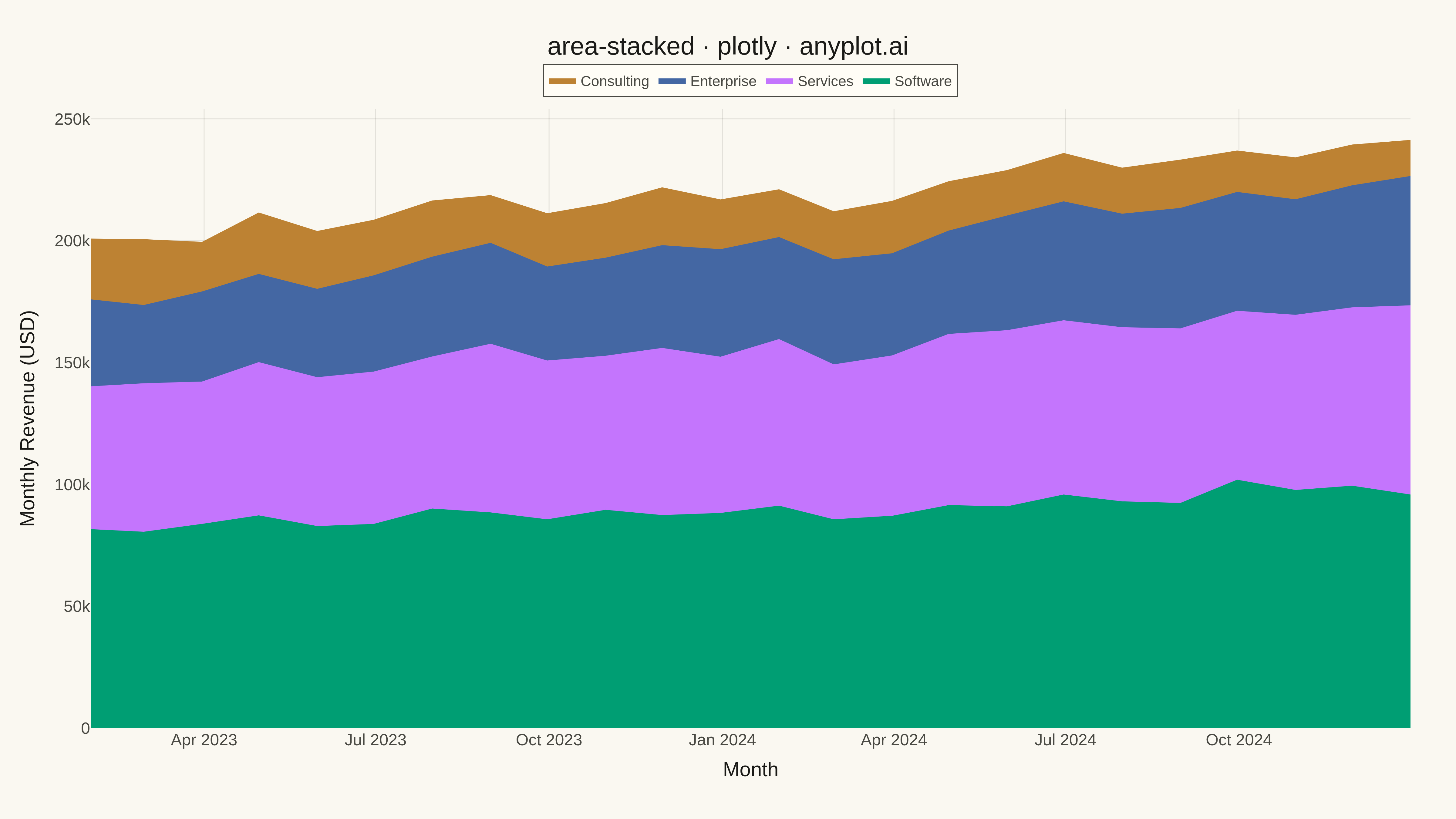
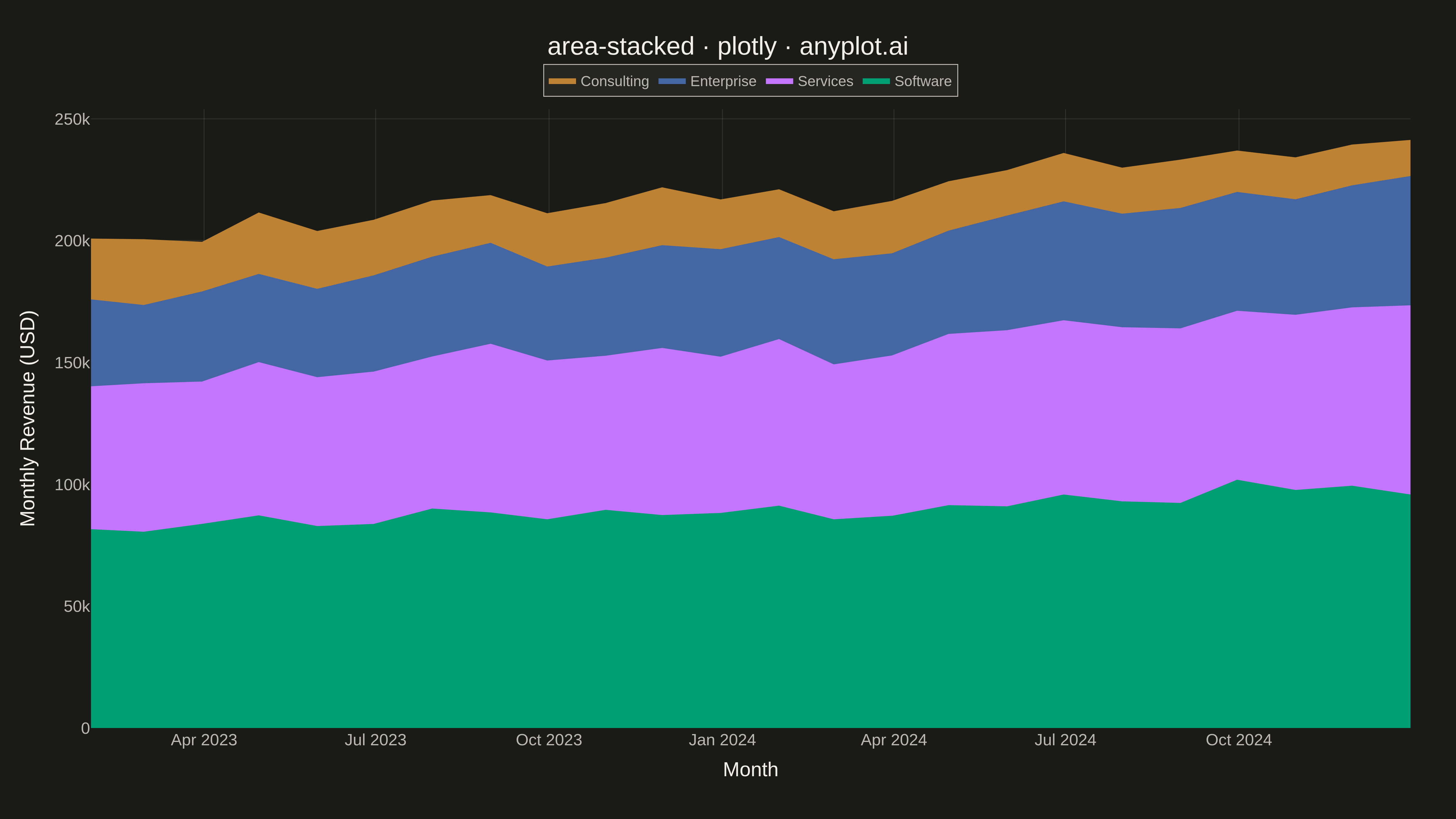
A stacked area chart displays multiple data series as areas stacked on top of each other, with each series starting where the previous one ends. This visualization emphasizes both individual contributions and cumulative totals over a continuous axis (typically time). It is ideal for showing how parts contribute to a whole while tracking changes over time, making patterns of composition and overall trends immediately visible.
""" anyplot.ai
area-stacked: Stacked Area Chart
Library: plotly 6.7.0 | Python 3.13.13
Quality: 85/100 | Updated: 2026-05-07
"""

import os

import numpy as np
import pandas as pd
import plotly.graph_objects as go


# Theme tokens
THEME = os.getenv("ANYPLOT_THEME", "light")
PAGE_BG = "#FAF8F1" if THEME == "light" else "#1A1A17"
ELEVATED_BG = "#FFFDF6" if THEME == "light" else "#242420"
INK = "#1A1A17" if THEME == "light" else "#F0EFE8"
INK_SOFT = "#4A4A44" if THEME == "light" else "#B8B7B0"
GRID = "rgba(26,26,23,0.10)" if THEME == "light" else "rgba(240,239,232,0.10)"

# Okabe-Ito palette (first series is always brand green)
IMPRINT = ["#009E73", "#C475FD", "#4467A3", "#BD8233"]

# Data - Monthly revenue by product category over 2 years
np.random.seed(42)
months = pd.date_range(start="2023-01", periods=24, freq="ME")

# Generate realistic revenue data with varied trends
software = 80000 + np.linspace(0, 20000, 24) + np.random.randn(24) * 3000
services = 60000 + np.linspace(0, 15000, 24) + np.random.randn(24) * 2500
enterprise = 40000 + np.linspace(-5000, 10000, 24) + np.random.randn(24) * 2000
consulting = 25000 + np.linspace(0, -8000, 24) + np.random.randn(24) * 1500

# Ensure positive values
software = np.maximum(software, 10000).astype(int)
services = np.maximum(services, 5000).astype(int)
enterprise = np.maximum(enterprise, 5000).astype(int)
consulting = np.maximum(consulting, 3000).astype(int)

# Create figure
fig = go.Figure()

# Add traces in order (largest at bottom)
fig.add_trace(
    go.Scatter(
        x=months,
        y=software,
        name="Software",
        mode="lines",
        line=dict(width=0.5, color=IMPRINT[0]),
        fill="tozeroy",
        fillcolor=IMPRINT[0],
        stackgroup="one",
        hovertemplate="<b>Software</b><br>%{x|%b %Y}<br>Revenue: $%{y:,.0f}<extra></extra>",
    )
)

fig.add_trace(
    go.Scatter(
        x=months,
        y=services,
        name="Services",
        mode="lines",
        line=dict(width=0.5, color=IMPRINT[1]),
        fill="tonexty",
        fillcolor=IMPRINT[1],
        stackgroup="one",
        hovertemplate="<b>Services</b><br>%{x|%b %Y}<br>Revenue: $%{y:,.0f}<extra></extra>",
    )
)

fig.add_trace(
    go.Scatter(
        x=months,
        y=enterprise,
        name="Enterprise",
        mode="lines",
        line=dict(width=0.5, color=IMPRINT[2]),
        fill="tonexty",
        fillcolor=IMPRINT[2],
        stackgroup="one",
        hovertemplate="<b>Enterprise</b><br>%{x|%b %Y}<br>Revenue: $%{y:,.0f}<extra></extra>",
    )
)

fig.add_trace(
    go.Scatter(
        x=months,
        y=consulting,
        name="Consulting",
        mode="lines",
        line=dict(width=0.5, color=IMPRINT[3]),
        fill="tonexty",
        fillcolor=IMPRINT[3],
        stackgroup="one",
        hovertemplate="<b>Consulting</b><br>%{x|%b %Y}<br>Revenue: $%{y:,.0f}<extra></extra>",
    )
)

# Layout
fig.update_layout(
    title=dict(text="area-stacked · plotly · anyplot.ai", font=dict(size=28, color=INK), x=0.5, xanchor="center"),
    xaxis=dict(
        title=dict(text="Month", font=dict(size=22, color=INK)),
        tickfont=dict(size=18, color=INK_SOFT),
        gridcolor=GRID,
        showgrid=True,
        showline=False,
        zeroline=False,
    ),
    yaxis=dict(
        title=dict(text="Monthly Revenue (USD)", font=dict(size=22, color=INK)),
        tickfont=dict(size=18, color=INK_SOFT),
        gridcolor=GRID,
        showgrid=True,
        rangemode="tozero",
        showline=False,
        zeroline=False,
    ),
    legend=dict(
        font=dict(size=16, color=INK_SOFT),
        bgcolor=ELEVATED_BG,
        bordercolor=INK_SOFT,
        borderwidth=1,
        orientation="h",
        yanchor="bottom",
        y=1.02,
        xanchor="center",
        x=0.5,
    ),
    paper_bgcolor=PAGE_BG,
    plot_bgcolor=PAGE_BG,
    margin=dict(l=100, r=50, t=120, b=100),
    hovermode="x unified",
)

# Save as PNG and HTML
fig.write_image(f"plot-{THEME}.png", width=1600, height=900, scale=3)
fig.write_html(f"plot-{THEME}.html", include_plotlyjs="cdn")
Runnable source as JSON, for any HTTP client: https://api.anyplot.ai/specs/area-stacked/plotly/code. Any spec id and library id listed in llms-full.txt fit the same URL shape; every URL below is complete and callable.
{
  "spec_id": "area-stacked",
  "language": "python",
  "library": "plotly",
  "page": "https://anyplot.ai/area-stacked/python/plotly",
  "hub": "https://anyplot.ai/area-stacked",
  "code_json": "https://api.anyplot.ai/specs/area-stacked/plotly/code",
  "spec_json": "https://api.anyplot.ai/specs/area-stacked",
  "render_light_png": "https://storage.googleapis.com/anyplot-images/plots/area-stacked/python/plotly/plot-light.png",
  "render_dark_png": "https://storage.googleapis.com/anyplot-images/plots/area-stacked/python/plotly/plot-dark.png",
  "interactive_light_html": "https://storage.googleapis.com/anyplot-images/plots/area-stacked/python/plotly/plot-light.html",
  "interactive_dark_html": "https://storage.googleapis.com/anyplot-images/plots/area-stacked/python/plotly/plot-dark.html",
  "quality_score": 85.0,
  "license": "MIT",
  "guide": "https://anyplot.ai/llms.txt"
}
Part of Stacked Area Chart on anyplot.ai.