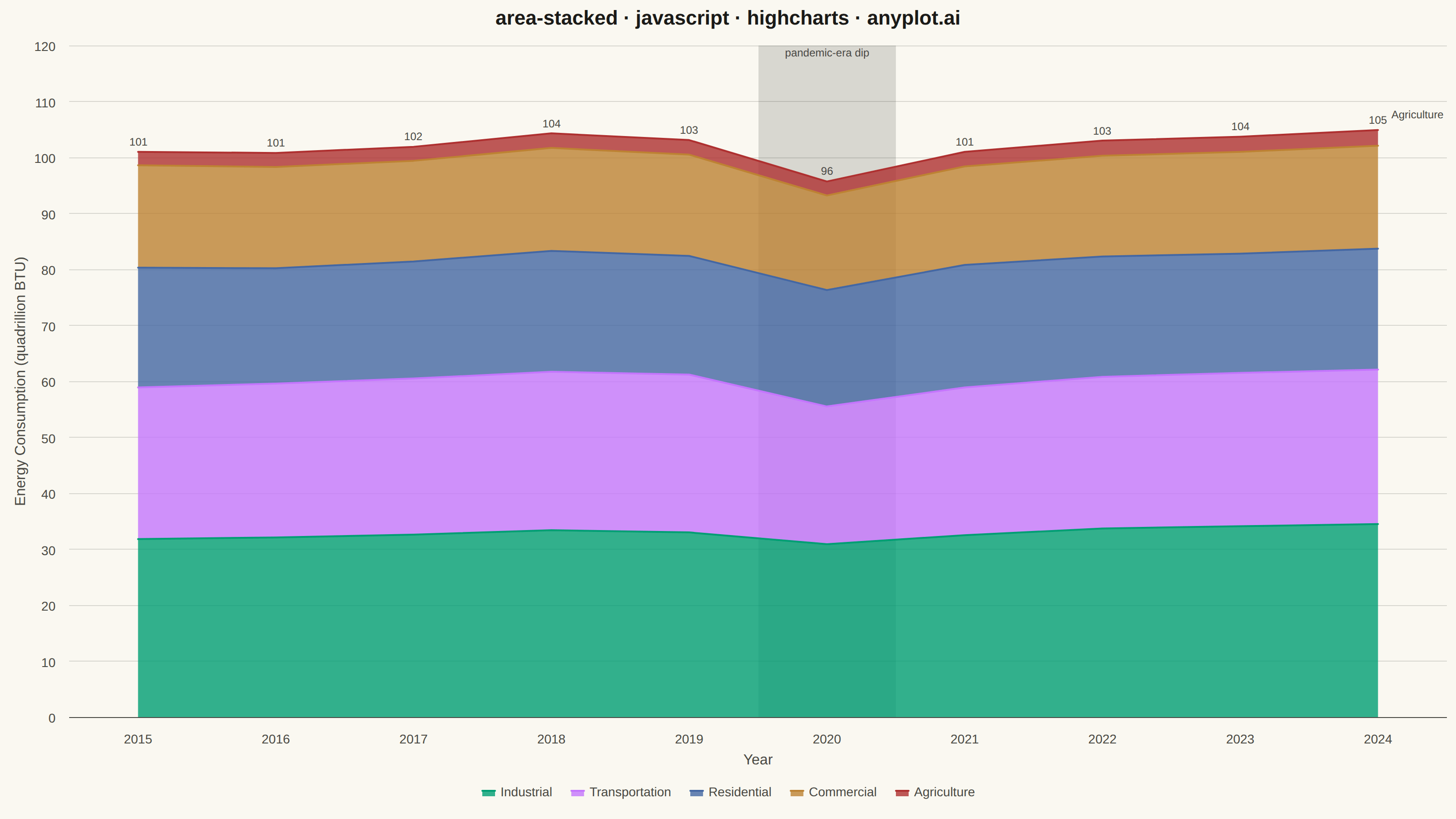
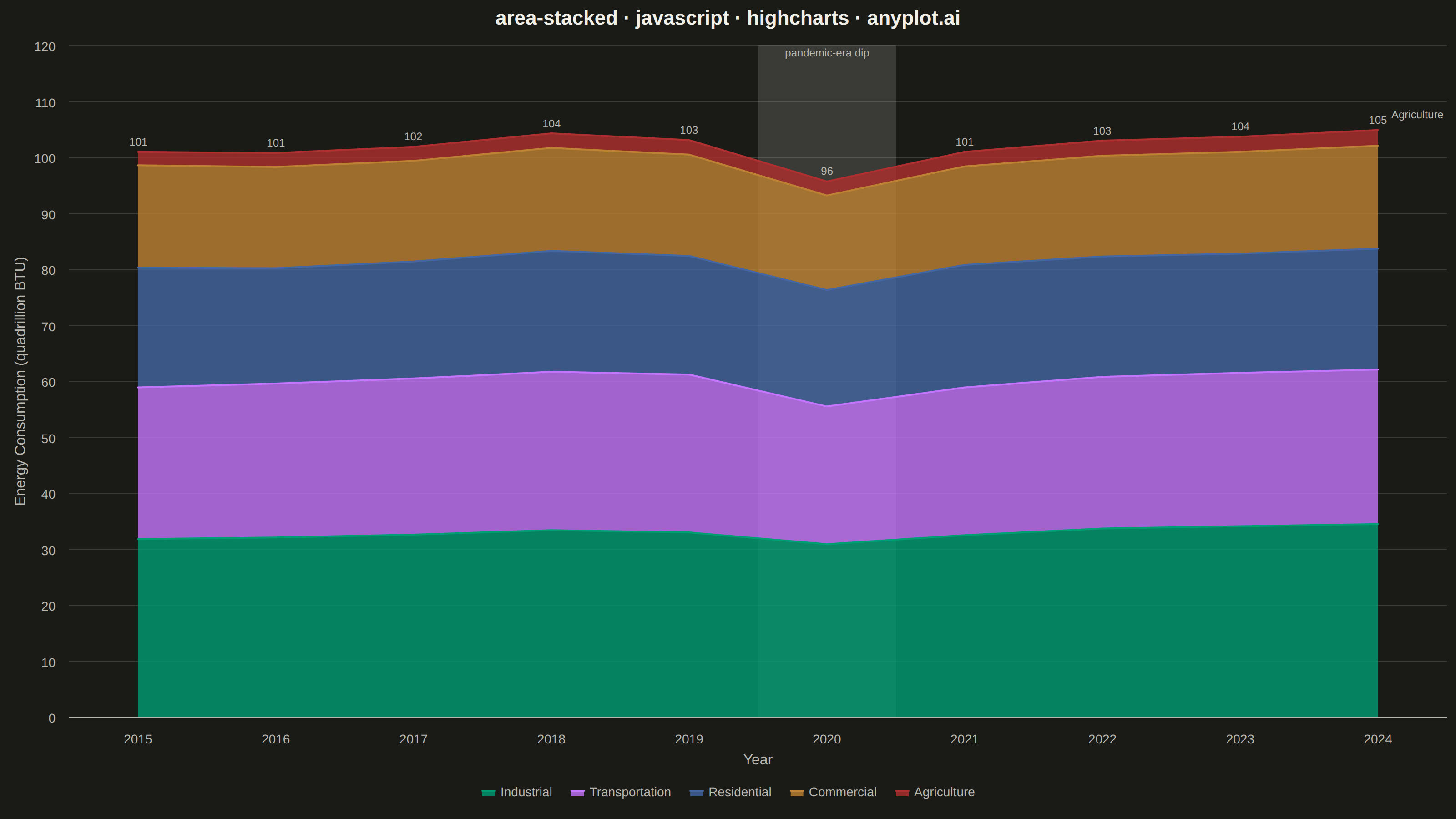
The same plot in 14 other libraries — JavaScript: Chart.js, D3.js, Apache ECharts, MUI X Charts; Python: Altair, Bokeh, lets-plot, Matplotlib, Plotly, plotnine, Pygal, Seaborn; R: ggplot2; Julia: Makie.jl. Compare all 15 side by side: Stacked Area Chart in Python, R, Julia and JavaScript.
A stacked area chart displays multiple data series as areas stacked on top of each other, with each series starting where the previous one ends. This visualization emphasizes both individual contributions and cumulative totals over a continuous axis (typically time). It is ideal for showing how parts contribute to a whole while tracking changes over time, making patterns of composition and overall trends immediately visible.
// anyplot.ai
// area-stacked: Stacked Area Chart
// Library: highcharts 12.6.0 | JavaScript 22.23.2
// Quality: 90/100 | Created: 2026-08-17

//# anyplot-orientation: landscape
const t = window.ANYPLOT_TOKENS;

// --- Data (in-memory, deterministic) ----------------------------------------
// US energy consumption by sector, 2015-2024 (quadrillion BTU, illustrative)
const years = Array.from({ length: 10 }, (_, i) => 2015 + i);
const dipYearIndex = years.indexOf(2020);

const industrial = [31.8, 32.1, 32.6, 33.4, 33.0, 30.9, 32.5, 33.7, 34.1, 34.5];
const transportation = [27.1, 27.5, 27.9, 28.3, 28.2, 24.6, 26.4, 27.1, 27.4, 27.6];
const residential = [21.4, 20.6, 20.9, 21.6, 21.2, 20.8, 21.9, 21.5, 21.3, 21.6];
const commercial = [18.3, 18.1, 18.0, 18.4, 18.1, 16.9, 17.6, 18.0, 18.2, 18.4];
const agriculture = [2.4, 2.5, 2.5, 2.6, 2.6, 2.5, 2.6, 2.7, 2.7, 2.8];

// Last point of the thinnest band (Agriculture) carries a direct callout label
// so the smallest series stays legible even though its ~2.7/~100 share is
// visually near-invisible against the four larger bands beneath it.
const agricultureData = agriculture.map((v, i) =>
  i === agriculture.length - 1
    ? {
        y: v,
        dataLabels: {
          enabled: true,
          format: "Agriculture",
          align: "left",
          x: 10,
          y: -6,
          style: { color: t.inkSoft, fontSize: "12px", fontWeight: "normal", textOutline: "none" },
        },
      }
    : v,
);

// --- Chart -------------------------------------------------------------------
const title = "area-stacked · javascript · highcharts · anyplot.ai";

Highcharts.chart("container", {
  chart: {
    type: "area",
    backgroundColor: "transparent",
    animation: false,
    style: { fontFamily: "inherit" },
  },
  credits: { enabled: false },
  colors: t.palette,
  title: {
    text: title,
    style: { color: t.ink, fontSize: "22px", fontWeight: "600" },
  },
  xAxis: {
    categories: years.map(String),
    maxPadding: 0.07,
    lineColor: t.inkSoft,
    tickColor: t.inkSoft,
    labels: { style: { color: t.inkSoft, fontSize: "14px" } },
    title: { text: "Year", style: { color: t.inkSoft, fontSize: "16px" } },
    // Shaded column (not a hard line) so it sits behind the opaque stack fill
    // and never cuts across the per-year stack-total labels above the peak.
    plotBands: [
      {
        from: dipYearIndex - 0.5,
        to: dipYearIndex + 0.5,
        color: t.grid,
        label: {
          text: "pandemic-era dip",
          verticalAlign: "top",
          align: "center",
          y: 12,
          style: { color: t.inkSoft, fontSize: "12px" },
        },
      },
    ],
  },
  yAxis: {
    min: 0,
    title: {
      text: "Energy Consumption (quadrillion BTU)",
      style: { color: t.inkSoft, fontSize: "16px" },
    },
    gridLineColor: t.grid,
    labels: { style: { color: t.inkSoft, fontSize: "14px" } },
    stackLabels: {
      enabled: true,
      style: { color: t.inkSoft, fontSize: "12px", fontWeight: "normal", textOutline: "none" },
      formatter: function () {
        return Math.round(this.total);
      },
    },
  },
  legend: {
    reversed: true,
    itemStyle: { color: t.inkSoft, fontSize: "14px" },
    itemHoverStyle: { color: t.ink },
  },
  tooltip: { enabled: false },
  plotOptions: {
    series: { animation: false, marker: { enabled: false } },
    area: {
      stacking: "normal",
      lineWidth: 2,
      fillOpacity: 0.8,
      lineColor: undefined,
    },
  },
  series: [
    // Highcharts stacks the last-defined series at the base of the stack, so
    // the array runs smallest-to-largest (Agriculture first) to put the
    // largest series (Industrial) at the bottom per the spec's guidance.
    { name: "Agriculture", data: agricultureData, color: t.palette[4] },
    { name: "Commercial", data: commercial, color: t.palette[3] },
    { name: "Residential", data: residential, color: t.palette[2] },
    { name: "Transportation", data: transportation, color: t.palette[1] },
    { name: "Industrial", data: industrial, color: t.palette[0] },
  ],
});
Runnable source as JSON, for any HTTP client: https://api.anyplot.ai/specs/area-stacked/highcharts/code. Any spec id and library id listed in llms-full.txt fit the same URL shape; every URL below is complete and callable.
{
  "spec_id": "area-stacked",
  "language": "javascript",
  "library": "highcharts",
  "page": "https://anyplot.ai/area-stacked/javascript/highcharts",
  "hub": "https://anyplot.ai/area-stacked",
  "code_json": "https://api.anyplot.ai/specs/area-stacked/highcharts/code",
  "spec_json": "https://api.anyplot.ai/specs/area-stacked",
  "render_light_png": "https://storage.googleapis.com/anyplot-images/plots/area-stacked/javascript/highcharts/plot-light.png",
  "render_dark_png": "https://storage.googleapis.com/anyplot-images/plots/area-stacked/javascript/highcharts/plot-dark.png",
  "interactive_light_html": "https://storage.googleapis.com/anyplot-images/plots/area-stacked/javascript/highcharts/plot-light.html",
  "interactive_dark_html": "https://storage.googleapis.com/anyplot-images/plots/area-stacked/javascript/highcharts/plot-dark.html",
  "quality_score": 90.0,
  "license": "MIT",
  "guide": "https://anyplot.ai/llms.txt"
}
Part of Stacked Area Chart on anyplot.ai.