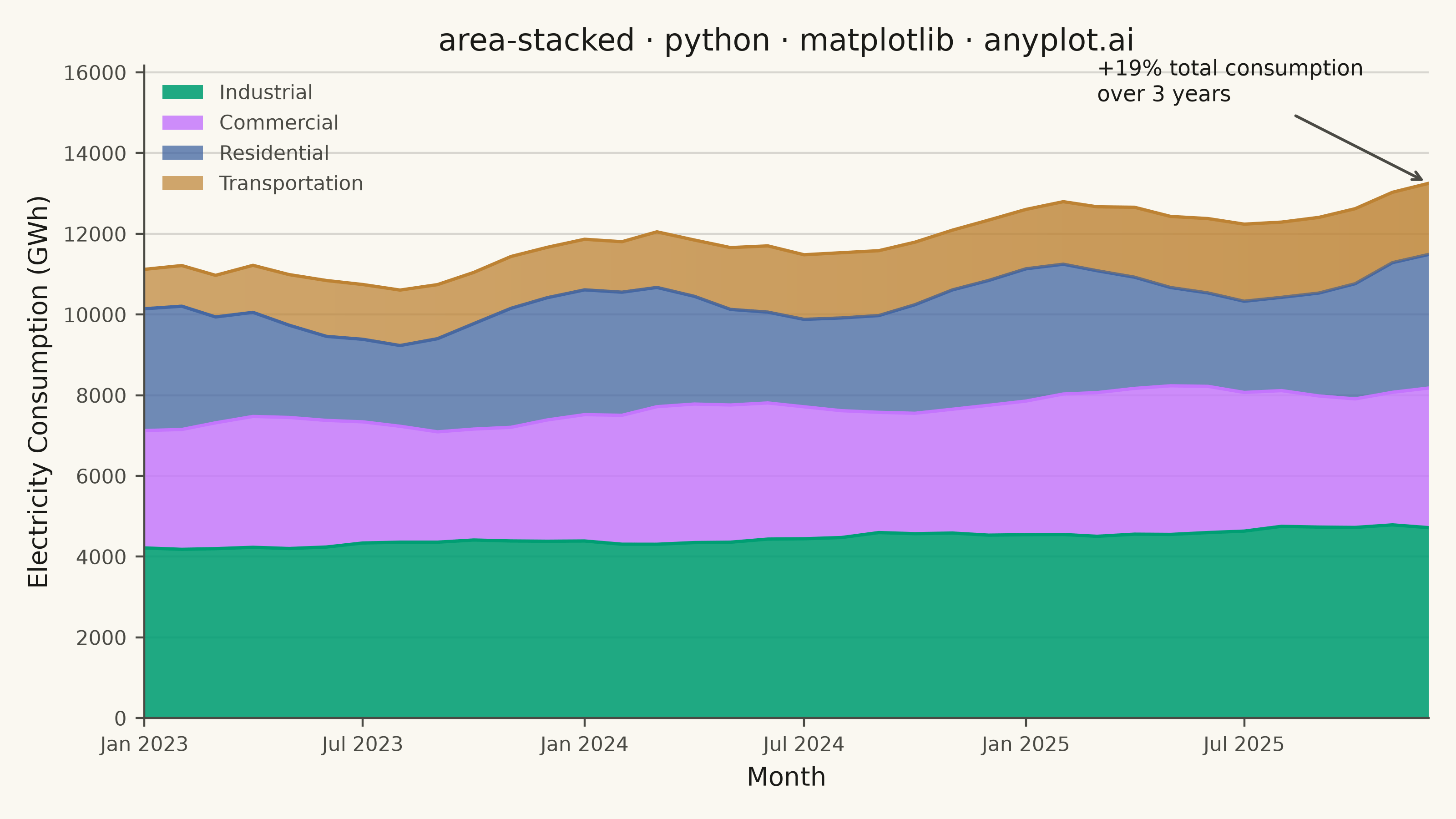
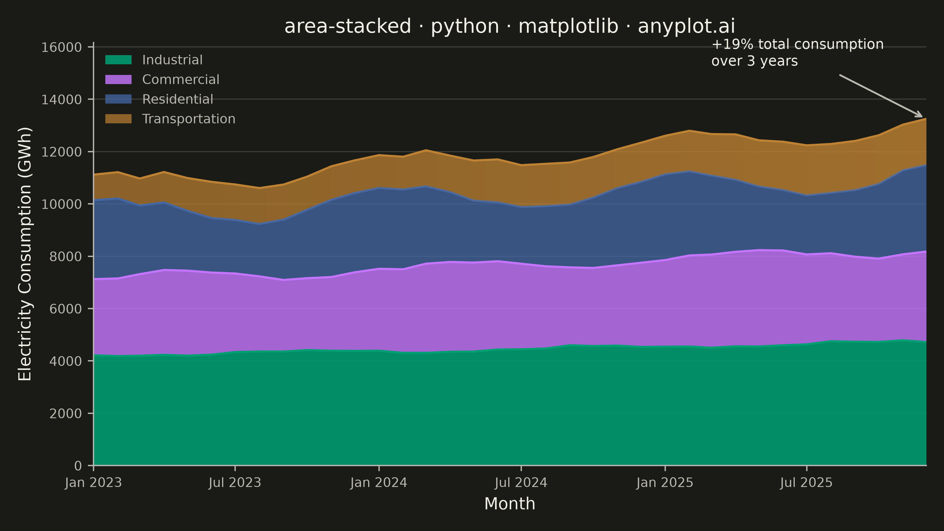
A stacked area chart displays multiple data series as areas stacked on top of each other, with each series starting where the previous one ends. This visualization emphasizes both individual contributions and cumulative totals over a continuous axis (typically time). It is ideal for showing how parts contribute to a whole while tracking changes over time, making patterns of composition and overall trends immediately visible.
""" anyplot.ai
area-stacked: Stacked Area Chart
Library: matplotlib 3.11.1 | Python 3.13.15
Quality: 92/100 | Updated: 2026-08-17
"""

import datetime
import os

import matplotlib.dates as mdates
import matplotlib.pyplot as plt
import numpy as np
from matplotlib.colors import LinearSegmentedColormap
from matplotlib.path import Path


# Theme tokens
THEME = os.getenv("ANYPLOT_THEME", "light")
PAGE_BG = "#FAF8F1" if THEME == "light" else "#1A1A17"
ELEVATED_BG = "#FFFDF6" if THEME == "light" else "#242420"
INK = "#1A1A17" if THEME == "light" else "#F0EFE8"
INK_SOFT = "#4A4A44" if THEME == "light" else "#B8B7B0"

# Imprint palette (canonical order, positions 1-4)
IMPRINT = ["#009E73", "#C475FD", "#4467A3", "#BD8233"]

# Data: monthly grid electricity consumption by sector over 3 years (GWh).
# Each sector follows its own seasonal cycle plus a steady adoption/growth
# trend, rather than an unstructured random walk.
np.random.seed(42)
n_months = 36
t = np.arange(n_months)


def month_add(base_date, months):
    total = base_date.month - 1 + months
    year = base_date.year + total // 12
    month = total % 12 + 1
    return datetime.date(year, month, 1)


dates = [month_add(datetime.date(2023, 1, 1), i) for i in range(n_months)]

industrial = 4200 + 15 * t + 60 * np.sin(2 * np.pi * t / 12 + np.pi) + np.random.normal(0, 30, n_months)
commercial = 2900 + 18 * t + 280 * np.sin(2 * np.pi * t / 12) + np.random.normal(0, 45, n_months)
residential = 2500 + 10 * t + 520 * np.cos(2 * np.pi * t / 12) + np.random.normal(0, 60, n_months)
transportation = 1100 + 22 * t + 130 * np.sin(2 * np.pi * (t - 3) / 12) + np.random.normal(0, 25, n_months)

# Ensure all values stay positive
industrial = np.maximum(industrial, 3500)
commercial = np.maximum(commercial, 2000)
residential = np.maximum(residential, 1500)
transportation = np.maximum(transportation, 700)

# Stack largest at bottom for easier reading
categories = ["Industrial", "Commercial", "Residential", "Transportation"]
data = np.vstack([industrial, commercial, residential, transportation])

# Create plot
fig, ax = plt.subplots(figsize=(8, 4.5), dpi=400, facecolor=PAGE_BG)
ax.set_facecolor(PAGE_BG)

# Emphasize scale hierarchy: larger sectors read more opaque, smaller ones
# lighter, so the eye naturally weights the areas by their magnitude. Built
# manually (cumsum + fill_between) rather than ax.stackplot() so each layer
# can carry its own alpha and an edge-stroke boundary; stackplot applies one
# uniform style to every band and can't express that per-layer hierarchy.
alphas = [0.88, 0.82, 0.76, 0.70]
cumulative = np.cumsum(data, axis=0)
baseline = np.zeros(n_months)
for top, color, alpha, label in zip(cumulative, IMPRINT, alphas, categories, strict=True):
    ax.fill_between(dates, baseline, top, color=color, alpha=alpha, label=label, linewidth=0)
    # Thin edge stroke at each layer boundary for stronger definition between areas
    ax.plot(dates, top, color=color, linewidth=1.3, alpha=1.0)
    baseline = top

# Transportation (top band) grew fastest in relative terms (small base, steep
# slope). Rather than adding a second text callout, reinforce that story
# visually: an alpha-ramped raster clipped to the band's own fill polygon,
# so the layer itself visibly "heats up" left-to-right. Built with the
# matplotlib clip_path + imshow gradient-fill recipe (a raster masked by a
# vector Path) — a distinctly matplotlib technique with no equivalent
# one-liner in fill_between/stackplot.
transport_bottom, transport_top = cumulative[2], cumulative[3]
x_num = mdates.date2num(dates)
band_path = Path(
    np.column_stack([np.concatenate([x_num, x_num[::-1]]), np.concatenate([transport_bottom, transport_top[::-1]])])
)
growth_cmap = LinearSegmentedColormap.from_list("growth_highlight", [f"{IMPRINT[3]}00", f"{IMPRINT[3]}66"])
gradient = np.linspace(0, 1, 256).reshape(1, -1)
growth_overlay = ax.imshow(
    gradient,
    extent=(x_num[0], x_num[-1], 0, cumulative[-1].max() * 1.22),
    aspect="auto",
    cmap=growth_cmap,
    origin="lower",
    zorder=2.5,
)
growth_overlay.set_clip_path(band_path, ax.transData)

# Callout the overall growth story: total consumption across all sectors
total = cumulative[-1]
growth_pct = (total[-1] - total[0]) / total[0] * 100
ax.annotate(
    f"+{growth_pct:.0f}% total consumption\nover 3 years",
    xy=(dates[-1], total[-1]),
    xytext=(month_add(dates[-1], -9), total[-1] + total[-1] * 0.14),
    fontsize=8.5,
    color=INK,
    ha="left",
    va="bottom",
    arrowprops={"arrowstyle": "->", "color": INK_SOFT, "lw": 1.1},
)

# X-axis formatting: real date values driven by matplotlib's date locator/
# formatter machinery, rather than hand-picked tick positions/labels.
ax.xaxis.set_major_locator(mdates.MonthLocator(bymonth=[1, 7]))
ax.xaxis.set_major_formatter(mdates.DateFormatter("%b %Y"))

# Labels and styling
ax.set_xlabel("Month", fontsize=10, color=INK)
ax.set_ylabel("Electricity Consumption (GWh)", fontsize=10, color=INK)
ax.set_title("area-stacked · python · matplotlib · anyplot.ai", fontsize=12, fontweight="medium", color=INK)
ax.tick_params(axis="both", labelsize=8, colors=INK_SOFT)

# Grid
ax.yaxis.grid(True, alpha=0.15, linewidth=0.8, color=INK)
ax.set_axisbelow(True)

# Spines
ax.spines["top"].set_visible(False)
ax.spines["right"].set_visible(False)
for s in ("left", "bottom"):
    ax.spines[s].set_color(INK_SOFT)

# Legend (borderless, per the Decoration Removal Checklist)
leg = ax.legend(loc="upper left", fontsize=8, frameon=False)
if leg:
    for text in leg.get_texts():
        text.set_color(INK_SOFT)

# Ensure y-axis starts at zero; extra headroom above the stack for the growth callout
ax.set_ylim(bottom=0, top=cumulative[-1].max() * 1.22)
ax.set_xlim(dates[0], dates[-1])

plt.tight_layout()
plt.savefig(f"plot-{THEME}.png", dpi=400, facecolor=PAGE_BG)
Runnable source as JSON, for any HTTP client: https://api.anyplot.ai/specs/area-stacked/matplotlib/code. Any spec id and library id listed in llms-full.txt fit the same URL shape; every URL below is complete and callable.
{
  "spec_id": "area-stacked",
  "language": "python",
  "library": "matplotlib",
  "page": "https://anyplot.ai/area-stacked/python/matplotlib",
  "hub": "https://anyplot.ai/area-stacked",
  "code_json": "https://api.anyplot.ai/specs/area-stacked/matplotlib/code",
  "spec_json": "https://api.anyplot.ai/specs/area-stacked",
  "render_light_png": "https://storage.googleapis.com/anyplot-images/plots/area-stacked/python/matplotlib/plot-light.png",
  "render_dark_png": "https://storage.googleapis.com/anyplot-images/plots/area-stacked/python/matplotlib/plot-dark.png",
  "quality_score": 92.0,
  "license": "MIT",
  "guide": "https://anyplot.ai/llms.txt"
}
Part of Stacked Area Chart on anyplot.ai.