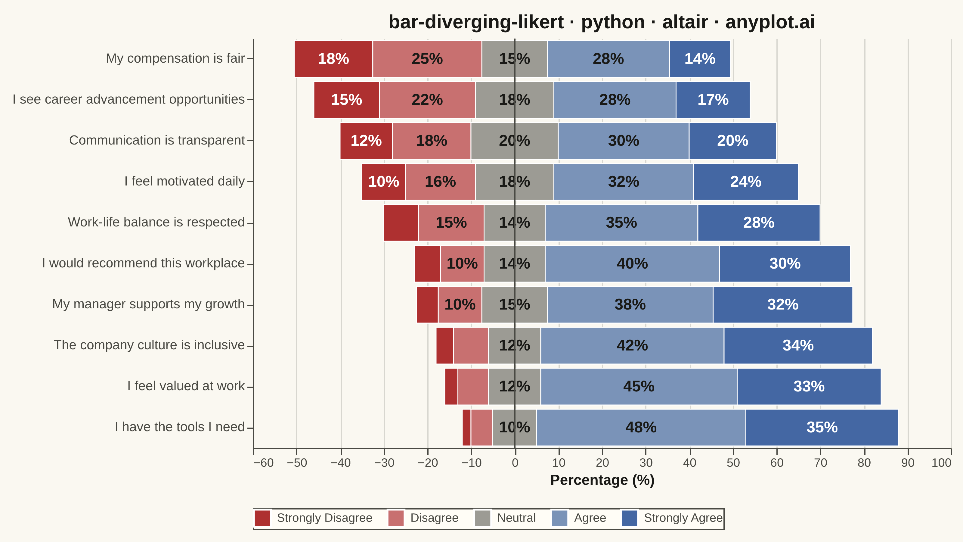
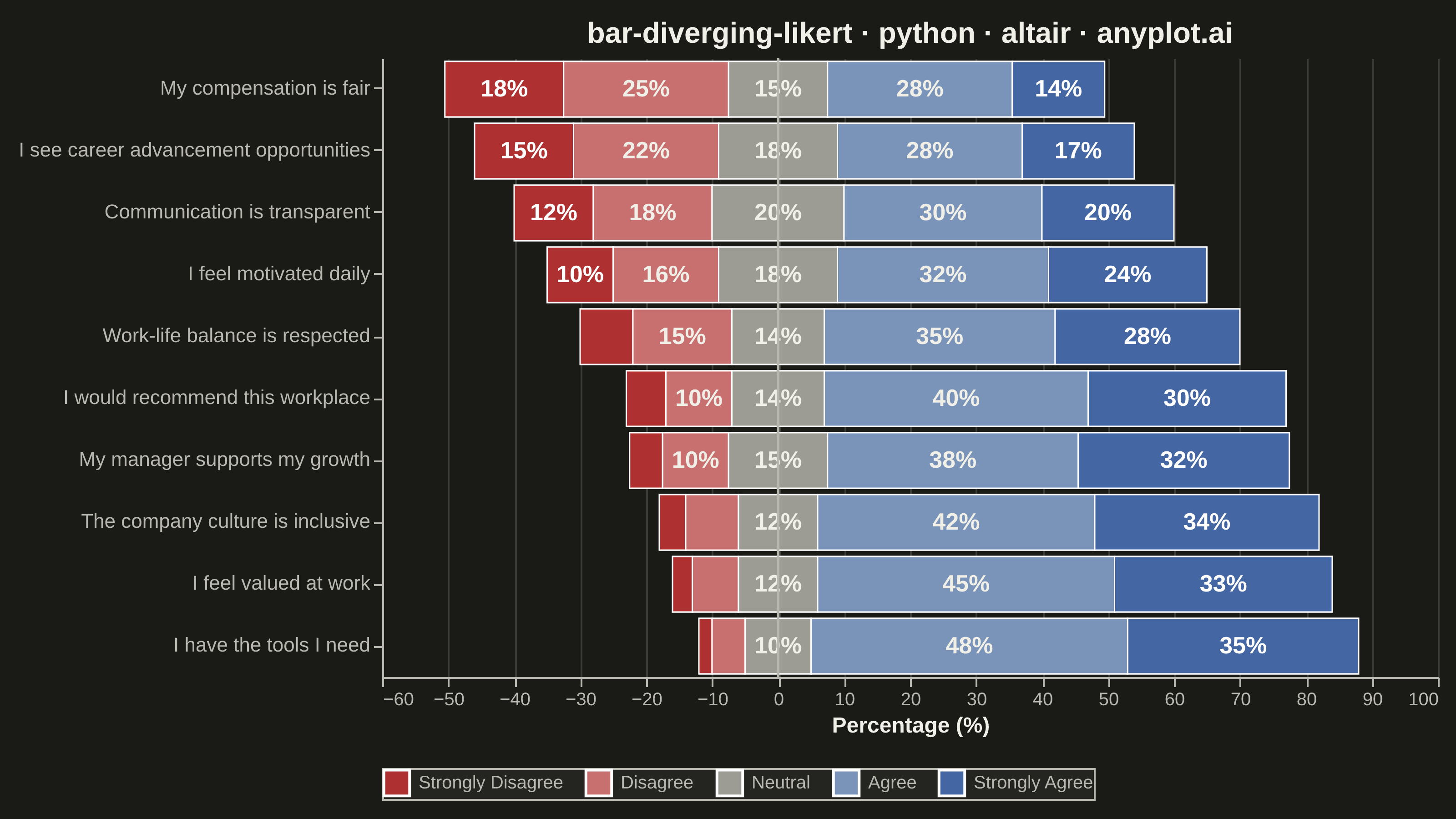
A diverging stacked bar chart designed for Likert scale survey responses (e.g., Strongly Disagree to Strongly Agree). Bars diverge from a central neutral point, with negative responses (Disagree, Strongly Disagree) extending left and positive responses (Agree, Strongly Agree) extending right. This layout makes it easy to compare overall agreement levels across multiple survey questions at a glance.
""" anyplot.ai
bar-diverging-likert: Likert Scale Diverging Bar Chart
Library: altair 6.1.0 | Python 3.13.13
Quality: 90/100 | Updated: 2026-06-01
"""

import os

import altair as alt
import pandas as pd
from PIL import Image


# Theme tokens
THEME = os.getenv("ANYPLOT_THEME", "light")
PAGE_BG = "#FAF8F1" if THEME == "light" else "#1A1A17"
ELEVATED_BG = "#FFFDF6" if THEME == "light" else "#242420"
INK = "#1A1A17" if THEME == "light" else "#F0EFE8"
INK_SOFT = "#4A4A44" if THEME == "light" else "#B8B7B0"

# Imprint diverging palette for Likert — anchored at position 5 (#AE3030) and 3 (#4467A3)
# with interpolated intermediates; fixed across themes (only chrome adapts)
LIKERT_COLORS = ["#AE3030", "#C87070", "#9C9B94", "#7A93B8", "#4467A3"]
categories = ["Strongly Disagree", "Disagree", "Neutral", "Agree", "Strongly Agree"]

# Data — Employee engagement survey, 10 questions on 5-point Likert scale
data = pd.DataFrame(
    {
        "question": [
            "I feel valued at work",
            "My manager supports my growth",
            "I have the tools I need",
            "Work-life balance is respected",
            "Communication is transparent",
            "I see career advancement opportunities",
            "The company culture is inclusive",
            "My compensation is fair",
            "I would recommend this workplace",
            "I feel motivated daily",
        ],
        "Strongly Disagree": [3, 5, 2, 8, 12, 15, 4, 18, 6, 10],
        "Disagree": [7, 10, 5, 15, 18, 22, 8, 25, 10, 16],
        "Neutral": [12, 15, 10, 14, 20, 18, 12, 15, 14, 18],
        "Agree": [45, 38, 48, 35, 30, 28, 42, 28, 40, 32],
        "Strongly Agree": [33, 32, 35, 28, 20, 17, 34, 14, 30, 24],
    }
)

# Sort by net agreement (agree + strongly agree − disagree − strongly disagree)
data["net_agreement"] = data["Agree"] + data["Strongly Agree"] - data["Disagree"] - data["Strongly Disagree"]
data = data.sort_values("net_agreement").reset_index(drop=True)
question_order = data["question"].tolist()

# Build diverging segments — neutral split evenly across the zero midpoint
rows = []
for _, row in data.iterrows():
    half_neutral = row["Neutral"] / 2
    positions = {
        "Strongly Disagree": (
            -(row["Strongly Disagree"] + row["Disagree"] + half_neutral),
            -(row["Disagree"] + half_neutral),
        ),
        "Disagree": (-(row["Disagree"] + half_neutral), -half_neutral),
        "Neutral": (-half_neutral, half_neutral),
        "Agree": (half_neutral, half_neutral + row["Agree"]),
        "Strongly Agree": (half_neutral + row["Agree"], half_neutral + row["Agree"] + row["Strongly Agree"]),
    }
    for cat in categories:
        x_start, x_end = positions[cat]
        val = row[cat]
        rows.append(
            {
                "question": row["question"],
                "x_start": x_start,
                "x_end": x_end,
                "category": cat,
                "value": val,
                "x_mid": (x_start + x_end) / 2,
                "label": f"{int(val)}%",
            }
        )

segments_df = pd.DataFrame(rows)

# Title — scale font size linearly if longer than the 67-char baseline
title_str = "bar-diverging-likert · python · altair · anyplot.ai"
title_fs = max(11, round(16 * 67 / len(title_str))) if len(title_str) > 67 else 16

# Bars
bars = (
    alt.Chart(segments_df)
    .mark_bar(stroke="white", strokeWidth=0.8)
    .encode(
        x=alt.X(
            "x_start:Q",
            title="Percentage (%)",
            axis=alt.Axis(titleFontSize=12, labelFontSize=10),
            scale=alt.Scale(domain=[-55, 90]),
        ),
        x2="x_end:Q",
        y=alt.Y("question:N", title=None, sort=question_order, axis=alt.Axis(labelFontSize=11, labelLimit=280)),
        color=alt.Color(
            "category:N",
            scale=alt.Scale(domain=categories, range=LIKERT_COLORS),
            legend=alt.Legend(title=None, labelFontSize=10, symbolSize=200, orient="bottom", direction="horizontal"),
        ),
        tooltip=[
            alt.Tooltip("question:N", title="Question"),
            alt.Tooltip("category:N", title="Response"),
            alt.Tooltip("value:Q", title="%", format=".0f"),
        ],
    )
)

# In-bar labels — white text on dark segments (Strongly Disagree / Strongly Agree)
dark_segs = segments_df[
    (segments_df["value"] >= 10) & segments_df["category"].isin(["Strongly Disagree", "Strongly Agree"])
]
labels_white = (
    alt.Chart(dark_segs)
    .mark_text(fontSize=13, fontWeight="bold", color="white")
    .encode(x="x_mid:Q", y=alt.Y("question:N", sort=question_order), text="label:N")
)

# In-bar labels — dark text on light segments (Disagree / Neutral / Agree)
light_segs = segments_df[(segments_df["value"] >= 10) & segments_df["category"].isin(["Disagree", "Neutral", "Agree"])]
labels_dark = (
    alt.Chart(light_segs)
    .mark_text(fontSize=13, fontWeight="bold", color=INK)
    .encode(x="x_mid:Q", y=alt.Y("question:N", sort=question_order), text="label:N")
)

# Zero baseline
zero_line = alt.Chart(pd.DataFrame({"x": [0]})).mark_rule(color=INK_SOFT, strokeWidth=1.5).encode(x="x:Q")

# Compose and apply theme-adaptive chrome
chart = (
    (bars + labels_white + labels_dark + zero_line)
    .properties(
        width=580,
        height=340,
        background=PAGE_BG,
        title=alt.Title(title_str, fontSize=title_fs, anchor="middle", color=INK),
    )
    .configure_view(strokeWidth=0, fill=PAGE_BG)
    .configure_axisX(
        gridOpacity=0.15, gridColor=INK, domainColor=INK_SOFT, tickColor=INK_SOFT, labelColor=INK_SOFT, titleColor=INK
    )
    .configure_axisY(grid=False, domainColor=INK_SOFT, tickColor=INK_SOFT, labelColor=INK_SOFT)
    .configure_legend(fillColor=ELEVATED_BG, strokeColor=INK_SOFT, labelColor=INK_SOFT, titleColor=INK)
)

# Save — PAD to exact 3200×1800; never crop
TW, TH = 3200, 1800
chart.save(f"plot-{THEME}.png", scale_factor=4.0)
chart.save(f"plot-{THEME}.html")

_img = Image.open(f"plot-{THEME}.png").convert("RGB")
_w, _h = _img.size
if _w > TW or _h > TH:
    raise SystemExit(
        f"altair vl-convert produced {_w}×{_h}, exceeds target {TW}×{TH}. "
        f"Shrink chart .properties(width=, height=) and re-render."
    )
if _w < TW or _h < TH:
    _canvas = Image.new("RGB", (TW, TH), PAGE_BG)
    _canvas.paste(_img, ((TW - _w) // 2, (TH - _h) // 2))
    _canvas.save(f"plot-{THEME}.png")
Runnable source as JSON, for any HTTP client: https://api.anyplot.ai/specs/bar-diverging-likert/altair/code. Any spec id and library id listed in llms-full.txt fit the same URL shape; every URL below is complete and callable.
{
  "spec_id": "bar-diverging-likert",
  "language": "python",
  "library": "altair",
  "page": "https://anyplot.ai/bar-diverging-likert/python/altair",
  "hub": "https://anyplot.ai/bar-diverging-likert",
  "code_json": "https://api.anyplot.ai/specs/bar-diverging-likert/altair/code",
  "spec_json": "https://api.anyplot.ai/specs/bar-diverging-likert",
  "render_light_png": "https://storage.googleapis.com/anyplot-images/plots/bar-diverging-likert/python/altair/plot-light.png",
  "render_dark_png": "https://storage.googleapis.com/anyplot-images/plots/bar-diverging-likert/python/altair/plot-dark.png",
  "interactive_light_html": "https://storage.googleapis.com/anyplot-images/plots/bar-diverging-likert/python/altair/plot-light.html",
  "interactive_dark_html": "https://storage.googleapis.com/anyplot-images/plots/bar-diverging-likert/python/altair/plot-dark.html",
  "quality_score": 90.0,
  "license": "MIT",
  "guide": "https://anyplot.ai/llms.txt"
}
Part of Likert Scale Diverging Bar Chart on anyplot.ai.