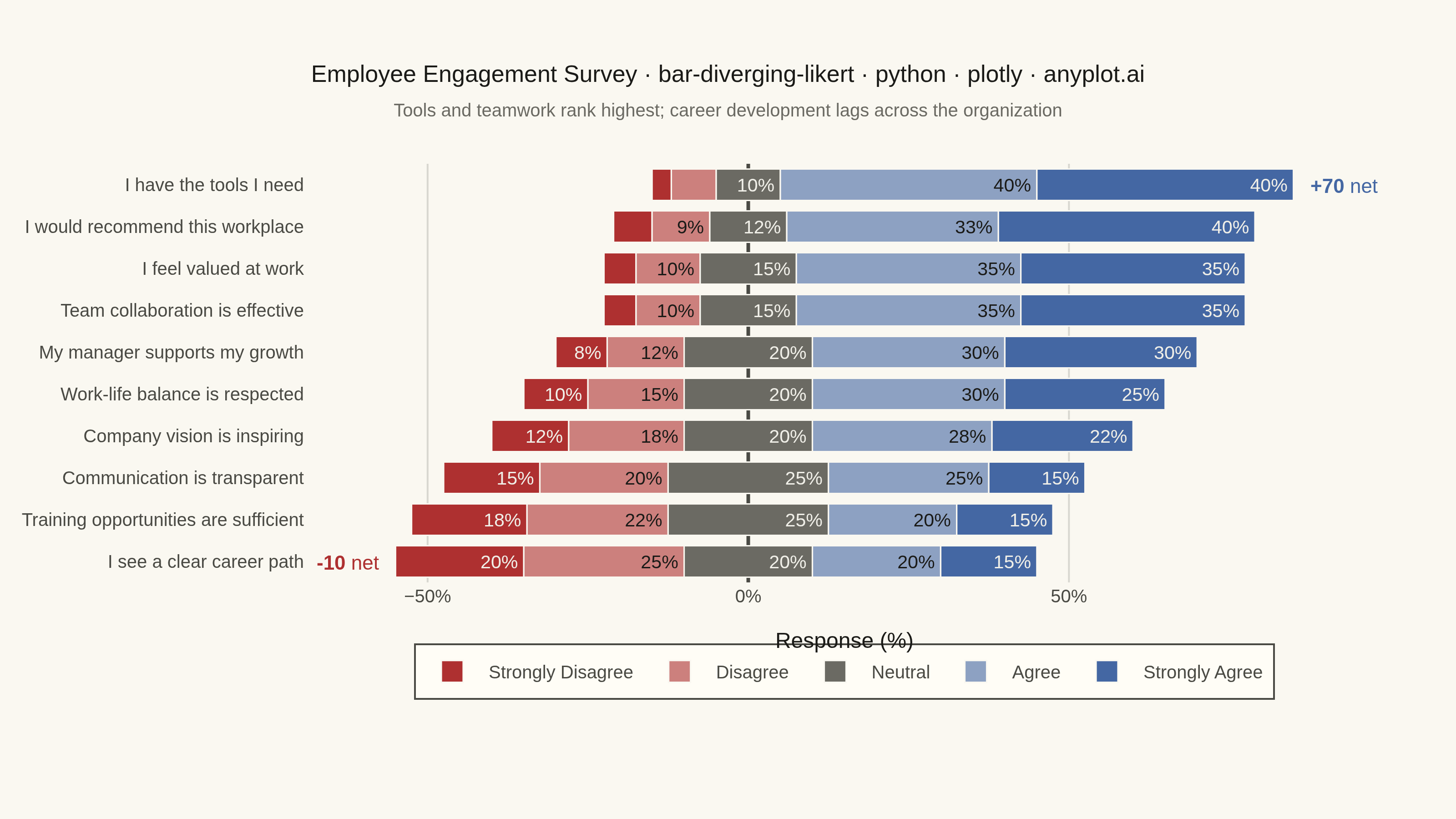
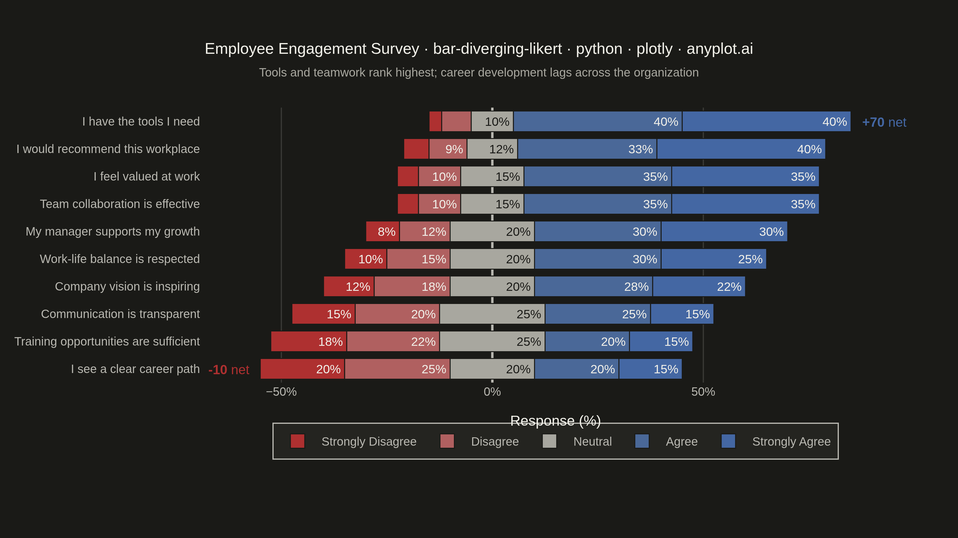
A diverging stacked bar chart designed for Likert scale survey responses (e.g., Strongly Disagree to Strongly Agree). Bars diverge from a central neutral point, with negative responses (Disagree, Strongly Disagree) extending left and positive responses (Agree, Strongly Agree) extending right. This layout makes it easy to compare overall agreement levels across multiple survey questions at a glance.
""" anyplot.ai
bar-diverging-likert: Likert Scale Diverging Bar Chart
Library: plotly 6.7.0 | Python 3.13.13
Quality: 91/100 | Updated: 2026-06-01
"""

import os
import sys


# Prevent self-import: remove this script's directory from sys.path so that
# "import plotly" resolves to the installed package, not this file.
_here = os.path.dirname(os.path.abspath(__file__))
sys.path = [p for p in sys.path if os.path.abspath(p) != _here]

import pandas as pd
import plotly.graph_objects as go


# Theme tokens
THEME = os.getenv("ANYPLOT_THEME", "light")
PAGE_BG = "#FAF8F1" if THEME == "light" else "#1A1A17"
ELEVATED_BG = "#FFFDF6" if THEME == "light" else "#242420"
INK = "#1A1A17" if THEME == "light" else "#F0EFE8"
INK_SOFT = "#4A4A44" if THEME == "light" else "#B8B7B0"
INK_MUTED = "#6B6A63" if THEME == "light" else "#A8A79F"
GRID = "rgba(26,26,23,0.15)" if THEME == "light" else "rgba(240,239,232,0.15)"

# Imprint diverging colors for Likert scale (sampled from imprint_div: #AE3030 → midpoint → #4467A3)
# Intermediate shades interpolated toward the theme midpoint; neutral uses the muted anchor
LIKERT_COLORS = {
    "strongly_disagree": "#AE3030",
    "disagree": "#CC807D" if THEME == "light" else "#B06060",
    "neutral": INK_MUTED,
    "agree": "#8DA1C2" if THEME == "light" else "#4A6898",
    "strongly_agree": "#4467A3",
}

# Text contrast inside bar segments
TEXT_COLORS = {
    "strongly_disagree": "#F0EFE8",
    "disagree": INK if THEME == "light" else "#F0EFE8",
    "neutral": "#F0EFE8" if THEME == "light" else "#1A1A17",
    "agree": INK if THEME == "light" else "#F0EFE8",
    "strongly_agree": "#F0EFE8",
}

FONT_FAMILY = "Inter, Helvetica Neue, Arial, sans-serif"

# Data — employee engagement survey (10 questions, 5-point Likert scale)
df = pd.DataFrame(
    {
        "question": [
            "I feel valued at work",
            "My manager supports my growth",
            "I have the tools I need",
            "Communication is transparent",
            "Work-life balance is respected",
            "I see a clear career path",
            "Team collaboration is effective",
            "Company vision is inspiring",
            "Training opportunities are sufficient",
            "I would recommend this workplace",
        ],
        "strongly_disagree": [5, 8, 3, 15, 10, 20, 5, 12, 18, 6],
        "disagree": [10, 12, 7, 20, 15, 25, 10, 18, 22, 9],
        "neutral": [15, 20, 10, 25, 20, 20, 15, 20, 25, 12],
        "agree": [35, 30, 40, 25, 30, 20, 35, 28, 20, 33],
        "strongly_agree": [35, 30, 40, 15, 25, 15, 35, 22, 15, 40],
    }
)

# Sort by net agreement (positive minus negative)
df["net_agreement"] = df["agree"] + df["strongly_agree"] - df["disagree"] - df["strongly_disagree"]
df = df.sort_values("net_agreement").reset_index(drop=True)

# Diverging positions — neutral split evenly across zero midpoint
half_neutral = df["neutral"] / 2
neg_sd = -(df["strongly_disagree"] + df["disagree"] + half_neutral)
neg_d = -(df["disagree"] + half_neutral)
neg_n = -half_neutral
pos_n = half_neutral
pos_a = half_neutral + df["agree"]
pos_sa = half_neutral + df["agree"] + df["strongly_agree"]

labels = {
    "strongly_disagree": "Strongly Disagree",
    "disagree": "Disagree",
    "neutral": "Neutral",
    "agree": "Agree",
    "strongly_agree": "Strongly Agree",
}

# Plot
fig = go.Figure()

segments = [
    ("strongly_disagree", neg_sd, neg_d),
    ("disagree", neg_d, neg_n),
    ("neutral", neg_n, pos_n),
    ("agree", pos_n, pos_a),
    ("strongly_agree", pos_a, pos_sa),
]

for key, starts, ends in segments:
    widths = ends - starts
    text_vals = df[key].astype(int).astype(str) + "%"
    text_display = [t if abs(w) > 7 else "" for t, w in zip(text_vals, widths, strict=False)]

    fig.add_trace(
        go.Bar(
            y=df["question"],
            x=widths,
            base=starts,
            orientation="h",
            name=labels[key],
            marker={"color": LIKERT_COLORS[key], "line": {"color": PAGE_BG, "width": 0.8}},
            text=text_display,
            textposition="inside",
            textfont={"size": 11, "color": TEXT_COLORS[key], "family": FONT_FAMILY},
            customdata=df[key],
            hovertemplate="%{y}<br>" + labels[key] + ": %{customdata}%<extra></extra>",
        )
    )

# Net score annotations for top and bottom items
best_idx = df["net_agreement"].idxmax()
worst_idx = df["net_agreement"].idxmin()
best_net = df.loc[best_idx, "net_agreement"]
worst_net = df.loc[worst_idx, "net_agreement"]
best_end = pos_sa.iloc[best_idx]
worst_start = neg_sd.iloc[worst_idx]

fig.add_annotation(
    x=best_end + 2,
    y=df.loc[best_idx, "question"],
    text=f"<b>+{best_net}</b> net",
    showarrow=False,
    font={"size": 11, "color": "#4467A3", "family": FONT_FAMILY},
    xanchor="left",
)
fig.add_annotation(
    x=worst_start - 2,
    y=df.loc[worst_idx, "question"],
    text=f"<b>{worst_net}</b> net",
    showarrow=False,
    font={"size": 11, "color": "#AE3030", "family": FONT_FAMILY},
    xanchor="right",
)

# Title — 79 chars, scale down from default 16px
title_text = "Employee Engagement Survey · bar-diverging-likert · python · plotly · anyplot.ai"
title_n = len(title_text)
title_size = round(16 * 67 / title_n) if title_n > 67 else 16

# Style
fig.update_layout(
    autosize=False,
    paper_bgcolor=PAGE_BG,
    plot_bgcolor=PAGE_BG,
    font={"family": FONT_FAMILY, "color": INK},
    title={
        "text": title_text,
        "subtitle": {
            "text": "Tools and teamwork rank highest; career development lags across the organization",
            "font": {"size": 10, "color": INK_MUTED, "family": FONT_FAMILY},
        },
        "font": {"size": title_size, "family": FONT_FAMILY, "color": INK},
        "x": 0.5,
        "xanchor": "center",
    },
    xaxis={
        "title": {"text": "Response (%)", "font": {"size": 12, "color": INK}},
        "tickfont": {"size": 10, "color": INK_SOFT, "family": FONT_FAMILY},
        "ticksuffix": "%",
        "zeroline": True,
        "zerolinecolor": INK_SOFT,
        "zerolinewidth": 2,
        "showgrid": True,
        "gridcolor": GRID,
        "linecolor": INK_SOFT,
        "showline": False,
        "range": [neg_sd.min() - 14, pos_sa.max() + 14],
    },
    yaxis={
        "tickfont": {"size": 10, "color": INK_SOFT, "family": FONT_FAMILY},
        "automargin": True,
        "linecolor": INK_SOFT,
        "showline": False,
    },
    barmode="overlay",
    legend={
        "orientation": "h",
        "yanchor": "bottom",
        "y": -0.28,
        "xanchor": "center",
        "x": 0.5,
        "font": {"size": 10, "family": FONT_FAMILY, "color": INK_SOFT},
        "bgcolor": ELEVATED_BG,
        "bordercolor": INK_SOFT,
        "borderwidth": 1,
        "traceorder": "normal",
    },
    margin={"l": 20, "r": 40, "t": 90, "b": 130},
    bargap=0.25,
)

# Save
fig.write_image(f"plot-{THEME}.png", width=800, height=450, scale=4)
fig.write_html(f"plot-{THEME}.html", include_plotlyjs="cdn")
Runnable source as JSON, for any HTTP client: https://api.anyplot.ai/specs/bar-diverging-likert/plotly/code. Any spec id and library id listed in llms-full.txt fit the same URL shape; every URL below is complete and callable.
{
  "spec_id": "bar-diverging-likert",
  "language": "python",
  "library": "plotly",
  "page": "https://anyplot.ai/bar-diverging-likert/python/plotly",
  "hub": "https://anyplot.ai/bar-diverging-likert",
  "code_json": "https://api.anyplot.ai/specs/bar-diverging-likert/plotly/code",
  "spec_json": "https://api.anyplot.ai/specs/bar-diverging-likert",
  "render_light_png": "https://storage.googleapis.com/anyplot-images/plots/bar-diverging-likert/python/plotly/plot-light.png",
  "render_dark_png": "https://storage.googleapis.com/anyplot-images/plots/bar-diverging-likert/python/plotly/plot-dark.png",
  "interactive_light_html": "https://storage.googleapis.com/anyplot-images/plots/bar-diverging-likert/python/plotly/plot-light.html",
  "interactive_dark_html": "https://storage.googleapis.com/anyplot-images/plots/bar-diverging-likert/python/plotly/plot-dark.html",
  "quality_score": 91.0,
  "license": "MIT",
  "guide": "https://anyplot.ai/llms.txt"
}
Part of Likert Scale Diverging Bar Chart on anyplot.ai.