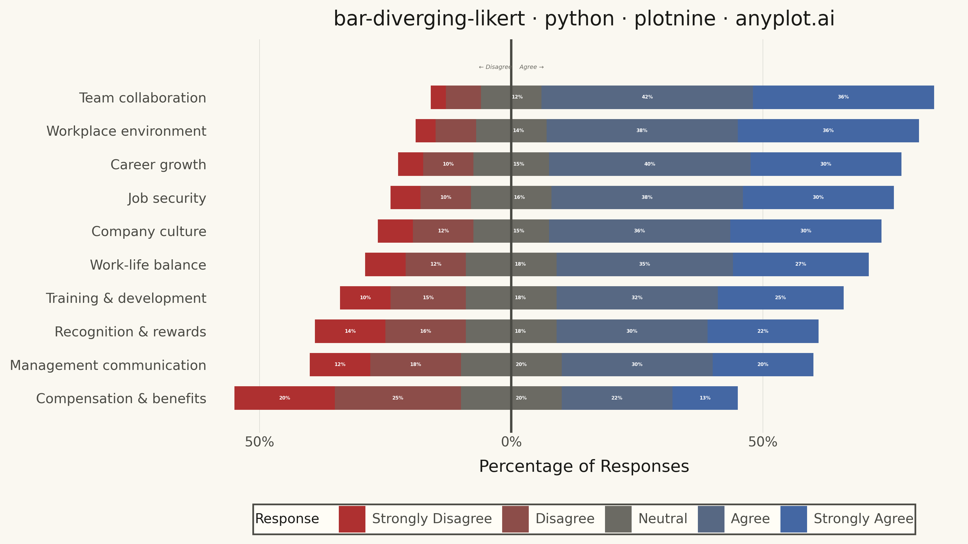
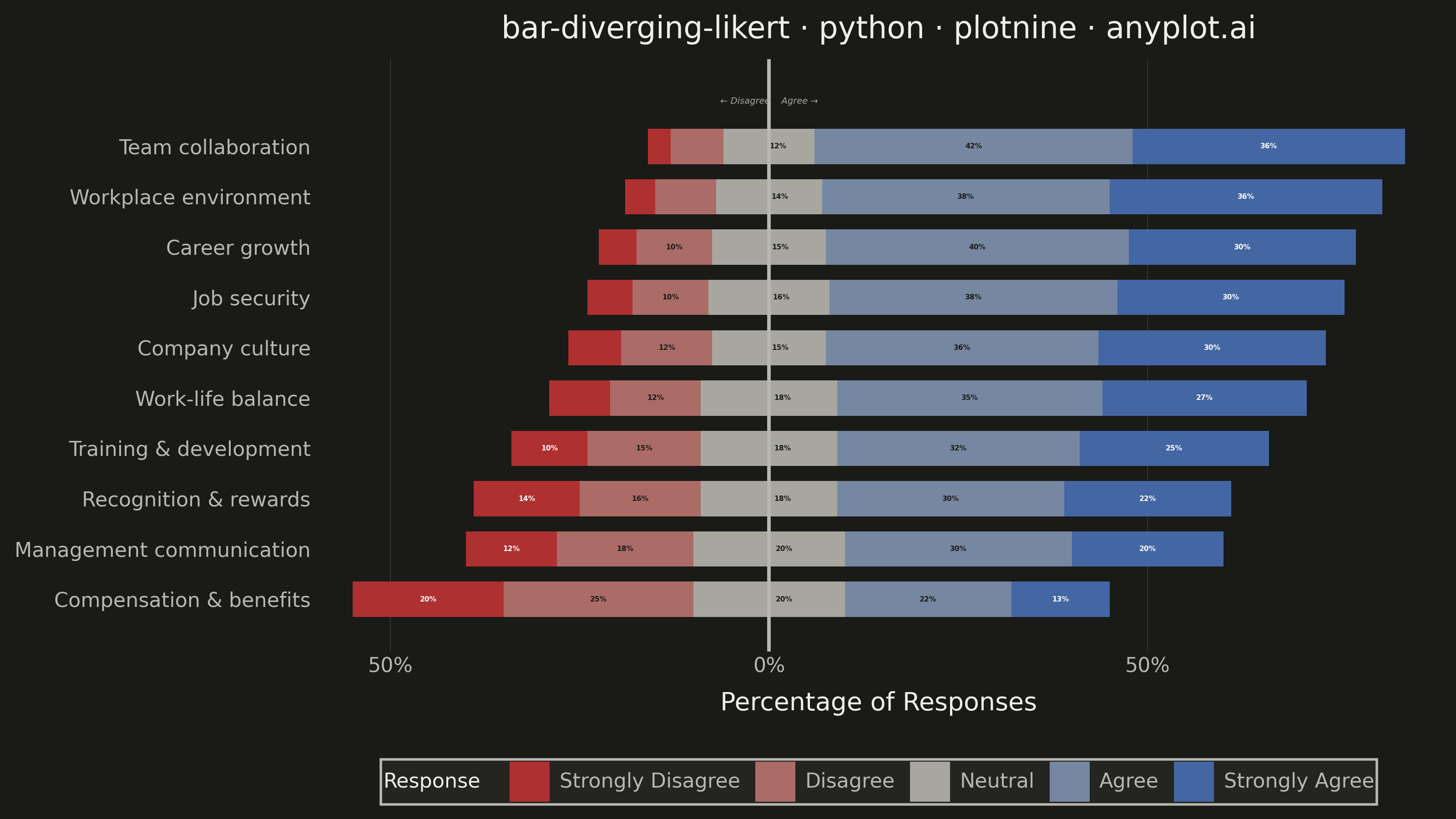
A diverging stacked bar chart designed for Likert scale survey responses (e.g., Strongly Disagree to Strongly Agree). Bars diverge from a central neutral point, with negative responses (Disagree, Strongly Disagree) extending left and positive responses (Agree, Strongly Agree) extending right. This layout makes it easy to compare overall agreement levels across multiple survey questions at a glance.
""" anyplot.ai
bar-diverging-likert: Likert Scale Diverging Bar Chart
Library: plotnine 0.15.4 | Python 3.13.13
Quality: 89/100 | Updated: 2026-06-01
"""

import sys


# Remove the script directory from sys.path so the plotnine package isn't shadowed by this file
if sys.path and sys.path[0] in ("", "."):
    sys.path.pop(0)
sys.path = [p for p in sys.path if not p.endswith("/implementations/python")]

import os

import numpy as np
import pandas as pd
from plotnine import (
    aes,
    annotate,
    element_blank,
    element_line,
    element_rect,
    element_text,
    geom_rect,
    geom_text,
    geom_vline,
    ggplot,
    guide_legend,
    guides,
    labs,
    scale_color_manual,
    scale_fill_manual,
    scale_x_continuous,
    scale_y_continuous,
    theme,
    theme_minimal,
)


# Theme tokens
THEME = os.getenv("ANYPLOT_THEME", "light")
PAGE_BG = "#FAF8F1" if THEME == "light" else "#1A1A17"
ELEVATED_BG = "#FFFDF6" if THEME == "light" else "#242420"
INK = "#1A1A17" if THEME == "light" else "#F0EFE8"
INK_SOFT = "#4A4A44" if THEME == "light" else "#B8B7B0"
INK_MUTED = "#6B6A63" if THEME == "light" else "#A8A79F"

# Imprint diverging palette for 5 Likert levels: matte-red → neutral → blue
# Piecewise linear interpolation via numpy (avoids matplotlib import conflict)
c_neg = np.array([0xAE, 0x30, 0x30], dtype=float)
c_mid = np.array([0x6B, 0x6A, 0x63] if THEME == "light" else [0xA8, 0xA7, 0x9F], dtype=float)
c_pos = np.array([0x44, 0x67, 0xA3], dtype=float)
levels = [
    "#{:02x}{:02x}{:02x}".format(
        *(
            (c_neg + t * 2 * (c_mid - c_neg)).clip(0, 255).astype(int)
            if t <= 0.5
            else (c_mid + (t * 2 - 1) * (c_pos - c_mid)).clip(0, 255).astype(int)
        )
    )
    for t in [0.0, 0.25, 0.5, 0.75, 1.0]
]
response_order = ["Strongly Disagree", "Disagree", "Neutral", "Agree", "Strongly Agree"]
fill_colors = dict(zip(response_order, levels, strict=True))

# Contrast-aware label text: dark mid fills use white; lighter dark-theme mid fills use near-black
mid_label = "#1A1A17" if THEME == "dark" else "white"
label_colors = {
    "Strongly Disagree": "white",
    "Disagree": mid_label,
    "Neutral": mid_label,
    "Agree": mid_label,
    "Strongly Agree": "white",
}

# Data: employee engagement survey — Compensation has negative net agreement to showcase divergence
survey_data = pd.DataFrame(
    {
        "question": [
            "Team collaboration",
            "Workplace environment",
            "Job security",
            "Company culture",
            "Career growth",
            "Training & development",
            "Work-life balance",
            "Management communication",
            "Recognition & rewards",
            "Compensation & benefits",
        ],
        "strongly_disagree": [3, 4, 6, 7, 5, 10, 8, 12, 14, 20],
        "disagree": [7, 8, 10, 12, 10, 15, 12, 18, 16, 25],
        "neutral": [12, 14, 16, 15, 15, 18, 18, 20, 18, 20],
        "agree": [42, 38, 38, 36, 40, 32, 35, 30, 30, 22],
        "strongly_agree": [36, 36, 30, 30, 30, 25, 27, 20, 22, 13],
    }
)

# Sort ascending by net agreement (lowest at bottom showcases the negative-net question)
survey_data["net_agreement"] = (
    survey_data["agree"] + survey_data["strongly_agree"] - survey_data["disagree"] - survey_data["strongly_disagree"]
)
survey_data = survey_data.sort_values("net_agreement", ascending=True).reset_index(drop=True)

# Wide-to-long transformation for grammar of graphics
response_cols = ["strongly_disagree", "disagree", "neutral", "agree", "strongly_agree"]
long_df = survey_data.melt(id_vars=["question"], value_vars=response_cols, var_name="response_key", value_name="pct")

name_map = {
    "strongly_disagree": "Strongly Disagree",
    "disagree": "Disagree",
    "neutral": "Neutral",
    "agree": "Agree",
    "strongly_agree": "Strongly Agree",
}
long_df["response"] = pd.Categorical(long_df["response_key"].map(name_map), categories=response_order, ordered=True)

# Diverging position: offset = SD + D + N/2 centers the neutral segment on zero
offset_map = survey_data.set_index("question")[["strongly_disagree", "disagree", "neutral"]].assign(
    offset=lambda d: d["strongly_disagree"] + d["disagree"] + d["neutral"] / 2
)["offset"]
long_df["offset"] = long_df["question"].map(offset_map)

stack_pos = {col: i for i, col in enumerate(response_cols)}
long_df["stack_pos"] = long_df["response_key"].map(stack_pos)
long_df = long_df.sort_values(["question", "stack_pos"]).reset_index(drop=True)

long_df["xmax"] = long_df.groupby("question")["pct"].cumsum() - long_df["offset"]
long_df["xmin"] = long_df["xmax"] - long_df["pct"]

# Horizontal bar geometry
question_order = survey_data["question"].tolist()
y_map = {q: i for i, q in enumerate(question_order)}
long_df["y_pos"] = long_df["question"].map(y_map)
bar_height = 0.7
long_df["ymin"] = long_df["y_pos"] - bar_height / 2
long_df["ymax"] = long_df["y_pos"] + bar_height / 2
long_df["label_x"] = (long_df["xmin"] + long_df["xmax"]) / 2
# Shift neutral labels slightly right of center to avoid overlap with the x=0 reference vline
neutral_mask = long_df["response_key"] == "neutral"
long_df.loc[neutral_mask, "label_x"] = long_df.loc[neutral_mask, "xmin"] + long_df.loc[neutral_mask, "pct"] * 0.60
long_df["label"] = long_df["pct"].apply(lambda v: f"{v}%" if v >= 10 else "")

title = "bar-diverging-likert · python · plotnine · anyplot.ai"

# Plot
plot = (
    ggplot(long_df)
    + geom_rect(aes(xmin="xmin", xmax="xmax", ymin="ymin", ymax="ymax", fill="response"))
    + geom_text(
        aes(x="label_x", y="y_pos", label="label", color="response"), size=2.8, fontweight="bold", show_legend=False
    )
    + geom_vline(xintercept=0, color=INK_SOFT, size=0.8)
    + scale_fill_manual(values=fill_colors, breaks=response_order)
    + scale_color_manual(values=label_colors, breaks=response_order)
    + scale_y_continuous(breaks=list(range(len(question_order))), labels=question_order, limits=(-0.5, 10.2))
    + scale_x_continuous(labels=lambda ticks: [f"{abs(int(v))}%" for v in ticks], expand=(0.02, 2))
    + annotate(
        "text", x=0, y=9.9, label="← Disagree    Agree →", size=3.5, color=INK_MUTED, fontstyle="italic", ha="center"
    )
    + labs(x="Percentage of Responses", y="", title=title, fill="Response")
    + guides(fill=guide_legend(nrow=1))
    + theme_minimal()
    + theme(
        figure_size=(8, 4.5),
        plot_background=element_rect(fill=PAGE_BG, color=PAGE_BG),
        panel_background=element_rect(fill=PAGE_BG),
        panel_grid_major_y=element_blank(),
        panel_grid_minor=element_blank(),
        panel_grid_major_x=element_line(color=INK, size=0.3, alpha=0.15),
        text=element_text(size=7),
        axis_title=element_text(size=10, color=INK),
        axis_text_y=element_text(size=8, color=INK_SOFT),
        axis_text_x=element_text(size=8, color=INK_SOFT),
        plot_title=element_text(size=12, color=INK, ha="center"),
        legend_text=element_text(size=8, color=INK_SOFT),
        legend_title=element_text(size=8, color=INK),
        legend_background=element_rect(fill=ELEVATED_BG, color=INK_SOFT),
        legend_position="bottom",
    )
)

# Save
plot.save(f"plot-{THEME}.png", dpi=400, width=8, height=4.5, units="in", verbose=False)
Runnable source as JSON, for any HTTP client: https://api.anyplot.ai/specs/bar-diverging-likert/plotnine/code. Any spec id and library id listed in llms-full.txt fit the same URL shape; every URL below is complete and callable.
{
  "spec_id": "bar-diverging-likert",
  "language": "python",
  "library": "plotnine",
  "page": "https://anyplot.ai/bar-diverging-likert/python/plotnine",
  "hub": "https://anyplot.ai/bar-diverging-likert",
  "code_json": "https://api.anyplot.ai/specs/bar-diverging-likert/plotnine/code",
  "spec_json": "https://api.anyplot.ai/specs/bar-diverging-likert",
  "render_light_png": "https://storage.googleapis.com/anyplot-images/plots/bar-diverging-likert/python/plotnine/plot-light.png",
  "render_dark_png": "https://storage.googleapis.com/anyplot-images/plots/bar-diverging-likert/python/plotnine/plot-dark.png",
  "quality_score": 89.0,
  "license": "MIT",
  "guide": "https://anyplot.ai/llms.txt"
}
Part of Likert Scale Diverging Bar Chart on anyplot.ai.