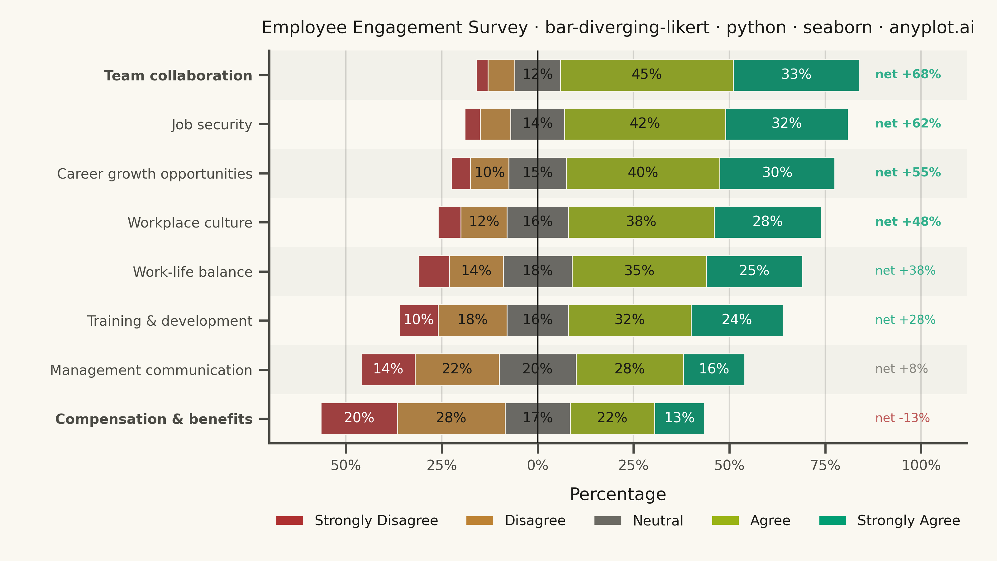
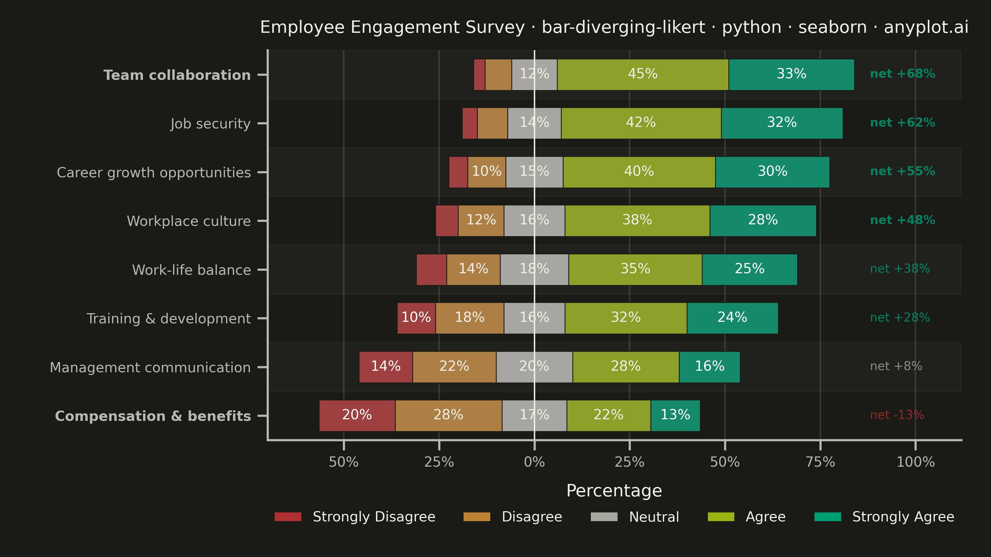
A diverging stacked bar chart designed for Likert scale survey responses (e.g., Strongly Disagree to Strongly Agree). Bars diverge from a central neutral point, with negative responses (Disagree, Strongly Disagree) extending left and positive responses (Agree, Strongly Agree) extending right. This layout makes it easy to compare overall agreement levels across multiple survey questions at a glance.
""" anyplot.ai
bar-diverging-likert: Likert Scale Diverging Bar Chart
Library: seaborn 0.13.2 | Python 3.13.13
Quality: 91/100 | Updated: 2026-06-01
"""

import os
import sys


# Remove the script's own directory from sys.path so that local matplotlib.py
# does not shadow the installed matplotlib package.
sys.path.pop(0)

import matplotlib.pyplot as plt
import matplotlib.ticker as mticker
import pandas as pd
import seaborn as sns
from matplotlib.patches import Patch


# Theme tokens
THEME = os.getenv("ANYPLOT_THEME", "light")
PAGE_BG = "#FAF8F1" if THEME == "light" else "#1A1A17"
ELEVATED_BG = "#FFFDF6" if THEME == "light" else "#242420"
INK = "#1A1A17" if THEME == "light" else "#F0EFE8"
INK_SOFT = "#4A4A44" if THEME == "light" else "#B8B7B0"
INK_MUTED = "#6B6A63" if THEME == "light" else "#A8A79F"

# Imprint palette — semantic mapping: positive→green, negative→red, neutral→muted
COL_SA = "#009E73"  # Strongly Agree    — brand green (most positive)
COL_A = "#99B314"  # Agree             — lime (softer positive)
COL_N = INK_MUTED  # Neutral           — theme-adaptive muted
COL_D = "#BD8233"  # Disagree          — ochre (mild negative)
COL_SD = "#AE3030"  # Strongly Disagree — matte red (most negative)

sns.set_theme(
    style="ticks",
    rc={
        "figure.facecolor": PAGE_BG,
        "axes.facecolor": PAGE_BG,
        "axes.edgecolor": INK_SOFT,
        "axes.labelcolor": INK,
        "text.color": INK,
        "xtick.color": INK_SOFT,
        "ytick.color": INK_SOFT,
        "grid.color": INK,
        "grid.alpha": 0.15,
        "legend.facecolor": ELEVATED_BG,
        "legend.edgecolor": INK_SOFT,
    },
)

# Data — employee engagement survey, 8 questions on 5-point Likert scale
questions = [
    "Career growth opportunities",
    "Work-life balance",
    "Team collaboration",
    "Management communication",
    "Compensation & benefits",
    "Job security",
    "Training & development",
    "Workplace culture",
]

survey_data = {
    "question": questions,
    "strongly_disagree": [5, 8, 3, 14, 20, 4, 10, 6],
    "disagree": [10, 14, 7, 22, 28, 8, 18, 12],
    "neutral": [15, 18, 12, 20, 17, 14, 16, 16],
    "agree": [40, 35, 45, 28, 22, 42, 32, 38],
    "strongly_agree": [30, 25, 33, 16, 13, 32, 24, 28],
}

df = pd.DataFrame(survey_data)

df["net_agreement"] = df["agree"] + df["strongly_agree"] - df["disagree"] - df["strongly_disagree"]
df = df.sort_values("net_agreement").reset_index(drop=True)

category_keys = ["strongly_disagree", "disagree", "neutral", "agree", "strongly_agree"]
category_names = ["Strongly Disagree", "Disagree", "Neutral", "Agree", "Strongly Agree"]
colors = {"strongly_disagree": COL_SD, "disagree": COL_D, "neutral": COL_N, "agree": COL_A, "strongly_agree": COL_SA}

# Cumulative values for diverging stacked layout (overlay technique)
half_n = df["neutral"] / 2
df["r_sa"] = half_n + df["agree"] + df["strongly_agree"]
df["r_a"] = half_n + df["agree"]
df["r_n"] = half_n
df["l_sd"] = -(half_n + df["disagree"] + df["strongly_disagree"])
df["l_d"] = -(half_n + df["disagree"])
df["l_n"] = -half_n

# Question order: most positive at top (seaborn plots first item in order at top)
q_order = df["question"].tolist()[::-1]

# Plot
fig, ax = plt.subplots(figsize=(8, 4.5), dpi=400, facecolor=PAGE_BG)
ax.set_facecolor(PAGE_BG)

# Subtle alternating row banding — seaborn-idiomatic scanline separation
for i in range(len(q_order)):
    if i % 2 == 0:
        ax.axhspan(i - 0.5, i + 0.5, facecolor=INK, alpha=0.03, zorder=0)

bar_kw = {
    "y": "question",
    "order": q_order,
    "orient": "h",
    "ax": ax,
    "width": 0.65,
    "edgecolor": PAGE_BG,
    "linewidth": 0.5,
    "errorbar": None,
}

# Right side: outermost layer first, overlaid by progressively narrower inner layers
sns.barplot(data=df, x="r_sa", color=colors["strongly_agree"], **bar_kw)
sns.barplot(data=df, x="r_a", color=colors["agree"], **bar_kw)
sns.barplot(data=df, x="r_n", color=colors["neutral"], **bar_kw)

# Left side: outermost first
sns.barplot(data=df, x="l_sd", color=colors["strongly_disagree"], **bar_kw)
sns.barplot(data=df, x="l_d", color=colors["disagree"], **bar_kw)
sns.barplot(data=df, x="l_n", color=colors["neutral"], **bar_kw)

# Percentage labels inside segments ≥10%
for _, row in df.iterrows():
    hn = row["neutral"] / 2
    sd_left = -hn - row["disagree"] - row["strongly_disagree"]
    d_left = -hn - row["disagree"]
    a_left = hn
    sa_left = hn + row["agree"]

    segments = [
        (sd_left + row["strongly_disagree"] / 2, row["strongly_disagree"], "white"),
        (d_left + row["disagree"] / 2, row["disagree"], INK),
        (0, row["neutral"], INK),
        (a_left + row["agree"] / 2, row["agree"], INK),
        (sa_left + row["strongly_agree"] / 2, row["strongly_agree"], "white"),
    ]
    y_pos = q_order.index(row["question"])
    for x_center, value, text_color in segments:
        if value >= 10:
            ax.text(
                x_center,
                y_pos,
                f"{value}%",
                ha="center",
                va="center",
                fontsize=8,
                fontweight="medium",
                color=text_color,
            )

# Net agreement callout — colored score badge at right edge for each question
for _, row in df.iterrows():
    y_pos = q_order.index(row["question"])
    net = int(row["net_agreement"])
    sign = "+" if net > 0 else ""
    color = COL_SA if net > 15 else COL_SD if net < 0 else INK_MUTED
    ax.text(
        88,
        y_pos,
        f"net {sign}{net}%",
        ha="left",
        va="center",
        fontsize=7,
        color=color,
        alpha=0.8,
        fontweight="bold" if abs(net) > 40 else "normal",
    )

# Style
title = "Employee Engagement Survey · bar-diverging-likert · python · seaborn · anyplot.ai"
title_len = len(title)
title_fontsize = max(8, round(12 * 67 / title_len))

ax.set_ylabel("")
ax.set_xlabel("Percentage", fontsize=10, color=INK, labelpad=8)
ax.set_title(title, fontsize=title_fontsize, fontweight="medium", color=INK, pad=10)
ax.tick_params(axis="y", labelsize=8, colors=INK_SOFT)
ax.tick_params(axis="x", labelsize=8, colors=INK_SOFT)
ax.axvline(0, color=INK, linewidth=0.8, zorder=3)
ax.xaxis.set_major_formatter(mticker.FuncFormatter(lambda x, _: f"{abs(int(x))}%"))
ax.set_xlim(-70, 112)
ax.xaxis.grid(True, alpha=0.15, linewidth=0.8, color=INK)
ax.yaxis.grid(False)
ax.set_axisbelow(True)

# Bold extreme question labels for storytelling emphasis
for i, label in enumerate(ax.get_yticklabels()):
    if i == 0 or i == len(q_order) - 1:
        label.set_fontweight("bold")

sns.despine(ax=ax)

legend_handles = [
    Patch(facecolor=colors[k], edgecolor=PAGE_BG, linewidth=0.5, label=cat_name)
    for k, cat_name in zip(category_keys, category_names, strict=True)
]
ax.legend(
    handles=legend_handles,
    loc="upper center",
    bbox_to_anchor=(0.5, -0.15),
    ncol=5,
    fontsize=8,
    frameon=False,
    labelcolor=INK,
)

fig.subplots_adjust(left=0.27, right=0.97, top=0.91, bottom=0.21)
plt.savefig(f"plot-{THEME}.png", dpi=400, facecolor=PAGE_BG)
Runnable source as JSON, for any HTTP client: https://api.anyplot.ai/specs/bar-diverging-likert/seaborn/code. Any spec id and library id listed in llms-full.txt fit the same URL shape; every URL below is complete and callable.
{
  "spec_id": "bar-diverging-likert",
  "language": "python",
  "library": "seaborn",
  "page": "https://anyplot.ai/bar-diverging-likert/python/seaborn",
  "hub": "https://anyplot.ai/bar-diverging-likert",
  "code_json": "https://api.anyplot.ai/specs/bar-diverging-likert/seaborn/code",
  "spec_json": "https://api.anyplot.ai/specs/bar-diverging-likert",
  "render_light_png": "https://storage.googleapis.com/anyplot-images/plots/bar-diverging-likert/python/seaborn/plot-light.png",
  "render_dark_png": "https://storage.googleapis.com/anyplot-images/plots/bar-diverging-likert/python/seaborn/plot-dark.png",
  "quality_score": 91.0,
  "license": "MIT",
  "guide": "https://anyplot.ai/llms.txt"
}
Part of Likert Scale Diverging Bar Chart on anyplot.ai.