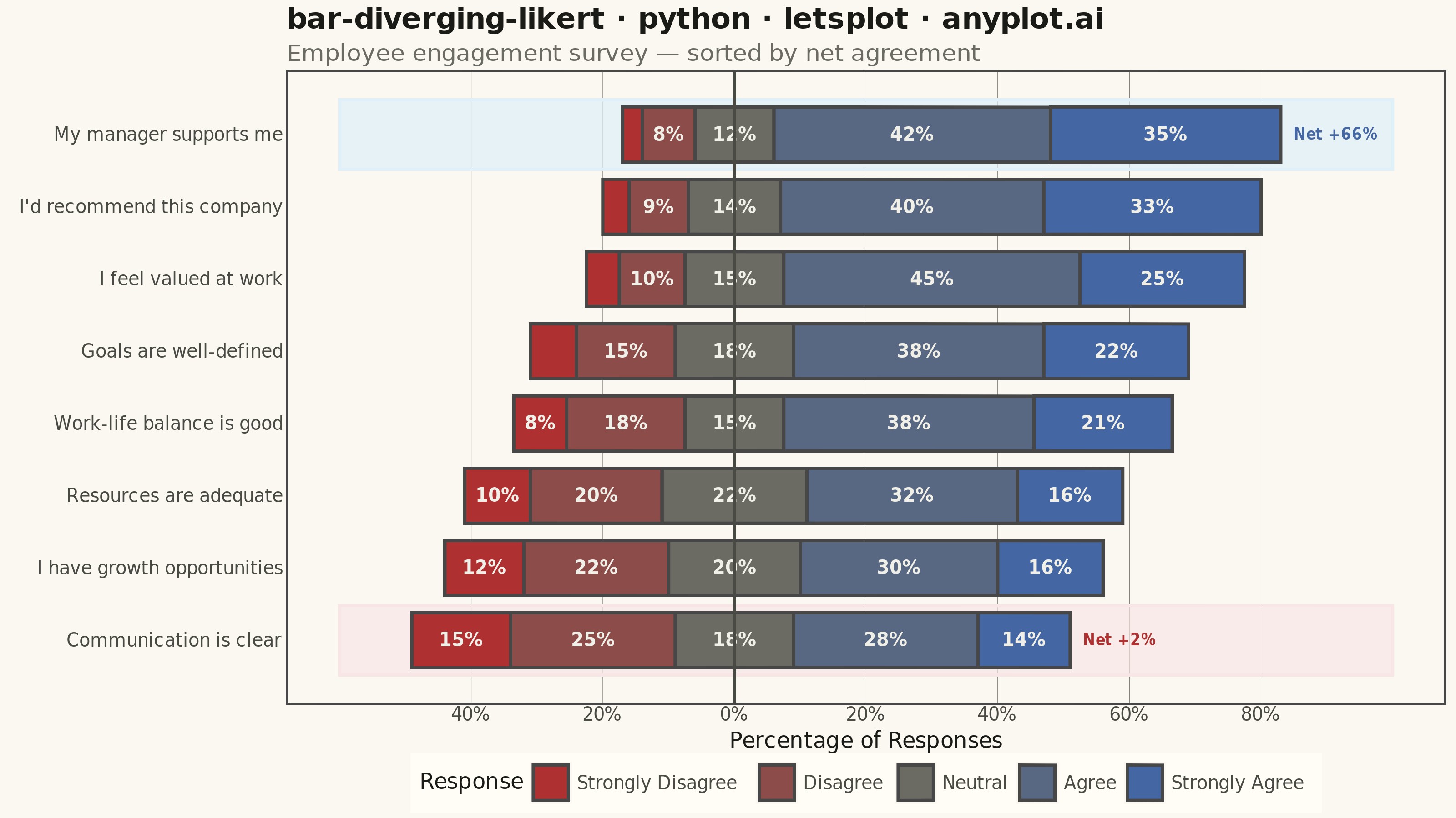
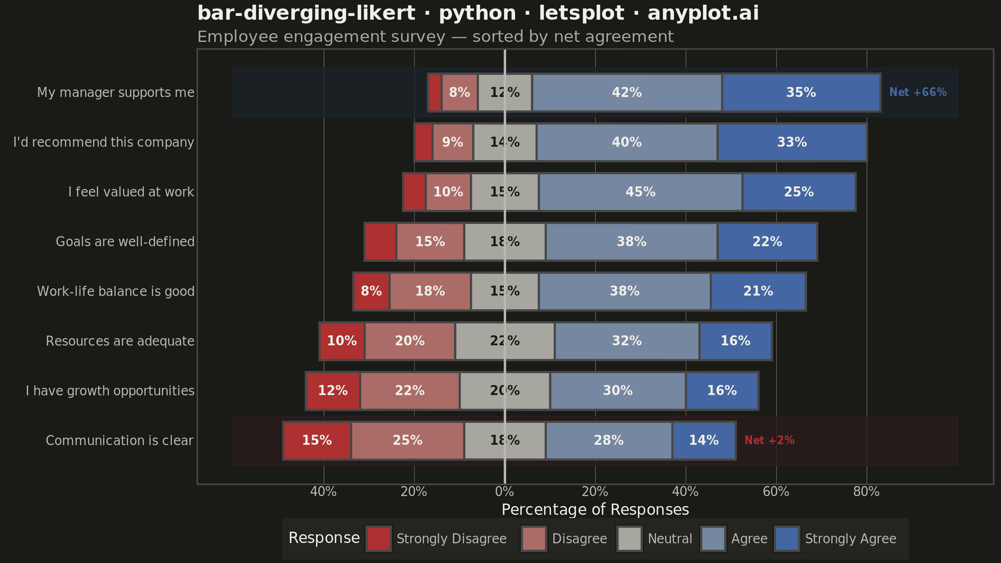
A diverging stacked bar chart designed for Likert scale survey responses (e.g., Strongly Disagree to Strongly Agree). Bars diverge from a central neutral point, with negative responses (Disagree, Strongly Disagree) extending left and positive responses (Agree, Strongly Agree) extending right. This layout makes it easy to compare overall agreement levels across multiple survey questions at a glance.
""" anyplot.ai
bar-diverging-likert: Likert Scale Diverging Bar Chart
Library: letsplot 4.10.1 | Python 3.13.13
Quality: 90/100 | Updated: 2026-06-01
"""

import os

import pandas as pd
from lets_plot import *


LetsPlot.setup_html()

# Theme tokens
THEME = os.getenv("ANYPLOT_THEME", "light")
PAGE_BG = "#FAF8F1" if THEME == "light" else "#1A1A17"
ELEVATED_BG = "#FFFDF6" if THEME == "light" else "#242420"
INK = "#1A1A17" if THEME == "light" else "#F0EFE8"
INK_SOFT = "#4A4A44" if THEME == "light" else "#B8B7B0"
INK_MUTED = "#6B6A63" if THEME == "light" else "#A8A79F"

# Imprint diverging palette for 5 Likert categories
# Interpolated from imprint_div anchors: #AE3030 ↔ INK_MUTED (neutral) ↔ #4467A3
_rn = (int(INK_MUTED[1:3], 16), int(INK_MUTED[3:5], 16), int(INK_MUTED[5:7], 16))
_c_d = "#{:02X}{:02X}{:02X}".format(
    round(0xAE + (_rn[0] - 0xAE) * 0.5), round(0x30 + (_rn[1] - 0x30) * 0.5), round(0x30 + (_rn[2] - 0x30) * 0.5)
)
_c_a = "#{:02X}{:02X}{:02X}".format(
    round(_rn[0] + (0x44 - _rn[0]) * 0.5), round(_rn[1] + (0x67 - _rn[1]) * 0.5), round(_rn[2] + (0xA3 - _rn[2]) * 0.5)
)
categories = ["Strongly Disagree", "Disagree", "Neutral", "Agree", "Strongly Agree"]
likert_palette = ["#AE3030", _c_d, INK_MUTED, _c_a, "#4467A3"]

# Text colors inside bars — near-white works on all bars except neutral in dark theme
text_color_map = {
    "Strongly Disagree": "#F0EFE8",
    "Disagree": "#F0EFE8",
    "Neutral": "#1A1A17" if THEME == "dark" else "#F0EFE8",
    "Agree": "#F0EFE8",
    "Strongly Agree": "#F0EFE8",
}

# Data: Employee engagement survey (percentages, each row sums to 100)
survey = pd.DataFrame(
    {
        "question": [
            "My manager supports me",
            "I'd recommend this company",
            "I feel valued at work",
            "Goals are well-defined",
            "Work-life balance is good",
            "Resources are adequate",
            "I have growth opportunities",
            "Communication is clear",
        ],
        "Strongly Disagree": [3, 4, 5, 7, 8, 10, 12, 15],
        "Disagree": [8, 9, 10, 15, 18, 20, 22, 25],
        "Neutral": [12, 14, 15, 18, 15, 22, 20, 18],
        "Agree": [42, 40, 45, 38, 38, 32, 30, 28],
        "Strongly Agree": [35, 33, 25, 22, 21, 16, 16, 14],
    }
)

# Sort by net agreement (positive minus negative)
survey["net"] = survey["Agree"] + survey["Strongly Agree"] - survey["Disagree"] - survey["Strongly Disagree"]
survey = survey.sort_values("net").reset_index(drop=True)

# Build diverging bar segments centered on neutral midpoint
rows = []
bar_extents = {}
for idx, row in survey.iterrows():
    half_n = row["Neutral"] / 2
    segments = [
        (
            "Strongly Disagree",
            -(half_n + row["Disagree"] + row["Strongly Disagree"]),
            -(half_n + row["Disagree"]),
            row["Strongly Disagree"],
        ),
        ("Disagree", -(half_n + row["Disagree"]), -half_n, row["Disagree"]),
        ("Neutral", -half_n, half_n, row["Neutral"]),
        ("Agree", half_n, half_n + row["Agree"], row["Agree"]),
        ("Strongly Agree", half_n + row["Agree"], half_n + row["Agree"] + row["Strongly Agree"], row["Strongly Agree"]),
    ]
    bar_extents[idx] = half_n + row["Agree"] + row["Strongly Agree"]

    for cat, xmin, xmax, pct in segments:
        rows.append(
            {
                "y": idx,
                "ymin": idx - 0.38,
                "ymax": idx + 0.38,
                "xmin": xmin,
                "xmax": xmax,
                "category": cat,
                "pct": int(pct),
                "x_mid": (xmin + xmax) / 2,
                "label": f"{int(pct)}%" if pct >= 8 else "",
                "text_color": text_color_map[cat],
                "question": row["question"],
            }
        )

rect_df = pd.DataFrame(rows)
for col in ["category", "label", "text_color", "question"]:
    rect_df[col] = rect_df[col].astype(object)

label_df = rect_df[rect_df["label"] != ""].copy()

q_labels = survey["question"].tolist()
q_breaks = list(range(len(q_labels)))

# Net agreement annotations (storytelling focal points)
top_idx = len(survey) - 1
bot_idx = 0
top_net = int(survey.iloc[top_idx]["net"])
bot_net = int(survey.iloc[bot_idx]["net"])

annot_top = pd.DataFrame({"x": [bar_extents[top_idx] + 2], "y": [top_idx], "label": [f"Net +{top_net}%"]})
annot_bot = pd.DataFrame({"x": [bar_extents[bot_idx] + 2], "y": [bot_idx], "label": [f"Net +{bot_net}%"]})

# Subtle theme-adaptive highlight bands for best/worst items
hl_fill_top = "#DFF0F8" if THEME == "light" else "#1B2229"
hl_fill_bot = "#F8E6E6" if THEME == "light" else "#291C1B"
hl_top = pd.DataFrame({"xmin": [-60], "xmax": [100], "ymin": [top_idx - 0.48], "ymax": [top_idx + 0.48]})
hl_bot = pd.DataFrame({"xmin": [-60], "xmax": [100], "ymin": [bot_idx - 0.48], "ymax": [bot_idx + 0.48]})

# Plot
title_str = "bar-diverging-likert · python · letsplot · anyplot.ai"

plot = (
    ggplot()
    # Highlight bands — visual emphasis on best/worst items
    + geom_rect(
        data=hl_top,
        mapping=aes(xmin="xmin", xmax="xmax", ymin="ymin", ymax="ymax"),
        fill=hl_fill_top,
        color=hl_fill_top,
        alpha=0.7,
    )
    + geom_rect(
        data=hl_bot,
        mapping=aes(xmin="xmin", xmax="xmax", ymin="ymin", ymax="ymax"),
        fill=hl_fill_bot,
        color=hl_fill_bot,
        alpha=0.7,
    )
    # Diverging bar segments with interactive tooltips
    + geom_rect(
        data=rect_df,
        mapping=aes(xmin="xmin", xmax="xmax", ymin="ymin", ymax="ymax", fill="category"),
        tooltips=layer_tooltips().line("@question").line("@category: @{pct}%").format("pct", "d"),
    )
    # Percentage labels inside bars
    + geom_text(
        data=label_df, mapping=aes(x="x_mid", y="y", label="label", color="text_color"), size=5, fontface="bold"
    )
    # Center reference line
    + geom_vline(xintercept=0, color=INK_SOFT, size=0.8)
    # Net agreement annotations
    + geom_text(
        data=annot_top, mapping=aes(x="x", y="y", label="label"), color="#4467A3", size=4, fontface="bold", hjust=0
    )
    + geom_text(
        data=annot_bot, mapping=aes(x="x", y="y", label="label"), color="#AE3030", size=4, fontface="bold", hjust=0
    )
    # Scales
    + scale_fill_manual(values=likert_palette, breaks=categories, name="Response")
    + scale_color_identity()
    + scale_y_continuous(breaks=q_breaks, labels=q_labels)
    + scale_x_continuous(breaks=[-40, -20, 0, 20, 40, 60, 80], labels=["40%", "20%", "0%", "20%", "40%", "60%", "80%"])
    + labs(
        title=title_str,
        subtitle="Employee engagement survey — sorted by net agreement",
        x="Percentage of Responses",
        y="",
    )
    + theme_minimal()
    + theme(
        plot_background=element_rect(fill=PAGE_BG, color=PAGE_BG),
        panel_background=element_rect(fill=PAGE_BG),
        plot_title=element_text(size=16, face="bold", color=INK),
        plot_subtitle=element_text(size=13, color=INK_MUTED),
        axis_title_x=element_text(size=12, color=INK),
        axis_title_y=element_blank(),
        axis_text_x=element_text(size=10, color=INK_SOFT),
        axis_text_y=element_text(size=10, color=INK_SOFT),
        legend_title=element_text(size=12, color=INK),
        legend_text=element_text(size=10, color=INK_SOFT),
        legend_background=element_rect(fill=ELEVATED_BG, color=INK_SOFT),
        legend_position="bottom",
        panel_grid_major_x=element_line(color=INK_SOFT, size=0.2),
        panel_grid_major_y=element_blank(),
        panel_grid_minor=element_blank(),
    )
    + ggsize(800, 450)
)

# Save
ggsave(plot, f"plot-{THEME}.png", path=".", scale=4)
ggsave(plot, f"plot-{THEME}.html", path=".")
Runnable source as JSON, for any HTTP client: https://api.anyplot.ai/specs/bar-diverging-likert/letsplot/code. Any spec id and library id listed in llms-full.txt fit the same URL shape; every URL below is complete and callable.
{
  "spec_id": "bar-diverging-likert",
  "language": "python",
  "library": "letsplot",
  "page": "https://anyplot.ai/bar-diverging-likert/python/letsplot",
  "hub": "https://anyplot.ai/bar-diverging-likert",
  "code_json": "https://api.anyplot.ai/specs/bar-diverging-likert/letsplot/code",
  "spec_json": "https://api.anyplot.ai/specs/bar-diverging-likert",
  "render_light_png": "https://storage.googleapis.com/anyplot-images/plots/bar-diverging-likert/python/letsplot/plot-light.png",
  "render_dark_png": "https://storage.googleapis.com/anyplot-images/plots/bar-diverging-likert/python/letsplot/plot-dark.png",
  "interactive_light_html": "https://storage.googleapis.com/anyplot-images/plots/bar-diverging-likert/python/letsplot/plot-light.html",
  "interactive_dark_html": "https://storage.googleapis.com/anyplot-images/plots/bar-diverging-likert/python/letsplot/plot-dark.html",
  "quality_score": 90.0,
  "license": "MIT",
  "guide": "https://anyplot.ai/llms.txt"
}
Part of Likert Scale Diverging Bar Chart on anyplot.ai.