The same plot in 14 other libraries — JavaScript: D3.js, Apache ECharts, Highcharts, MUI X Charts; Python: Altair, Bokeh, lets-plot, Matplotlib, Plotly, plotnine, Pygal, Seaborn; R: ggplot2; Julia: Makie.jl. Compare all 15 side by side: Diverging Bar Chart in Python, R, Julia and JavaScript.
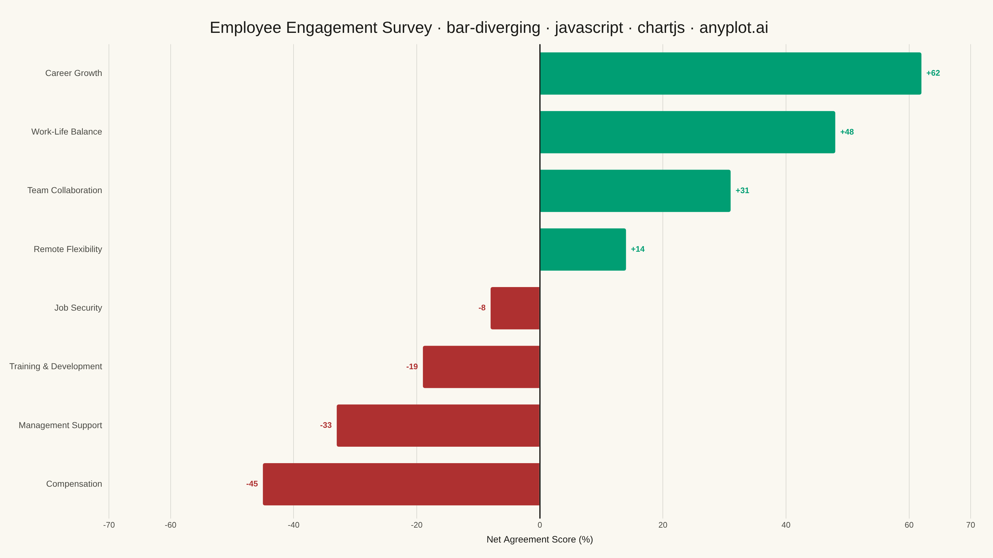
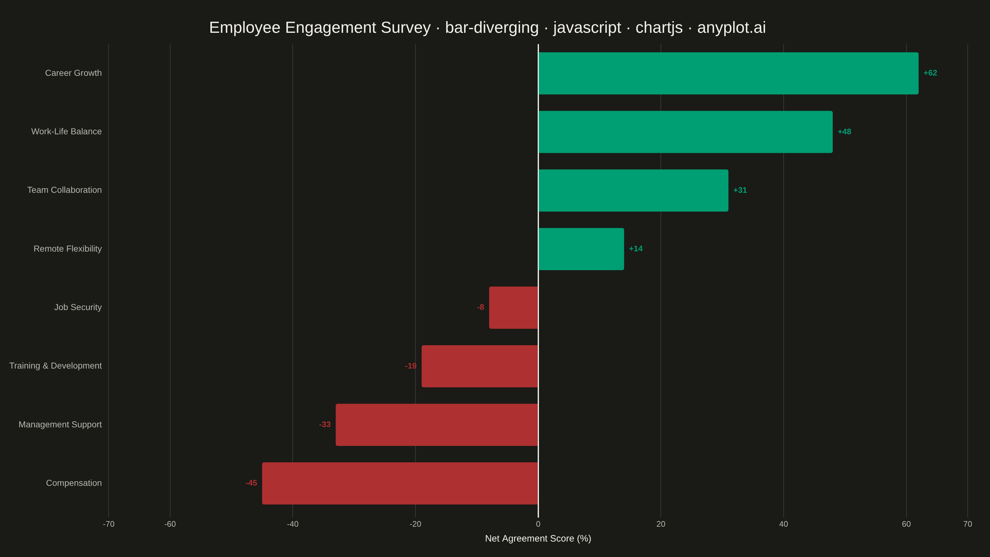
A diverging bar chart displays bars extending in opposite directions from a central baseline, typically at zero. This visualization is ideal for comparing positive and negative values, showing responses above and below a neutral point, or contrasting opposing categories. Different colors distinguish positive from negative values, making it easy to identify magnitude and direction at a glance.
// anyplot.ai
// bar-diverging: Diverging Bar Chart
// Library: chartjs 4.4.7 | JavaScript 22.23.2
// Quality: 95/100 | Created: 2026-08-18

const t = window.ANYPLOT_TOKENS;

// --- Data (in-memory, deterministic) ----------------------------------------
// Employee engagement survey: net agreement score (% agree − % disagree) per
// topic, sorted descending so the pattern (strong positives to strong
// negatives) reads at a glance.
const topics = [
  "Career Growth",
  "Work-Life Balance",
  "Team Collaboration",
  "Remote Flexibility",
  "Job Security",
  "Training & Development",
  "Management Support",
  "Compensation",
];
const netScores = [62, 48, 31, 14, -8, -19, -33, -45];

const positiveColor = t.palette[0]; // #009E73 brand green — sentiment: agree
const negativeColor = t.palette[4]; // #AE3030 matte red — sentiment: disagree

// --- Mount -------------------------------------------------------------------
const canvas = document.createElement("canvas");
document.getElementById("container").appendChild(canvas);

// --- Title (fontsize scaled against this spec's own mandated-title length) --
// Only shrink once the descriptive prefix pushes the full title past 1.8x the
// bare mandated suffix ("bar-diverging · javascript · chartjs · anyplot.ai");
// short spec-ids like this one keep the full base size instead of being
// over-shrunk against a generic fixed-length reference.
const mandatedTitle = "bar-diverging · javascript · chartjs · anyplot.ai";
const title = `Employee Engagement Survey · ${mandatedTitle}`;
const titleFontSize = Math.round(26 * Math.min(1, (mandatedTitle.length * 1.8) / title.length));

// --- End-of-bar value labels (custom Chart.js plugin, canvas-drawn) ---------
// Gives every bar an explicit numeric focal point (e.g. Career Growth +62,
// Compensation -45) instead of relying on axis reading alone.
const valueLabelsPlugin = {
  id: "valueLabels",
  afterDatasetsDraw(chart) {
    const { ctx } = chart;
    const meta = chart.getDatasetMeta(0);
    ctx.save();
    ctx.font = "600 13px sans-serif";
    ctx.textBaseline = "middle";
    meta.data.forEach((bar, i) => {
      const value = netScores[i];
      ctx.fillStyle = value >= 0 ? positiveColor : negativeColor;
      ctx.textAlign = value >= 0 ? "left" : "right";
      ctx.fillText(`${value > 0 ? "+" : ""}${value}`, bar.x + (value >= 0 ? 8 : -8), bar.y);
    });
    ctx.restore();
  },
};

// --- Chart ---------------------------------------------------------------
new Chart(canvas, {
  type: "bar",
  data: {
    labels: topics,
    datasets: [
      {
        label: "Net agreement",
        data: netScores,
        backgroundColor: netScores.map((v) => (v >= 0 ? positiveColor : negativeColor)),
        borderWidth: 0,
        borderRadius: 3,
      },
    ],
  },
  plugins: [valueLabelsPlugin],
  options: {
    indexAxis: "y",
    responsive: true,
    maintainAspectRatio: false,
    animation: false,
    layout: { padding: { top: 20, right: 36, bottom: 16, left: 12 } },
    plugins: {
      title: { display: true, text: title, color: t.ink, font: { size: titleFontSize, weight: "500" } },
      legend: { display: false },
    },
    scales: {
      x: {
        min: -70,
        max: 70,
        title: { display: true, text: "Net Agreement Score (%)", color: t.ink, font: { size: 15 } },
        ticks: { color: t.inkSoft, font: { size: 13 } },
        grid: {
          color: (ctx) => (ctx.tick.value === 0 ? t.ink : t.grid),
          lineWidth: (ctx) => (ctx.tick.value === 0 ? 2 : 1),
        },
        border: { display: false },
      },
      y: {
        ticks: { color: t.inkSoft, font: { size: 14 } },
        grid: { display: false },
        border: { display: false },
      },
    },
  },
});
Runnable source as JSON, for any HTTP client: https://api.anyplot.ai/specs/bar-diverging/chartjs/code. Any spec id and library id listed in llms-full.txt fit the same URL shape; every URL below is complete and callable.
{
  "spec_id": "bar-diverging",
  "language": "javascript",
  "library": "chartjs",
  "page": "https://anyplot.ai/bar-diverging/javascript/chartjs",
  "hub": "https://anyplot.ai/bar-diverging",
  "code_json": "https://api.anyplot.ai/specs/bar-diverging/chartjs/code",
  "spec_json": "https://api.anyplot.ai/specs/bar-diverging",
  "render_light_png": "https://storage.googleapis.com/anyplot-images/plots/bar-diverging/javascript/chartjs/plot-light.png",
  "render_dark_png": "https://storage.googleapis.com/anyplot-images/plots/bar-diverging/javascript/chartjs/plot-dark.png",
  "interactive_light_html": "https://storage.googleapis.com/anyplot-images/plots/bar-diverging/javascript/chartjs/plot-light.html",
  "interactive_dark_html": "https://storage.googleapis.com/anyplot-images/plots/bar-diverging/javascript/chartjs/plot-dark.html",
  "quality_score": 95.0,
  "license": "MIT",
  "guide": "https://anyplot.ai/llms.txt"
}
Part of Diverging Bar Chart on anyplot.ai.